Featured Blog | This community-written post highlights the best of what the game industry has to offer. Read more like it on the Game Developer Blogs or learn how to Submit Your Own Blog Post
The simple most difficult challenge of bringing Frostpunk to consoles
Bringing Frostpunk to consoels was challenging. Here's one short tale how UX design theory can get you out of a hole when bringing a survival-city builderes designed for mouse an keyboard with an ambition to make it feel like a native console experience.

This one will be simple. Also, not really.
Yesterday reviews for Frostpunk: Console Version dropped and they are shaping up very nicely indeed. We knew Frostpunk holds its own as a game, but bringing this mood & narrative heavy survival-city builder to the gamepad? That one wasn’t so obvious.
And we found that out acutely. In the beginning of the process the team tested around 5 completely different ideas for the control scheme. None of them worked the way we wanted them to. And despite feeling this game could be a good fit for gamepads (even the city is circular for pete’s sake!) they were at a loss.
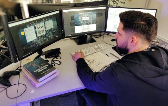
 That's me, clearly at a loss.
Frostpunk is a complex game. City-builders seem ready-made for mouse and keyboard and while there are examples of successful ports to consoles, none of them feel native to the couch-gaming experience. Our ambition for this project was always not to just “do a port”. This game relies on you being able to settle in the mood, immerse yourself, feel the challenge and the consequences of your choices. How were you to do it cursing over deleting your only Infirmary yet again, because controls are so fiddly? We wanted to do it in a way that would set a new high bar for strategy games on consoles.
We doubled down on the problem - and for once I was glad for my UX design background. User-centered design methods are nothing new of course, but in my experience, everywhere but the largest of studios a formal approach to crafting the user experience gives way to hunch-centered design: “this should work like this, because I feel it should work like this, and besides, we’re out of time”. We’re all gamers, so it works surprisingly often. But when faced with a finished, complex game designed for a completely different control scheme, this approach just doesn’t cut it.
What actually helped me at this point was not the heavy-hitters of UCD - personas, scenarios and the lot. These were unnecessary, because the game was done: there were no more unknowns in the needs/emotions, personal differences/scenarios to take into account. What did help was a less well known approach called activity-centered design, stemming from Russian developments in cognitive science, the activity theory.
The crucial paradigm shift for me is well illustrated by this passage from the summary of Activity-Centered Design: An Ecological Approach to Designing Smart Tools and Usable Systems by Geraldine Gay and Helene Hembrooke (a book that discusses the subject well):
With context-based design, designers start not with a preconceived idea of what users should do, but with an understanding of what users actually do.
This clicked. Suddenly, our efforts were no longer about trying to find new ways to solve one problem at a time: (“How information should be structured in the Selection Panels”, “How a building header should look like”, “How should construction control look like”). It was about contexts.
It turned out the activities within Frostpunk are actually quite simple: I want to build a building. I want to pass a law. I want to research technology. I want to employ people here. I want to send scouts there. And… that’s really it! That’s 80% of Frostpunk, right there.
Of course, the devil is in the details, but the realization what core activities are within the context of the game allowed us to kickstart from a standstill. Using regular Information Architecture tools, such as proper affinity grouping and labeling, two core concepts were born. The first was the Command Radial which allowed to aggregate the “I want to build/research/pass/know” global activities under one “power button” - the Left Trigger. The second one was the Shortcuts Menu which aggregated most “I want to employ/let go/use ability contextual to the building to another, the Right Trigger. Similar structure (I want to do X vs. I want to know X) propagated to the Selection Panels of the game. One button to always close a window. One button to always confirm selection/action. And that’s it!
.jpg/?width=700&auto=webp&quality=80&disable=upscale)
.jpg/?width=700&auto=webp&quality=80&disable=upscale)
Above is a comparison of one of the first mockups for Shortcuts Menu and final rendition of the concept in-game.
The rest was more or less bookkeeping and making sure we stay coherent. Of course, there were many low-level pitfalls, cruxes and challenges which ended in months of work for our UI/UX team. Most notably, camera controls is a curious example that really showcases how little details - the snapping mechanics for instance, which there are 3 separate ones in the game - make a world of difference. But as soon as we’ve solved this high level structural problem, the rest was manageable… Until we ran into optimization problems.
But that is whole other story for another time.
Read more about:
Featured BlogsAbout the Author
You May Also Like


