Daily news, dev blogs, and stories from Game Developer straight to your inbox
Sponsored By
Featured Blog | This community-written post highlights the best of what the game industry has to offer. Read more like it on the Game Developer Blogs or learn how to Submit Your Own Blog Post
Reading by Gaslight: A look inside Sunless Skies' UI redesign
Tobias Cook, artist at Failbetter Games, shares some of the thinking behind the UI redesign featured in Sunless Skies' penultimate Early Access update, prior to the game's full launch in January 2019.
6 Min Read

Hi, I’m Toby and I’m the lead on the User Interface redesign for Sunless Skies. This is a a major overhaul touching every element of the UI, so I wanted to give a bit of insight into our rationale for the redesign, and explain the thinking behind the decisions we’ve made.
A bit of background:
We delayed the release of Sunless Skies to next January because we wanted to improve several key areas of the game. Of these, a major priority was the game’s UI and user experience. Sunless Skies is a relatively text-heavy game and demands a greater than average amount of reading from the player, and we wanted that reading experience to be as immersive, atmospheric and intuitive as possible. At the same time, we took the opportunity to shift the tone of the interface to better align with the - increasingly dark and spooky - game world. We only had a few months, so there was no time to start from the ground up. We had to be economical, adapting existing technology wherever possible.
Identifying problems
We began with an analysis of our existing UI. Having chosen the areas we wanted to focus on, we had to quickly produce wireframes (Adobe XD was useful for this) and problem solve ‘on-the-go’ during implementation.
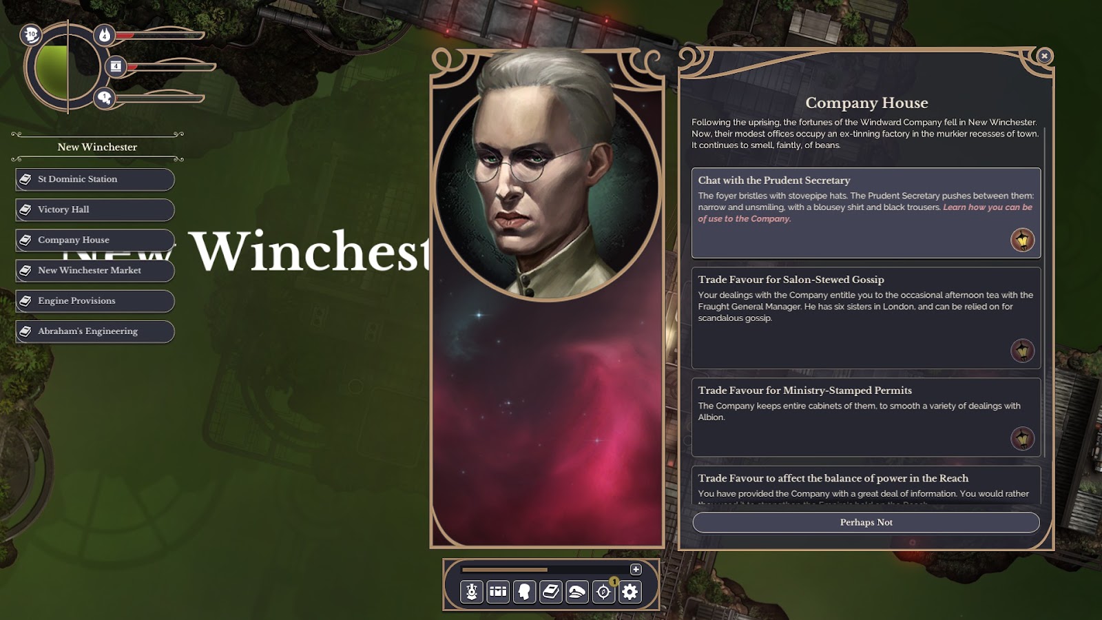
One of the primary issues we identified was a less than ideal reading experience. This was due to a few factors, among which the most significant was the off-center positioning of the reading panel. This was an aspect of the old design, a panel based system which allowed users to open any combination of two interfaces in a left/right configuration. The intention was to allow the player to review their inventories whilst simultaneously interacting with story content, allowing simultaneous comparison of different inventories, and so on. The unfortunate result of this design was the pushing of the reading panel off the screen center, a sometimes confusing and unpredictable visual layout, as well as a general loss of real estate in which to display content.

Simplification
For the update, we decided to cut back on this design. We moved away from the mixed two panel design to a center panel/side panel layout. We centered and expanded the reading panel, and expanded the inventories whilst locking them to the side of the screen and adding tab cycling. We allowed a small amount of travel in the reading panel when the inventories panel opened to afford more space to the interface as a whole, while ensuring that the reading panel would remain centered if no other interface required real estate.
I wanted to cut back on the three dimensional, button-heavy appearance of the existing UI, presenting the written content as seamlessly and free of distractions as possible whilst remaining intuitive. To this end we cut back on overt affordance in the reading interface, using colouration, indenting and dividers to indicate hotspots rather than buttons.
Text logging and readability
The biggest technical challenge we faced during the redesign was the implementation of logging. Previously, every selection made in the reading panel would wipe and refresh the
content entirely. Adding logging allowed players to review their past decisions and refresh their memory on previous events in the current area, as well as tackling layout issues where the refreshed content might consist of only a single line. Implementing this system posed many challenges; smooth fading and transitioning of large quantities of text, a scrollbar that could adapt dynamically to these changes, and defining the rhythm and appearance of new content. Ultimately I think this system adds a feeling of weight to player decisions and just *feels* more natural to read.
HUD matters
The inventories all received a degree of attention, again with the intention of increasing readability whilst also better leveraging our icon library (one feature of the redesign was a 50% increase the the size of our small icons - you can generally see what they are supposed to be now.). Changes here were typically less substantial and more about layout adjustments and aligning visually with the reading panel, as well as improving affordance and highlighting to better indicate areas of interaction.
For the HUD, we moved away from the spherical health indicator and curved fuel/supply indicators, which we considered too difficult to read, and moved back to a more traditional bar format. The contrast, size and colouration of the bars was reconsidered to better balance their visual priority and provide better at-a-glance access to key data. All HUD elements were moved to the lower portion of the screen and reframed, ensuring a better visual balance and easier comparison especially of the central heat bar and the health bar on the left.
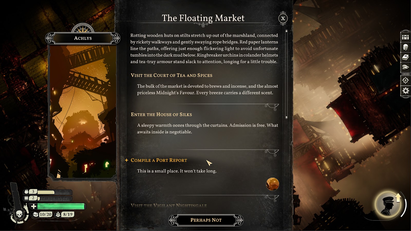
[Pictured: An example of the new content logging feature. Link to larger image.]
Atmosphere
To refine the tone and atmosphere of the UI, we adjusted the texturing and saturation of the frames to give a more distressed appearance, and used a more restricted colour palette in the text with brighter colours reserved for interaction and important points of interest. Another challenge was selecting a typeface that felt tonally correct (Sunless Skies takes place in an alternate history Victorian setting) whilst remaining readable. Ultimately we landed on Vollkorn for much of our text, which maintains an aspect of our targeted period tone whilst retaining readability (a common issue with serif typefaces).
Scaling
The previous design was very ambitious - it allowed granular independent user scaling of both the UI frames and the text. Users could fine tune both to suit their own tastes. Unfortunately, though it allowed a wide range of customisation, it also presented huge challenges in presenting a functional, consistent UI. We therefore decided to to scale back this feature, restricting scaling options instead to two text size options. We felt this accommodated what would be the most valuable scaling feature- larger text- while also not creating undue obstacles and risk in implementing the UI redesign successfully in the time we had left.
We made innumerable other small decisions not noted here in the redesign, but I hope this has provided some insight into our process. I’m really proud of the work we’ve done on the new UI- you can check it out in the forthcoming Commander release of Sunless Skies Early Access on the 19th December, or when Sunless Skies releases in full on January 31st!
Read more about:
Featured BlogsAbout the Author
You May Also Like