

Daily news, dev blogs, and stories from Game Developer straight to your inbox
Sponsored By
The utilize of Color Psychology in game graphics designs
Color plays a crucial role in the "first impression" and by using color matching well, the design philosophy of game art can be better conveyed, and it can also better assist in the game’s success.
8 Min Read

Many people in the past believed that colors had some kind of mysterious power, and some modern psychologists also concluded that there is some kind of connection between colors and the human brain, which deeply affects people's emotions and behavior.
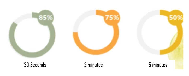
Data shows that when people observe objects, they initially stay on the appearance for about 20 seconds, with color perception accounting for 85% and shape perception for 15%; after two minutes, color drops to 75%, and after five minutes, it tends to be evenly split.
The impression colors give to people is quick, profound, and lasting, which also determines what kind of first impression many things give to people. This blog will combine color related theories and the practical application of colors in game design to reveal how color is used in game playing psychology.
Conveying concepts through colors.
Physical features
On the same basis of elements or shapes, using different colors will present different themes. Art concept designer OLDFISH has also emphasized the importance of the physical features conveyed by color in concept communication. At the same time, colors can also produce differences in the conveying of the materials. The same shape can be used to express materials such as silver and gold by giving them different inherent colors and light-shadow relationships.
Some specific colors can express certain cultural background and features. When people assign a specific meaning to a group of colors and continue to use them out of habits, it will eventually become a symbolic color of the object. This is most common in religion, ancient class systems, and different customs.
The same color may represent different meanings in different cultural backgrounds, and even completely opposite meanings. These cultural connotations related to color are also reflected in the design of some games. For example, in Chinese culture, red often represents celebration and good luck, while in some Western contexts, it may symbolize violence, and tension. Therefore, in game scenes with an Eastern background, red wooden buildings or red decorations are more common, while in game scenes with a Western background, they are relatively less frequent. Of course, scene design is closely related to the era in which the game background/world view is located and the theme of the game itself. However, as an important element in different cultures, colors can also inspire artists to generate or represent many different design ideas.
The influence of colors on people's emotions is subtle, and the psychological implications brought by different colors are also different. Taking some common examples in life, the color scheme of many fast food restaurants is red and yellow, which gives people a fast-paced psychological hint; while hospital rooms are usually decorated with light colors such as white and light blue, which can bring a sense of stability and comfort to people and help relieve their emotions.
In game design process, color is also a direct and powerful way to evoke players' emotions. Research conducted on some players shows that yellow usually represents "fun" in the minds, while red usually means "anger". Of course, these studies are not absolute, but represent certain trends in color design of games, which cannot be separated from the player's psychological state. However, it is undeniable that the use of different colors can indeed evoke certain specific emotions in people's hearts.
Comparative color matching
Colors usually can be roughly divided into complementary colors, contrasting colors, and middle colors. The stronger the color contrast, the easier it can be recognized by people. Many game arts use this principle when design scenes, character costumes, etc., making it easier to create a cutting effect and a clear distinction effect between strong and weak.
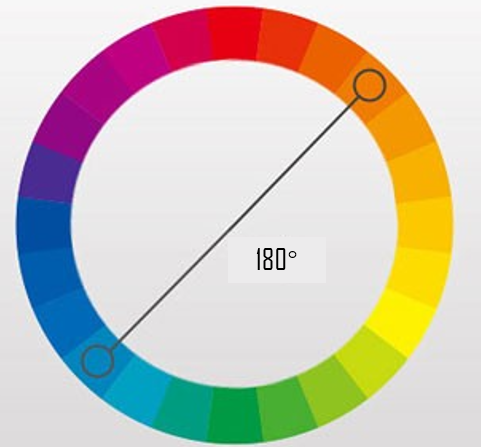
Usually, we define colors that have an angle of 180° on the color wheel as complementary colors. Complementary colors have the greatest range of color tone changes and produce the strongest contrast in the image's color relationship, thereby giving people a strong visual impact. However, in art and design, this also means "high risk". Excessive contrast can easily cause disharmony and overly stimulating feelings.
However, as long as it is well balanced, "high risk can also bring high returns" and produce unexpected aesthetic innovations. Complementary colors usually have strong contrast and conflict, so the use of complementary color combinations generally has greater challenges. Usually, changing the area ratio or saturation is used to present a better visual effect.
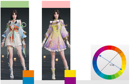
Blue and orange, yellow and purple are relatively common complementary color combinations. In Naraka: Bladepoint, the costume of the hero Kurumi has always been a focus of players' attention. Designers use blue and orange complementary colors for the chest, sleeves, and waistband, which highlights the lively and clever character image. On the other hand, another skin uses a large area of yellow and purple colors, which is also favored by many players, but from the perspective of color contrast and complementary effects, it is not as outstanding as the former.
The three key elements of color are hue (i.e. color tone), lightness, and saturation (i.e. colorfulness). In addition to selecting different combinations of hues, color relationships can be further emphasized by adjusting the lightness and saturation of colors.
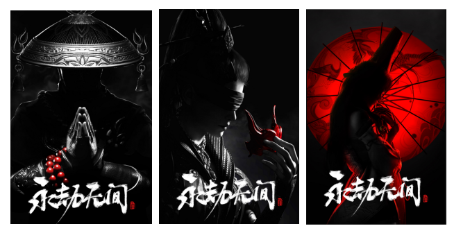
Especially when the lightness or saturation of large color blocks is low, and the color purity of smaller blocks is high, a very distinguished sense of contrast will naturally appear. In a low-purity background, especially when black, white, and gray are used as the base colors, a small part of high-purity color will be particularly eye-catching.
For example, in this set of single-character posters for Naraka: Bladepoint, the overall background color is black and gray, and the most eye-catching part of the picture is the iconic items of each character, all of which are high-purity red, intuitively and implicitly expressing the character's positioning and even related background. For example, the red Buddhist beads on Tianhai's wrist, Viper Ning's eye mask, and Kurumi's red umbrella behind her all fully reflect the implicitness of Eastern narrative in artistic form, creating a sense of mystery and a strong visual impact.
The role of color matching.
In addition to the intuitive visual performance that can be seen at a glance, color also has a strong psychological implication. In game design, it is also common to shape the appearance by adjusting the color.
By adjusting the hue, brightness and purity, objects with the same style can present different effects. Generally speaking, the greater the range of color changes or the richer the level of changes, the greater the difference in the final appearance. This difference can be cleverly transformed into different qualities of "rules" in game design.
For example, the four pictures below are the four sets of costumes of the female character Matari in Naraka: Bladepoint. From left to right, the quality and value of the skin in the game increase gradually. We can see that the overall color matching of these four sets of clothes is relatively close, all with a white and reddish-brown color scheme. The default skin on the far left is red with light brown, with a small and soft color change and relatively weak performance power, and it’s the first level quality and free skin that can be obtained in the begining. Compared with the first set, the second set has no difference in design, but the color of the neckline and skirt hem is changed to dark red, with a stronger contrast and a higher level of quality. In addition to the more complex design, the white, pink and golden-brown combination of the third set also enhances the sense of color hierarchy. The last set is the very popular high quality skin, which also has a white base color. However, the red ribbon and gold decoration on the whole body give this costume a sense of nobility and delicacy.
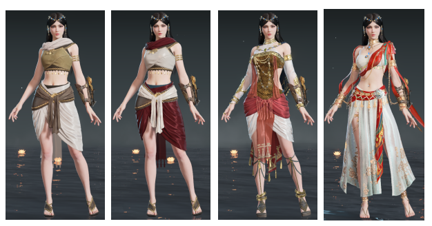
Upon further observation of these four sets of clothes, the quality increases from left to right. The brightness of the red color scheme from the second to the fourth set also has different "standards". The lower quality sets mostly use colors with low brightness, while the highest quality set uses a bright and pure red color, with a material that has a slightly golden luster.
In reality, the presentation of colors will be affected by factors such as lighting and distance. For example, when taking pictures for people, if there is extra lighting, the skin will appear whiter and more translucent. When trying on clothes in a mall, there are often small spotlights in front of the dressing mirror to make the color of the clothes appear more eye-catching.
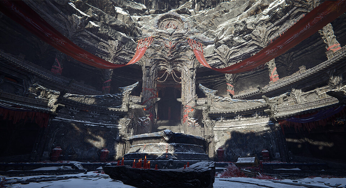
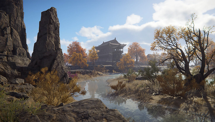
In games, designers will use this feature in reverse, using the changes in light and dark of colors to shape the spatial relationship of the scene. For example, in the scene shown in the picture, the colors of the rocks, and trees on the right side are purer, and visually closer. The houses and trees in the distance have lower purity but higher brightness, and the color contrast is relatively blurred, giving people a feeling of being in the sunlight in the distance.
Read more about:
BlogsAbout the Author(s)
You May Also Like


.jpeg?width=700&auto=webp&quality=80&disable=upscale)


