Postmortem: Windy Meadow
"I love this idea, and I could make it better. I just need one more chance."
Game Developer Deep Dives are an ongoing series with the goal of shedding light on specific design, art, or technical features within a video game in order to show how seemingly simple, fundamental design decisions aren’t really that simple at all.
Earlier installments cover topics such as how indie developer Mike Sennott cultivated random elements in the branching narrative of Astronaut: The Best, how the developers of Meet Your Maker avoided crunch by adopting smart production practices, and how the team behind Dead Cells turned the game into a franchise by embracing people-first values.
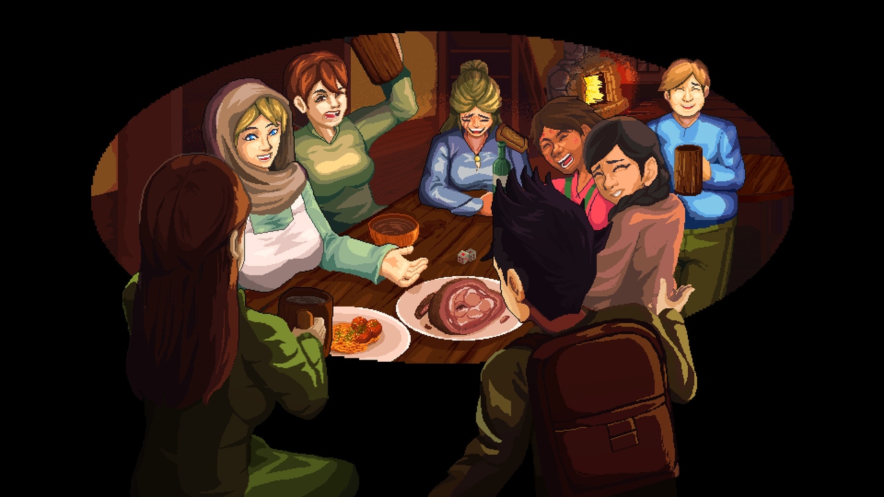
In this edition, the developer of Roadwarden looks back on the making of the original Windy Meadow and what they learned going into the game's recent remake.
I’m Aureus, and this is my second time writing for Game Developer. Previously, I had the pleasure of introducing the narrative-oriented design of my 2022 video game, Roadwarden. Now, a new game of mine is reaching its release: Windy Meadow, a visual novel set in the same fantasy realm. An interactive story that’s cozy in some parts and gruesome in others, it explores the themes of choosing your path and being a part of a community.
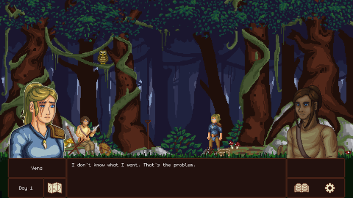
While the game is just a one-time, 3.5-hour experience, it’s still quite a feat for a one-year project. With plenty of illustrations, 2D pixel art animations, an intertwining narrative, gentle story branching, sound effects, and music, it surely took thousands of hours to finish.
Here’s the kicker: this project was originally released in 2018. It was a massive flop and a tiresome, crucially flawed project with an inexperienced designer behind it—me.
The re-release isn’t exactly a remake, update, or a re-imagining. But here’s the mantra that’s been following me for years: I love this idea, and I could make it better. I just need one more chance.
Please be aware that this postmortem is spoiler-heavy.
I. What’s going on here — the basic summary
I’m going to use Tales From Windy Meadow (or TFWM) in reference to the original version of the game, while Windy Meadow (or WM) will denote the re-release.
TFWM, released in 2018, was designed, written, and “programmed” by me.
The development started in 2017.
It was made in Ren’Py. It was my first contact with the engine.
It had no publisher.
It was illustrated by a few different parties, including the game’s main partner: the Indonesian creative guild Oray Studios.
I also tried to illustrate parts of the game to speed up the process, but it didn’t go well.
The game used various Creative Commons and royalty-free music tracks.
It received kind reviews from a few humble websites.
It sold extremely poorly on Steam and Itch.io.
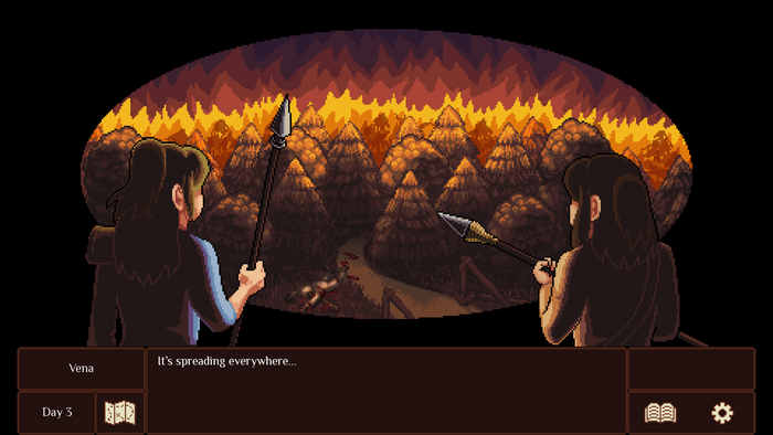
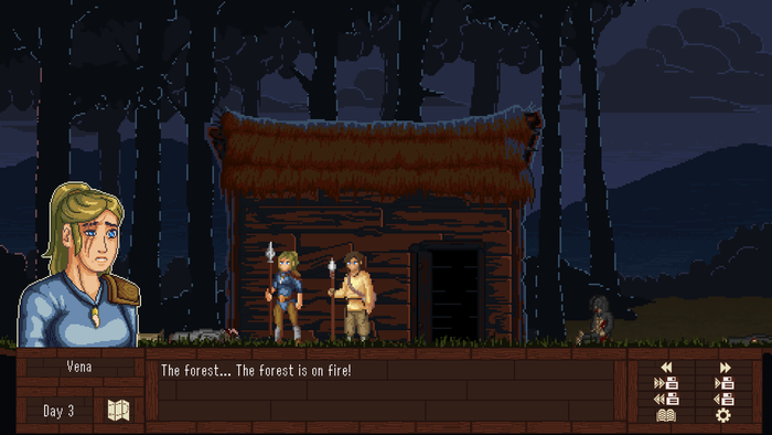
WM, about to be released on October 16, 2023, updates the game in every regard.
It sticks to a more advanced version of Ren’Py.
It’s getting published by Assemble Entertainment, a company from Germany.
The majority of the game’s illustrators have returned to update the game.
Since I got much better at drawing, I also updated some of the game’s visuals.
The game still uses Creative Commons music.
Because of Roadwarden’s renown, a few larger websites were willing to announce the game’s development.
At the time of writing the first draft of this article (July of 2023), the number of wishlists on Steam were far from great.
In September of 2023, Roadwarden’s Anniversary Patch brought in quite a spike in regards to WM’s wishlists.
WM is set in Roadwarden’s setting, while TFWM was set in a much older version of it, oftentimes contradicting Roadwarden’s lore.
It’s an interactive visual novel—a story with hardly any gameplay elements that uses plenty of text and compliments it with visuals, sound, and UI.
While the player does make various impactful choices, the story doesn’t have any branching routes. It’s a rather focused, linear experience.
It’s a slice-of-life story, probably best classified as young adult fiction.
It has an experimental narrative structure, divided into four chapters. The first three are focused on their own protagonists, with some of the side characters showing across all of the stories. The fourth chapter finishes with a rather complex epilogue shaped by the player’s actions.
The first three chapters all occur over the span of the same four days, so the player gets to see some of the events from different perspectives.
Unlike most visual novels, it offers no romance.
II. Why even rerelease a flop
1. To fulfill my old dream
TFWM was my grand passion project. As my first large video game, it was meant to offer a story focused on the topics I resonated with most. I’ve fallen in love with this small settlement and its residents, yet I couldn’t taste the satisfaction of playing what I envisioned. The gap between my dream and reality was too wide, and the financial hit I took was impossible to ignore.
While the failure of TFWM was justified and even expected, it hurt.
2. To serve as a palette cleanser
Roadwarden took almost four years of development and was followed by patches, interviews, and live events.
I was craving to jump into a smaller project, something that would add fuel to my creative efforts. To work on something with a simpler UI, a straightforward narrative, more colors, and less tiresome coding.
Unlike Roadwarden, this remake didn’t require a constant pace of 40-50 hour work weeks. I could focus on my health, spend more time exercising, get engaged, and refresh a few friendships as I was waiting for feedback, editing, commissioned illustrations, and so on.
I was working half-time and enjoying myself rather than struggling, as I used to.
3. To turn a profit
Making TFWM was a financial disaster, not just for me but also for the contributors, who received an underwhelming revenue share.
Remaking it, however, is something I can finance much more easily, and I was able to use the majority of the budget to compensate its artists. The game’s publisher, Assemble Entertainment, covered the cost of marketing.
Windy Meadow promotes itself as an accompanying piece for Roadwarden and will likely join it in a bundle, offering a different side of the same fantasy setting.
If I get to work on a new text-heavy RPG, this visual novel will be the perfect mezzanine between two larger games.
While I don’t expect an insane number of copies sold, even a humble success would surpass these expenses more than a few times, definitely enough to justify a moderate effort.
I guess I shouldn’t let the opportunity cost go unacknowledged. I mean, I could have worked on something else. But I wanted to work on WM.
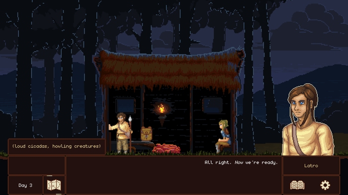
III. What went wrong with the old version
Almost everything.
I was completely delusional about my competence. The creative process went on without any story consultations or editing, born out of a depressed, immature mind. There were threads that went nowhere, characters acting with no justification, constant reliance on the most basic, easy-to-portray emotions.
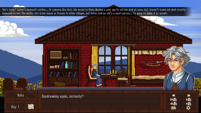
Arguably, the worst narrative tool I used was the “hidden” details, small scraps of vague character relationships that were poorly explained and could only be caught, if at all, under a magnifier if someone were to track each chapter and character description with great care, ideally playing the game more than once.
Also, English isn’t my first language, and it took me some time to get used to its idioms and grammar. Many would point out that Roadwarden is also lacking in regards to the artistic value of its writing style and to the clarity of communication. Even the most polite reviews described TFWM’s writing as “jarring.”
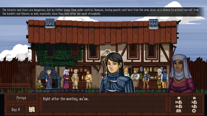
While various illustrations were pretty decent, the general art direction was lacking. During more complex dialogues, the screen gets confusing, with a static, boring camera and little visual variation.
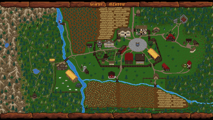
The map of the village is a great example of a picture where I simply wasn’t able to direct the artist properly. I didn’t even realize that the buildings were drawn in mismatched perspectives, creating complete chaos:
I didn’t know how to utilize the tools offered by the Ren’Py engine, and I didn’t know much about UIs in general. Everything looked ugly and was dysfunctional, often being unresponsive to clicks and, as a result, awkward, barely holding together:
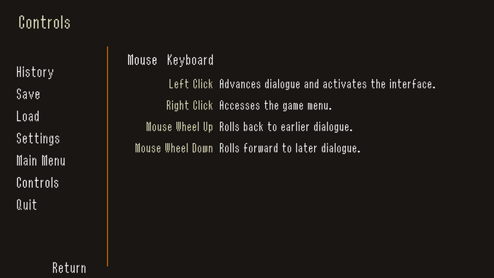
TFWM makes a terrible first impression, with an ugly title screen, unreadable dialogue font, and a mouse pointer too narrow not to get visually lost on the screen. The boring “Tales From” phrase adds nothing to the title, and the game’s logo that I commissioned, while pretty, suggests that the game would be a horror. It’s so massive it was useless in promo materials, constantly forcing me to either resize it or fiddle with versions that omitted the first two words.
And the trash cherry on top: the audio. The game was filled with music, whether it was fitting or not, often shoehorning piano tracks into “sad” moments. It lacked cohesion, taste, and moderation. The sound effects were also a mixed bag.
In summary, the core issues I would diagnose TFWM with are:
a) lackluster narrative with an incomprehensible structure;
b) weak writing;
c) tasteless UI with limited functionality;
d) boring, static visuals filled with too many “this will have to do” placeholders;
e) overwhelming, uneven music;
f) poor first impression that was sabotaging its marketing.
IV. The updates
1. Story structure
TFWM allowed the player to choose any character’s story as the starting point of the game, with the assumption that only after finishing all three chapters they would have enough information to understand the core plot:
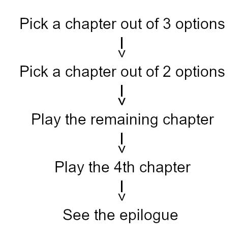
This terrible idea led to many confusing moments in the flow of events, leaving most players with more questions than answers, no matter which chapter they started with. Since I could never assume that the player would know the context of various conversations, I had to repeat the same information in each chapter, just in case.
In WM, the chapter order is fixed, which allows me to clean up the dialogues. All the crucial events occur during Chapter 1, and the game can now widen the cast of characters slowly, in a planned way, without overwhelming the player.
Originally, each protagonist was meant to have a story that would involve two points of tension. The main one would be resolved in the game’s epilogue with a single, direct decision, while the subsidiary would be shaped by various small choices occurring over the span of their chapters.

That caused even more issues. The subsidiary story often wasn’t clear, and most players were unaware they shaped the outcome whatsoever. The feedback offered by bits of dialogue was sparse and too subtle (or rather—half-assed). It wasn’t clear that one thing led to another.
Fabel’s story, now “Chapter 2”, didn’t really have its subsidiary point of tension, just the primary one. I’d argue I didn’t know how to handle this chapter at all; it was falling apart trying to follow too many different possible directions, neither of which was actually explored.
In WM, the structure I decided to follow more closely goes like this:
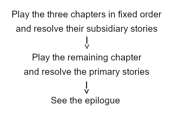
Not only that, the subsidiary stories are resolved more directly, getting more feedback even through the UI. As a result, I was able to form a proper six-ingredient epilogue.
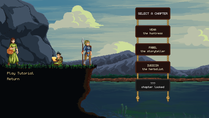
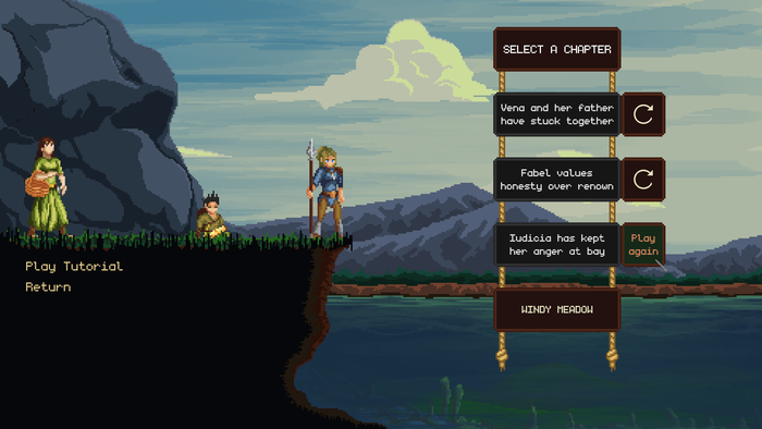
Here, for example, the chapter selection screen acknowledges both potential subsidiary outcomes for the first chapter:
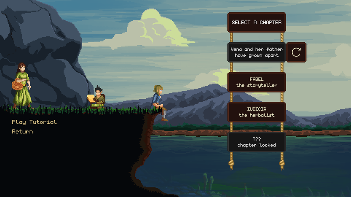
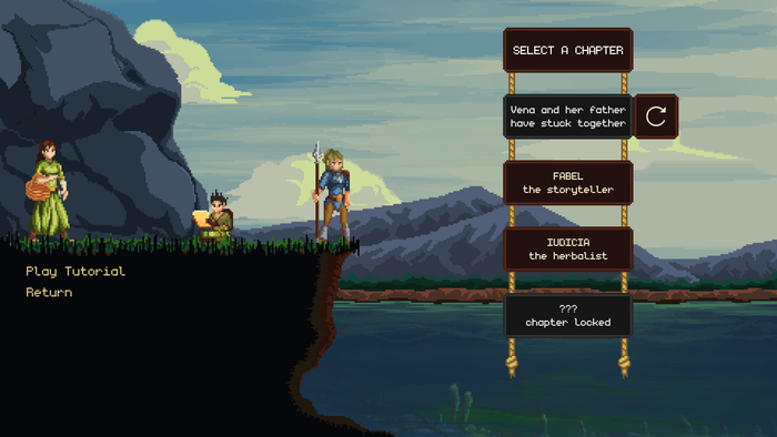
2. Writing
I rewrote the entire script, not just rephrasing lines but also adding whole chunks of dialogue or building entire conversations anew.
Thanks to the new structure, I could add new scenes to the game, putting greater trust in the player’s familiarity with the side characters, allowing them to return in further chapters, and establishing a stronger set of themes.
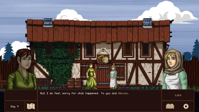
Because of this, almost no characters are showing up just for a single conversation, and all the stories feel more intertwined.
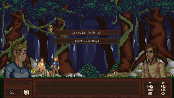
Here are two new scenes that show up during Chapters 1 and 2, both of them occurring at the same time in the same place and reusing an old, underutilized background:
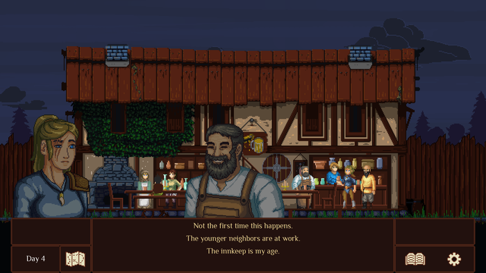
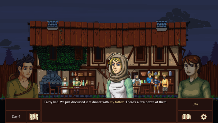
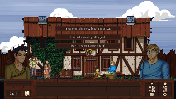
Since the testers were losing track of who was saying which line of dialogue, despite the visual aid, they helped me realize that the characters all sounded the same, lacking their unique, personal voices. Fixing this took another round of rewrites, as well as research.
I also introduced separate dialects for the locals, the cityfolk, and the outsiders, which provided an additional layer of authenticity. At the same time, I took to heart all the advice about not relying too strongly on accents, so I treated them as an embellishment rather than the only thing that distinguished the character voices.
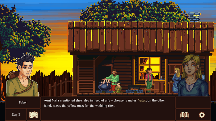
Fabel, for example, uses long sentences, metaphors, and idioms and keeps his language precise, though at times, it becomes emotional. He uses the same dialect as the other people in the village, although it rarely comes to the surface:
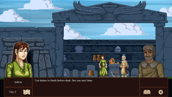
Iudicia is very direct, at times impolite, and uses short sentences, often omitting pronouns and abbreviating words whenever she’s got the chance. She displays all the features of the local dialect:
The new character with the most “basic” voice is the narrator, who in TFWM appeared only a few times, chipping in no more than a few words at once. This time, they show up more often, helping me express the characters’ thoughts and distress without showcasing their emotions through less-refined outbursts like it used to happen previously:
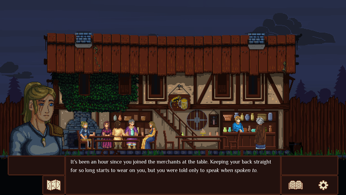
The better way, of course, would be to use, you know, a cutscene, or at least a moving camera. Acting. Or just a voice. But it works well with the scope I allowed myself to undertake.
I added more opportunities for the player to make decisions that influence the story in more or less subtle ways. An example could be the interaction invented by my girlfriend: in Chapter 2, playing as Fabel, the player has an option to correct another character, stating that they don’t see their guardian as their “father” but rather as their “uncle.” The game remembers this choice, using it to alter how various other characters refer to this relationship.
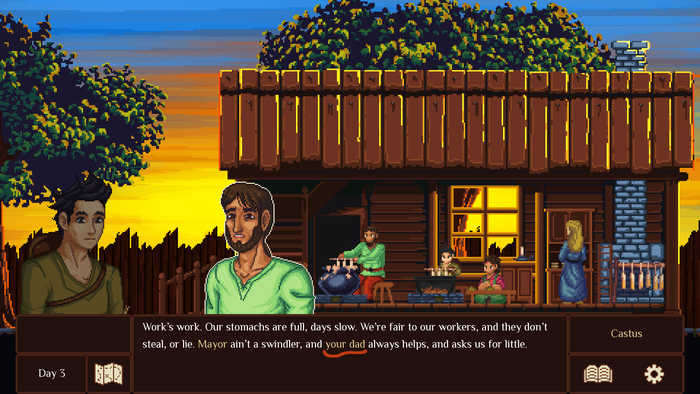
I also updated the game’s setting, taking lessons from Roadwarden. Still, I needed to keep some details unchanged because of the budgetary limitations, for example, omitting some cool lore bits that were not relevant to the presented stories.
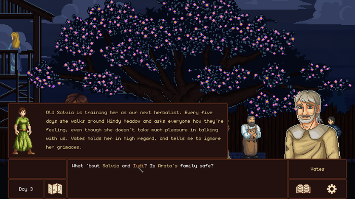
I decided to place WM’s events in spring instead of TFWM’s fall, both because of some minor story details and the grander theme of reaching a new, more mature phase of one’s life and of the grand decisions that come with new responsibilities. It took a bunch of rewrites and even visual changes but it was definitely worth it.
Here’s an example: The Large Apple Tree bearing flowers instead of fruit.
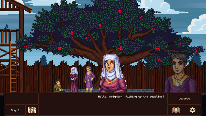
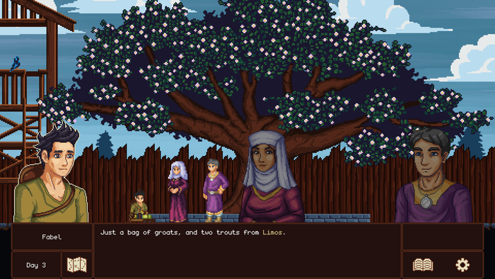
Last but not least, this time, the game has been properly proofread, so ideally, my writing and language won’t shatter the illusion it tries to build as often.
3. UI
Even a great narrative, when made into a video game, can get hindered by a bad UI. I needed to address both the interface’s poor appearance and its lack of functionality.
The terrible, “decorated” brown boxes; choices pushed to the center of the screen, away from the main text; the notifications kept even further away, in the upper-left corner; the narrow mouse pointer; the unreadable pixel font; the numerous, tiny buttons in the corner of the screen that are not even necessary... There was a ton of stuff to do.
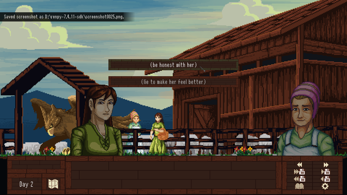
I aimed at a more elegant yet responsive approach. The entirety of the text is kept very close to the main dialogue box, and the game smoothly responds to all sorts of clicking, speeding up, or displaying and hiding notifications. The frames don’t draw attention to themselves, allowing the text to breathe (and the background illustrations to do their work):
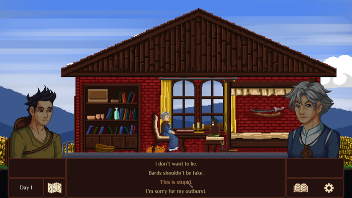
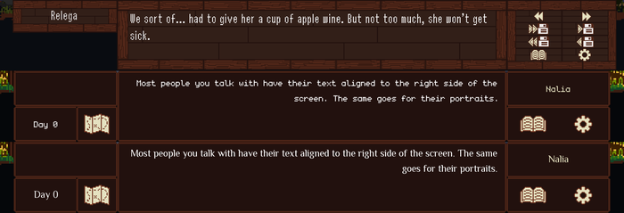
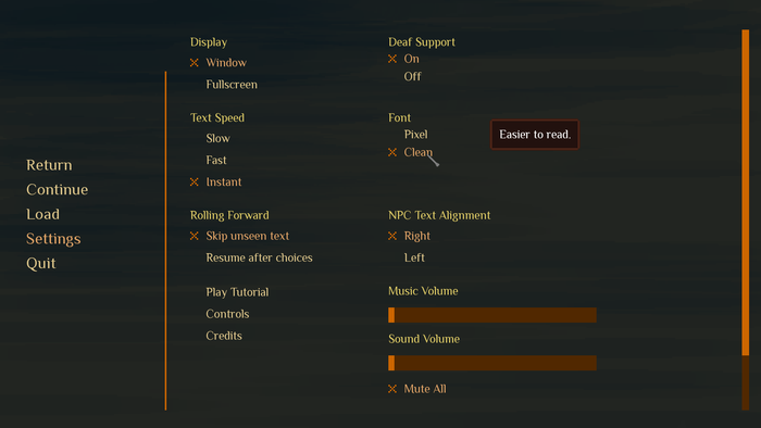
The new pixel font is easier to read but can also be switched to a regular, cleaner font familiar to Roadwarden players. In dialogues, your character’s words are adjusted to the left side, while the other voices are adjusted to the right (though this feature can also be turned off). Having two separate boxes for character names on the left and on the right makes recognizing who’s currently speaking even easier.
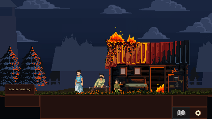
I implemented a new “closed captions” feature to make the game more accessible, especially for the hard-of-hearing players. Now they can read descriptions for the most important sound effects, especially if those are not conveyed by the visual cues:
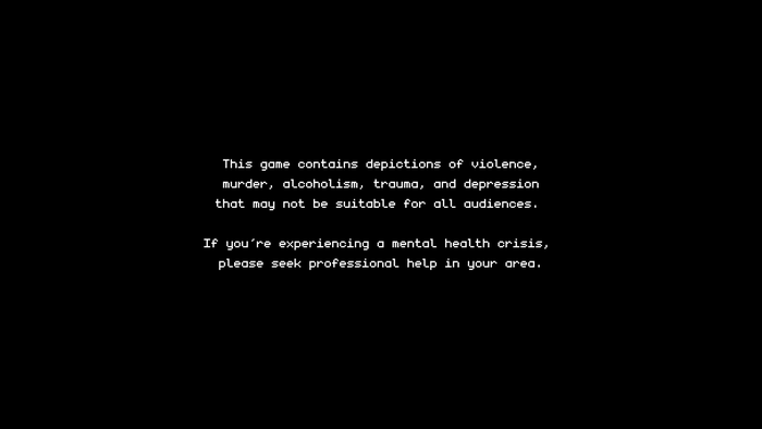
The content warning before the title screen will hopefully weaken the impact of the more disturbing scenes. This message can also be disabled in the game’s settings:
The game now saves automatically, so the old “save” buttons were removed, though I kept the quick saves just in case. The quick menu is generally larger, but most of the buttons remain hidden unless called to show up by hovering over the “settings” button in the very corner of the screen.
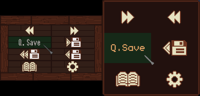
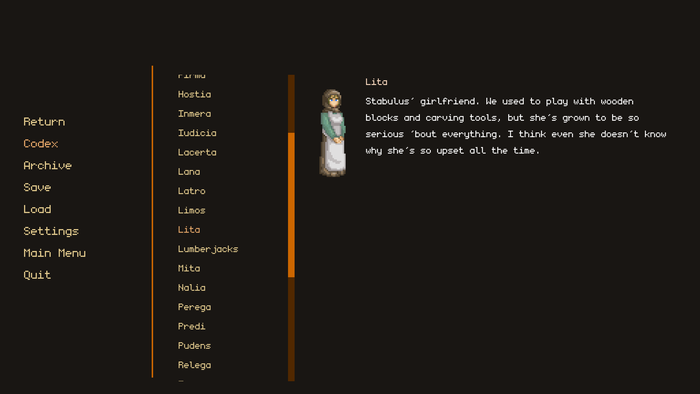
The “book” button no longer opens the dialogue archive, which can still be accessed from the menu. Instead, it opens the new Codex, a journal-like collection of all the characters living in the village, as well as some additional information. Each protagonist uses a different set of descriptions for everyone they meet in their chapter, so writing essentially three different Codexes took a lot of work.
These character descriptions used to show up only when the player pointed at a name of a character during a conversation. Now, they are meant not only to introduce a new character but also reveal more about the played protagonist by presenting their perspective to their neighbors. And thanks to The Codex, an eager player may read and analyze all of these descriptions whenever they desire.
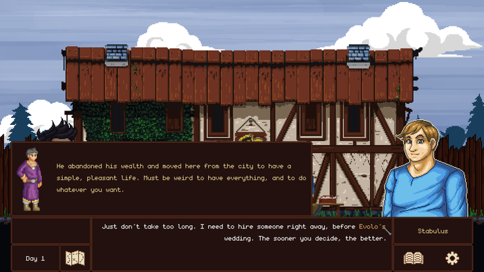
Bringing up the descriptions in-game with notifications is much more responsive, showing and hiding the textbox with greater fluidity. If a mentioned character is absent during that conversation, their description also contains their character sprite.
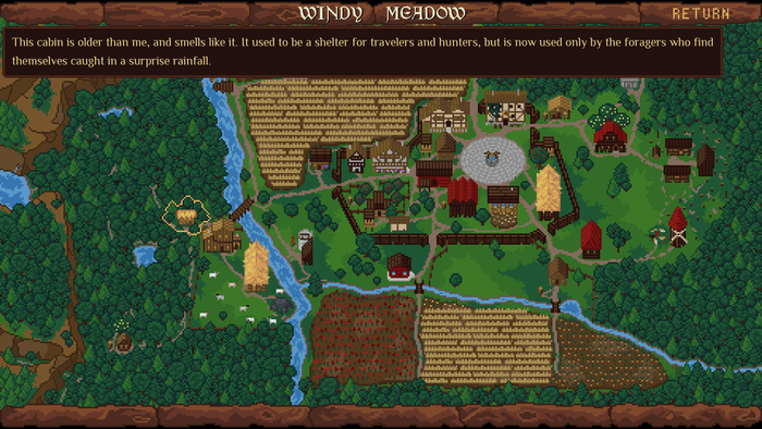
Similar descriptions are used on the in-game map, providing additional fluff and insight into the local community. Every time the player visits a place that provides a new description, the game encourages them to check it out with a not-so-subtle animation highlighting the “map” button.
And since that’s quite a few tools to learn, the game now offers a handy tutorial for the UI and controls:
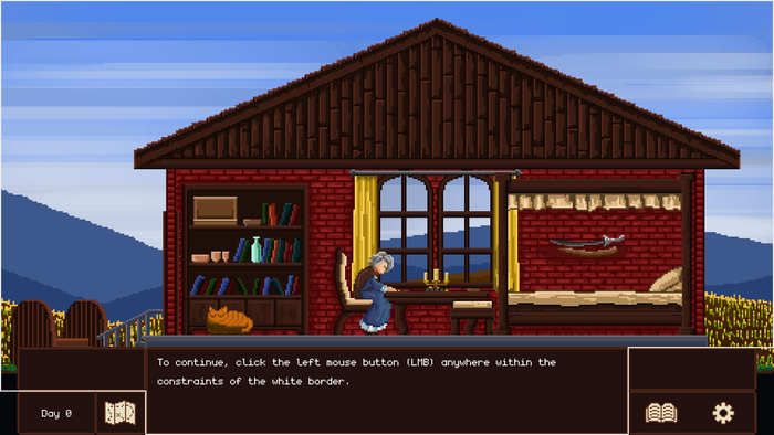
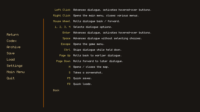
One thing the tutorial lacks is a guide through the keyboard shortcuts. Some of them, like the “F5 to quick save” or an option to select the dialogue choices with the 1-4 numeric buttons, can be handy, but usually, the game does better when playing with the mouse, and the keyboard is just a quality of life addition.
The select-the-chapter screen was also rebuilt. In TFWM, the player’s progress was stored only in their save file. This time, the chapters are selected from the main menu, allowing the player to replay a specific chapter more easily.
Also, taking the lesson from Roadwarden, I moved the About and Credits screens away from the main list of buttons, squeezing them into the game’s Settings.
4. New visuals
Some of the visual updates, like the map of the village, were quite obviously sorely needed:
Or this dream sequence, where I added a few more characters and made the stars move horizontally, just to make it prettier and more oniric:
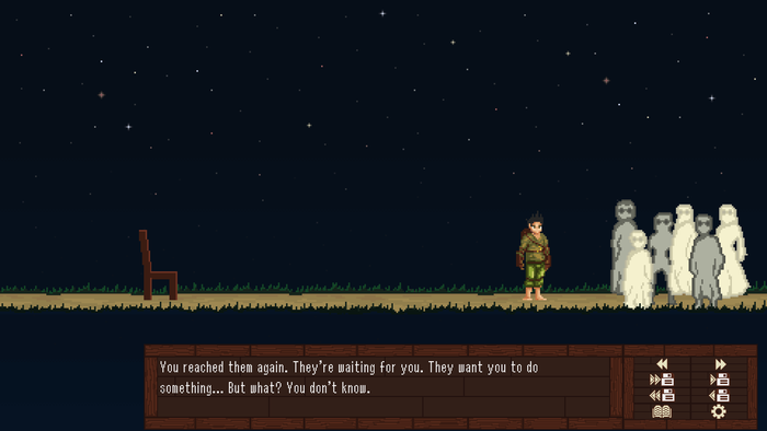
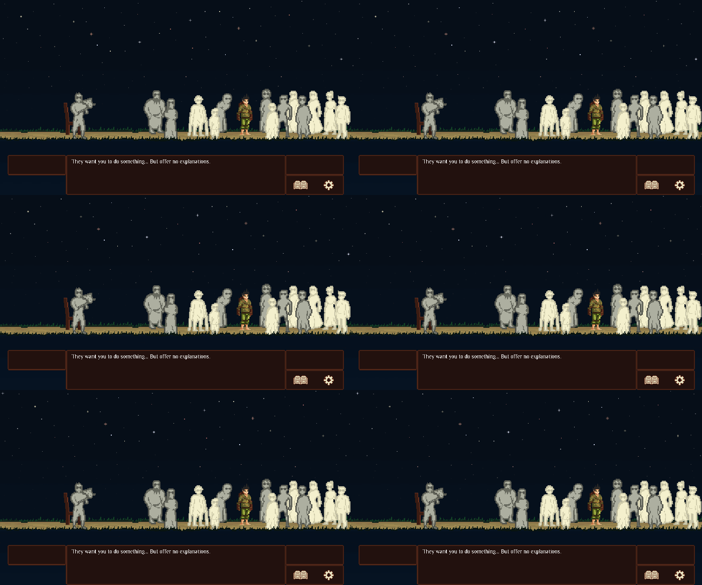
I could list dozens of examples, but I’ll limit myself to just a few
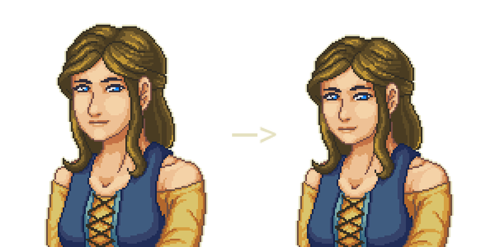
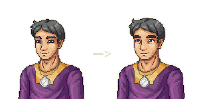
Some of the portraits were so out-of-size they required tiny redraws, while pretty much all of them were too narrow in scope of expressions, so I needed to both add the new expressions and update the less successful ones:
A few of the backgrounds are not properly framed—proof of my poor art direction and failed communication. The stronghold is the best example: the building was so tall it didn’t fit the screen, forcing the UI to cover the bottom third of the characters in every scene. Considering how crucial this area is for the game’s plot, it was a terrible misstep.
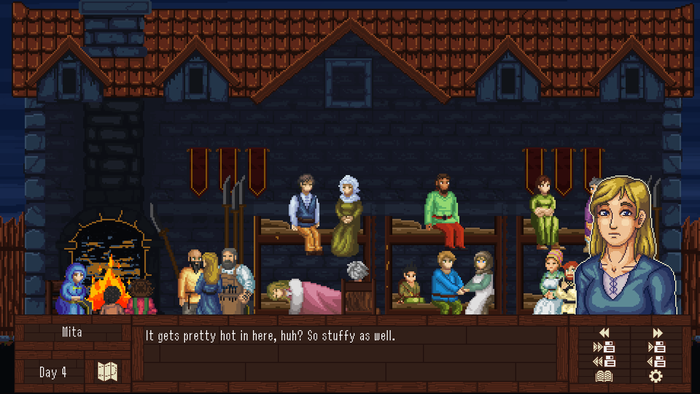
I had to spend two days adjusting each background tied to this location by hand and then adapting the sprites and the game’s code accordingly:
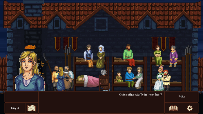
Another important area had no gate introduced in its first depiction, and so the artists skipped it in all the sub-backgrounds tied to it. I had to add it by hand.
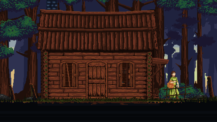
One scene portrays a cat that pretty much disappears for the rest of the game. Now, it appears every now and then, resting in the background or observing what’s going on.
One of the doors—I drew it myself back in 2017—was absolutely terrible:
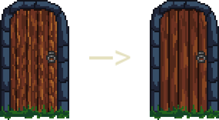
And in this scene, the door used to be in the foreground. I still remember how I tried to hide it in 2018, but it looked so bad I just ignored it until now:
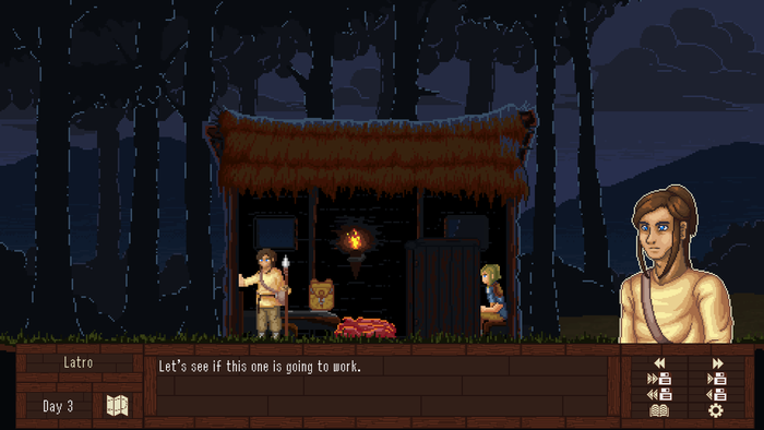
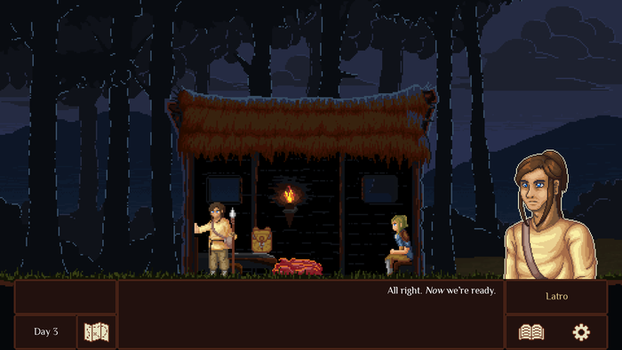
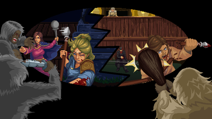
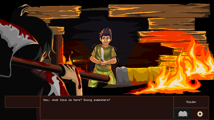
But I was interested not just in fixing stuff but also in adding completely new illustrations. Thanks to the original pixel artists, about a dozen scenes were decorated with high-detail illustrations, all of which broke the rules of the original front-view camera. In some cases, it’s more of an update, meant to improve the appeal of the previously underwhelming events:
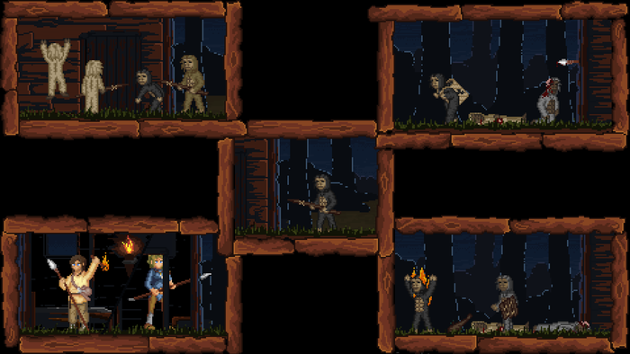
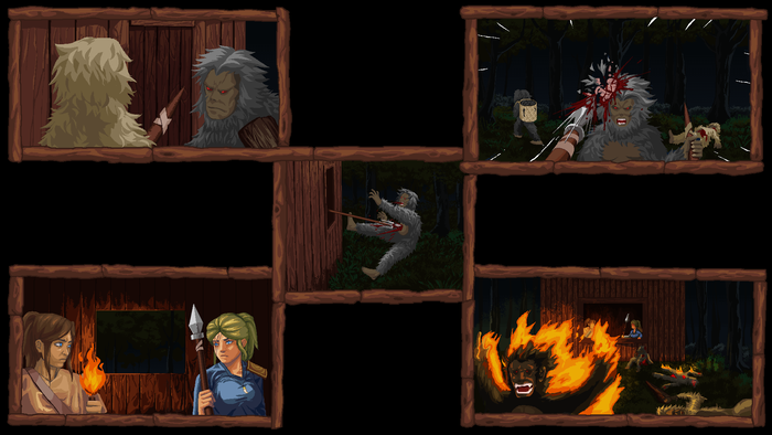
But usually, they were meant to portray the characters’ emotions or to mark the crucial events occurring in the game’s narrative.
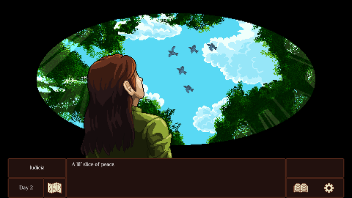
In TFWM, I often allowed the characters to yell at each other. I was lacking both the skills and the tools to express them in more toned-down ways. Now, these scenes can introduce more interesting emotions. Here, I focused more on the characters’ grief rather than fear and anger, and the additional spectacle adds gravity to the event, too:


Other illustrations allow me to show, if briefly, the events that in the past were either omitted or limited to an out-of-frame description:
One of the scenes got its own unique shift in perspective for its dialogue, hopefully helping to add variety to yet another conversation and spark slightly different emotions, maybe even a sense of wonder:
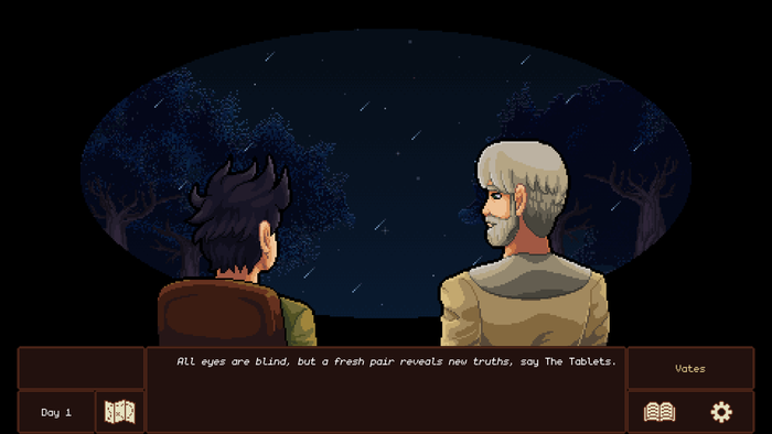
If I had a limitless budget, I would replace another 20%-30% of the game with this type of camera work.
5. Sound
The remake still uses mainly the Creative Commons guitar folk music recorded by Doctor Turtle, but unlike TFWM, it has no sappy piano tracks, instead incorporating Doctor’s tracks released post-2018 and a few royalty-free songs that fill the gaps.
Now, the base of used tracks is more numerous, but at the same time, they appear less often, giving the player some moments of silence. There are a few scenes that use only the ambient sounds—some of them copied directly from Roadwarden—and many music tracks, in general, were removed or moved around in order to suit the corresponding scenes better.
Also, I changed the diegetic sound effects completely. Previously, the sounds were tied only to the rain and fire, but now most steps, hits, shrugs, cloth-folding, and so on all have assigned sounds, adding much-desired impact to the animations and drawing attention to them. And since the game’s code was significantly updated, they also fade out or get interrupted more smoothly.
It took weeks to add them, but it moved the game’s production value to a completely new level. Better yet, It forced me to address the constant issue of incohesive volume levels, and I was finally able to adjust them correctly.
And one more fun little change. At the end of Chapters 2-4, all of which end with their own music tracks (unlike Chapter 1, which ends with a nature ambiance), their music continues after the player gets moved back to the chapter-selection screen, rather than getting cut and replaced by the main title screen track. It makes the transition very smooth.
6. The presentation
This may sound stupid, but when I was choosing “Tales From Windy Meadow” as the game’s title all the way back in 2017, I was afraid “Windy Meadow” alone would be too similar to Stardew Valley. And since the game presents a collection of separate, intertwined chapters, I decided that “Tales From” would be an appropriate addition.
It was, of course, a terrible idea. Not only did it make the game derivative and less recognizable, the massive logo couldn’t be squeezed anywhere:

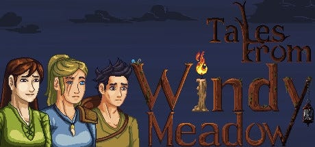
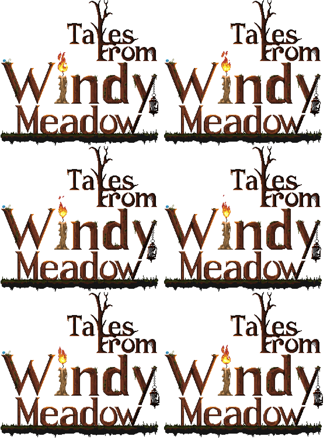
After some discussions with the kind folks at Assemble Entertainment, I cut out the first chunk of the title. I was considering adding “The Night of The Great Fire” as a side title, but I knew that in the end, no one would remember it anyway.
The new logo is simple, scalable, and a bit more generic, but matches Roadwarden’s logo in style.


The finally-agreed-upon side title, “The Roadwarden Tale,” is meant to do the heavy lifting in advertising the game by drawing attention to its setting and making it clear that this small visual novel is tied to a much larger, more successful game.
The old title screen was boring and unable to convey what the game was really about:

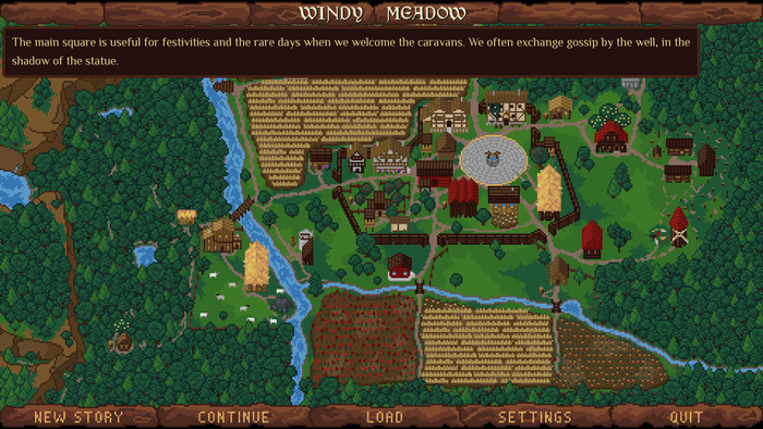
The new one is not just a decoration (damn it, I’m proud of this map, it took me a long time to draw it), but also establishes the game’s landscape and makes it easier to learn what’s-what and where’s-what. If the player wants to, they can immediately try to hover over different locations on the map to see a textbox revealing some fluff.
And another embarrassing detail: when the game was released on Steam, the player’s system would show a generic “A Ren’Py Game” program name in the game’s window title bar. I made sure to fix this mistake.
Since I knew nothing about translating tools for Ren’Py, a ton of stuff in TFWM needed to be replaced by hand, so the original translations had to be switched manually while launching the game. This time, I prepared proper tools that allow me to export the translatable files with no additional effort—if there is ever a need for this, incorporating a translation for a new language in the build should take just a few hours.
V. What hasn’t been fixed (but arguably should)
Most visual novels have two layers of graphics: portraits and backgrounds. They can be static or fancily animated, with dramatic lighting and looped idle movement and whatnot. I’m convinced dividing TFWM visuals into three layers instead of two—the background, character sprites, and character portraits—was a mistake.
The camera is oftentimes boring, tied to a specific spot, unmoving, and not utilizing the conventional language of cinema, such as dynamic blocking. Ideally, the art design should take a lesson from games like Pentiment and A Space for the Unbound, zooming in on the details and blending the character expressions (portraits) with their sprites while allowing customized, high-detail cinematic scenes.
So, one camera reserved for two-layer scenes that involve character sprites and the backgrounds alone, and other shots used in events of greater importance.
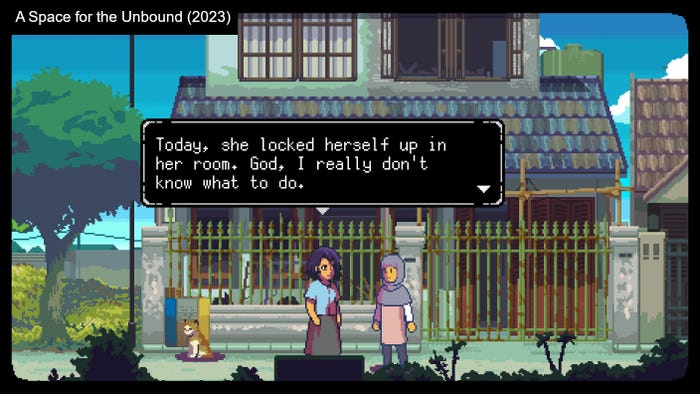
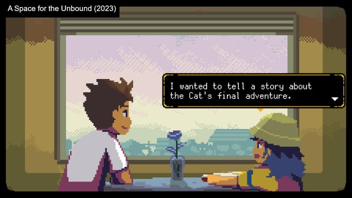
I was always too ambitious for my own good, but I tried to be clever, using the three-layered system as a way around the fact I had a limited budget. I can imagine a better version of Windy Meadow that would make each of its scenes more visually unique and customized, but I guess I’ll think back on that lesson in a few years once I get to work on another visual novel project.
The plot has its own share of problems, and that’s also the result of my past mistakes: it would be better to have a professional editor on board from Day 1, someone to point out the weakest parts of the story and help me form it into better shape. Even after all the narrative fixes, I can see that some of the core issues were not solved. There are characters that could be cut or ones whose roles could be expanded. There are events and aftermaths that are underdeveloped. All I can do is learn from my mistakes.
And while I’m happy that I updated the game’s setting, it feels much more generic than in Roadwarden, even if it’s stronger and better explained than in TFWM. It is more of “a fantasy world” than “MY fantasy world,” and some parts of the game expose that. Fabel’s house and a few other buildings, for example, are away from the village walls, while they should be hidden inside the village. I just didn’t have the resources to redraw, adjust, and fix all of these scenes and illustrations.
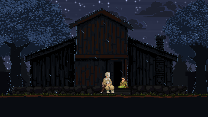
One more detail: there’s a simple reason why the legacy edition of the game is still available on Steam while we’re working on the re-release. Steam didn’t agree to take the game down. It would be much simpler if we could make sure it’s out of the picture and doesn’t confuse any more players in the meantime, but oh well.
VI. The ghosts of the past
I don’t know how clear it is, but working on Windy Meadow forced me to sort out the spiritual skeletons in my closet. That’s the doubtful charm of taking responsibility for your art, work, and leadership: you can only blame yourself for your mistakes.
I used to avoid mentioning TFWM in conversations. I saw its failure as proof that I would never be a real game developer. I tried to launch it a year or two ago to take a few screenshots for a conference talk, but I couldn’t force myself to go through with it. It was worse than I remembered.
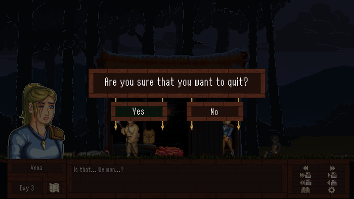
I spent years of therapy learning to forgive myself for various harms and inadequacies. To work on Windy Meadow again, I had to handle not only the usual dev work but also the overwhelming emotional labor. I looked at the cheesy lines of dialogue, the bad illustrations, the terrible code, and all the bad memories tied to them—and then took a step forward, and another one, and then countless more.
I’m convinced I’ve created something special, and it helped me reconnect with parts of me that make me cringe. “I should have known better,” I kept thinking. And yes, I should have. But I’m now something greater than the sum of my faults.
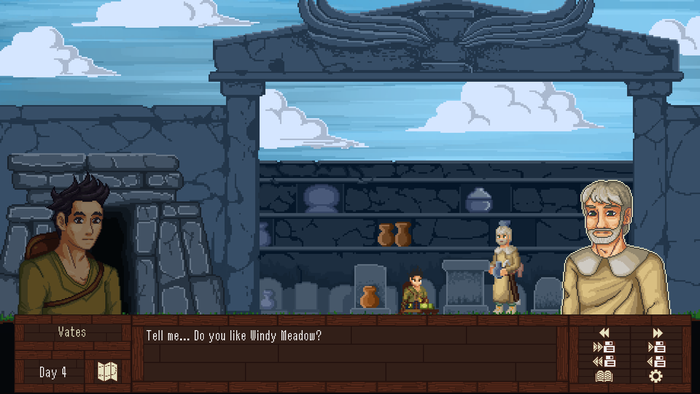
Every now and then, I hear comments expressing disappointment that I am working on this visual novel instead of starting Roadwarden 2, or maybe a DLC for the first one. Some folks are disappointed with WM’s demo, and I feel for them—there are fewer choices, not as much interaction, not as many mysteries.
The truth is that if I were a person who could stick to doing the same thing over and over again, Roadwarden would never have come into existence. It was stupid to even make such an obscure, weird, boring game instead of walking in the footsteps of more successful projects. But it worked. It worked for me. Somehow.
I crave exploration. And this time, I looked for answers in my past—and I believe I found some. Windy Meadow is my own little slice of peace, and I hope you’re going to enjoy your journey with it, too, wherever it takes you.
About the Author
You May Also Like


