Trending
Opinion: How will Project 2025 impact game developers?
The Heritage Foundation's manifesto for the possible next administration could do great harm to many, including large portions of the game development community.
APICO's many moving parts mean its menu system needs to be just as dynamic as its gameplay. Here's how devs at TNGineers created a drag-and-drop UI to compliment the game's crafty nature.

Game Developer Deep Dives are an ongoing series with the goal of shedding light on specific design, art, or technical features within a video game in order to show how seemingly simple, fundamental design decisions aren’t really that simple at all.
Earlier installments cover topics such as UI and difficulty levels in Cook Serve Forever, the challenges of programming for 2D for Sweet Transit, physics-based animation in Gibbon: Beyond the Trees, and designing spatial inventories in dark fishing sim Dredge.
In this edition, Ell, half of indie game dev team TNgineers, shares how they went about designing APICO's unique menu design, covering drag-and-drop customization, button design, and the evolution of the system from first pitch to final release.
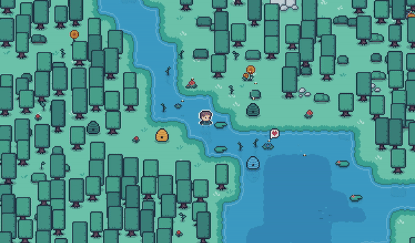
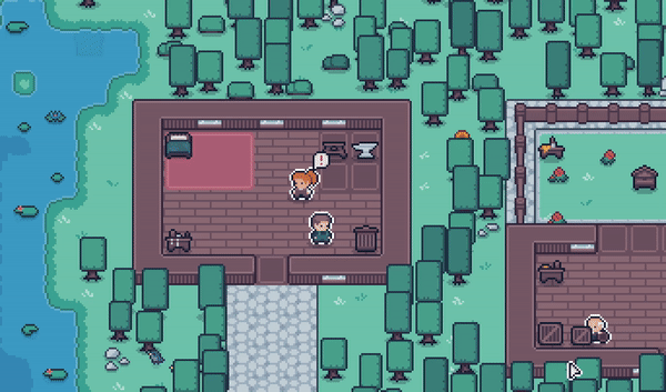
I’m Ell (@ellraiser), the developer at TNgineers, an indie game dev studio I started with my brother, Jamie (@metakitkat)! We recently released APICO, a laid-back beekeeping sim game about breeding, collecting, and conserving bees (on World Bee Day no less!).
Set in a series of lush environments, APICO combines resource gathering, biology, and beekeeping minigames, taking inspiration from a mix of real-life and fantasy apiculture and floriculture (just don’t think about the water bees…).
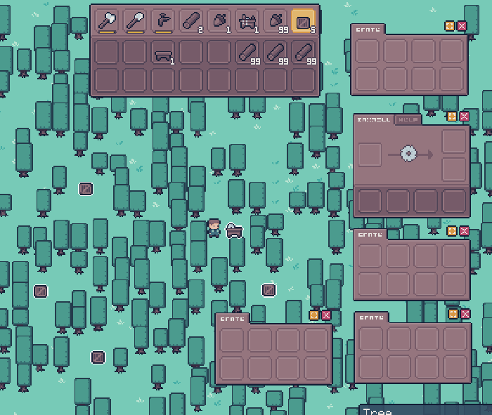
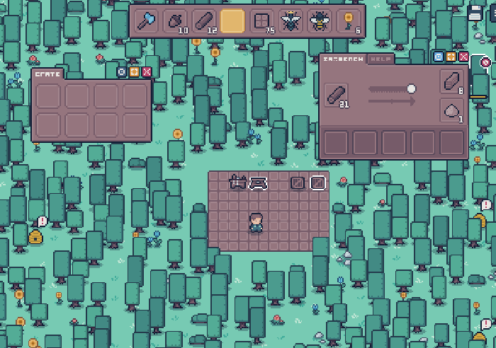
One of the features we get people talking about a lot is the menu system in APICO. It’s certainly a love it or hate it, marmite situation! However this system is something I’m really proud of, so I thought it’d be fun to dive into the UX/UI design of APICO and talk about some of the decisions made along the way.
Just a cosy game about menu management (oh and bees, I guess…)
When first designing the game, I knew that I wanted to have a big focus on the menu system, and not just because of my own UI design background bias! What always frustrated me in games like Terraria, Starbound or Minecraft was the fact I could only ever open one menu at a time.
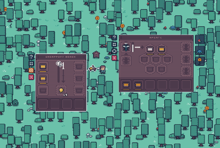
Especially when you have lots of different crafting minigames to switch between!
Need to get an item to put into a crafting station? You have to open the crate, take the item into your inventory, go to the crafting station, put it back in - and as processes or crafting gets more complicated, this back and forth can get annoying pretty quickly.
Right from the start, I wanted APICO to completely remove this limit, and let players open as many menus as they wanted - for better or worse.
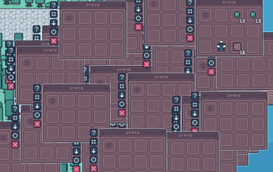
This isn’t even an advanced setup either lol
Immediately the fact that multiple menus could be opened at the same time brought in a lot of issues and scenarios we’d need to consider. How would you layer multiple menus on top of each other while keeping it easy to reach the one you wanted? How would you easily let players transfer items between menus and avoid the same painful crafting misery we were trying to avoid in the first place? How best to show the player that that functionality exists?
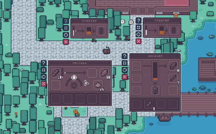
One of the first problems was, okay, great, we can open a bunch of different menus, but now we need to be able to move them around the screen easily!
Given how far the player can “reach” with the mouse, it’d be very easy to open a menu offscreen or open a menu on top of another menu, so we absolutely needed a way to move menus around. At first, we used a button on the menu - holding down on the button would let you drag the menu where you wanted.
The first ever menu designs from 2 years ago!
This worked fine but wasn’t immediately obvious - plus, the hitboxes on those buttons were pretty small and so it didn’t make it super easy to use. Given that the game was already rapidly becoming an OS simulator, I thought I’d follow the design of computer windows and give each menu a bar along the top that you could drag! This way it’d be a much larger hitbox for the player to drag with, whilst also re-using a concept that anyone using a PC would be familiar with.
This was when we first moved the game over to GameMaker and had to redo everything :’)
I also wanted to make it really clear which menu you were dragging, so I gave each menu a “dragging” state, which included extra visual highlights, a direct line linking the menu to the parent object as you move the menu around, as well as a change in the mouse cursor to use the “dragging” symbol that we’re all familiar with.
Pls don’t judge babies first game UI sprites :’D
So now we could display multiple menus at the same time, see what they linked to, and organize them as we liked on-screen. However, players could still move menus on top of each other, effectively hiding them. We needed to think about how menus would stack on top of each other without making the whole thing extremely frustrating!
Now, perhaps rather foolishly, I had now given players the power to open as many menus as they wanted and move them anywhere on the screen!
However, if a player had several menus open the game was starting to have issues knowing “which” menu to show on top. When it came to selecting and highlighting a menu, the game was defaulting to the order in which they were created. This meant you could hover over a menu and the game would unintentionally highlight a different menu underneath if that menu underneath was created “first” when the game loaded.
Did I regret making OS Simulator 2022? Very much so.
I tackled this issue by having three different layers or “depths” for a menu:
a default depth just based on creation
a “last highlighted” depth to keep the last menu interacted with stacked on top of any others
a “highlighted” depth to prioritize whatever menu is currently highlighted at the very top
A lot of tears hold this system together
With these three layers, I could swap the depth of a menu based on what the player had open and was hovering over, and make it easy to “swap” between menus (i.e. as soon as you highlighted part of a menu, it would become “highlighted” and be on top of all others, then if you moved your mouse cursor away from that menu, it would still remain on top where you left it).
This works a little differently to how OS windows operate, as usually you need to click them first to bring them into focus. However, given that the player is usually holding an item that they’re trying to move between menus, I wanted to make it a bit easier to move a held item without needing to click twice (i.e. first to select, then again to interact). This would also avoid clashing with the player actually wanting to click on the slots in the menu itself.
Another deviation from common OS windows you might have noticed was the button positioning! Initially, I planned to have these buttons where you’d expect them, i.e. in the top-right.
And this was before you could use “Q” to set the highlighted menu as the target…
However after actually testing them, we found there were quite a few instances (especially with the bigger menus) where you open a menu and it would be partially off-screen, meaning you couldn’t actually access the buttons until you moved the menu back in view.
Especially chonky boys like the Centrifuge menu.
Now you could argue that I could have automatically moved menus to always be in view and not overlap each other, but when you’ve finished having a headache thinking about easy ways to do that, it would have also meant that the object itself in the overworld (plus anything else) would potentially get covered by the menu which could get confusing/frustrating for the player over time (i.e. a couple of crates next to each other and wanting to open both of them).
Most buttons also have a keyboard shortcut too!
To avoid this, I moved the buttons to the left-hand side - this way they’d always be in view and they’d also be right next to the mouse when the object was clicked (as menus automatically open just to the right of the object they belong to), so you have easy access to an immediate action without having to move the mouse very far.
Using a vertical layout also meant we could fit a lot of different buttons in, which we would come to appreciate later when we added several more buttons, such as a help button, an automatic inventory sorting button, and—probably most importantly—a target button.
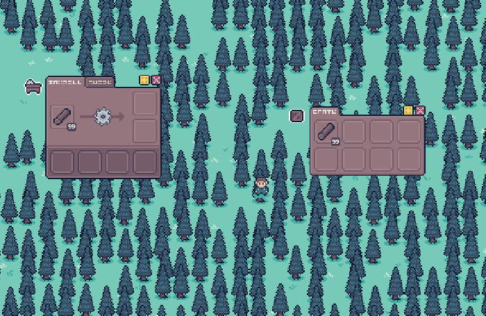
In most games with menus and a player inventory you can shift-click to quickly move items from one to the other!
This is something we just had to include, especially given the muscle memory that Minecraft and friends have ingrained in us over the years (which could be a whole other topic in itself…). However, we now have a new problem: if you shift-click an item when you have more than one target menu open, where on earth is it supposed to go?
What I decided to do is allow a menu to be specified as a “target”, either by clicking a button on the menu itself, or using a keyboard shortcut key when the menu is highlighted to label it as the ‘target’. The “targeted” menu would then receive all shift-clicked items automatically!

You can see the little circle button light up orange when “targeted”.
Under the hood, I’d re-use this “target menu” concept even when there were only two menus open, automatically switching the “target” behind the scenes - this helped visually reinforce the concept of a “target menu” as the orange button would still light up, helping the player notice the pattern before they even get into more advanced shift-click movement.
So you can now open multiple menus, organize them and specify what goes where. What happens when you close those menus? Do you have to reorganize your workspace again? This was something that came up in the initial design stages (having the ability to pin a menu at a specific location on-screen) but we didn’t add it to the game at first!
Initially, closing and opening a menu would reset its position back next to the parent object to save you from accidentally losing it off-screen. However as more people played the game and got used to the mechanics we had players want to be able to set up their ultimate honey power-plant control room, walk away, and be able to come back later and still have those menus in the same place they left them.

Resetting the position by default.
After APICO was released, it turned out that a LOT of players were really embracing the multiple menu system (which was amazing to see!), so we ended up with a lot of requests from players asking if they could pin their menus in place.
Opening at last pinned position.
Luckily (for me), this was just a case of exposing something that was already there as by default. The game was already storing the menus’ last position - it was just resetting it when you opened it again. It was easy enough to just NOT reset the location of a menu if the pinned button was turned on, and then save the menus’ “pinned” status for when the game loaded next time.
I came from that classic “Product Design > Graphic Design > UX > Full Stack Dev” pipeline (like you do…), and one of the things that I learned about a long time ago was Jakob Nielsen's “10 usability heuristics”.[1]
These were a set of 10 guiding principles Jakob wrote about (back in 1994!) about the state of a system for general interaction design, both physical and digital, and there were a lot of good rules in here applicable to a lot of different areas of design, even in the modern digital space.
They’ve always been in the back of my mind whenever I’ve designed something, and making APICO was no different!
The fact that I even had to add this validation… smh
At this point we now had this entire system (apicOS? I’ll see myself out) where the player can have several different menus, organize them how they like, and sit in their mad bee-based control room with all sorts of buttons and levers in front of them.
However it’s no good having a million things to click on if you have no idea what any of them do, so there were a lot of things that could be done to improve the overall UX that would make a heavily UI-based game much more approachable and easy to use:
Constantly having tooltips for things you hover (what is X? what can I do with X?)
Making sure error messages were clear (why can’t I do X?)
In a similar vein showing clear mouse interaction cursors (not allowed, dragging, text editing)
Validating input before letting players put things in them (why did you try putting bees in the bin?)
Showing the “status” of certain useful things at all times (what time is it? what climate/biome?)
Sawbench slots, like me, require validation <3
All of these things add up to a smooth user experience that allows players to easily get to grips with the system, as well as provide more advanced ways to interact with the game once they’ve got used to the general principles established!
All of these heuristics are still very relevant today in all aspects of design, and there’s a lot that can be applied in games! We’ve all played a game where something wasn’t really clear or got super frustrating to understand and just from that experience myself I wanted to make sure the player had all the information they could want at all times - without feeling completely overloaded or massively handheld the whole time.
If you’re interested in checking out APICO for yourself you can get it on all the usual suspects - we also have a free demo on Steam / Itch.io / GameJolt so if you just wanted to mess with the menu system yourself you can try it out there too!
Thanks so much for reading!
[1] “10 Usability Heuristics for User Interface Design”, Jakobs Nielson, 1994 (https://www.nngroup.com/articles/ten-usability-heuristics/)
You May Also Like