Daily news, dev blogs, and stories from Game Developer straight to your inbox
Sponsored By
Curating the gritty, retrofuturistic art direction of Rollerdrome
Everything from Jean Giraud's iconic ligne claire style to the brutalist architecture of the 70s played a role in developing this unforgettable visual style.
6 Min Read
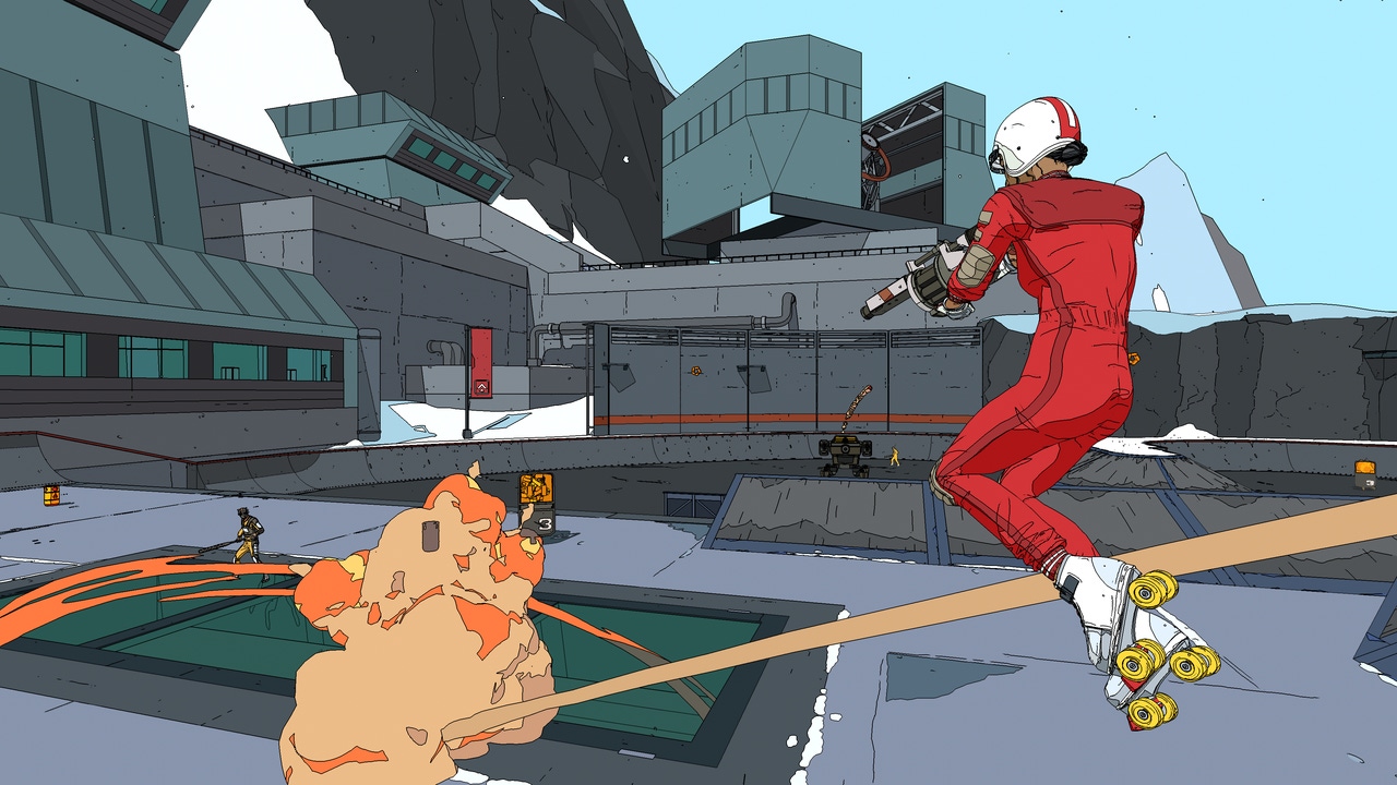
If you combined the visual style of Heavy Metal, the fluidity of OlliOlliWorld, and the hip, slow motion bullet time of Max Payne, you'd the latest title from Roll7, Rollerdrome. Noteworthy not just for its unconventional protagonist Kara Hassan, the game features a gritty, retrofuturistic look that is simultaneously distinct and unfussy--and impossible to forget.
Recently, Roll7 lead artist Antoine Dekerle spoke with Game Developer to lend some insight into how the game's art direction was conceived. From brutalist architecture to the visual style of ligne claire and the dark side of the '70s, here are the sources of inspiration that curated this iconic look.
Game Developer: What’s your name and education and professional background? What was your role on Rollerdrome?
Antoine Dekerle: My name is Antoine Dekerle, I am the Lead Artist on Rollerdrome, I am taking care of the art direction of the game as well as managing an awesome team of artists. I have studied CG Art at Supinfocom in France (now known as Rubika).
Early in my career, I worked for the animation industry as a character and environment artist. I worked on a few animated TV series and a couple of movies. I clearly remember the day I watched a real time tech demo for the Xbox 360 and thought I should move to the video game industry. I applied to a few studios and quickly got my first job in the UK and never looked back. I love working on video games, it is a very creative and rewarding job.
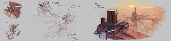
Concept art for "Canyon Landscapes", illustrating the team's idea to have a rocket launch pad in the canyon.
I like how Rollerdrome’s muted palette and clean lines reduce the gameplay's visual chaos. It’s very sporty despite its simplicity. What tone were you aiming for with Rollerdrome and how did this particular style fit in with that vision? How does retro-futuristic look help convey the setting and story of Rollerdrome?
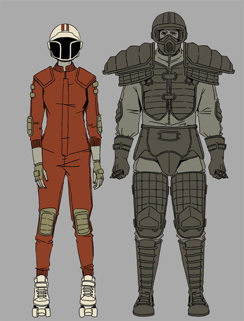
We were inspired by the dark side of the 70s. We love sci-fi movies from the era, the visual style, the outfits, the environments, all of this was a huge source of references to help us define the tone of Rollerdrome. We put anything groovy or psychedelic on the side to focus on everything brutal and dark that goes with the dystopian backstory of the game. We looked at brutalist architecture and all that it brings in austerity and oppressive feeling. The materials you see the most in Rollerdrome are naked concrete and dark metal, which reinforce this idea. Characters’ outfits were also inspired by the 70s, the jumpsuit is pretty much a base layer for all of them, they always have something of a sport, you cannot necessarily identify which sport, but it is there. It can be as simple as a number on a shield, some padding, or a stripe on the side of a jumpsuit.
An early concept sketch, 'Kara Hassan & Warhead'. At this point in the process, Kara did not yet have a face. On the right, an early version of the Warhead.
The visual style of Rollerdrome is so striking: simple yet expressive. Press materials cite its “comic book-inspired look” as a key feature; personally, I can read everything from Jean Giraud to (forgive me) the old GI Joe cartoon from the 1980s. Can you break down the most important elements of your visual formula? Were there any particular artists or artworks you drew direct inspiration from during the conceptualization stages?
Artists like Moebius and Hergé were our go-to when it came to finding the right way to stylize something. They were two of the masters of the Ligne Claire style. Looking at their work and making some visual development, we put a few rules in place. Everything, every stain of colors, must have a black outline with a constant width, no matter how far or close it is from the camera, including shadows. Everything is flat shaded; material details are shown through lines and speckles, not through a more classic texture work. Absolutely no gradients, ever. Just flat colors. Details disappear in the distance, like a comic artist would do, especially for our characters; it took some good work to keep them highly visible and recognizable in the distance while they become a simple silhouette. Buildings can be grand but never too epic, we wanted them to look somehow realistic, like they could have been built with the technology of the 70s.
Were there any other styles you considered during the process? What did those look like? How did the art direction evolve towards its final look over time?
Very early on, we decided to go for this particular style. What was a long process was to master it and to translate in 3D something that was meant to be printed on paper. At times, it took many iterations and days of work just to find the right way to depict something in the style of Rollerdrome. It was a concerted effort between extremely talented 3D artists and concept artists.
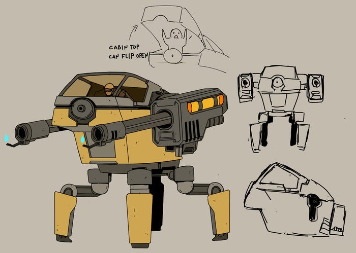
An early concept sketch of the Mechubus House Player featured in-game, "showcasing the fact that they are not AI robots but instead piloted mechs."
Can you tell me anything about your color script and break down how the contrast between certain elements in the environment was used?
We chose to limit the color palette to the maximum, just keeping what was essential. We used a limited color scheme for each environment, a set of four to five key colors with variations where needed. Before all, I prepared an art brief for each environment and a huge part of it was color research, what would be the set of colors that would fit a given environment the best. We had the same approach for the level of details in the environments and characters, we put just enough there to carry the idea of what something was made from, it is amazing how much you can tell with just a few lines and speckles.
This was also a necessity as Rollerdrome is a very fast game, too many details wouldn’t have worked so well at this speed, we wanted the game to look clean, efficient, and straight to the point. About contrast between elements, we put in place some rules about breaking rhythm and repetition of masses, so things look natural. We looked at contrast between busy areas and quiet areas. We paid attention to contrast of values and colors between different elements so light elements are clearly visible against a dark background, so a deep blue sky is striking against the orange/red rocks of a desert.
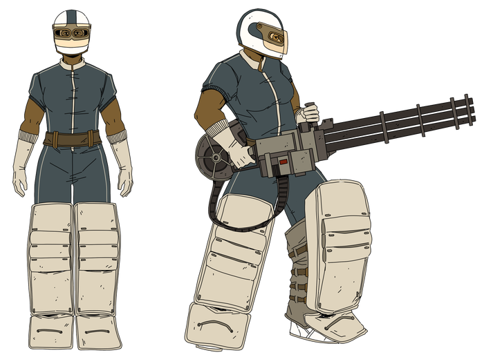
Concept sketch, 'The Defender'
About the Author
You May Also Like