

Daily news, dev blogs, and stories from Game Developer straight to your inbox
Sponsored By
Featured Blog | This community-written post highlights the best of what the game industry has to offer. Read more like it on the Game Developer Blogs or learn how to Submit Your Own Blog Post
A UI System Architecture and Workflow for Unity
There are many ways to skin an Unity UI and as many to implement one. In this post, I talk about the UI system I built for Blood Runs Cold which is by no means a silver bullet, but contains some ideas that were battle tested in released mobile games.
23 Min Read

(This article was originally posted on my personal blog. )
[2019 update] Source code released!
I've released a homebrew version of this architecture, which you can get at my github page. There's also an examples repository, and a live demo. It's pretty much the same, except that in there I refer to the "UI Manager" as an "UI Frame", and the "Dialogs" are now called "Windows". Other than that, the original post below should still have helpful information.
FOREWORD
In mobile games, especially F2P, there’s no escape from developing a metagame, many times more technically complex than the core loop itself. This means one thing: UI work. Lots of it.
A lot of developers frown on the idea of doing UI development. More often than not, admittedly, there’s a lot of repetitive, less interesting things to be done – and also way more often than not, there isn’t an understanding of the nuances required for proper UX, which frustrates a lot of programmers when having to iterate a lot on seemingly minor things. Add to that the countless possible architectures that are proven, loved and hated, which usually spawn religious arguments upon using MVC, MVVM, XGH… You probably know the drill.
Now is the point where an article would usually pull a XKCD and say “fear not, for the ultimate answer is here!”, but not only I don’t believe in silver bullets, this also isn’t my first rodeo in the regard of proving myself wrong. That’s why I’m not talking about UI code architecture holistically. My focus will be disclosing one specific way to do things, which is good enough for medium-to-high complexity UI and was battle tested in released mobile games. That said, it’s most likely too complicated if you simply want to display a few UI elements here and there, and there isn’t complex navigation etc. The main idea is encapsulating complexity within the “core” so the end-code is highly agnostic and simple to implement.
In a nutshell, this architecture is simply a “window manager” of sorts, with history and flow control and an accompanying workflow and general guidelines on how to organize things. This means it’s easy enough to adapt it to any approach. If you want to go for single compound “view-controller” classes or go full StrangeIOC (although why would you ever), all or most of these ideas should work. So read on and pick yer poison.
(Seriously, why would you)
(maybe you’re into steampunk and have a strange attraction for boiler plates)
(not judging tho)
(don’t use Strange)
ACKNOWLEDGEMENTS
I built this system for Blood Runs Cold. On the code-side, I’ve simplified some things and added some improvements, but a lot of the structure is inspired by a design used by Renan Rennó when we worked together in Legends of Honor. One trick regarding how to make setting up transition animations artist-friendly is derived from my time in Aquiris working on Ballistic. The trigger for writing this post was a short chat on twitter with Nikos Patsiouras and Steve Streeting, so if you find this useful, thank them as well!
A BIT ABOUT UNITY UI
Unity’s UI is pretty awesome, but it can also be pretty shitty: it comes with a bunch of stuff out of the box and layouting is super powerful and easy once you get a grip on how it works. It can, however, drive you nuts with all the little hidden details and a few questionable design decisions. You should watch this Unite 2017 talk (from 23:51min on) for some nitty gritty details.
You’ll sometimes really want to write your own UI components, and you sometimes should. Nordeus for example wrote an entire custom UI hierarchy system to optimize reparenting in the hierarchy – which in the near future possibly won’t be that much of an issueanymore. But remember it’s all about cost and benefit, and that if you’re frustrated about how something works (or why something is NOT working), you might jump to conclusions too soon and implement something that may already be there, out of the box.
If you’re making your own code, compose, don’t inherit. It’s pretty easy to extend the base UI classes and add extra functionalities piggy-backing on all the existing default UI components, so a lot of people tend to first think about inheritance. However, there’s a great chance that you’ll end up having to extend more than one class later simply because you’re not using a native base component. An example I’ve been through in a project was a component for localized text someone had made. It was pretty neat, and had a nice editor, but instead of being a separate component, it extended UnityEngine.UI.Text. Further down the road, we ended up with 2 or 3 more classes that also had to have a “localized” version. Had it been a separate component, we could probably simply slap it in anything without having to worry about how other parts worked.
Canvases define what parts of your UI needs to be rebuilt: if you change something on the hierarchy, even position, the whole mesh up to the bottom-most parent Canvas is rebuilt. This means if you have a single canvas for your whole UI, if some small textfield with a number is being rewritten every frame on some Update loop, your WHOLE UI will be rebuilt because of that. Also, every frame.
That said, you probably don’t want to update things every frame. Rebuilding the UI is pretty expensive and generates a quite a bit of garbage. Try to update things via events only when things change, or try to have things that need to update every frame inside their own canvas.
Ideally, you would even have all the static elements in one canvas, and all the dynamic ones in another one, but that’s usually not possible: it’s again about weighting the sweet spot between optimization and an easy workflow.
Use anchoring instead of absolute positioning. Having things responsive will make it easier for you to support multiple aspect ratios and resolutions. That said, make sure you also set up your reference resolution on your CanvasScaler from day 0. Your whole layout will be based on it, and changing it after things are done will most likely end in you(r UI artist) having to rework every single UI in the game. I usually go for 1920×1080.
Last but not least, use transform.SetParent(parent, false) instead of assigning to transform.parent: this is a very common mistake and the symptom is your UI elements looking fine if you drag and drop them in the Editor, but getting all screwed up when you instance them in real time. I can’t tell you how many times I forgot about it in the early days, and how many times I’ve seen code resetting position and scale and whatnot to make sure things don’t get all weird.
With this out of the way, let’s get down to business.
GLOSSARY
To better understand the rationale behind this system, some terminology needs to be defined. Remember these names are completely arbitrary, they are just names that were deemed “good enough” to represent something – the imporatnt thing is understanding the concept behind them.
We’ll use this wonderful mockup I made on Google Slides as an example:
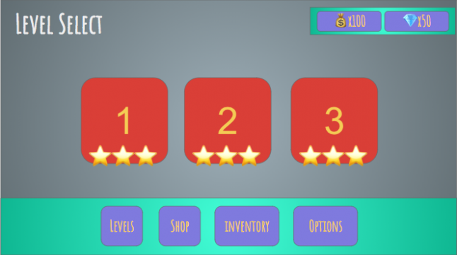
A Screen is any self-contained part of a given UI. Screens can be of 2 types:
Panels: a given chunk of UI that can coexist at the same time as other pieces of UI. Eg: status bars, elements on your HUD.
Dialogs: a Screen which is the main point of interest at a given time, usually using all or most of the display. Eg: popups, modals.
You can have multiple Panels open, even when a Dialog is open. You can have more than one Dialog visible at the same time, but only one of them is interactable (eg: you can have a Dialog open, but darkened out and blocked by a popup that is interactable on top of it). Panels either are open or closed at any point, but Dialogs have a history.
A Widget is a reusable part of a Screen. It can be displayed visually in several ways, but you most likely will have a single component that drives it.
A Layer is responsible for containing and controlling a specific type of Screen.
Using our example again, here’s a possible way of dividing it with those concepts:
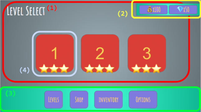
(1) is the Level Select Dialog, which is the main interaction element for the user at this point. However, you can still see (2), which is a Panel to display how much currency the user has, and even interact with (3), which is a navigation Panel. If you clicked one of the navigation buttons, (1) would be replaced with the target Dialog, eg the Shop or Options screens, but all the rest would remain the same. Last but not least, (4) would be a Widget: it’s a part that you’ll most likely instantiate dynamically several times, and could even be used in other parts (on an Achievements Dialog for example).
How to define what should be what and how granular should the division be? Well, common sense – or as we say in Portuguese, “good sense”. Remember the code overhead between doing a Screen (which needs to plug into the system, be registered etc) and a Widget (which is simply a component). If a big chunk of your display has contextualized information that should disappear as you navigate away, that’s most likely a Dialog; if it’s always there and cares little for navigation states, it’s a Panel. If it’s a part of something bigger, it’s probably a Widget. Try looking at some other games and looking out for these behaviours to get a better grip on the concept.
The UI Manager is the central control spot for everything. If you’re on the school of thought that “omg managers are monolithic super classes and you should avoid them like the plague!” just… use whatever name makes you feel better. This should actually be a very simple façade and the real meat is on the Layer code. You can even split this into several Commands, or however you like to do things – just make sure the code is localized in a way so the rest of your game can easily communicate with a single spot on the UI system. Never ever access Screens or Layers directly.
Fun fact: Blood Runs Cold is a Narrative-driven game and the narrative designers were using the term “dialog” for narrative conversations. I ended up naming the classes “Dialogue“ to differentiate the narrative systems from “Dialog” (UI), which in retrospect, could have used a bit more thought, as when referring to them out loud we said a fair share of “I mean narrative dee-ah-log-oo-eh, not UI dialog”. Even more fun fact: the dialogues were displayed in a Panel. 😅
HIERARCHY
This is a rough example of what your UI Hierarchy would look like (brackets for which components they would contain):
UI [UI Manager Code, Main Canvas]
UI Camera
Dialog Layer [Dialog Layer Code]
Dialog A [Dialog A controller]
Dialog B [Dialog B controller]
Panel Layer [Panel Layer Code]
Panel A [Panel A controller]
Panel B [Panel B controller]
As you (should) know, Unity sorts elements based on hierarchy order, so lower elements get drawn last. In this specific example, Panels are always drawn on top of Dialogs.
When setting up your main Canvas, use “Screenspace – Camera“, not “Screenspace – Overlay“. It behaves the exact same way (besides the extra camera) and you can easily have things like 3d models, Particle Systems and even postprocessor FX.
ORGANIZING YOUR SCREENS AND WIDGETS
One thing that would make everyone’s life easier would be nested prefabs. Unfortunately, that has achieved meme-status (but you can always check to see if this article is outdated). Some people like the idea of using a scene to store Screens (and then every element can be a Prefab). I’ve never personally done this, so I can’t assess if it’s better or worse. What I usually go for is having a single prefab per UI screen, and several prefabs for widgets. This obviously calls for some proper communication to avoid having any merge conflicts, but we never had any major problems. Just make sure that, whatever you do, try to split things into as many prefabs as you can.
Fun fact: once there was a minor redesign in the Ballistic UI to change the color of all purchase buttons from yellow to blue, but there wasn’t time for anyone to make a tool for that change. We had an intern reworking all of them manually for a couple of weeks. Sorry, Luís!
Ideally, your UI artist should work within Unity, and should be responsible for rigging your UI. The engine gives us access to a pretty artist-friendly toolset out of the box, so don’t waste development time making slightly offset programmer-art-y things that will trigger artist OCDs if you can focus on coding. If the artist doesn’t know how to use Unity, help them learning and enable them, and plan for this in your pre-production and early production timelines. If you think UI artists are not smart enough and can never be trusted to touch the repo, stop being such a fucking snob. If you’re a UI artist and you think you can’t/shouldn’t do it, embrace the challenge and remember that like anything else, practice makes it perfect.
You can make a suite of editor tools for your UI artists, but whatever you do, do it WITH them: they are the ones who will work with it, and they will develop their own daily workflows. That said, the tech team is the gatekeeper and will define the policies for the repo, assets and guidelines on how to assemble and rig things, hierarchy and performance concerns. This will most likely also include naming conventions and it’s helpful to define those as early as possible.
Fun fact: back in Legends, I made this Editor window where you could preview and create widgets, and could easily add, remove and replace pieces of UI prefabs. It was pretty neat. Also, it was never used by the UI artists. They just copy pasted their way through and worked fast and comfortably enough like that.
Regarding assets, you’ll definitely want to atlas your Sprites. This is its whole own can of worms, especially when dealing with Asset Bundles, even more if there’s variations involved (eg: HD vs SD resolution assets). I usually use Unity’s Sprite Packer and organize all the sprites that go in the same atlas in the same folder, so it’s easier to make sure all of them go to the same Asset Bundle (otherwise you might end up with copies of your atlas sprinkled all around).
Workflow-wise, I recommend iterating on external mockups as much as possible before jumping into Unity, using tools like Balsamiq, Axure, InVision, Origami Studio (free) or whatever your UI/UX designer prefers. I’ve even seen people using Powerpoint to better communicate their ideas interactively.
After the mockups are ready and approved from Game Design for the first implementation, your UI artist can start assembling the Screen prefab. When that is done, the dev team can pick it up and implement it. When everything is working properly, you can pass back to your UI artist again to do any tweaks.
If you don’t have enough time to do the complete pipeline (we usually don’t anyway), you can always do crappy programmer-art versions to start implementing all functionalities you’ll need on the dev side, then substitute it for the final prefab later. In an ideal scenario, you’d have a UI artist quick enough on their feet to do the re-rigging for you if they change anything.
CODE ARCHITECTURE
The UI System code has 3 parts: the main façade, layer controllers and screen controllers. The idea is that each layer can treat its screens in any way it’d like, which means a layer will group things by functionality. So far, I’ve been able to represent all possible cases as either Dialogues or Panels.
In the hierarchy example, I had 2 layers. However, in practice, you’ll most likely need more than that. You could, theoretically, create several layers, but then you’d be having multiple things that actually work kinda the same way (which would most likely create the need for extra code in the façade, which you don’t really want). My way out of this was actually creating Para-Layers: they’re simply extra objects in the hierarchy to which the Layer code will reparent Screen transforms to. During the reparenting, you might also treat some special cases: in BRC for example, we had a darkener object that would be activated every time a popup appeared, and some things would get re-organized in the hierarchy. We had one para-layer for Dialogs (used for making sure popups were always on top) and several para-layers for Panels (one for regular UI, one for blockers, one for tutorial elements etc).
All Layer controllers derive from AUILayerController. This class has all the boilerplate for showing and hiding Screens, and communicates with the Screens themselves. The PanelLayer is really simple: it doesn’t really do anything, it’s mostly just there to strongly type that it handles Panels and route to proper para-layers. The DialogueLayer, however, has a lot of functionality for controlling history and queueing. As a comparison point, the Panel Layer is 65 lines and Dialog Layer 217 lines. Here’s a crop of the base class:
public abstract class AUILayerController<S> : MonoBehaviour where S: IUIScreenController
{
    protected Dictionary<string, S> screenControllers;

    public abstract void ShowScreen (S screen);
    public abstract void ShowScreen<P> (S screen, P properties) where P : IScreenProperties;
    public abstract void HideScreen (S screen);

    [...]
}
Every Screen can have an optional Properties parameter. This was used to pass a data payload to the Screen. For the Screens that don’t really require a payload, there’s a parameterless version as well (implemented extending the version using a default Properties class as parameter). The properties are also [System.Serializable] classes, which means you can define some (or all) of their properties directly on the Prefab in Editor time. The lifetime of the Screen begins with a registration step, where the prefab reference is passed to the Layer, then it’s instanced and it’s registered bound to its ScreenID (it’s basically a Dictionary<string,T>).
Here’s a crop of the AUIScreenController:
public abstract class AUIScreenController<T> : MonoBehaviour, IUIScreenController where T : IScreenProperties
{
    [Header("Screen Animations")]
    [SerializeField]
    private ATransitionComponent animIn;

    [SerializeField]
    private ATransitionComponent animOut;

    [Header("Screen properties")]
    [SerializeField]
    protected T properties;

    public bool IsVisible { get; private set; }
    public string ScreenId { get; set; }

    [...]

    protected abstract void OnPropertiesSet();
    public void Show(IScreenProperties properties = null)
    {
        [...]
    }

    [...]
}
Remember I mentioned the idea that whoever implements the UI doesn’t need to worry about anything? OnPropertiesSet is the only method that needs to be implemented for the a ScreenController. Internally, we make sure that at the point where it’s called, the Properties are for sure set, which means you can freely use the payload.
I wish I could say that the generics-fest internally made everything type safe automatically, but I do have to admit there’s a single cast in there: since the Show receives an interface and the Properties in the class are <T>, I had to up then downcast the parameter:
Properties = (T)(object)properties;
I’m pretty sure I could avoid this giving it a bit more thought, but I didn’t want to spend too much more time in this back then.
That leaves the Manager itself: it simply receives method calls (or responds to messages, if you want to keep the code free of cross-module method calls) and routes them to the proper Layer. I usually also add some handy shortcuts to important UI specific things that you’ll most likely need to use, like the UICamera or the MainCanvas of the UI. This means no code should ever communicate directly with the Screen or Layer code, it simply says “Hey, I need ScreenID XXX opened with this payload” or “close ScreenID YYY“, and the UIManager is your access point to all that. Coming back to “being a simple façade” thing, the biggest method in there is the one that initializes the system, and it’s less than 20 lines long (and actually pretty verbose).
ANIMATION AND FLOW CONTROL
Some people love Animator to death, and they’re right. It’s an incredibly powerful tool, especially if you’re a humanoid character. Which, last time I checked, not really the case for UI. I’m rarely a control freak over things, but when it comes to UI flow, I might be one, and the idea of having animation controlling THE FLOW of the UI gives me Vietnam flashbacks. The legacy Animation component actually worked pretty well for UI, but even if it doesn’t look like it’s going anywhere anytime soon, I avoid using anything that is considered legacy in production.
That said, if you have very simple UI, piggybacking on the Animator state machines can be a good idea. But as soon as you cross a certain complexity threshold (which to me, again, is very, very low), things can quickly go awry. All that said, it’s not just about being conservative regarding the workflow and asset count: there’s also considerable performance issues linked to Animator and Canvas updating. I didn’t really know this beforehand, so it was good to be gifted an extra argument instead of simply having the gut feeling it just didn’t work well enough workflow-wise.
Juicy UI needs a lot of animations on Screens going in or out, and during those, it’s really easy to create some weird soft lock conditions if the user (or especially, QA) decides to tap a button. In the Screen code, there are built in options for animating in and animating out, and the interaction is blocked while there’s an animation happening. You can either do it by fancily controlling your EventSystem, or do it like I did, and just slap a transparent fullscreen Rect on top of everything else to block raycasts.
On the code side, there’s an ATransitionComponent:
public abstract class ATransitionComponent : MonoBehaviour
{
    /// <summary>
    /// Animate the specified target transform and execute CallWhenFinished when the animation is done.
    /// </summary>
    /// <param name="target">Target transform.</param>
    /// <param name="callWhenFinished">Delegate to be called when animation is finished.</param>
    public abstract void Animate(Transform target, Action callWhenFinished);
}
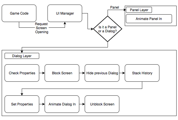
These can be set up in “transition in” or “transition out” fields on any AUIScreenController. In the AUIScreenController, there’s 2 events that the Layer registers to and warn when animations are over. This allows having the code flow closer to what you see regarding timing and things like blocking the screen for interactions: whenever a Dialog opens or closes, it triggers the UI blocking, animates, and when the animation is over, the embargo is lifted. Because of this, we never had a single bug report by misuse during transitions. If there’s no animations configured, the GameObject is simply activated or deactivated. Internally it’s a bit more involved, but this is a simplified diagram of the process:
The good thing about this is that you can easily build several different transition types and they can be rigged directly by the artists. We had things like sliding from a direction, fading, and even some fancy foldouts all controlled by DOTween. That said, for some Screens you probably want some flashy, awesomely complex animated stuff. To enable that, we simply cooked up an AScreenTransition that works together with Animator, which means the UI artists could use animations if they wanted to.
My biggest beef is that even for very, very simple animations you’ll still need an Animator Controller (or AC override) and special sets of animations: as Unity’s animation system depends on hierarchy and names, you either have to do something smart with your hierarchy to make it possible for multiple screens to use the same animations, or you’ll end up with a boatload of assets to simply make a screen slide in and out. Fortunately, there’s now the SimpleAnimationComponent in which you won’t need an animator controller and can use an API more similar the legacy system (haven’t tried it though).
At the end of the day, UX-wise, you’ll probably have a grammar for transitions, which means that you’ll be able to make do with just a handful of types. It also means that on a lot of cases you can pull it off with simple parametric tweens, and you won’t need to even touch an Animator. Design your systems for the default cases and make it possible for exceptions, not the other way around; if everything is special, nothing is special; if your UI is all the time super flashy and noisy for every single element, it might just be distracting and hard to read.
Also regarding animations, I ended up making this little extension component for buttons that is based on ScriptableObjects for configuration. This allowed us to batch change all the buttons of a given type without having to re-serialize all the prefabs in which they exist. This means a button simply needed to reference a given SO, and then it would automatically animate and play sounds in a given way, and if that specific kind of button ever changed those behaviours, we simply had to change in one spot. In theory, you could do a scheme based on that for types of screens and in-and-out animations as well.
AFTERWORD
In retrospect, the UI system didn’t go through any major changes at any point in production, and it permitted very quickly building everything up. The focus on being agnostic paid off, and when we had to prototype a new feature, it was easy to make quick and dirty code in a very localized way and clean it up afterwards.
Legends used StrangeIOC, and I honestly didn’t see any major advantages in it – it was mostly boilerplate. On BRC, we used a single class per screen and it was enough for what we needed, with focus on making reusable widgets whenever possible. Some screens had all the data prepared outside and passed via Properties, but some screens just accessed the data directly. We used a lightweight global messaging system which I’ll also write about (actually inspired by StrangeIOC’s Signals), and that helped us achieve pretty much total decoupling regarding UI – things would happen in the game and, if there was some UI element present that cared about that, it would update itself, otherwise, nothing would happen.
While it was a pretty long post, it feels weirdly nonspecific. I unfortunately can’t share the code itself as the latest version was created at work, but I’m currently rebuilding it from scratch at home and can maybe do so in the future. That said, I hope it contains some helpful pointers and ideas. If you think I totally missed the mark at any point or if you have any specific questions, feel free to add a comment or hit me up on twitter.
Read more about:
Featured BlogsAbout the Author(s)
You May Also Like


.jpeg?width=700&auto=webp&quality=80&disable=upscale)


