

Daily news, dev blogs, and stories from Game Developer straight to your inbox
Sponsored By
Featured Blog | This community-written post highlights the best of what the game industry has to offer. Read more like it on the Game Developer Blogs or learn how to Submit Your Own Blog Post
Using Powerpoint to prototype your UI: A Molemen Must Die case study
Cutting edge tools are great, but sometimes they're not quite what you're looking for. We put a familiar tool to work in unfamiliar ways, using Powerpoint to fully visualise our UI prototyping for Molemen Must Die.
8 Min Read

As we approached the end of production on Molemen Must Die, the Mokomoto team knew we really had to lock down how our UI would look and function.
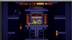
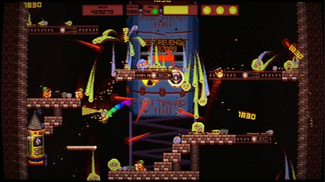
Molemen Must Die is a PC and Mac game about delivering a bomb to the center of the Earth under the orders of your hissy-fit president. Cutting edge political drama, I know. Move over House of Cards! Our UI needed to fit with our B-grade movie aesthetic, as well as maintain clear visual communication to players.
While we have a lot of features and flavor in the game, it also only has 5 months of development time in it. It’s a small game! These kinds of constraints meant that the Mokomoto team really had to think smart and push everything to sing, including our (at the time) quite static UI.
I had investigated various tools meant for just such a design task. Both Lewis (programming) and myself (art and design) are pretty visual people - personally I dislike writing long descriptions about how a feature is meant to work, and Lewis hates reading them. We work remotely in different Australian states, so we needed something that would effectively help us gain a mutual understanding of how the UI should look and function.
Our problems with all the UI tools we considered can be sorted into the following categories:
Cost more than our general budget (of $0)
Had more of a learning curve than we really had time for
Weren’t really applicable to PC and Console
orJust plain lacked features we needed, like animation support for mock ups.
With all that in mind, I looked at alternative solutions that could offer the above, and Powerpoint really nailed everything we needed. With a small amount of experimenting, I figured out a flow that worked well for us, with little room for interpretation or error. Best of all, it meant we could easily (and cheaply) demo the overall flow to other people, to see if it worked for them.
Once we were reasonably confident that our feature set was locked, I set about reworking the overall layouts that had really been debug display built on debug display. During this process I made a point of staying out of Unity, keeping things visual and easy to mold without having to navigate the behind the scenes set up of the game. Represented mostly by colored boxes set on screenshots of the game, using Powerpoint like this allowed us to establish an initial layout and goal layout for each screen. This would be the way a screen would start, and the goal being what the player sees 95% of the time.
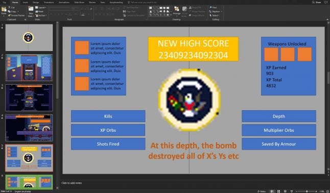
Once we knew the initial and goal states for each screen, it was a question of how we were going to get between them. As mentioned, we really had to make sure we were doing the most with what we had, so getting all our elements moving was important. We display no obvious loading screens in the game, and have no opportunities to hide a UI switch.
We broke each slide into transitions, with the start state being what the player first sees, and the end being where things land. When we needed to follow on from a previous transition, we simply duplicated the slide with all its elements, and produced another transition within the slide. This way, we could play through the entire game’s UI without having to imagine any elements.
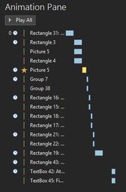 The animation tools in Powerpoint are surprisingly powerful. While you’ll find your fair share of animations that you’ve been seeing in presentations since the mid 90s, the most useful for us was their line animation tools, allowing us to tween objects between A and B, or even A, B, C, D, and E. We could also set up when objects should move together, after one another, and how long it should take. Again, this meant what we had built in this presentation tool was pretty much what we got in-game, down to elaborate fullscreen takeovers and such. The Animation Pane also meant it was quite visual as to how things would flow, and allow us to step through problems in a way that would be familiar to anyone who’s used a recent version of Microsoft Office.
The final result meant that Lewis smashed the implementation in a very small amount of time, with few questions. This efficiency even allowed us to test the presentation of UI with other stakeholder groups, such as players or the marketing consultants working with us. It’s a great way to test for those early reactions to show if you’re on the right track.
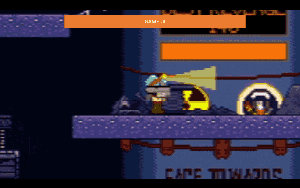
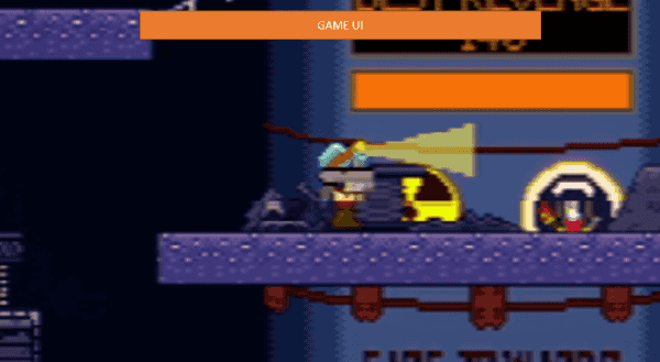
Left: Early Powerpoint mockup, Right: Final UI after playtesting.
So straight up, Powerpoint isn’t what you MUST use, it’s just an option. There’s other tools out there such as Google Drive and Open Office that you might be more familiar with, and this whole approach was about us getting a meaningful result quickly. We happened to have Powerpoint, so that’s what we went with! Your mileage may vary, but for the efficiency and the affordability, we recommend fellow gamedevs check out Powerpoint for prototyping their UI!
Getting into the headspace of each slide being a transition between states is important, so gathering all your elements before you get animating (no matter what you use) will go a long way towards getting something done quickly. The biggest frustration I’ve experienced previously with UI has been reworking entire layouts as you introduce more elements you didn’t anticipate before.
Once you have demonstrated your layouts and transition between layouts, you can simply create a new slide in Powerpoint or duplicate the previous one, and then work on how to get from the current state to the next one.
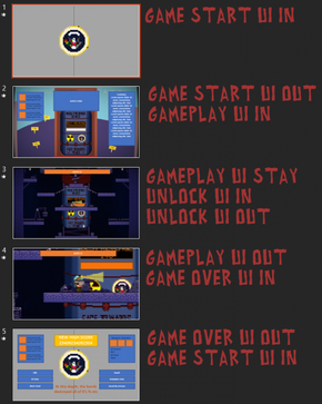 In the end, your flow will look something like this:
Slide 1 - Game start UI transition in
Slide 2 - Game start UI transition out, gameplay UI transition in
Slide 3 - Gameplay UI transition out, gameover UI transition in
Slide 4 - etc.
If you’re confident that you’ve built what you intend to put in game, send the presentation to a few people and get their reactions based on your demo. It’ll help catch issues early without investing a ton of programming time. The moment I knew we were on the right track was when my friend leapt up behind me while I was working and shouted ‘Wow, is that how it’s going to work?! That’s awesome!!’’.
While what you can do in a game engine vastly outweighs what you can do in Powerpoint, we kept the rule that if it can’t be done in Powerpoint, it wouldn’t be done in the game. It meant we had a pragmatic design without any additional concerns to be addressed.
In terms of finally confirming UI and locking it down, that was very much a two-stage process for us. While there had been plenty of UI hacks across the course of development, as soon as we had our features locked, we did a kind of inventory pass of all the game’s features to ensure it was being appropriately communicated to the player. It caught some issues, and gave us a list of everything we had to get onto screen in some way through UI or directly in-game.
From there, we actually went on to look at the game’s branding. Molemen Must Die has a very ‘B-Grade film’-inspired logo along with a few other elements, and so that dictated what a lot of our UI Art would look like. Inconsistency is always a buzzkill, and we wanted to avoid that by working on our most prominent piece of UI art first.
Once we had our elements figured out, along with our overall ‘look’, we went about doing our Powerpoint pass and implemented it in-game.
We sent this out to testers on our mailing list (about 50 in total), and got back pretty universal feedback that some of our text work was too low contrast, and too small. We switched a handful of elements around, and the complaint vanished. Yay! Once completed, we considered our UI locked for the stage, aside from some additional touches such as sparks or fireworks during appropriate moments. Those would come as part of a broader visual pass towards the end of production to ensure consistency.
I hope this case study has given you some food for thought on UI prototyping. Please keep in touch! Molemen Must Die is currently on Steam Greenlight and if you’re keen on what you’ve read, or just want to lend a hand, a vote here would be super appreciated! Alternatively, you can sign up for our mailing list at https://bit.ly/MokomotoNews, where we share what we’re up to with our players quite a bit. Lastly I can always be reached on Twitter @CrowdedWorlds!
Thanks for reading! :D
Read more about:
Featured BlogsAbout the Author(s)
You May Also Like


.jpeg?width=700&auto=webp&quality=80&disable=upscale)


