


Trending
Opinion: How will Project 2025 impact game developers?
The Heritage Foundation's manifesto for the possible next administration could do great harm to many, including large portions of the game development community.
How do you make your game UI more usable? Developer Glinert takes a look at the four main elements -- learnability, simplicity, efficiency, and aesthetic -- that help game usability to flourish.

[How do you make your game UI more usable? Developer Glinert looks at the four main elements -- learnability, simplicity, efficiency, and aesthetic -- that help game usability to flourish.]
A common gripe I hear from developers is that a game has a really great concept or aesthetic, but that the user interface (UI) is lousy. Games that are hard to control or that mystify users by not providing useful or sufficient feedback are pretty damn frustrating to play. This can translate into worse sales, so it's worthwhile for game developers to really spend a lot of time thinking about a game's UI.
How are great UIs created? Certainly experience and good instincts are necessary to create a UI which is both highly functional and aesthetically pleasing. It is also helpful to have concrete methods for analyzing usability, and in this article I'll define and focus four dimensions of usability: Learnability, Simplicity, Efficiency, and Aesthetic[1].
The purpose of defining such usability dimensions is to provide a methodology for talking about UIs, i.e. user interface X is more learnable, but less efficient, than user interface Y. Keep in mind that these dimensions are not a rating of how "good" a UI is, as sometimes it makes sense to disregard certain principles for the sake of gameplay. What's important is in these cases the game developers are conscious of such choices, and that they are not decided arbitrarily.
This dimension mainly concerns novice users. Most developers prefer straightforward UI learning. To this end, tutorials are commonplace, as they provide a safe environment for learning controls and mechanics while providing meaningful assistance and guidance.
Once learned by the player, use of the UI should be based on recognition rather than recall. Generally one should not be expected to remember every game control, rather there should be easily accessible reminders where appropriate.
The exception to this rule comes from games where learnability is part of the game mechanic. The fighting genre is the most regular example of this exception, as players are rewarded for learning difficult-to-remember controls.
For instance, in Street Fighter II discovering the input sequence for a Hadouken (or any of the other complex moves in the game) is generally quite hard to learn from experimentation, but once it is found the player is rewarded with a new fun skill.
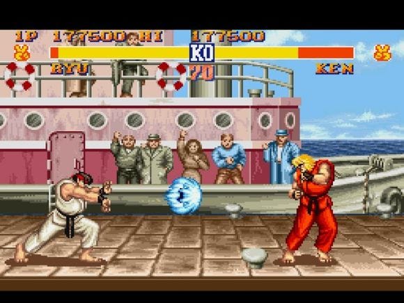
Street Fighter II has learnability at the core of its game mechanic, as players must learn complicated input sequences for attacks.
Even within fighting games there is a hidden learnability method -- namely, feedback. Obvious, immediate, and repeatable feedback between input and output are critical for learnability, and thus trial and error in a fighting game will likely teach the user much about the mechanic. Relying only on feedback is dangerous, though -- how will users learn non-obvious or complicated input methods? Perhaps more importantly, will such a game be fun for someone who has yet to learn these expert inputs?
Learnability also dictates that controller mappings should be consistent; if the X button is used for "yes" in one area of a game, it should always be used for confirmation throughout. This is why this sort of consistency is made part of the standards set by the console manufacturers.
Likewise, controls should match real world expectations; if most other games in a genre have X as the standard button for "yes", then a new game within that genre should conform for maximum learnability[2]. Games with highly learnable interfaces are inviting to new users as they tend to be easy to pick up and play, while novel user interfaces frequently have difficult learnability issues as all users are effectively novices. Remember how tricky it was playing Guitar Hero for the first time?
[1] This list is based on Rob Miller's dimensions of HCI usability, but only focuses on the four that are especially relevant to video games. For more information on usability dimensions I'd recommend references from design experts like Jakob Neilson, Donald Norman.
[2] However one must be wary of slavish adherence in the face of new, superior control schemes.
In contrast to learnability, efficiency mainly concerns expert users who want to accomplish tasks quickly.
The interface should allow users to move swiftly and effortlessly through the game. Efficient controls become an extension of the user's body, with the user being able to rapidly react to the game without even thinking of how to command the system.
There are often tradeoffs between efficiency and learnability and simplicity which game developers must be conscious of. When making such tradeoffs the rule of thumb is to think about the player demographics.
If the game will cater more towards expert users, it may be worthwhile to sacrifice some simplicity and learnability in favor of more efficient controls.
For example, StarCraft has a relatively efficient UI that allows users to quickly accomplish many actions by making use of the many buttons on the keyboard.
At the same time the game controls have serious learnability issues, and this is reflected by the fact that a large segment of the single player campaign is effectively an extended tutorial.
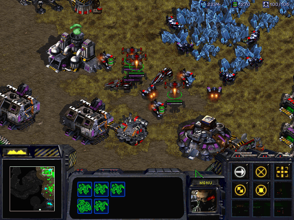
Starcraft has efficient controls that allow the user to quickly perform a wide variety of actions.
Game controls should be as simple as possible, but no simpler. This seems straightforward on the surface, as people only have so many fingers which they can only move at a certain speed. However, this frequently results in serious tradeoffs with efficiency. The best UIs are ones that determine ways to keep the game mechanic efficient and engaging but still only use simple controls.
Some great games are built around incredibly simplified control schemes, like Strange Attractors, where one toggles gravity on and off using only one button, and Katamari Damacy, in which the player controls movement and almost all actions using only two thumbsticks.
Another approach that is becoming more common is to offer alternative control schemes for different players, as seen in EA's "Family Play" mode for the Wii version of Madden NFL .
The basic idea in Family Play is to allow AI to handle some functionality in exchange for simpler controls while letting the user focus on critical game elements. Obviously tradeoffs in player freedom require creation of a more complicated "advanced" mode for expert users.

The newer versions of Madden NFL for Wii have two control schemes, a simple novice-friendly version (left) and an advanced expert-friendly version (right).
Arguably the most important dimension for video games, a user interface should have a pleasing aesthetic that makes it enjoyable to use. This dimension tends to focus on visual and audio output of the interface as well as feedback. Game actions should be clear, obvious, and easy to select. Graphics and sound effects should be agreeable, consistent, and informative. The style of the UI should match the tone of the game. This is the dimension of usability that game developers tend to focus most heavily upon, and for good reason! A game's UI aesthetic can define the user's experience.
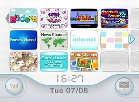
The Wii Menu system has a calming, subdued aesthetic that makes it enjoyable to use.
Usability analysis provides a good starting point for talking about UIs, but it is rarely possible to follow all principles. Improving one dimension may diminish another, so it is always important to keep tradeoffs in mind.
For instance, should a title have a more efficient user interface that is harder to learn, or one that is less efficient but more intuitive? Such questions frequently arise during development, and reaching meaningful solutions generally relies on thinking about how the user will be most likely to interact with the system.
It is generally not possible to excel in all four categories unless the game is very small in scope. Larger titles have trouble adhering to optimal design principles due to their inherit complexity, and frequently one dimension will be sacrificed to lead to increases in other dimensions, or guidelines will be ignored for the sake of supporting a game mechanic.
These sorts of decisions are acceptable as long as they are made consciously by the developers. However, poor decisions will likely make the interface much more challenging for several player demographics.
Likewise adhering to all of these guidelines may not be realistic in terms of cost, time, and manpower. As always it is necessary to weigh the costs of implementing features against the benefits gained from the implementation. On the other hand increases in usability can potentially reap large rewards in terms of customer base, hence improvements to any dimension is highly advised if possible.
Of course, it is perfectly reasonable to deliberately go against these design principles for a good cause. Game mechanics inherently have built in inefficiency and learnability challenges as the fun lies in overcoming these obstacles.
It is fine for UIs to follow suit if that is part of the gaming experience. For example, it may be desirable to take control away from the user to force watching a critical cut scene (however, that raises the question of whether the cut scene is the only way to relay the critical information.)
Obstruction mechanics seriously decrease learnability and efficiency, but if is done in the name of aesthetic such a tradeoff may be worthwhile. Space Giraffe (Xbox 360, 2007) is a great example of this. As a psychedelic space shooter, the game relies on obfuscation to confuse the user and make the play experience exciting.
Shifting backgrounds, constantly changing colors, morphing camera lens views, and no form of help or assistance make the game extremely challenging -- but therein lies the fun. The game sacrifices several usability dimensions for the sake of aesthetic. Good interface designers know when to break best practices in the name of the overall experience.

Space Giraffe deliberately makes serious tradeoffs in usability to support the game's aesthetic and mechanic.
The user interface is one of the most critical elements of a game, as poorly designed UIs will turn off users and well constructed ones will make the play experience that much more enjoyable. When designing and tweaking the UI it is important for developers to consider the the impact their changes and features will have. This can be done by analyzing the four dimensions of Learnability, Efficiency, Simplicity, and Aesthetic.
Of course, it is difficult to improve all of these simultaneously, so features and their tradeoffs should be considered with respect to what the gameplay is ultimately trying to achieve.
Read more about:
FeaturesYou May Also Like