

Daily news, dev blogs, and stories from Game Developer straight to your inbox
Sponsored By
Featured Blog | This community-written post highlights the best of what the game industry has to offer. Read more like it on the Game Developer Blogs or learn how to Submit Your Own Blog Post
This is Not a Ball Game or: How I Learned to Stop Worrying and Love the Absurd
Developing the first Art Nouveau game on iOS, from concept to production.
19 Min Read

On the verge of releasing Absurd Interactive's first title This is Not a Ball Game (TINABG) on iOS, I felt it was time to reflect on what TINABG means to us.
In retrospect, the road was long and unpredictable yet not without moments of wonder and priceless insights. The development of TINABG truly reflected our company’s namesake, the Absurd.
The Origins of Absurd Interactive
Our story begins in the spring of 2011, after returning to the U.S. from an eventful European vacation in which I ran across people interested in investing in a software company. I stood at the base of a mountain of responsibility I wasn’t sure I could handle. In hindsight, I realize you never really conquer the mountain, you just get better at climbing it.
During my time at the DigiPen Institute of Technology, a school focused in all aspects of game development, I made a number of great friendships, working relationships, and everything in-between. Year after year we were tasked with developing game engines and building games from scratch. Unbeknownst to me at the time, DigiPen trained me in the art of making games as an indie studio. It showed us how to multitask on every game we worked on, emphasizing the stress and pressure faced by teams with limited to zero budget.
DigiPen also taught us the importance of working with the right people. Students who chose wisely had successful and impressive projects to show. Those who chose poorly had epic “train-wreck like” stories to tell. Many learned working with friends does not necessarily lead to greatness, as many of their friends were either lazy or non-cooperative. It’s important early on, especially for teams that are as small as 3 to 4 people, to make sure everybody shares the same unified vision. If not, the ship will not be able to withstand the storm ahead.
At the end of my freshman year I met Willie Wight, who was not only already skilled at programming, but also very like-minded in emphasizing creativity with his approach to game design. We often discussed ideas by first questioning, “has this been done before?” When searching for new ideas, we always looked outside into nature and the real world for inspiration. This underlined the basis of our countless conversations, which usually led to interesting conclusions.
After working with Willie on a project together I realized we were the perfect creative and technical team. Needless to say the first person I contacted when creating my startup was Willie. We decided that we’d both handle programming duties with Willie being the Creative Director and myself in charge of managing the production.
Next was to come up with a name for our studio. We drafted up a list of roughly 20 possibilities. We tried to keep the names short and representative of our company’s culture. After making our list, I added “Absurd” to the bottom of the pile. I wanted to reference the underlying thematic philosophy I used to write one of my short stories in college. I did a lot of research on Absurdism and Albert Camus so I thought I’d include the word "Absurd" on the list. Absurd by itself didn’t quite work, but I liked the idea that the initials of Absurd Interactive were A.I. -- representing what we do on a whole other level. Later I realized Absurd worked on a superficial level in that it implies the strange and unpredictable, which really described our development process.
After narrowing our list of names down to eight, we did the only thing any true professional studio would do to pick our final name. We held a Street Fighter IV elimination tournament with each name assigned to each fighter. Unfortunately, for Absurd Interactive it was assigned to Dan, who for the uninitiated is renowned for being the worst Street Fighter character ever created. Every one of his fighting moves is either ridiculously underpowered or unimpressive. Capcom created Dan to mock the rival company SNK. SNK had created characters for Art of Fighting that were heavily influenced by Street Fighter designs and Capcom felt the need to retaliate.
The fate of our company’s name hung in the balance.
An amazing thing happened as we watched the computer A.I. fight each other. Dan demolished character after character. He took down the likes of E. Honda, Chun Li, and Ryu in an improbable fashion. Match after match he continued to dish out laughter at the ridiculous notion that he could actually compete with all these characters. Before we knew it he was in the final match, an unforeseen and unbeatable underdog. Without hesitation he defeated Blanka and became the champion of the tournament bracket. That’s when we realized how perfectly the name fit the situation and our company. Thus, we became Absurd Interactive.
Next we needed a logo. At the time I had been speaking with an artist friend of mine about our startup. His name is Salim El Harizi. He suggested I speak with a former professor of his, Peter Moehrle. Peter is an incredible painter who worked at Disney for a number of years on such films as Tarzan and Lilo & Stitch. His mastery of color and lighting is incredible. I spoke with him and mentioned that since the studio name was Absurd we needed a fitting logo.
After a few meetings, we finally asked Peter to create animal mixtures to see what kind of strange designs we could get from him. Amazingly, as he drew on the sketch paper all types of interesting individuals sprung to life. We had a gorilla mosquito, shark butterfly, and a robot sheep. Finally, one creature was drawn that really just called to us. It was a bear mermaid with a very wry expression on his face. It was as though he was aware how weird and funny he looked. He perfectly captured the tone we were trying to set for ourselves. Also, as an added bonus, the bear fish represented the location of our studio, the Pacific Northwest of Washington State. Thus, Benjamin J. Bearfish was born. I was honored to have met Peter and worked with him on our logo. He helped set precedence for us moving forward, which was high standards for quality and collaboration in everything we created.![]()
Absurd Interactive Logo Concepts
Finding the Right Engine and Team to Support It
Even before we were coming up with company names and logos, Willie and I began researching what we needed to develop a game professionally. The first thing we agreed upon was that we were not going to build a game engine from scratch like we did at DigiPen due to cost and development time. We had to find a preexisting engine that fulfilled the following requirements:
Multi-platform
Relatively inexpensive
Thoroughly supported
Large development community
Fast to learn and easy to use
This narrowed our selection down to two engines, Unity3D and the Torque engine. Though there were other engines out there that met the requirements, these two engines seemed to be the most talked about for studios on a smaller budget.
Willie and I realized we needed to formulate what game we were going to make before we proceeded with our engine selection, so we sat down for a few days and brainstormed to the max. Out of these sessions we came up with some interesting ideas, but none that stuck. Finally, we wrote down on a whiteboard real life games we liked to play. Miniature golf, bowling, pachinko, pinball, skee ball, and games at the carnival all made the list. As we looked at the list we realized we could extract from all of these a “formula for fun”: they all used balls with interesting physics that required skill on the player’s part. With this in mind, we had the essence of our first project.
Due to the nature of our idea we realized traditional controls would not work. We found mobile was the way to go due to its lower barrier of entry, immediate touch input feedback, and the increasingly powerful GPUs on the smartphones and tablets. After reading more about Unity3D, we found it supported the iOS and Android platforms, and allowed us to focus our attention on the game without having to learn the intricacy of a new language because Unity supported C# across all platforms. And so we began production with Unity3D.
We continued to draw up sketches of how our game would work. Early on, we pictured a ball that would roll down a ramp and, as it flew off the edge of the ramp, the ball would hit bowling pins and other objects in an enclosed environment (think bowling and pachinko).
Willie had a fully playable gameplay prototype up and running in less than two weeks. In fact, he got it done while we met with Peter to design our logo. We then spoke with our artist friend Salim about finding a contract artist to work on our game (he had an eye for recognizing well-developed skills). Salim suggested a few people who we spoke with and we continued to work on the prototype.
By September of 2011, Willie and I realized the extent of what we wanted to create on mobile devices and knew we would need a full-time artist at our studio. Speaking with Salim, it turned out he just happened to have a job offer fall through so we brought him onboard as Art Director. It was the best decision we ever made at Absurd up to now.
Production Begins
In the prototype phase, we found out that the enclosed skee ball-like ramp we used felt a bit too restrictive. We decided to open up the world and allow players to throw the ball in any direction they wanted. Due to this change the long skee ball ramp no longer made sense; we shortened the ramp just enough so the ball could take off immediately after players swiped their finger on the iPad.
The major dilemma we faced was that, though the prototype was fun, it didn’t breathe life. So we went through and discussed ideas for what we could create to make the in-game challenges more fun. The new open atmosphere of the game reminded us of real life carnival and circus games. The more we thought of it, the more we realized that the circus and carnival theme were a perfect fit to the game. We could use the circus theme to frame an enclosure for the game that felt organic and exciting. It simultaneously gave players a feeling of reasonable limitations, focus, and freedom.
The evolutionary process from prototype to final game.
We then came up with the idea that the circus was a theater stage being influenced by an outside presence. It reminded us of the music video for the song Float On by Modest Mouse. As we watched it we were inspired by the cutouts in the video and thought that wooden cutouts that you could break would make the gameplay even better. Since we were a circus, the obvious subject for the cutouts would be circus animals. The old vaudeville look of the video combined with our circus theme then led us down the path to explore the past; more specifically the early 20th century.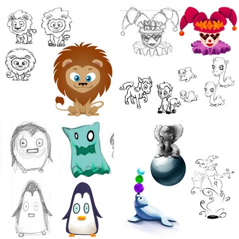
Concept to finished design for the circus characters.
When looking at the art from that era the one movement that really struck us was the Art Nouveau style. Salim was instrumental in helping us understand how it could influence every aspect of our game and visual design. With that style in mind, it felt right to make the circus a Parisian circus. Everything worked towards a unified whole.
In the meantime, while Salim was developing our visual canvas for the game, Willie and I were learning the Unity3D engine. We split duties, with Willie on gameplay and me on game engine systems and GUI. We had daily creative discussions on how to make our game more interesting.
One of the concepts that came out of those discussions was that we should have different balls with different powers. As we experimented with the iPad more and more we realized that it would be interesting to utilize the built-in specific functions of the touch screen and accelerometer to differentiate the balls from one another. We prototyped the ball ideas to make them feel as different as possible from each other. When we were finished we had 7 balls total.
The goal for production was to ship in less than six months, so that our game would be ready by early 2012. As we worked on the game though it became readily apparent that there was nothing that really made the balls memorable outside of their powers. Each ball had a separate ability, but was simply a texture swap of the other balls. The other issue we faced was that our main gameplay had no real goal to achieve to engage the player. We simply had a tech demo of really fun gameplay mechanics that allowed is to knock down objects in 3D, but outside of that, not much of a game.
As we discussed what we could add to flesh out or game, Salim came up with the idea that each ball should not only feel completely different, but also behave and look completely different as well. He suggested we adapt the abilities we made for each ball to real world objects with different color pallets. Realizing this was a great idea, but wanting to meet our early 2012 deadline, I argued against the idea, as it would extend development by a few months. Salim argued vehemently for the idea. He drafted concept art and modeled designs for each ball within a few days. After showing the designs to Willie and me, Willie was onboard as well. By the end of the week I begrudgingly approved (I'm glad I was so completely mistaken in that argument!). One of the best aspects of our gameplay -- by far -- is the balls and their different abilities. The importance of collaborating with other creative minds cannot be stressed enough when working on any creative project.
The next step besides making the ball’s different was to inject our game with a goal. We referenced Super Mario 64 and iOS games when looking at what felt right. Eventually, we felt with our real-time physics system it would feel right if the player had to hit 3 special blocks to beat each level. We were experimenting with breakable wood and glass objects at the time and realized that if every object in the scene was solid, then the special objects should be made of glass, as they would cater to the inner child inside everyone who ever wanted to break fine-China in a store. We needed a reason why the player was breaking the glass, so we figured that if there were stars trapped in the glass, players’ eyes would be drawn to them. We called them “star blocks.”
Gameplay goals
As we developed the aesthetic of the GUI, we realized that the GUI was overwhelming everything else on-screen, and there was no way to fit all the information at once without actually blocking the view of the player. We went through countless iterations of the GUI, until we finally realized we needed to integrate the GUI into the 3D scene itself. Thus, we added the scores, level number, and other various items to 3D signs within the scene itself. This freed us to place only mission critical gameplay elements as 2D objects on- screen when needed. This also brought about the creation and design of our 3D star lanterns, in which the stars fly to after being freed from their star block.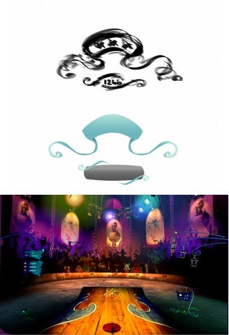
2D GUI Concepts and Designs that became 3D signs and lanterns
Sometime during these countless GUI revisions, the idea of a wheel inspired by a rotary telephone came about. We felt that it would be interesting if instead of the standard iOS approach to GUI, we should try something different. We also felt it helped unify our GUI with our early 20th century style. Salim and I worked endlessly together on countless iterations to get the wheel to feel right for the players to use.
The name of our project remained incomplete for most of the first 6 months of development. We had code names like Fysax and Ball-istic, but none of them really matched the game we were making. They either sounded cheap or uninspired. Finally, while discussing the art direction of our game, and the fact that our game was becoming so heavily inspired by early 20th century designs, Willie referenced a famous painting from that era. It was “The Treachery of Images” by the surrealist Belgium painter René Magritte. The painting displays a painting of a pipe, and famously says below it "Ceci n'est pas une pipe,” French for "This is not a pipe." After Willie mentioned it, Salim simply asked, what about This is Not a Ball Game? The second he said the title it rang true to our game’s identity and from then on we had our title. It was one of the few immediate unanimous decisions we ever made. Magritte commented on the illusionary grasp images and symbols maintain over our minds as we use them to make sense of art, yet at the end of the day they are just that, images. We were making a virtual representation of a ball game that we would have loved to play in real life, but was not possible in real life. In the end our game was only a moving interactive image. The painting inspired the logo of our game; the ramp was based on Magritte’s pipe.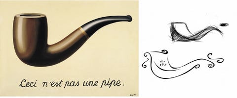
The ramp was inspired by the representation of a pipe.
The Great Redesign
The next step was to show the game off to the public. In the summer of 2012, we showed the game off at the Seattle Indies Expo. While we were there we showed TINABG off to as many players as possible, resulting in a warm reception and useful feedback like “your mechanics are not entirely user-friendly.” Going into the expo we were ready to ship in August 2012 on the App Store for $0.99. The most important piece of advice we took away from multiple developers who stopped by our booth was that our game needed to be a freemium game. When asked why many pointed to the evolving iOS App Store consumer expectations. When we did our research afterwards, we realized the expectations for Apple's App Store had shifted from the $0.99 Angry Birds model to freemium. Only pre-existing franchises or companies with massive marketing power could make their game stand out with a price tag on iOS.
After much discussion, we felt it was important that we met expectations and delayed development yet again. During this time we also realized we did not support iOS enough in its overall feature set. We decided to add Game Center leaderboards and achievements to emphasize replayability. We also wanted the player to get the most out of their download, so we made sure our game supported as many iOS devices as possible and made it a Universal App, which means the player can download the game on more than one iOS device for free. From this came the need to backup the player’s save data between devices, so we added in iCloud support as well.
Even before we thought to redesign the game to support the freemium model, we began discussing the balls as a commodity within our game. One of the main issues we had playing the game was that the difficulty of levels were incredibly easy and lacked any form of challenge when the player had an infinite amount of balls. On top of that, once the player unlocked the later balls there was no reason to use the previous ball types as the later balls were much more powerful. Our solution was to limit the amount of balls the player has and to award them coins every time they beat a level. From there they could go to an in-game shop and buy more balls, thus making the game more challenging as the player had to think strategically which balls they wanted to buy and how they would use them in each level. By making the more powerful balls more expensive, players couldn’t solely rely on them throughout the game.
As we were redesigning the game, we came up with the idea that the shop needed to be 3D and needed to feel like it belonged within our game world. Thus, we put the shop outside the circus tent and expanded the world of TINABG. At the same time Salim came up with the idea of a genie as an omnipotent protagonist who guides the player, to which we all took a liking. She gave our game a unique voice.
The evolutionary design of the shop from paper to final 3D models.
The last, but not least, step was audio design. We contacted a company to outsource the production of sound effects because none of us were audio designers and we knew it was important in getting our world to feel alive. We also had a local voice actress do the voice for the genie. The team had weekly e-mail correspondence to give feedback on the sound effects and music theme for our game. The goal was to combine the new with the old.
In The End
Almost two years after creating Absurd Interactive, our first professional release is upon us with This is Not a Ball Game ready launch at the end of April. After countless redesigns and evolutions, we’re finally releasing a product that we’re truly proud of.
We posted a 25-minute video walkthrough in which we go through all the basic gameplay in This is Not a Ball Game (YouTube).
If you’d like to play the game NOW, we can set you up with a beta build. Email us at [email protected] and we’ll let you play early.
You can follow This Is Not A Ball Game here.
Until next time Absurd denizens…![]()
Read more about:
Featured BlogsAbout the Author(s)
You May Also Like


.jpeg?width=700&auto=webp&quality=80&disable=upscale)


