

Daily news, dev blogs, and stories from Game Developer straight to your inbox
Sponsored By
Featured Blog | This community-written post highlights the best of what the game industry has to offer. Read more like it on the Game Developer Blogs or learn how to Submit Your Own Blog Post
Thematic Storytelling Through Menu Design
In this post I take a look at how can we learn to tell stories and communicate themes through games' most overlooked feature: menus.
12 Min Read

Menus. No! Not restaurant menus, menus in games, you know? Those things that most designers give about as much thought to as their dirty laundry during the design process (and if they work in a bigger studio, palm the design of off onto a poor UI artist)? Those things. Game menus have become the black sheep of the design process because we, as makers of games, have got their primary purpose and our primary criterion for their design completely wrong!
Most menus are designed with one major principle; practicality. Usually this translates into noninvasive, minimalist style affairs, a positive yawn-o-rama devoid of any personality or relationship with the actually game you are playing.
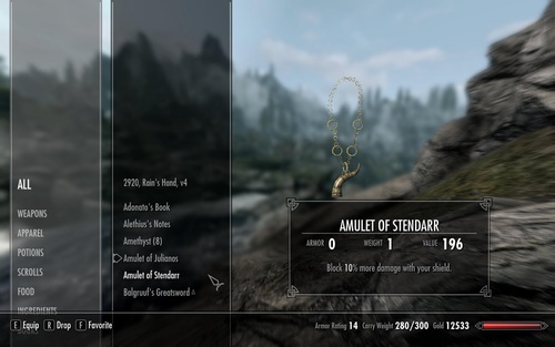
Dull, dull dull. Skyrim: one of the worst offenders. This beautifully streamlined interface doesn't exactly communicate the medieval gothic that pervades the rest of the game.
Think back to the first interactable moment you have had with most games over the course of your life. Almost always this experience will start with a menu laid out as a centred (or if the designers were feeling really edgy, right-aligned) list comprising the words: NEW GAME, LOAD GAME/CONTINUE, OPTIONS. And some sort of background image or animation. If you've picked up a game in which the UI designer was a real thrill seeker then selecting different sub-menus might change the background image, or even animate it!
In the department of missed opportunities I believe the abandonment of games menus by most games designers is one of the worst. And the reason for this? Because most games designers don't really approach the experience of interacting with a game holistically. Speaking to many of my peers they don't consider the interaction with a menu before "gameplay" begins to be part of he essential game experience. Most believe that menus functions as a kind of neutral conduit through which users travel into their more traditional experiences and this is tragic because there is SO much you can do with a menu that re-inforces the design, theme and storytelling of your game.
Let's look at a game that does this a bit better than our aforementioned Skyrim; Suda51's bizarre epic, Killer7. This game is one of best examples of meaningful menu design. Although it's not perfect and still has some standard "menuing" that many games suffer from, these standards are delivered in at least in an original style. When first loading it up the player will be treated to the run of the mill CAPCOM / GRASSHOPPER title cards, however each of these is underscored by the giggling laughs of KIller7's main enemy - the Heaven Smiles - followed by a gun shot synced with a violent red color palette swap on each logo throwing them into dramatic noir-style lighting. Then a rather (formally) uninspired Press Start to begin screen followed is followed by the NEW GAME / CONTINUE / LOAD GAME shtick. However, these titles are compressed as to be almost unreadable - it's arguable that much of KIller7's fiction is about the absurdity of the game play experience and its execution, so the use of these compressed titles forcing the player to interrogate ( and actually read) them for once, signs which they should be so familiar with, is at least a somewhat interesting statement as it forces a new perception of what one is actually doing when they press new game. As different options are selected from this list the titles spring out across the screen become grossly stretched - the opposite extreme - and equally hard to read. A simple transformation of text can have some interesting implications then and reinvigorate a tired formula but things are about to get a lot more interesting.
Next the player is taken to a mission select screen presented in the style of 80's documentary store archive cards, floating passively in space with an anonymous silhouette behind it - the target for your mission. In the mission card is a single check box into which a glowing blocky laser sight points from where the player is seated - as if in first-person shooter mode (another reference possibly to the point, shoot, select arcade games of the early 90's).
When first starting the player's only option is to accept and mission and proceed. However, later on this screen updates dynamically, placing the targets you have eliminated in cell-shaded color in the foreground, staring off, maimed and defeated. All of these elements immediately communicate the sense of the Killer7; contract assassins of the early 90's - in deep with the end of the political machinations of the Reagan administration.
The player literally plays accepting the mission card from this menu. On pressing accept another visceral gun shot is heard - yes, the Killer7 are the type of people who accept a mission by firing at it - shifting the screen again violently to the same target silhouette this time with a glowing red laser that the player can control tracing the line of the target's body, underscored by an abrasive ringing sound. You must then position the laser over a body part of the shadow and fire again. A final violent bang issues forth and the body disintegrates into a collection of red particles, the sound of a car or freight horn sampled and shifted to a deafening degree blares out, and the figure is replaced by a japanese kanji stating the theme for this level made from the same blood red spots that disintegrated them on your shot.
Here Killer7 offers a thoughtful look at how interactivity is important even in the basic procedure of selecting a mission. The player is forced to look, aim and fire. They are confronted at every moment by the fiction of the game world which they will, and arguably already have, stepped into. A world of paranoia, extremes of quiet and loud, compression and expansion, symbol and lie.
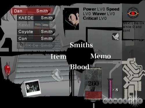
Killer7's innovative pause screen menu.
Similarly Killer7's "pause menu" has a very interesting and original aesthetic that reinforces the fiction and story of the game world. There are numerous examples in this image of the tailoring of menu for fiction - the blood bag styled blood counter, items displayed on silhouetted spikes, polaroids of targets yet to be found - but I will focus on one for the purposes of this post.
The eye in top right hand corner indicates the player's health. The closer it is to being closed the less health the player has - conceptually consistent with Killer7's fiction about the third eye, enlightenment and lines of sight, echoed again in the laser sights of the original opening screens discussed above. Compare that to how most games indicate health; a green or red bar that moves from right to left as health decreases and has absolutely nothing original to say. You can see why these sorts of customisations can be so powerful.
A final note about Killer7 is its save and load system which has a proper fictional context for it. All save and load files work through interaction with recorded surveillance tapes that appear on TV's in specific rooms. A nod to the nightmarish surveillance state in the style of Fahrenheit 451, in which citizens are spied on through their televisions, a state that records every move one makes, so closely that the player's very being can be reconstituted at the point they were last recorded. Save and load files are accessed through a tele-text style menu system that again fundamentally communicates the thematic ideas behind the game.
On a wider level the homogenisation of the menu also represents a kind of effacement of thought about games as whole and how all their interactable mechanics dictate the game world. The "standard" menu has become so accepted in the medium that we no longer think about the assumptions that spring from new game and load game. In terms of storytelling these two actions have become nothing more than a usability convenience. When many designers think about games they accept almost immediately that their game will have an unambiguous start button, and if its a game where the player makes character progress, there will be an easily accessed save/load option. All mediated through the meretricious neutrality of a standard menu list.
The act of loading a game is inherently bizarre when you consider the fictional context of most games and their implied experience. Even the act of starting is completely ridiculous when examined closely. Games seem to be fond of in medias res story telling but why do we "start" here, why is this a "new" game. What happened before now? What about the notion of "new"? Isn't it fundamentally absurd that we can finish a game and somehow make a "new" version of it just by selecting from a list.
My point is not meant to be a surface level, clever-clogs critique of the absurdities of interaction, I realise that designers can't somehow examine the nature of experiential interaction and the fourth wall in every game or play session. But the tacit acceptance of menu design as it is today is leading to a lack of thought about these aspects of design. These are really interesting questions about our medium, that could add so much to the story and execution of the video-game medium but no one wants to, or perhaps simply can't, engage with because of assumptions about the form the medium should take.
Think of Assassin's Creed. A series of games, the fiction of which is crying out for a fictionalised menu system. A game in which you explore memories through a computer. Why not make that computer terminal an operable component instead of a menu. Imagine loading up the game and the first thing you have to do is navigate through a computer terminal. Start up the memory module to plug your character into their matrix of remembered DNA. Immediately the player is engaged in a way that builds the fiction of a universe in a very interesting way. But because of designer's acceptance of how game menus "should" be, they shy away from these possibilities.
A quick disclaimer; I am not an enemy of usability, every menu should not be labyrinthine affair intended to put the player off from the start. But the idea that a UI should itself be a challenge to a player? If that's consistent with the fiction of the game world you are trying to communicate then surely it would be hugely beneficial to use that play time to your advantage as piece of story telling. So when I critique the primary tenent of menu design as being practicality (or usability) I am critiquing a particularly interpretation of this that has become widespread in the game's industry; that translates these worlds in the boredom inducing, uninspired minimal aesthetic that many games' menus use.
In games I've developed in the past I've tried to practice what I preach. I made a game about a year ago called Rosemary's Artery in which I cloaked all the menu elements in claustrophobic cuttings of a heart. The user, before they could select any options or begin the game then had to rake away these crowding fragments of heart to find the menu. This made the player immediately get a sense of the game's tone, the crushing atmosphere of being interned in another's body, trying to escape a prison of flesh.
More recently when developing a game called Really Good Paths, I'm hoping to create a fully fledged mini-game out of the start menu, through a paired down side-scrolling version of the central experience in which you have to play and catch the UI element you want to choose.
In essence. Go wild. Question your medium. And make your menus as artistic, beautiful and thought provoking as the experiences that you want to craft. More designers need to treat the menu as an essential part of the game experience.
Declan Kolakowski
@infiniteoctagon
Read more about:
Featured BlogsAbout the Author(s)
You May Also Like


.jpeg?width=700&auto=webp&quality=80&disable=upscale)


