Daily news, dev blogs, and stories from Game Developer straight to your inbox
Sponsored By
Featured Blog | This community-written post highlights the best of what the game industry has to offer. Read more like it on the Game Developer Blogs or learn how to Submit Your Own Blog Post
Programming visual effects for Lightmatter
The development process behind the visual effects in Lightmatter.
16 Min Read

Hey there! I’m Benjamin Overgaard and I was a Unity programmer on the recently released Lightmatter, developed by Tunnel Vision Games. I programmed the visual effects for the game, so naturally this blog goes through the development of those effects. For the sake of clarity, this post is more about the process and how the game’s look evolved over time than implementation details. However, I’ve made sure to link to any resources that I’ve used along the way.
Overview
In this blog post I’ll be going through:
Finding the core look
Edge detection
Specular
Shadow reflections (SSR)
Shadow death effect
Additional effects in the game
Effects cut from the final game
Background
Lightmatter was developed by Tunnel Vision Games - a 6 man development studio from Denmark. We started the company fresh out of the university and spent 3.5 years developing Lightmatter - a first person puzzle game where shadows kill you. I had already worked on a large number of small games before Lightmatter, but mostly as either a systems or gameplay programmer. On Lightmatter, I worked within these areas as well, but I also decided to delve into graphics programming, since we didn’t have that skill on the team.
With several years of experience in Unity, but with minimal experience in shaders, I started out with Shader Forge just to get the basics down. But I quickly jumped into writing my own shaders from the ground up for more control. I can really recommend taking this Udemy course for a basic overview followed by watching Makin’ Stuff Look Good for examples of some more advanced shaders. In general, going into existing shaders and pulling them apart was very helpful in my learning process. Furthermore, working alongside our 3D artist Austeja was essential for maintaining a consistent look across all effects. Make sure to check out her awesome blog post.
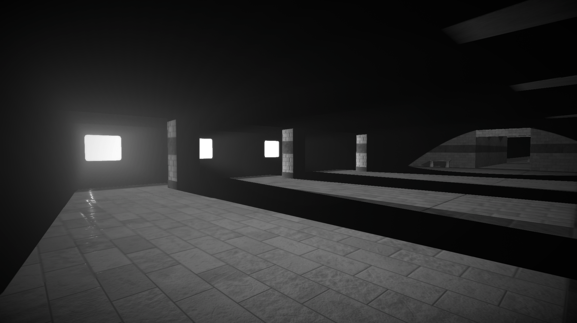
1. Finding the core look
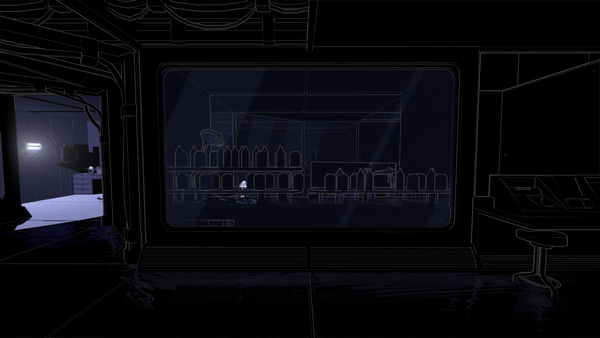
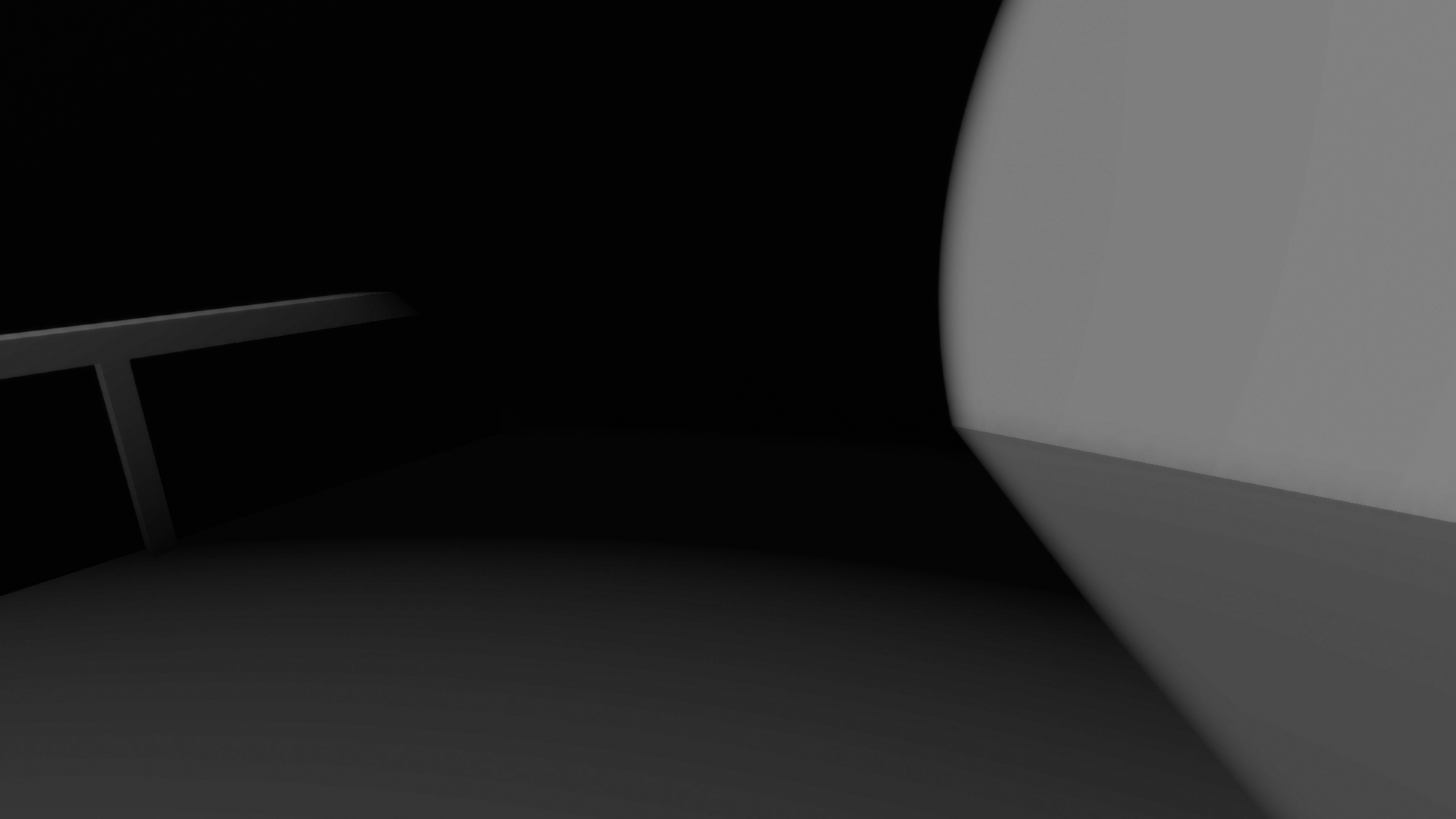
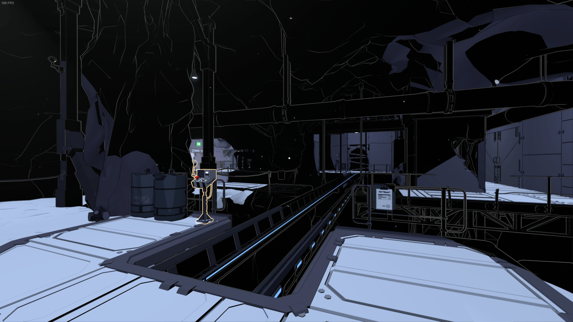
Due to the core mechanic of Lightmatter revolving around using lights and shadows, a strong contrast between light and dark is essential. Our initial approach was to make it look as if objects only exist if they are in light. Inspired by Serge Najar’s photography, we went for a highly textured concrete look. This required the workflow of using textures and normal maps combined with direct diffuse and specular lighting.
Since we knew that each level would have a large amount of light sources, we went with deferred rendering from the beginning for better performance using Unity’s built-in pipeline. Forward lighting is calculated per light, while deferred lighting is calculated per pixel (read about the difference here). In order to achieve the hard contrasts, I hooked into the lighting model and worked with the lighting falloff by thresholding the dot product. This blog by one of the developers behind the stealth game Aragami helped me locate the code for Unity’s deferred lighting model. The result was a flatter diffuse lighting, while keeping the standard specular reflection for fragments that are in light.
At times, however, the look was lacking detail, especially in darkness, so we also briefly tried an approach where certain lights would be softer for increased detail (like ambient light). But it clearly didn’t work, since it became hard to see the difference between light and shadow in some areas.
At this point, we also realized that the workflow with textures wasn’t realistic from a production standpoint. We only had one 3D artist accompanied with an intern, so we had to find a more efficient workflow.
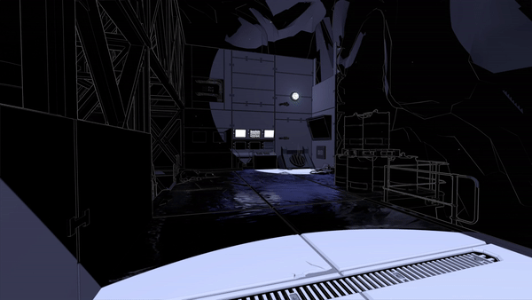
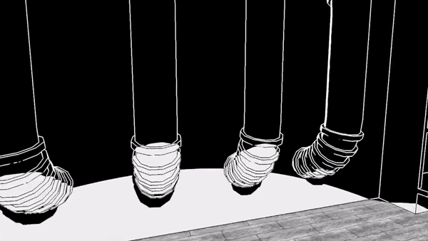
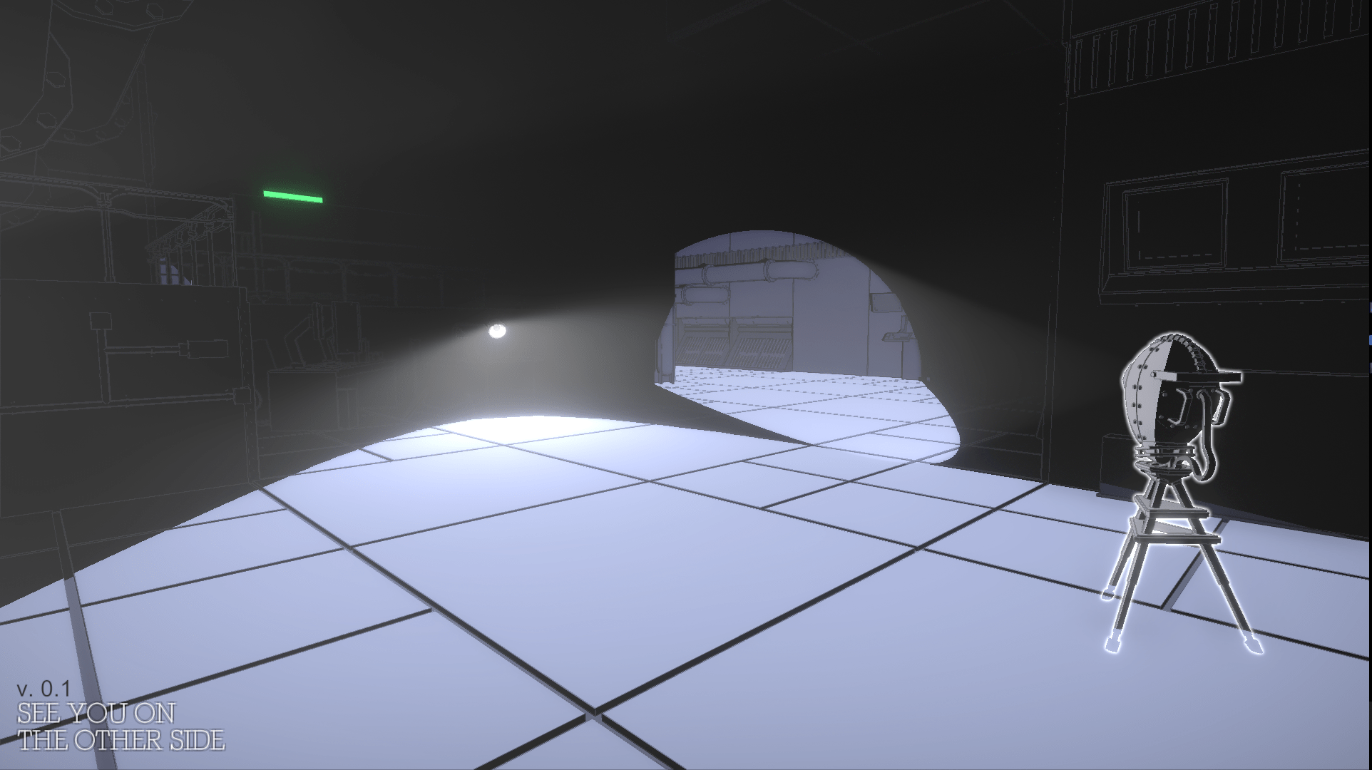
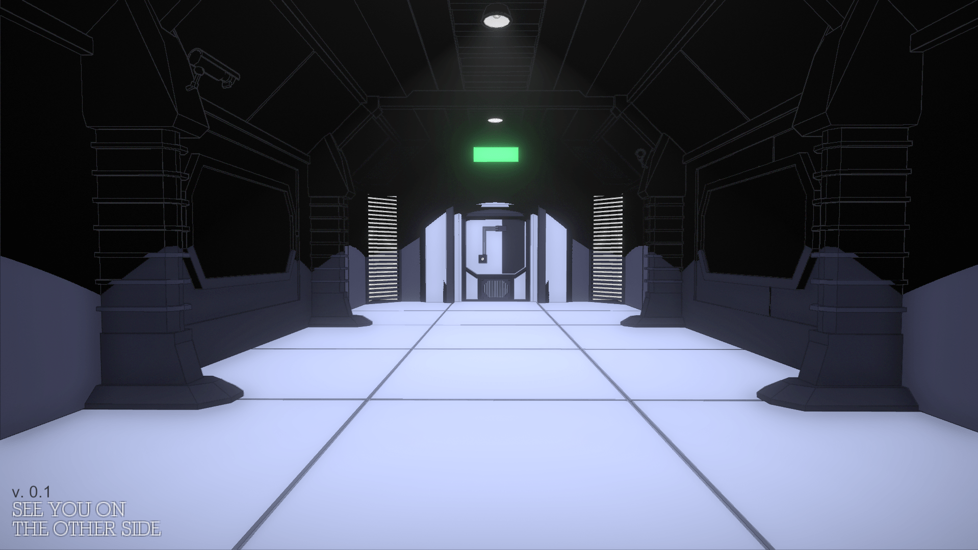
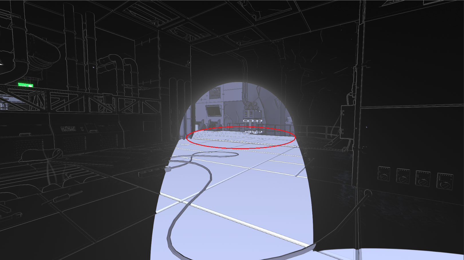
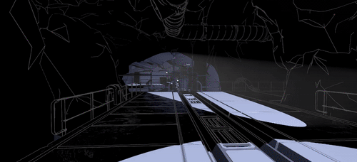
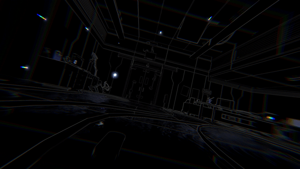
So inspired by the art style in White Night, I experimented with an edge detection post processing shader (detecting differences in depth and normals) that would give us the detail we needed without needing to make a lot textures and unwrapping models. I made the line color being dependent on the color in the frame buffer – e.g. white lines for dark pixels. This made the darkness visible, added a lot of detail and gave a much better overview in the levels, which is essential in a puzzle game like ours.
Since the white lines could easily be overwhelming, I fade them based on camera depth. I read Wiliam Chyr’s blog (Manifold Garden) on edge detection and got some advice from him via e-mail, which was super helpful for my process in learning about edge detection.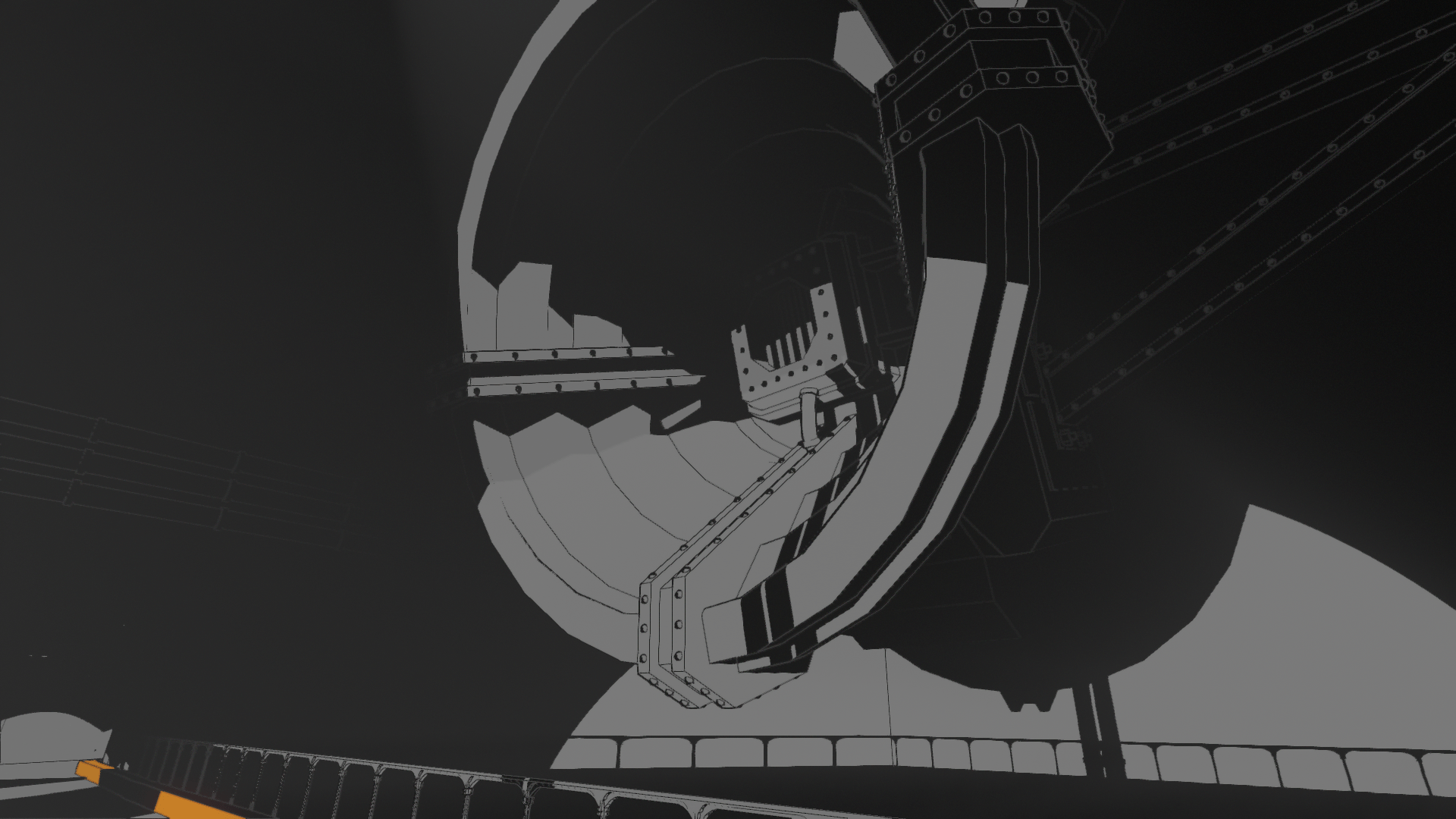
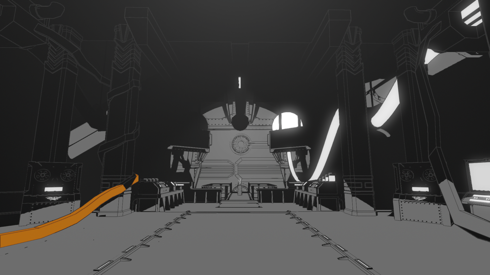
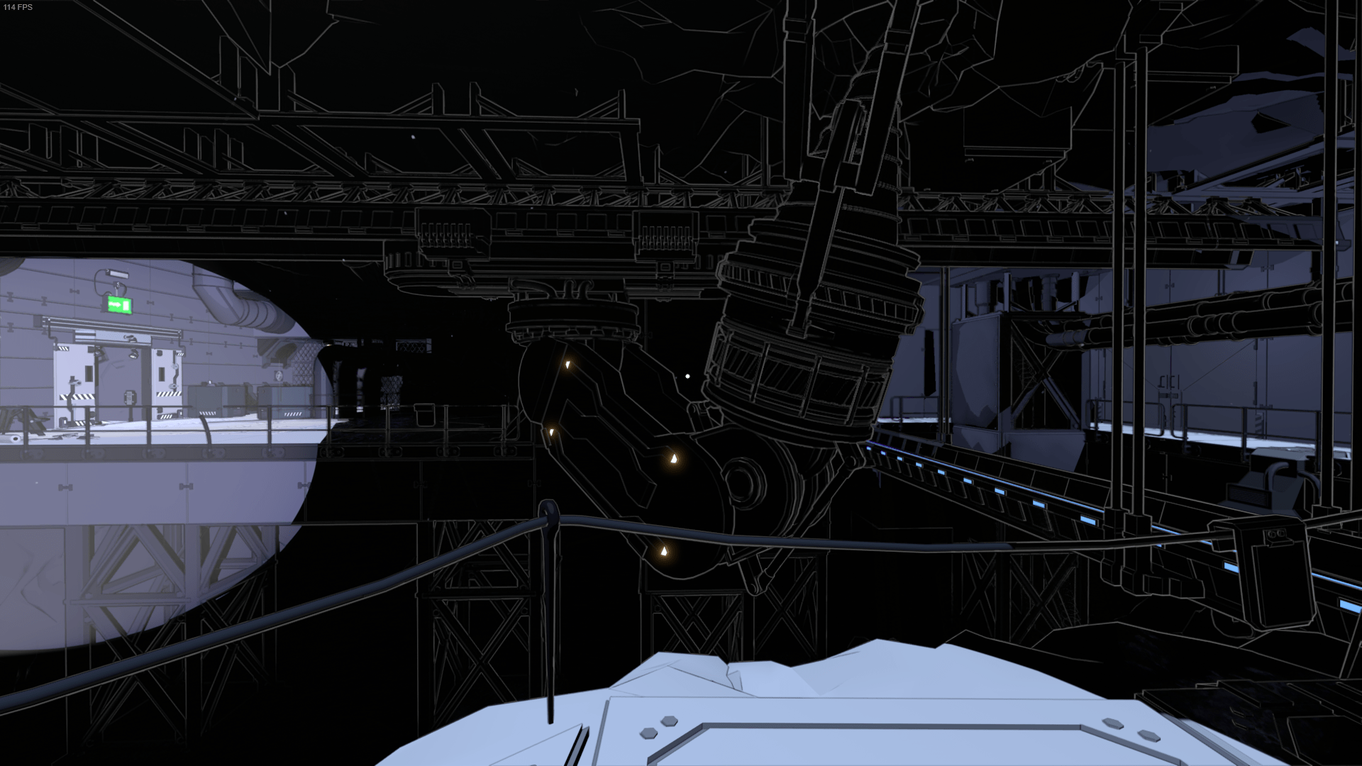
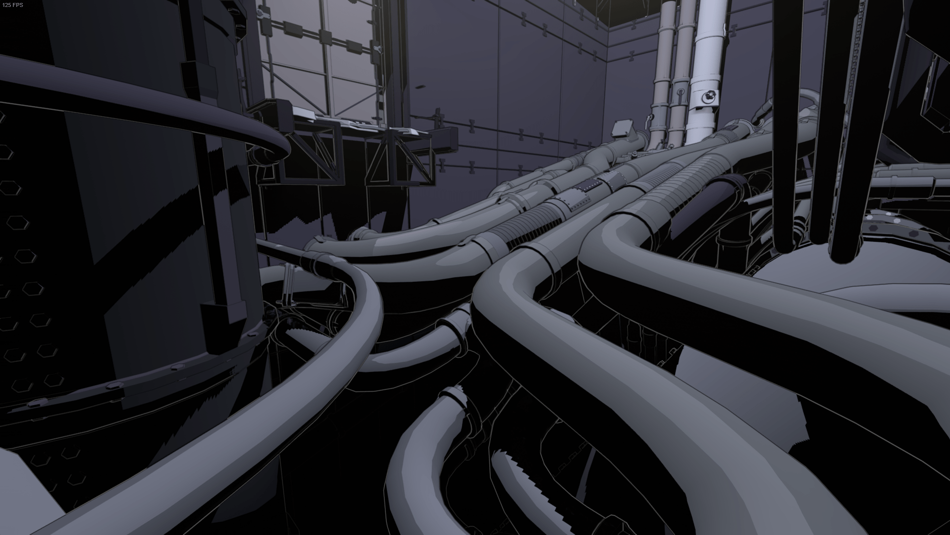
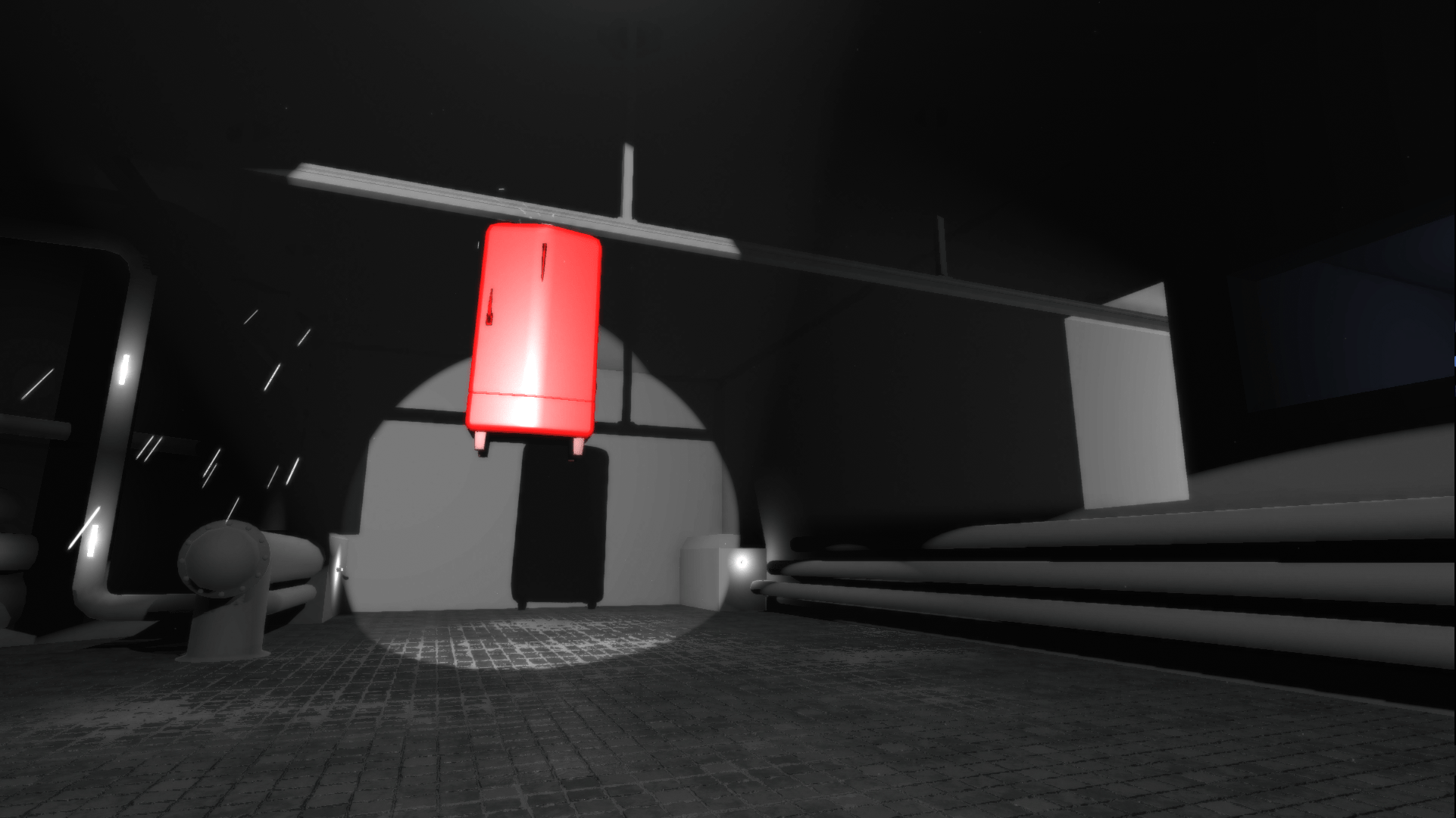
At the time, I found the deferred shader hard to work with because it's so big, so I wrote a minimalistic forward shader from scratch to use on all objects. This gave me more control for further experimentation. During this phase, the game was set in an old factory with a lot of big heavy machines.
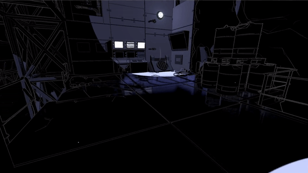
However, this art style still felt very flat. As the game’s mechanics got more defined with various technological devices, the setting turned into a science lab. We experimented with more colors and I added a slight gradient to the lighting, which greatly added contrast and detail while still maintaining the old-school comic book look. We also briefly experimented with screen space ambient occlusion, but eventually as scenes became more decorated, it was no longer necessary.
With this look, we truly felt that we had something that worked. Levels got a lot more depth and became much easier to read. Along the way, I felt confident to work within the deferred pipeline, so I re-wrote the shader back to deferred. As expected, the game had very poor performance in forward rendering.
2. Edge detection
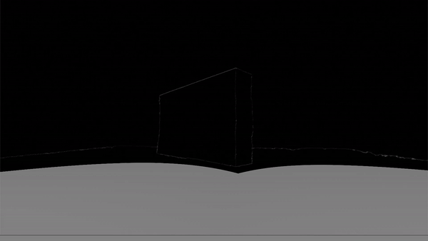
From a shader standpoint, there was still plenty of room for improvement, especially in regards to edge detection. The lines looked very flat with no variation in intensity and their binary output made them look jagged. Based on some great advice from Mikkel Gjoel (graphics programmer at Playdead), instead of the binary output, I used the original depth and normal difference information to control the intensity of the line color - thereby achieving softer and faded lines (right click on the images and select 'open image in new tab' to view them in full size).
Furthermore, I weighted depth-based lines to output a stronger color intensity than normal-based lines, resulting in stronger outlines and thereby even more variation and more of a comic book look. On top of that, giving normal-based lines a lower view distance than depth-based lines added a stronger sense of depth.
Although the edge detection improved, we still had aliasing problems. The highly detailed edge detection caused strong contrasts on geometry. Especially cracks and crevices on floor tiles viewed at an angle and distance would cause this. I experimented with using a custom depth normals map with a higher resolution for the edge detection. But I realised that even without edge detection, we had aliasing issues due to the contrasts caused by lighting on the highly detailed floor. The only anti-aliasing solution that came close to solving this was Unity’s temporal anti-aliasing (based on Playdead’s solution). But it still didn’t solve the problem completely.
So we decided to collaborate with the Alexandra Institute and develop a custom temporal anti-aliasing solution, which again is a direct modification of Playdead’s solution. This was a long process that would deserve its own blog post by Christian Heider from the Alexandria Institute some day. 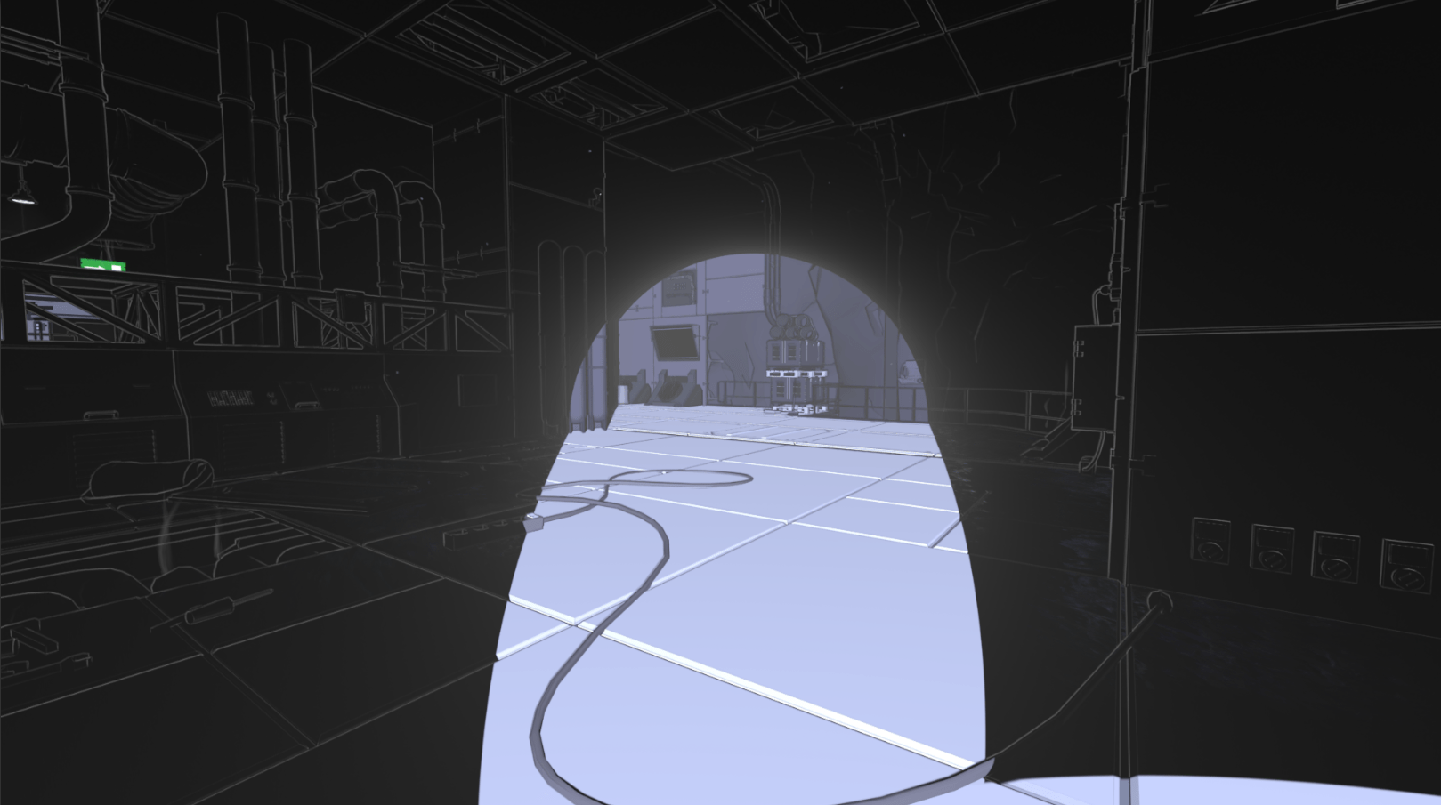
3. Specular
Although the gradient lighting helped tremendously on reducing flatness, more could still be done.
So I added specular to our deferred lighting. In order to match the art style, I went for a toony look. The deferred shading already computes the specular term, so it was only a matter of thresholding it, similar to what I did with the diffuse shading.
Once I had implemented specular shading, our 3D artist had already created the majority of the props in the game. And since specular didn’t look great on all objects (works best on round surfaces), she had to go through most objects and tweak them individually. Luckily, it was still within the same shader, so the same materials could be used. At first we weren’t quite sure if it would be worth it, but only a few days were spent on going through the models, and afterwards it felt like the visual quality got lifted quite a bit throughout the whole game.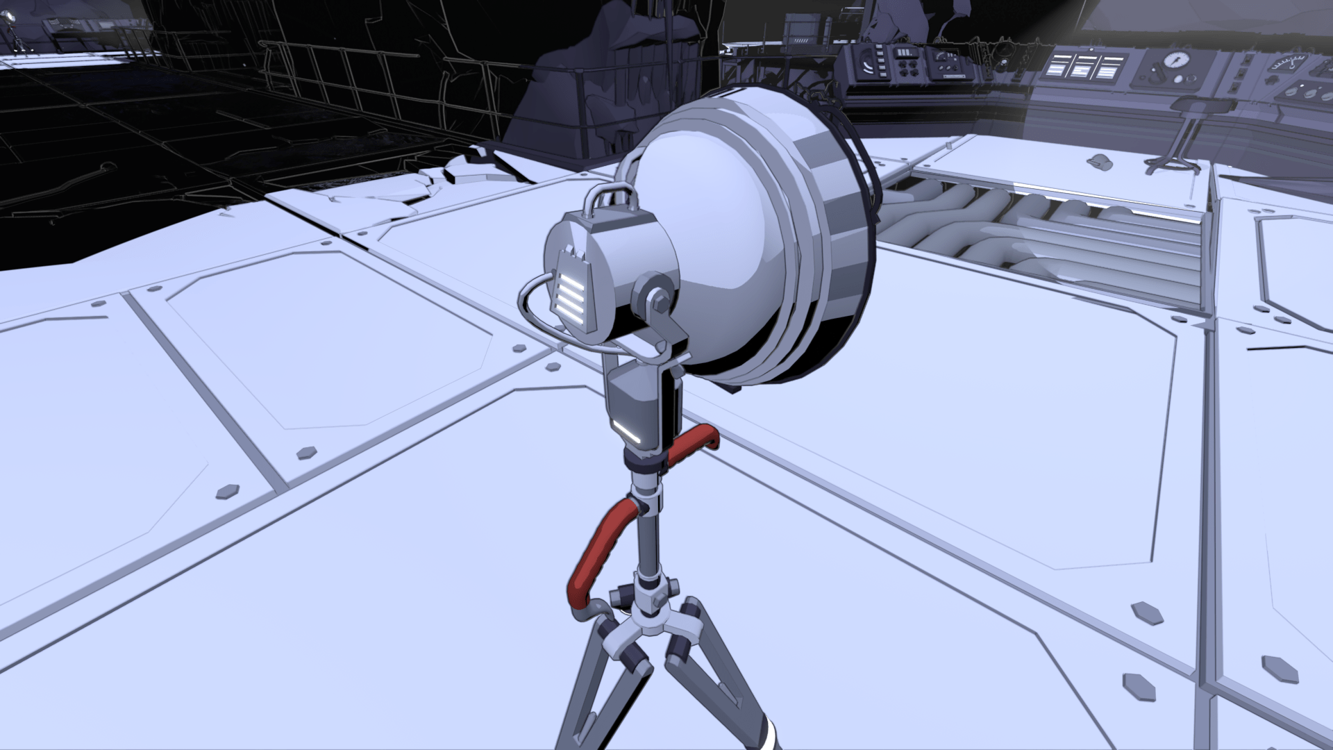
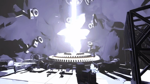
4. Shadow SSR
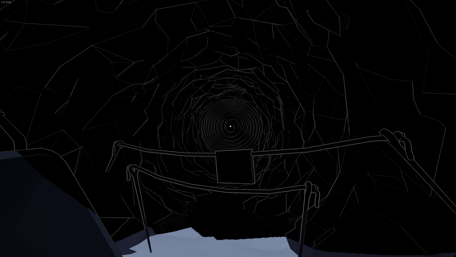
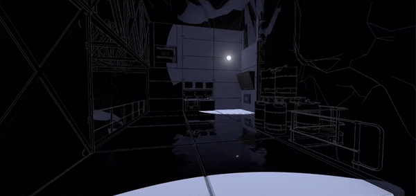
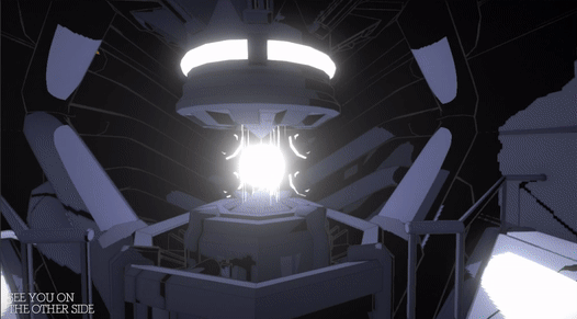
We knew early on in development that the shadows needed to look dangerous. My first approach was distorting the white lines as can be seen in the GIF just below.
Although an interesting effect, it didn’t work in the context of the game. Due to deferred lighting, all geometry is rendered before the lighting pass. So I could only distort shadow areas in post processing, meaning that I wouldn’t be able to show anything behind the object, since it’s all a screen effect. There might be a way to get around this, but I couldn’t figure it out at the time. Also, since only shadows on floors kill you, I decided to focus on that instead. When the shadows kill the player in Lightmatter, even in the early stages of development, the player would fall into the floor.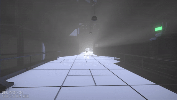
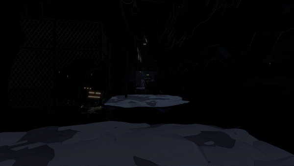
When stepping into shadow, the sinking feeling gives the players time to understand what is happening instead of killing them instantly. We quickly started to imagine the shadows as quicksand or tar. The latter being the most appealing due to it fitting into the context of darkness, and inspired by Marvel’s Venom, we could make it look ominous. Also, levels looked very static at the time, so having dark floor reflect as you move around would add a lot of life.
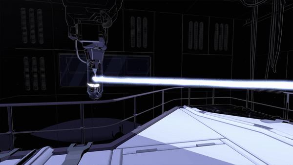
I had the idea to achieve this using screen space reflections (SSR). Looking into existing solutions, Kode80SSR had the least amount of artifacts and was the easiest to change (in contrast to the SSR in Unity’s post processing stack). By checking for black pixels in the frame buffer and upward normals in the depth-normals texture, I only apply SSR to floor in darkness. Afterwards, I distort the SSR with UV displacement over time to achieve the tar look and add movement to the reflections.
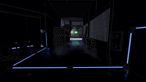
The GIF just below shows how the SSR looks without our distortion effect. Since SSR can be extremely costly, I downsample it greatly, which can be very apparent.
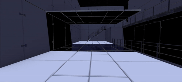
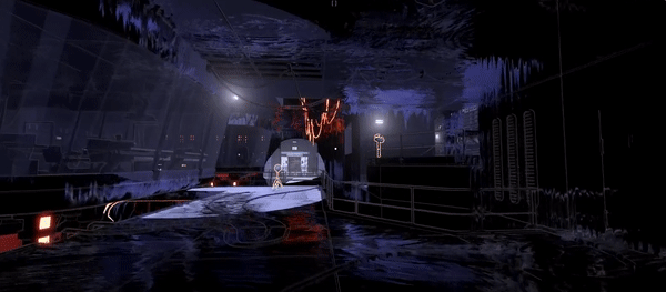
To make the downsampling less visible, I wrote a separate shader pass for the SSR distortion without downsampling. There were additional features of the original SSR shader that I removed for optimization. Due to the displacement texture used, the first version of the SSR distortion had a bit of a water look as you can see below.
In the version shown above, I displaced the UVs in screen space, which meant that the distortion would move faster when panning the camera. I solved the problem by projecting it into world space. This shader study from No Man’s Sky shows how to do just that. As you might also have noticed in the GIF above, the reflections are quite dark and not very noticeable. Initially I solved it by brightening the entire SSR, but some areas would get overly bright. So I just brighten darker areas. Also, we apply a bluish tint and saturate it to make it look less realistic and more otherworldly.
Surprisingly, Kode80SSR also had an artifact where objects in front of the reflections would be reflected. I solved this by only reflecting pixels in the frame buffer with higher depth than the current fragment. You can see the final result in the GIF below.
For future work, I would like write a cube map implementation for lower settings, but due to time constraints we decided to prioritize other parts of the game for the release.
5. Shadow death effect
Our first idea for the shadow death effect was simply having the shadows take over the screen. Similar to how you would make a dissolve effect, our 3D artist made a greyscale vignette texture with a shape similar to the GIF below. The vignette gets brighter towards the middle. In a screen shader, with a threshold value increasing over time, I compare the threshold to the current pixel value in the vignette texture. A black fragment is returned for any values that are below the threshold. I went with this implementation to give our 3D artist as much control of the animation as possible, since it’s simply a matter of making a new vignette texture.
We feared that the effect would getting boring to look at as players die a lot, so we made it as quick as possible.
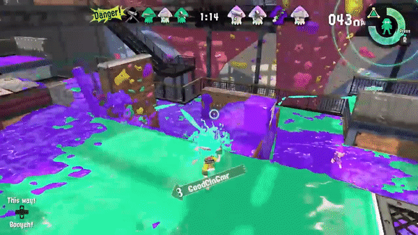
However, it needed to be more dramatic. Players should feel like they’re sinking into thick goo, so it needed to be longer. Furthermore, it was hard to see the shadow overlay if the player was dying in a pitch black area. Also, the overlay looked too perfect, like a cardboard cutout. To fit the tar look, it needed to look more organic. So I looked at the ‘taking damage’ overlay effect in Splatoon prior to the next iteration of the effect.
For the next iteration, I prolonged the effect - making players move and look exponentially slower while in the shadows, and making them sink faster. To make the effect visible in the dark, I distort the entire screen, with our good old friend: UV displacement. This makes everything wobble slightly - a strong indication to the player that something has gone wrong. To make the overlay itself more organic, I apply a separate UV displacement to the vignette threshold.
An improvement, but still a bit underwhelming. So, our 3D artist refined the vignette texture - making it cleaner. And I added screen shake, chromatic aberration, blur, and a vertigo effect by animating the FOV. However, since all of these are screen effects, it still felt a bit cheap. Something needed to happen in front of the player in 3D space. So, I added some bubbly particle effects to make it feel like the player is dissolving, almost boiling in the shadows. More particles are spawned exponentially as the sequence progresses, to give the feeling that player is getting more and more submerged into the shadows.
6. Additional effects in the game
I made a wholebunch of other effects that I could go on talking about in a similar style, but this post is already too long. So I’ll leave with some GIFs and some brief descriptions.
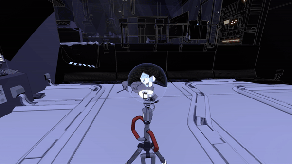
Lightmatter beam - For the beam itself, I wrote a vertex displacement shader with HDR output. For the light emitted from the beam, I wrote a lighting shader roughly based on the tube lighting in this example project from Unity Technologies.
Crystal shader - Interpolation between cube map reflection and HDR output for bloom.
Glass ball shader - GrabPass (re-used texture) with refraction on normals facing away from the camera direction + freznel.
Toony glass reflection - UV offset based on dot product of predetermined glass vector and direction towards the camera + freznel.
Toony glass reflection 2 - Inverted stepped freznel.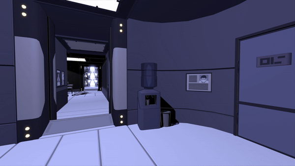
Shadow dissolve effect - The dangerous shadows are dissolving and turning into normal shadows. I achieved this by applying a displaced vignette texture (similar to the shadow death effect) to the shadow SSR render texture + adding particle effects.
Shadow border - A border showing the difference between dangerous and normal shadows. I achieved this by thresholding world positions used in the SSR with a displaced offset to achieve the wobbly line. 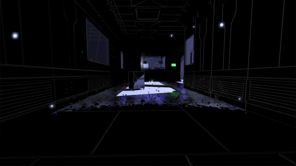
Fog - To hide e.g. the bottom of the levels. To give the level designer control, I use a grabpass (re-used texture) on a cube - fading the output based on depth of fragment and depth buffer value.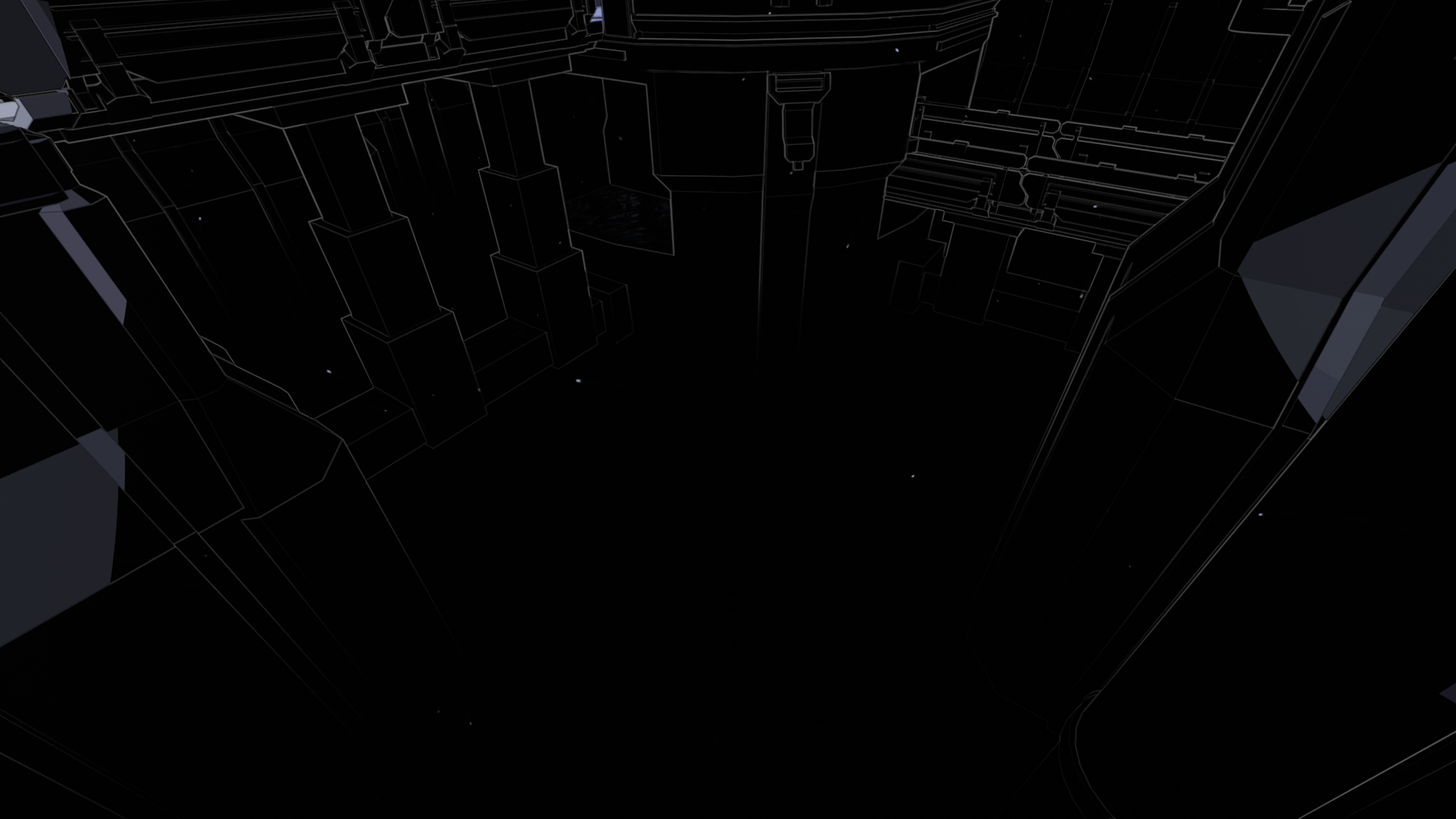
Effects cut from the final game
Shadow peep hole - Early in the project, you could jump through shadows on walls. I made a cutout + distortion shader that got triggered by our shadow detection script.
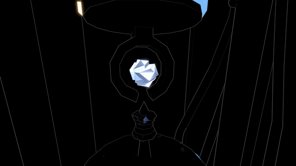
Light orb point - The game’s structure was once very similar to The Talos Principle - hubs with points you collect at the end of each puzzle. In GIF below, the light orb is one of those points. I made a path tool, so it was easy to animate stuff like the orb flying around. And as the orb gets close to the player, I change it to orthographic space, just before it turns into a UI element at the top of the screen.
Color-specific objects - A shader to test the idea of certain objects only existing in certain colors of light. Yes, the car is just placeholder :)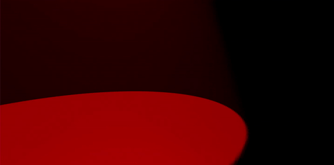
SSR artifact - I accidentally stumbled into the upside down.
Conclusion
Many programmers are afraid of shaders and often talk about them as black magic. I did too at first, and I think it’s because there aren’t as many resources that go through the discipline step by step. Although there are a few great resources that I linked to in the top of this post, I generally found it to be limited.
So what I really learned from was jumping into an existing shaders, pulling them apart and isolating segments that I didn’t understand to figure out exactly what they did. And yes, this is a long process, but it's also fun and playful. Often great effects come out of just getting lost, playing around and not worrying too much about where you’re heading. I also learned a whole lot from asking questions to various experienced people. So never be afraid to ask for help.
Read more about:
Featured BlogsAbout the Author
You May Also Like