

Daily news, dev blogs, and stories from Game Developer straight to your inbox
Sponsored By
Featured Blog | This community-written post highlights the best of what the game industry has to offer. Read more like it on the Game Developer Blogs or learn how to Submit Your Own Blog Post
PRACTICAL GUIDE ON FIRST PERSON LEVEL DESIGN
A guide to help you design better first person levels.
"Where to start?" And different notions used in level design explained with practical examples from Mirror's Edge & Bad Company 2.
22 Min Read

PRACTICAL GUIDE ON FIRST PERSON LEVEL DESIGN

Level design is something you almost always have to go through when making a game, but it’s one of the most overlooked segments of game production, especially on small/indie production teams.
Here I’ll try to give some advice on how to make a good level design, by using examples from my own experience. I’ll mostly use recurring games as references (Bad Company 2 and Mirror’s Edge), because they are games I played a lot and feel comfortable mentioning, and because they have fairly different gameplays.
WHERE TO START ?
Mirror’s Edge
The first step before making any “real” level design, is to put everything in perspective before going blindly in any direction.
Define what actions are allowed (and what aren’t) by the game design of your specific game, then what intentions or constraints you want on your level.
Focus on what makes your game unique.
What can the player(s) do in the game?
What elements of my game can harm, kill or put the player(s) close to the losing conditions?
Is there a theme, or a particular focus I want to put in this level/area of a level?
What mechanic stands out in my game?
USE GUIDELINES TO TEST & CREATE YOUR LEVEL
When making MAZE’s safe zone, we put some clear guidelines down:
“We want the safe zone to be square-shaped, with one door on each side of this square, and it should not take more than 30 seconds to run from one side to the other.
The safezone is also a “vegetation backup” so it should contain… vegetation.”
From these precise directions, we made a huge, square shaped forest, with all the liberty to put any type of vegetation, terrain modifications, little landmarks…
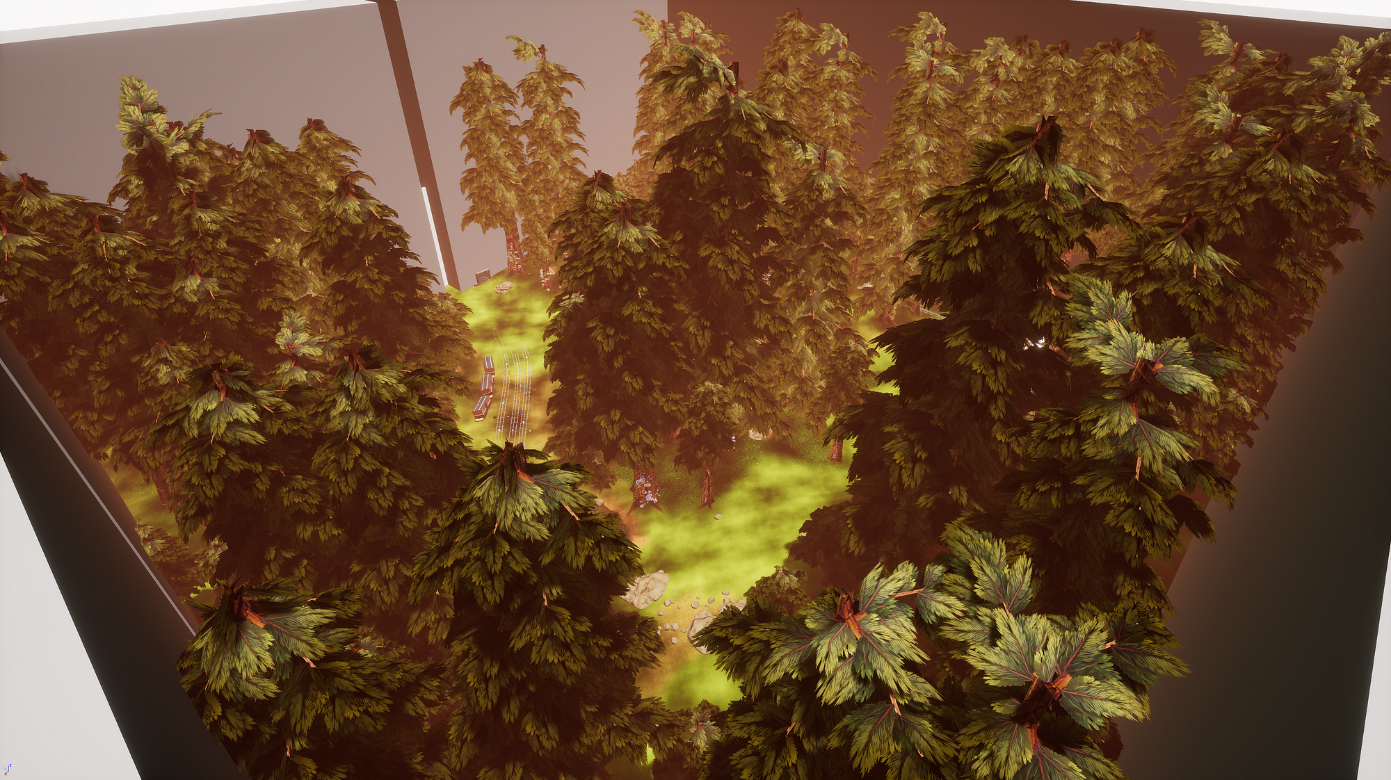
Editor view of the safe zone (the train wreckage at the left can be used for scale)
Before asking a playtester, or just other people to give you feedback on your level, you must be able to clear your own mistakes and correct your level accordingly.
To do so, define key points to help you create your level. It can also help you when testing the level on your own. Having precise constraints allows you to take more liberty to design around them.
In my opinion, it’s better to have some rock-hard, definite constraints than no constraints at all, especially when making a game aimed at someone other than just yourself. It gives you directions, and you can be as free as you want on every other part of your level when creating it.
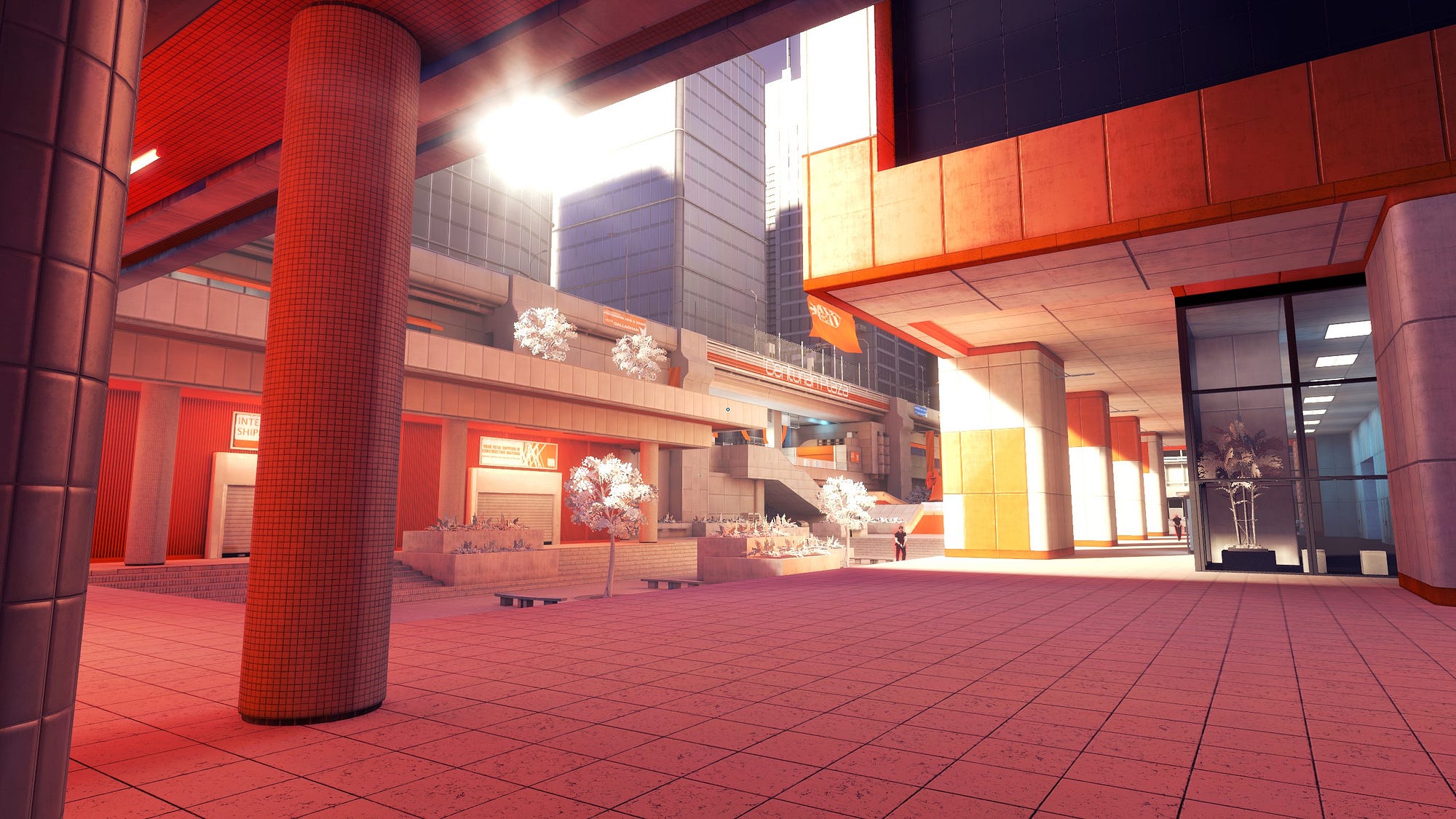
DESIGN LEVELS SPECIFICALLY FOR YOUR GAME
The more you design your level while keeping in mind your game design, the better it will be.
An example of this can be seen clearly on Source games. When playing Counter Strike, try to play 2Fort (a Team Fortress 2 map) on a community server. You can also find any classic CS map on a custom TF2 server. If the map has not been altered, you’ll see that most of the depth of each map loses its value. It’s not as fun playing de_dust2 on TF2 than it is on CS.
This is because dust2 was (brilliantly) designed with Counter Strike’s gameplay in mind, which is very different from Team Fortress 2’s.

2Fort — Team Fortress 2
Try to do the same for your levels: If your environments are imported in other games, they should not be as equally rewarding to experience than in their original game.
If your level seems really classic, well, you fucked up. No harm done, but my advice at this point would be to delete completely the faulty level, erase its dullness from existence and start again, from scratch.
USE REFERENCES FOR YOUR FUTURE LEVEL
The most obvious references when designing a level are the visual ones. Find architectural drawings or photos who capture well what you want to implement in your environment.
If you have some references & concept art used in your art direction, be sure to include them. Your artist(s) will be happy to see their work was not only used to be put on the studio walls to look cool.
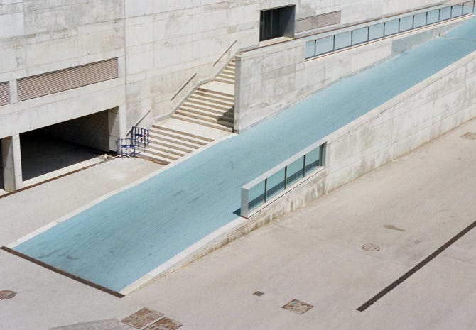
A reference for a level I’m working on(Photo by Asia Chmielewska)
Here’s an easy trick that often pays off when I’m looking for references: If you find an image that you want to use as a reference, try to find the author of the picture. The artist’s style, eye, whatever you want to call it, will not be in the one picture you randomly found on Pinterest. Use it to your advantage.
This is what I did with the photo above, and looked at other photos from Asia Chmielewska (check her out if you like architectural/urban photos she makes awesome photos).
The main problem I had when making a paper level design (I’ll talk about it in literally one paragraph), is that slopes are cool, but they need to lead somewhere.
So I found other references I can use to create what’s at the summit of the slope, and it will probably be super coherent because it was in the same photo collection. Neat.
DESIGNING ON PAPER
Once you have all this preparation part down, you can start actually designing the level… on paper.
It’s way faster to iterate on paper than recreate your level digitally.
— My point here is that you should find a //way// allowing you to design your level quickly, so you can iterate swiftly and easily change layouts, details etc. Most people would use paper, but if you prefer using Photoshop, Paint or woodworking, go for what is best for you.
From this point on, I’ll more drop different points and things I use to design levels, without any ranking.
Once you are designing your level, iterating over and over again, you can use or focus on these points to help you enhance your design:
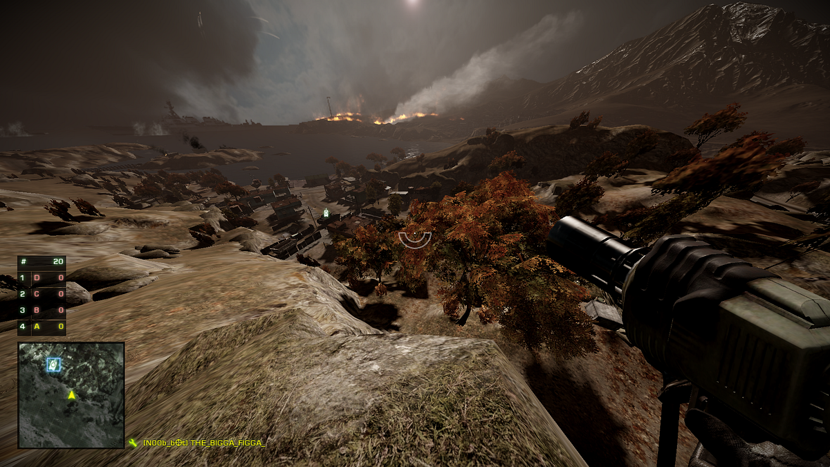
VERTICALITY
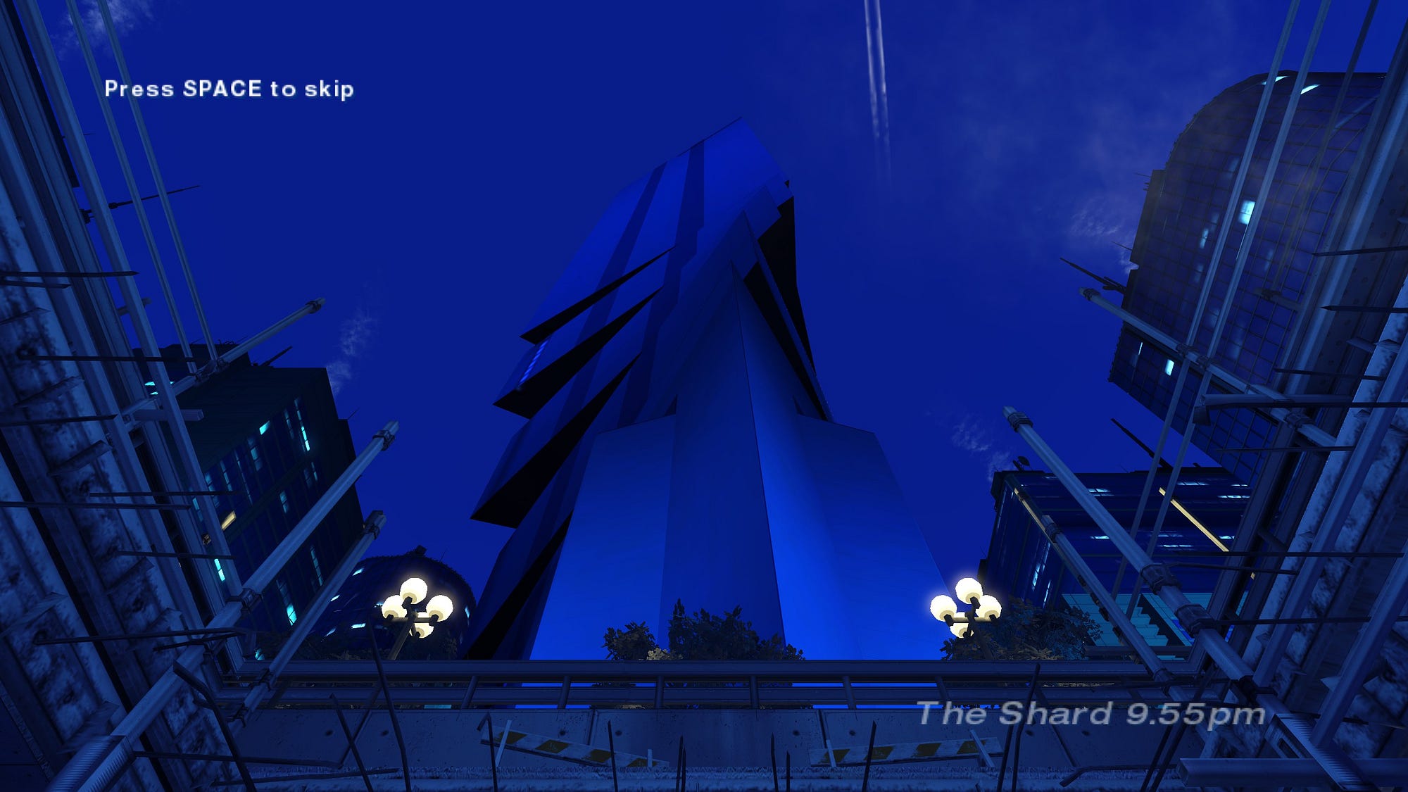
The intro cinematic of The Shard, Mirror’s Edge’s last level.
The Shard is the tallest building in Mirror’s Edge’s city, and also the last level of the game. The introduction cinematic of the level gives you the feeling that you are against your biggest challenge, like if the building itself is the final boss. How? By making you enter from the parking underneath the overwhelmingly tall building. You haven’t even started playing this level, but you already know the stakes are high.
One of the simplest elements that often separates a good level design from a bad one is verticality.
Verticality creates, vantage points, Landmarks, Occlusion and Focal Points(see the other points below).
Vantage points are really important to give exposition to your players. They are probably best used when creating a multiplayer map, as they can be fully utilized by players, whereas AIs usually aren’t advanced enough in games to use vantage points at their fullest.
It still is important in single player games to give exposition to your players, give them a better view of what challenges will come next. It’s also a really easy way to give your player a powerful feeling. Anyone standing on top of something will tell you: you’re better here than if you were standing at ground level.

Anatomically accurate representation of Verticality
In MAZE, we use verticality to convey the aggressiveness and strength of the maze itself: The walls stand tall, trapping the players. The maze walls would look inoffensive if they were just too high for the player to vault over.
In Mirror’s Edge, verticality is also used as an “enemy”: You have the cool, powerful feeling I described before when you are on top of a building, but you also know that if you slip, you’ll die.
In short: Verticality is easy to use because it’s a natural feeling. Utilize it and don’t overthink too much.
LANDMARKS
Screenshots from the 3rd and 7th level, located at different places in Mirror’s Edge’s city
The Shard (the big rectangular building) and the “multiple white tips” building are visible throughout the game and help players locate themselves inside the city.
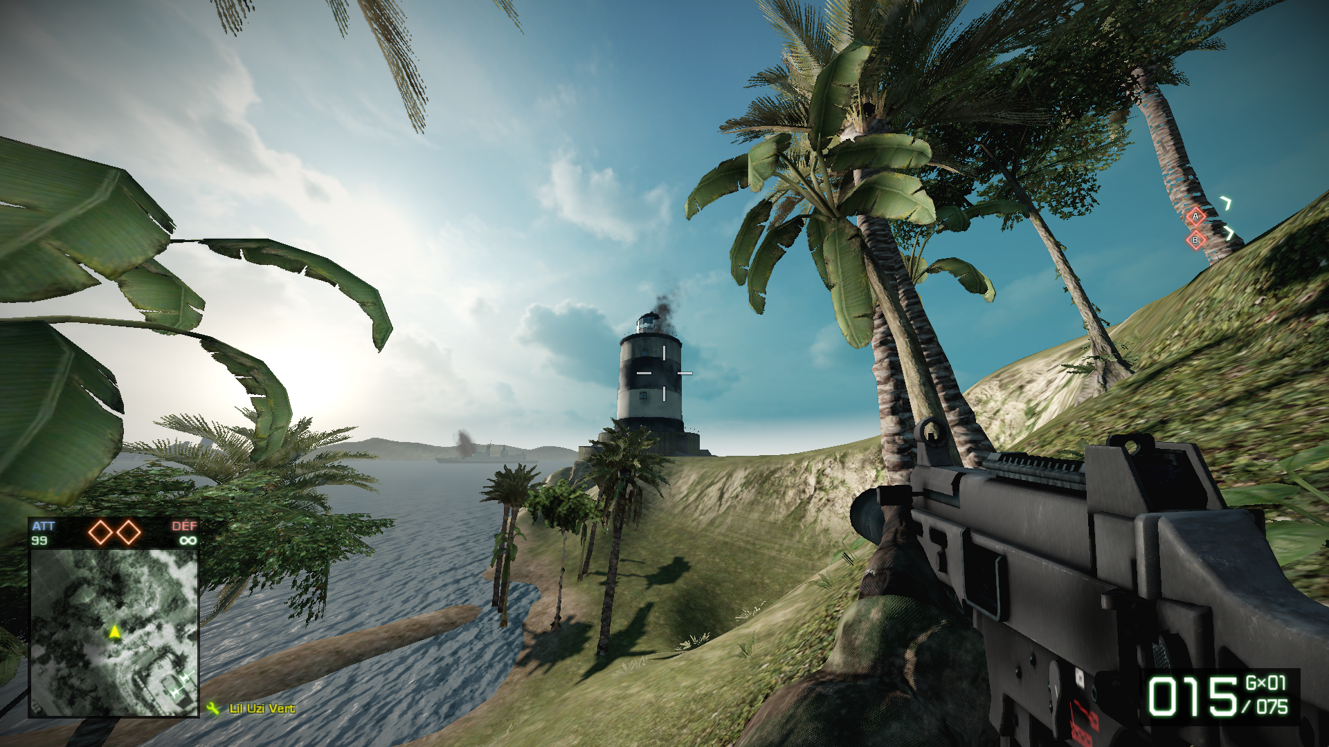
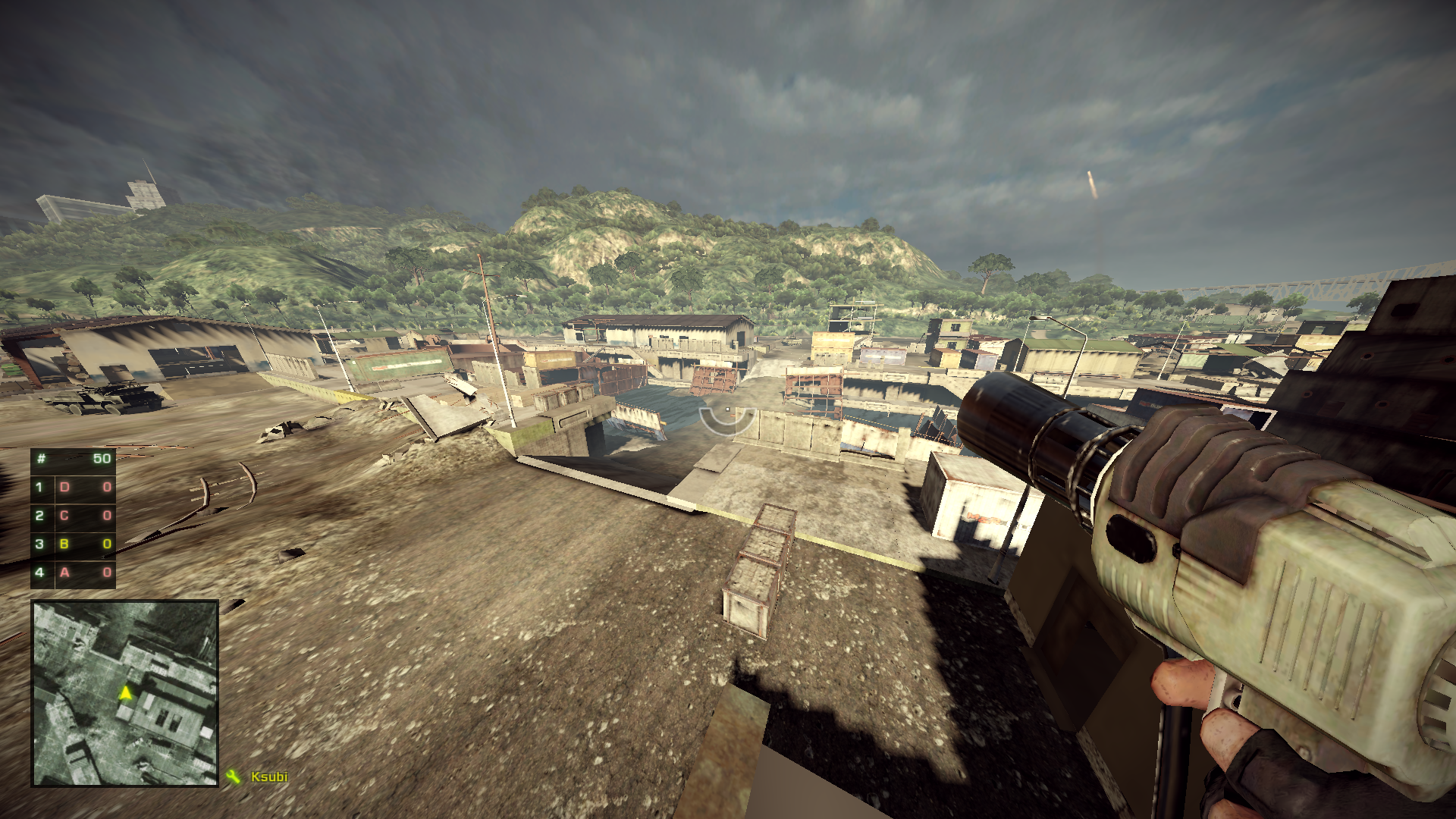
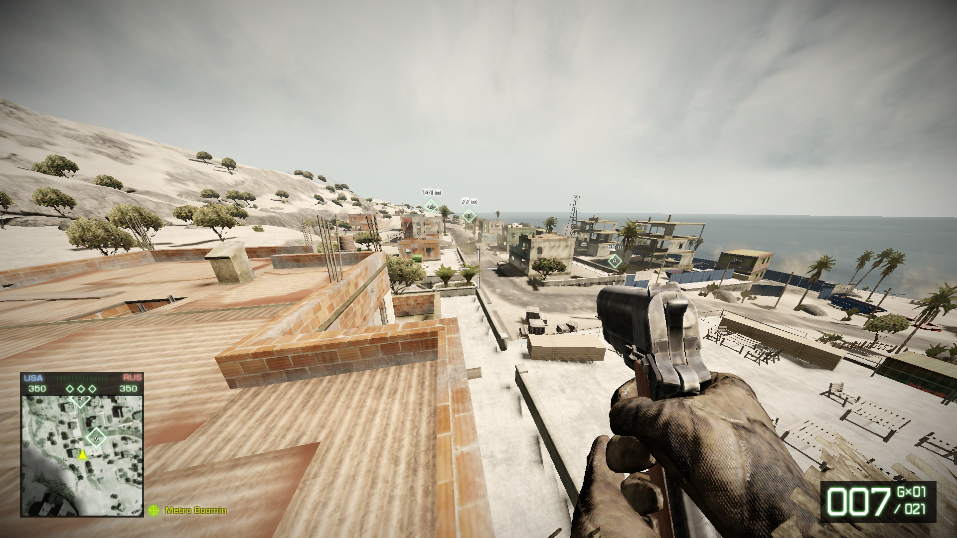
Valparaiso’s lighthouse (Bad Company 2)
Most of Bad Company 2’s maps have a singular building, or setting, to help player differentiate the maps and also give them more personality. For example, Valparaiso’s landmark is its lighthouse. It’s probable that most players refer to Valparaiso as “the lighthouse map”.
Landmarks are unique and memorable locations in your level. They help players locate themselves, in the level but also inside the whole game, and will make your area/level stand out.
FOCAL POINTS
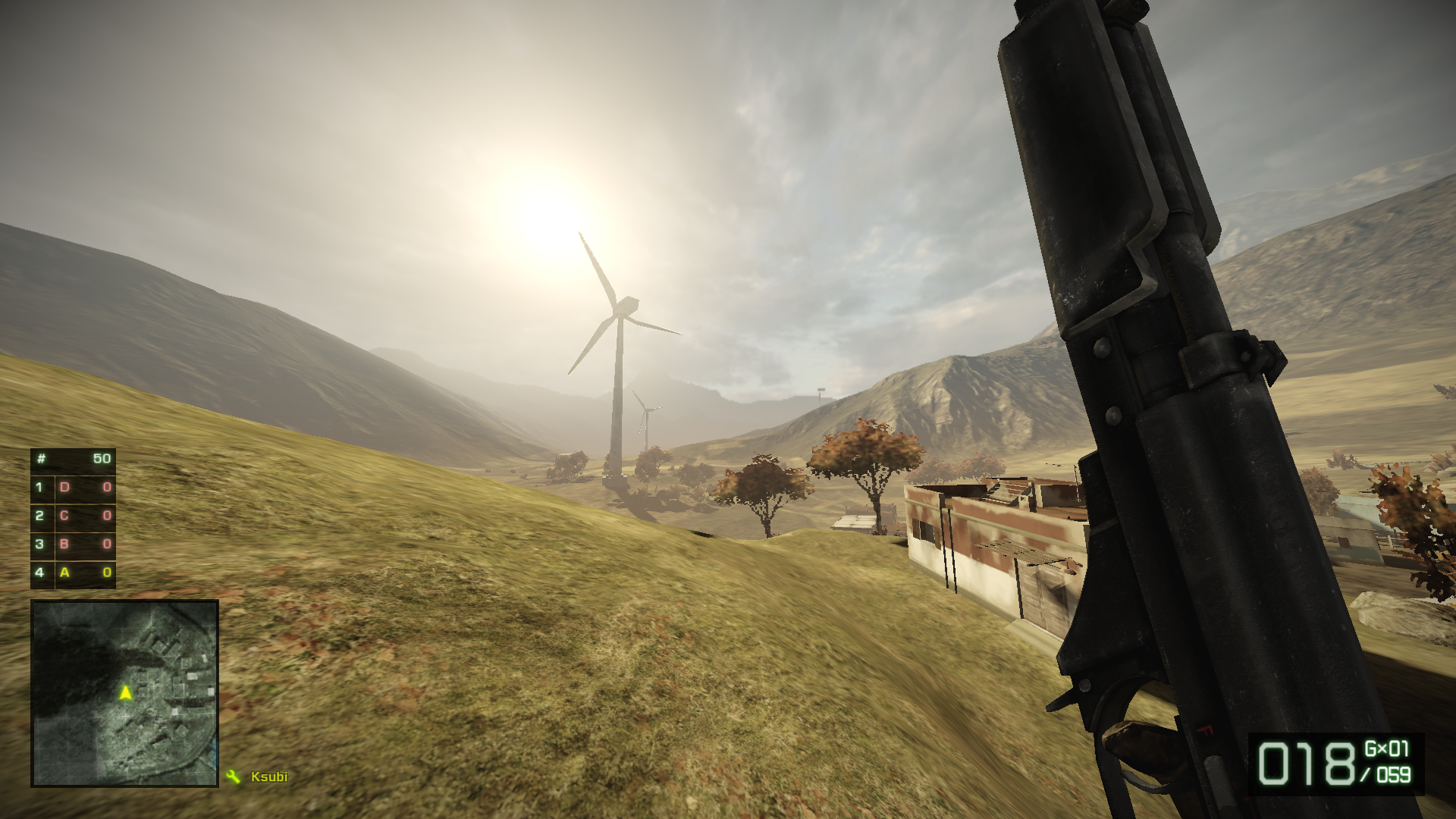
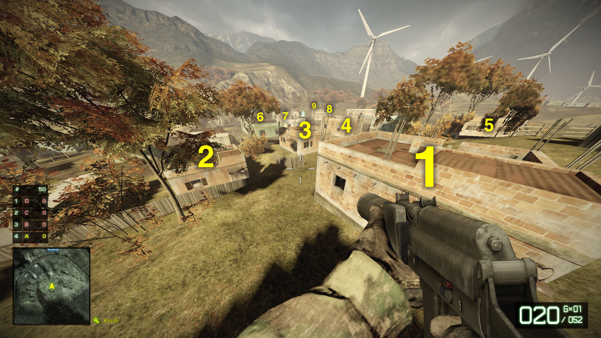
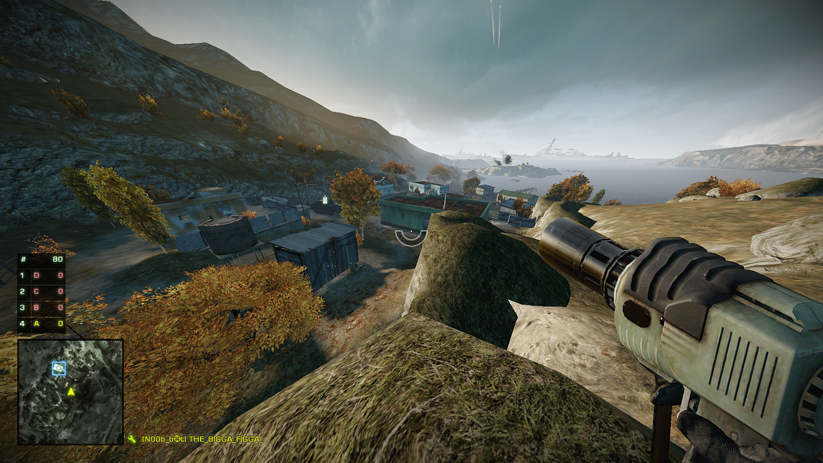
The clear focal points (and landmarks) of Heavy Metal are the wind turbines.
Heavy Metal is the biggest map in Bad Company 2. Heavy tanks fight each other while infantry tries to escape the firefight and go from one flag to another through areas with little to no cover, all while being careful about the choppers hovering over them.
Wind turbines are scattered all along the area. Apart of being a memorable landmark, they are a really practical focal point: by looking at them, players watch the sky, and thus are reminded to be careful about the choppers in the area, as well as the many snipers who are waiting on top of the mountains on the edges of the map (and sometimes on the wind turbines).
A simple focal point can change a lot on how people will experience a level.
Put focal points wherever you want to guide the player’s eyes. From that point, you just have to choose how to make your focal point stand out. Going to extremes is the easiest way to go: Big, bright, colored.
COVER/OCCLUSION
Panama Canal — Bad Company 2
The Bad Company series offered a new way of designing cover, with a fully destructible environment. As you’re playing, walls explode, leaving players more and more vulnerable.
Shootmania grids
In Shootmania, you’ll often find grids in levels. You can’t shoot through them but can watch your opponents movements and give the info to your team. These grids offer cover, but no occlusion.
Cover is about providing… cover (yay!) to the player(s), but can also be used to hide informations from them. It’s called occlusion.
Cover and occlusion naturally happen whenever you put some solid object on your map, like a wall. You can’t shoot or see through them. You can create cover/occlusion with verticality (like the canal in the Bad Company 2screenshot above), but also less tangible ones with lights, shadows, sounds, etc.
Just think about providing interesting situations to your players. The morecover and less occlusion they’ll have, the safer they’ll feel.

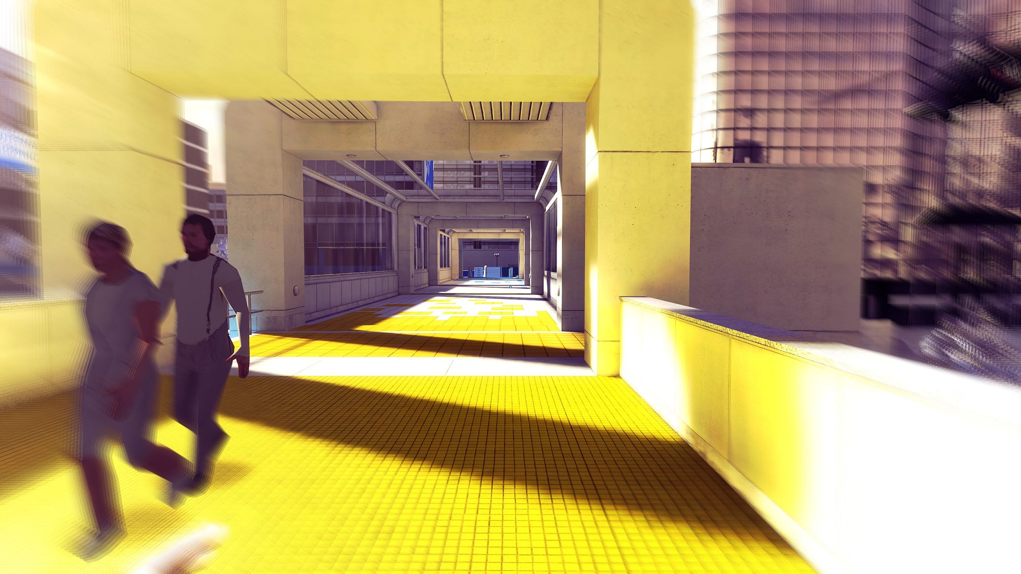
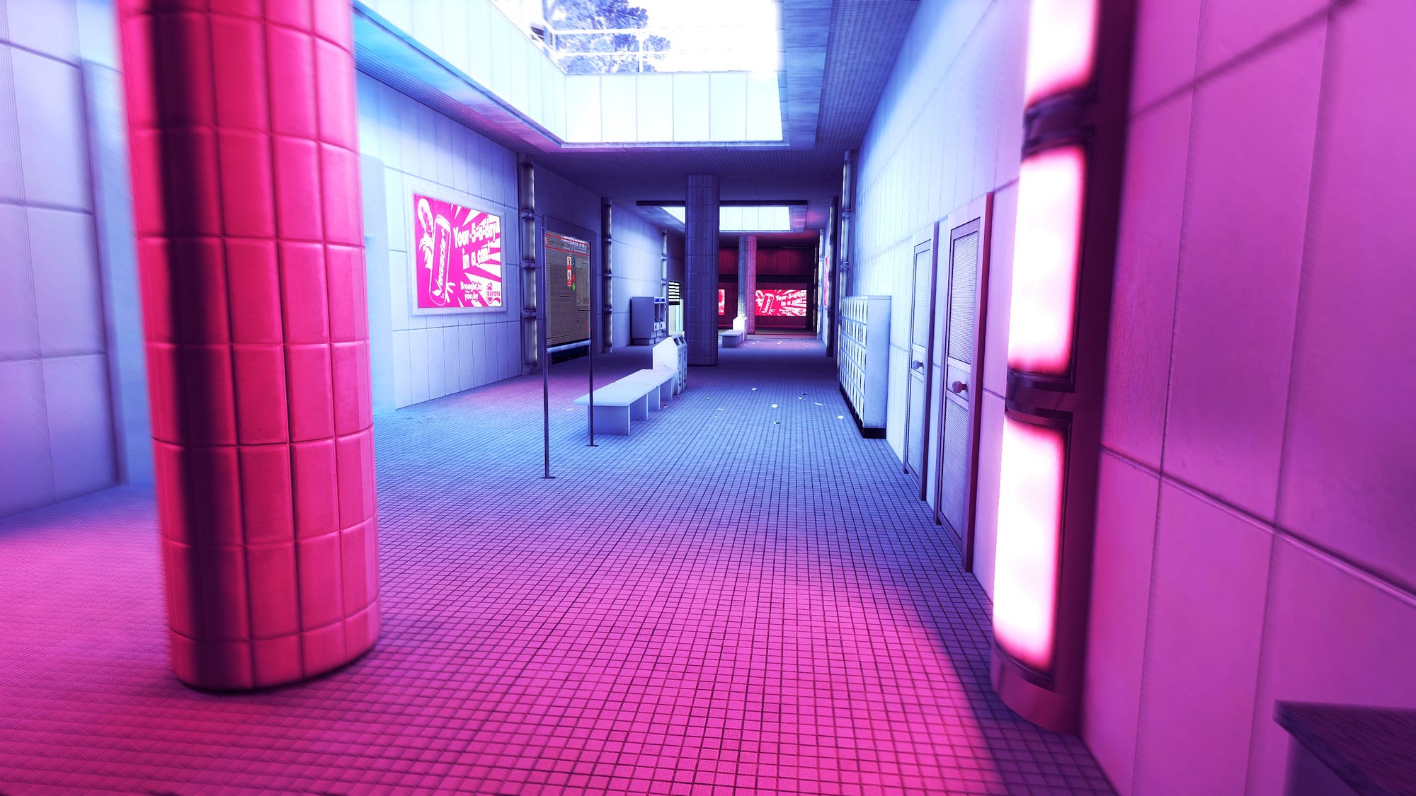
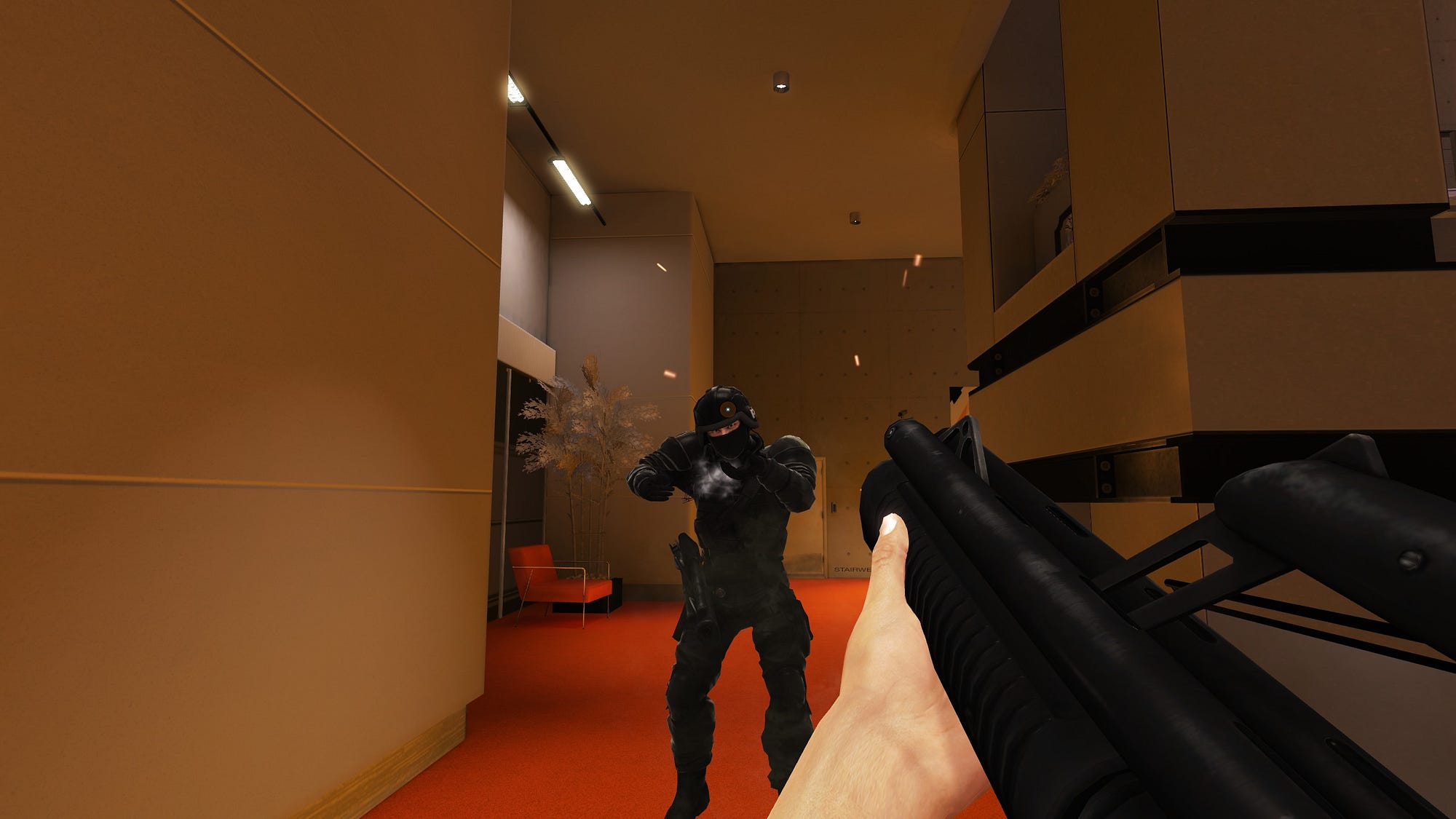
A simple situation involving cover in Mirror’s Edge: Players must take cover to the right to avoid being shot by the cops in the main hallway
WORLD COHERENCE
This industrial area seems functional. (Mirror’s Edge)
Buildings in Bad Company 2 lack coherence. You can’t imagine that someone was living here.
Make sure your environment is coherent with the game’s reality.
To hem your level in the game world, it should always stay coherent: If your enemies are supposed to exist (as in “living THE LIFE”) inside a level, make sure the hallways are wide enough for them to use, that they have toilets and stuff like that.
In the photo above, you can see that Bad Company 2 lacks coherence in its building interiors. It was probably done on purpose to offer better situations in mutliplayer. You sometimes have to sacrifice coherence to offer a better experience, but try to avoid finding yourself in these position.
DESIGN COHERENCE
Red is used to suggest a way to go to the player. The cop is in red too, so you know you’ll have to deal with him at some point. (Mirror’s Edge)
In Mirror’s Edge, the red color is associated with Faith, the character embodied by the player, contrary to usual game codes with red being the color of negative stuff (enemies, traps…).
Some areas are highlighted in red too guide the player in case he doubts what he should do. You’ll never see red used for something not related to Faith/the player.
If the player is used to shooting red barrels every time he sees them because it has always given him some kind of reward, DO NOT create a new situation in the same level / area of the game where he might kill himself if he shoots a red barrel.
It is important to be aware of the “codes” you put down on your game. Players are used to playing this way. Their behavior in games are heavily influenced by other games they previously played before trying yours. They will then confront these global video game codes to the first situations of your game, to try and figure what codes are applying to your game. You must be aware of the messages you convey, especially in your first levels, as they will be the bases the player relies on while experiencing the rest of the game.
Think of your player as a child, with your game being his upbringing. If you send mixed messages to your kid early on, he’ll be really confused later. Be clear about your messages. Have great kids.
One way to fix our red barrel problem, could be to change the color of the new barrel, so the player is aware that he should approach the situation a bit differently.
CHOICES
“Arland”: The first part Mirror’s Edge’s first level
There are at least 4 possible routes to go over the electric fence:
Use the easy, suggested route and use a springboard (the red pipe)
Jump over on the right from the little chimney-thing
Wallrun then walljump from the wall on the left
Go to the middle roof on the left and jump over the fence from there
These 4 choices are presented to the player in a smooth, binary way: you first have to choose wether you want to go to the right (1. and 2.), or to the left (3. and 4.). Then another binary choice is presented.
It adds a lot of value to the level, while still leading to the same place. The player doesn’t feel trapped, or lost, when seeing this situation.
Games are mostly about making choices, and Risk/Reward situations. Be sure to offer your players multiple approaches to the same situation. It adds replayability, and gives the player a better sense of freedom.
Putting minor choices such as the one in Arland is also an easy way to prevent boredom for the players.
Side note: Arland is at a point in the level where the player can take the time to choose his approach. On a chase scene later in the level the player shouldn’t, and doesn’t want to stop running: a unique & clear route is presented.
ASSET LIST/ PRODUCTION LIST
The same building is used all over the same area. And it’s not really a problem: people just want to shoot at each other.
At some point you’ll have to start listing what props, sounds, effects and whatever other thingies you want to use on your level.
That way, you can ask the qualified people if they can make these assets for you, or not. In this case, you’ll have to think about optimization, and modularity.
Your assets should fit well with other assets, in order to have as many combinations as possible among them.
FLOW
Flow is a very important part of game and level design. I recommend that you check Jenova Chen’s thesis on flow. I can’t explain it better than him.
Flow is mostly about making a level challenging enough for the player , without it feeling too hard to overcome.
It is also about making sure the player doesn’t experience any snag: You have to make sure your player doesn’t get stuck on corners, or fails to interact with something etc.
RHYTHM
Rhythm is something I really like to focus on. It’s very close to the Flow and the Game Design itself.
And just like Flow, it’s kinda hard to explain, as it’s really about feeling it.
One way to feel it for me is to think about the inputs the Player will most likely do.
Mirror’s Edge is very good for this. Most of the game revolves around muscle memory, and being in rhythm when doing runs over and over. Putting rhythm in your game will help players get into the Flow.
CHOKE POINTS
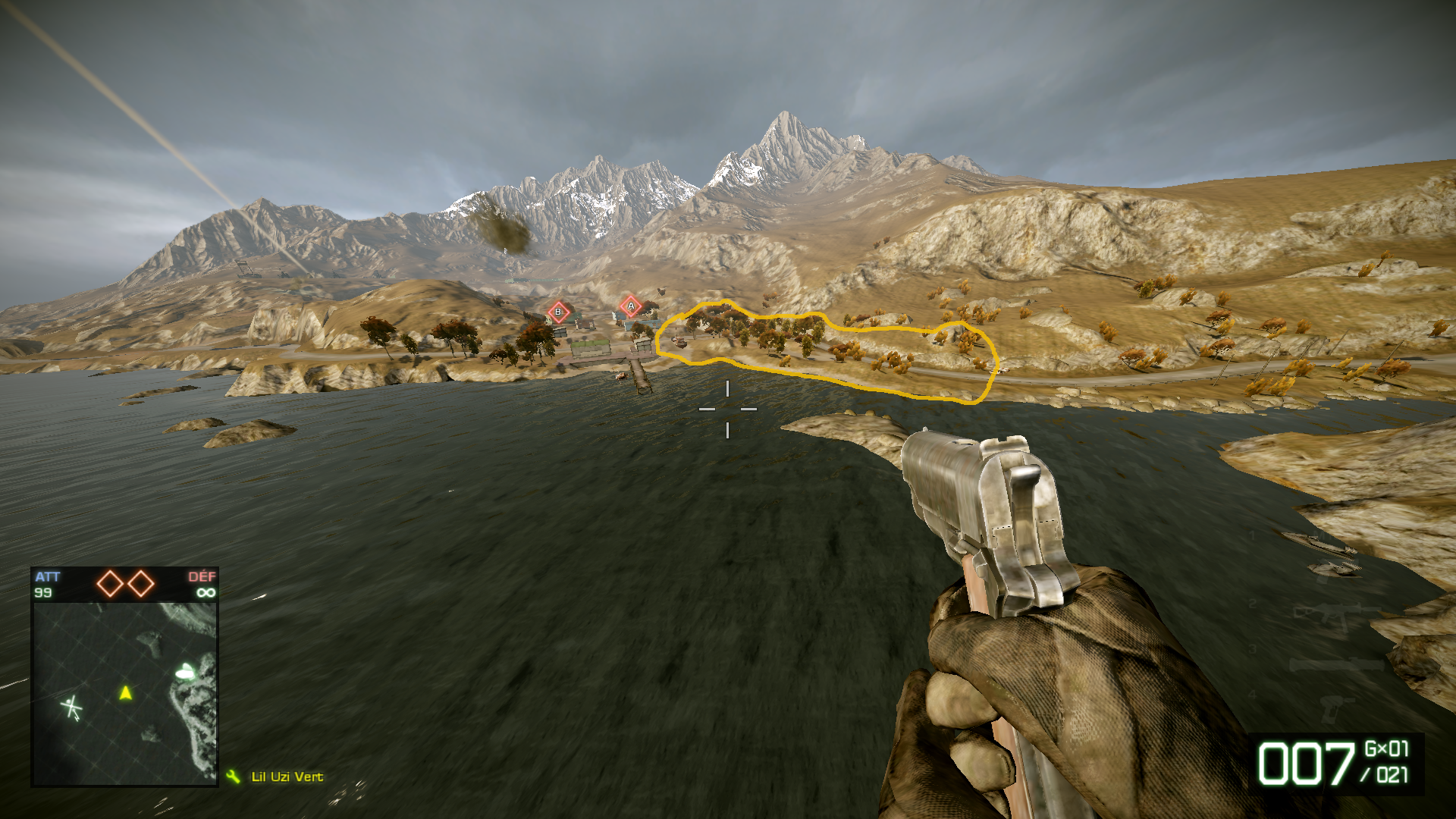
Isla Innocentes’ 2nd base — Bad Company 2
To arm the two objectives from Isla Innocentes’ 2nd base, infantry has to go through a narrow road, heavily defended by the opposite team.
They can also try to attack by sea or land, but time has shown that the victory for this base is almost always determined inside the yellow zone on the image above. Whoever controls it wins the round.
Choke points are the areas of your level where your opponents will most likely meet, and a big part of the fight will go there, with restrained movement.
Counter Strike maps are all designed with choke points in mind. I would suggest you study these maps if you want to learn more about it.
MULTIPLE
I wrote “MULTIPLE”, all caps and everything, on my draft. It must have seemed very crucial at the time.
So it’s staying here until I find what important piece of knowledge MULTIPLErefers to.
CONTRAST — OUTSIDE INSPIRATION
Mirror’s Edge
Contrast is something vital in black & white photography. In order to have a more pleasing photo, and add depth, you have to think about alternating between dark and white zones.
It’s a really precise thing, but a good segway to talk about using other medium’s rules. If you know rules used in photography, painting, cinema, or something else (gardening or sports for example), put them to use when designing your level!
Of course every medium has its own rules and it’s better to design with them, but some of these rules may overlap, and it probably won’t have been done before.
COLOR THEORY, COLOR HARMONY

Same game, different areas, different moods, different colors. (Mirror’s Edge)
The same level (Isla Innocentes) can relay a drastically different mood when changing atmospheric colors (Bad Company 2)
Colors convey different emotions, and can be used to transcribe a specific mood you want to emphasize on your level. Having the same palette used in similar areas of your world is a good thing to do. You don’t need to use extremely different colors by level like in Mirror’s Edge, nuances always are a good option, and better than just throwing random colors around.
BALANCE
Balance is more important in multiplayer games than in solo ones. It’s about providing a fair encounter for all the players.
The easiest way to balance your level is to use symmetry. But it’s been used over and over since the beginning of level design, so now we’re kinda forced to get more creative, and it’s for the best.
If you give an advantage at one area of the map, using verticality or cover for example, be sure the other side also has the same kind of area somewhere else.
N.B.: Most Counter Strike maps are not balanced (and mostly CT-sided), but the halftime alternation in the game design provides some sort of balance to the whole game. Seeing the big picture is important.
Visual balance is also important in levels. Just like composition in other visual arts, most of the time you want to present balanced images to your player, and sometimes surprise him with a very harsh composition. Here again, symmetry is always the easy and sure way, but getting more creative to find balance is way more interesting for you and your players.
DON’T TRY TO DO EVERYTHING AT ONCE
Side note: During this scene, walls are left naked to encourage the player to use powerful wallrun kicks instead of pick a gun and shoot his way out.
Mirror’s Edge run & gun gameplay is shitty: it lacks feedback, slows you down and is overall very limited and boring. It’s like the designer didn’t want you to use guns. And it’s the case.
They made a design decision, and it payed off. The game distanced himself from other FPSs, by emphasizing the lightweight running and hand-to-hand combat.
Your level and your game don’t need to be the best at every possible thing you can find in games.
MENTAL MAPPING
Arica Harbor — Bad Company 2
Arica Harbor is one of the most played map in Bad Company 2. There are many reasons to that, and one of them is the depth and various situations it offers, while staying simple.
Players can locate themselves really easily. They have a mini-map, the A,B,Cflags appear at all times on the screen. Flags are aligned along the main road. There are different heights in the map (to add verticality), but it is painless to remember: It goes down like a stair, from the mountain to the sea.
You should always be careful about your players mentally mapping your layouts, especially when making a game aimed at a large audience.
The easier it is for a player to remember where he went, how the level is arranged, the better his experience will be.
To facilitate mental mapping you can provide unique props or details to help differentiate between two almost identical hallways, put floor numbers in stairs, vantage points, landmarks, focal points etc.
Keeping the same logic throughout a level also helps a lot.
If your game involves backtracking, mental mapping goes from important to REALLY FUCKING IMPORTANT.
No-one wants to get lost in a game, trying to find an exit. Make sure you are helping the players as much as possible to avoid frustration.
CUT THE NOISE
As fun and tempting as it can be for a level designer, you shouldn’t add too much to your environment. Having dull and empty areas is not a good thing, but over-saturating it with props everywhere will just make it worse.
Details in your map must not come in the way of playability.
DO WHAT YOU ARE
“Leper Squint”
At the end of the day, you should still feel that the level you designed comes from you. These points are important, but it’s the only one you should always respect.
It doesn’t matter how hard you try to make your level/game feel different, or look like a particular style, it will never feel unique unless you invest a part of yourself in what you create.
Alright, that was my advice on level design. I’m a piece of shit, so some of these points might seem wrong to other gamedevs, or wrongly named etc. But hey, feel free to call me out on it, or write your own advice piece.
I like talking about LD in general so whether you have a different opinion, or are a beginner seeking advice, drop me a DM, a comment, a mail, shout my name really loud… be original, I’m not going to list all your options. Although they’re here.
- Niels
We hope this article will be useful!
Get in touch with us if you want more clarity on a point, or would like to request another subject for an article.
Read more about:
Featured BlogsAbout the Author(s)
You May Also Like


.jpeg?width=700&auto=webp&quality=80&disable=upscale)


