Daily news, dev blogs, and stories from Game Developer straight to your inbox
Sponsored By
Featured Blog | This community-written post highlights the best of what the game industry has to offer. Read more like it on the Game Developer Blogs or learn how to Submit Your Own Blog Post
Pokemon GO and the good things that can come from a bad UI
Web and App development UX is about removing friction, games UX is about meaningful friction. Pokémon GO's confusing UX/UI is applying meaningful friction and is feeding into the dense social experience of the game. Here's why.
8 Min Read

"A user interface is like a joke - if you have to explain it, it's just not very good"
You may have heard someone in your life say this or post this on Facebook (perhaps that person is an artist or designer of some sort!) and it's generally true! Interfaces should be intuitive and user interface and user experience design are usually focused on removing friction. When you're designing an app or a website, it's the job of the UX or UI designer to make the experience as streamlined, clear and frictionless as possible. The dream of the 90's is alive in Pokémon GO - everyone is a Pokémon trainer and Pokémon are everywhere. Pokémon GO's UX and UI are the subject of just about every single conversation I've had about the game. Casual players encountering it for the first time tend to be confused as to how to do anything in the game, bolstered by the novelty of catching a bunch of new Pokémon. What do I do with these guys? Can I fight them? What's a gym battle? Why can't I level up my starter Pokémon? Heck, even experienced players such as myself can find themselves confused, mostly because Pokémon GO does very little to teach you about what stuff actually does in the game. I'm not saying it's poorly designed, but it does raise some eyebrows. I actually really like some of the major UX affordances such as the main Pokeball button being ergonomically placed in the optimal spot for one-handed play. It even turns into the close button after you pop open the modal! That kind of interaction is enough to make a UX designer swoon.
I'm convinced, though, that if they modelled their UX after what else is out there in the App Store the game wouldn't be as big, wouldn't be as sticky. It certainly wouldn't be as social! Only Pokémon could get away with this kind of thing right now. The brand is huge enough to keep people invested even if the interface is confusing.
Meaningful friction
The majority of free to play games in the App Store are very hand-holdy (technical term) during the tutorial/first time user experience. Step by step instructions and exposition are paired with highlighted buttons and big bouncing arrows forcing you through an often patronizing flow. But as games become more like apps, presenting players with a good user experience is not just expected, it can be the thing that differentiates you from your competition. Web and App development UX is about removing friction, games UX is about meaningful friction. Pokémon GO's confusing UX/UI is applying meaningful friction and is feeding into the dense social experience of the game. Here's why.
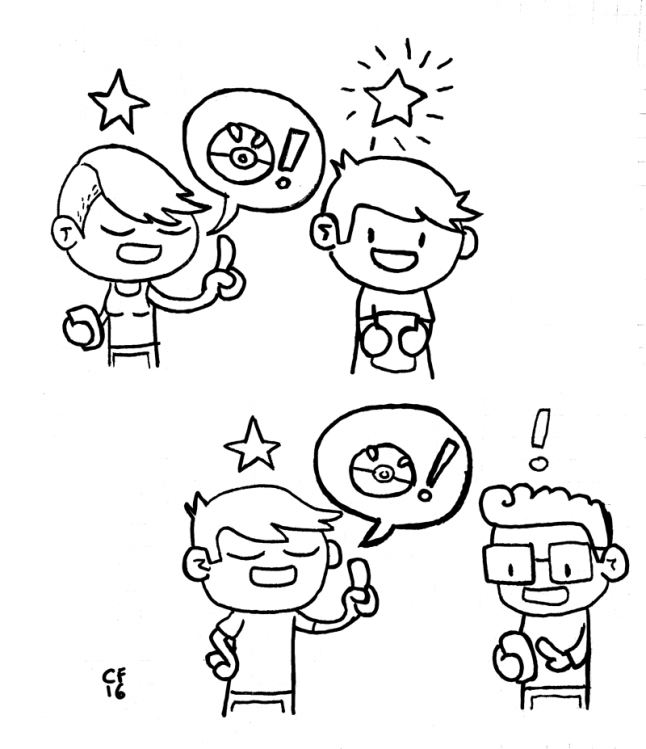
Sharing tribal knowledge about games makes the experience of playing a game better. When you are "in the know" you're in the cool kids' club. You then get to initiate other players into the cool kids' club, and you feel smart for it.
Heavy-handed tutorialization is the norm
The biggest thing that has stood out to me about Pokémon GO's launch isn't the ubiquity of the game (literally anyone I see walking down the street staring into a screen I assume are playing Pokémon GO) but the complete lack of hand-holding bouncing arrow tutorialization so ubiquitous in the vast majority of F2P games topping the charts. I doubt the lack of a tutorial was intentional - it's incredibly difficult to predict any kind of emergent behavior from your player base. But what Pokémon GO is benefitting from right now is a emergent mentorship that almost completely replaces a traditional tutorial. I would argue that this emergent mentorship is even more powerful than an actual tutorial. Mentorship increases engagement through social bonds. You've probably experienced this already with Pokémon GO: teaching a confused player something about the game that you've figured out already not only makes you feel smart and altruistic, it assuages confusion for the person you've mentored in a way that is highly personalized, and therefore more impactful. An in-game tutorial or series of tooltips will never top being able to ask questions of an expert when it comes to learning a game. Pokémon GO has a tips menu that you can bring up on your own (if you manage to find it in the settings menu) but that's it. I'm not convinced that Niantic intentionally obfuscated their UI, but I think it's actually integral to the experience. That's because UX/UI in video games greatly benefits from the application of "meaningful friction" - intentional or not.
Think about playing a new tabletop game for the first time. The majority of the time you're learning with a friend who has already played the game. You can ask questions, and get your learning experience tailored to the way that you learn best. It is incredibly difficult to replicate this experience in a video game. How do you create a single tutorial system that accounts for 100% of players of your game when there are different personas, different styles of learning and processing information? In the case of Pokémon GO, you don't! And you reap the rewards.
Quality of life improvements
While I'm not convinced that Pokemon GO should change their overall UX and UI philosophy, I do think that there are a number of quality of life improvements that could be made to the game.
(Disclaimer: I played a lot of Ingress and I'm UX lead for Plants vs Zombies: Heroes. I am not representing PopCap games in this article. These are my own personal recommendations and are not representative of any general thinking by the organization that employs me.)
Make getting items from Pokestops easier
Please don't make me tap into the Pokestop, wait for the animation to zoom in, wait for the data to load, spin a little thing, then close out of the Pokestop. In Ingress you can tap and hold on a portal to bring up a menu of common actions, including "hack" which is the same as spinning the coin in the center of a Pokestop.
Improve the loading experience
Beyond optimizing the game so that it loads faster, the load screen could use some love. It's not always the case that I'm just loading game assets. Some more relevant information such as "syncing with server" would help me understand why the game is taking so long to load.
Maybe if I am going to see this loading screen so much, it would be nice to see some different/varied screens. Rotating through a list of 5 different loading screens each with their own "pro tip" or safety message would keep me from just shutting the app off every time it hangs on load. At the very least I'd stop giving an audible grunt every time I see that damned Gyarados on the screen.
Get rid of the made by Unity splash screen.
I assume Niantic has paid for a Unity license. Dudes. You know you can just turn that off, right? It's in the build settings. You can totally just turn it off.
Reeinforce the core loop
Ok, so the early player experience consists of this core loop:
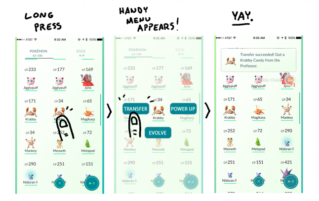
Collect all the Pokemon you can see > Transfer duplicate Pokemon to the Professor to get candy > Power up and Evolve Pokemon to gain XP and level up > Repeat
If transfer is the most common action, please make it easier to access. Here are the steps you currently have to take in order to complete this incredibly common interaction.
Tap the main Pokeball button.
Find the duplicate Pokemon you want to transfer
Scroll all the way down to the bottom of the stat sheet
Wait for the location map showing where it the Pokemon was first found to load because sometimes it doesn't load right away and it causes the transfer button to move its position.
Tap the transfer button and wait for the box to pop up
Tap "yes" on the box
Wait for server confirmation
Repeat
.png/?width=646&auto=webp&quality=80&disable=upscale)
Let's either move the Transfer button up to a more accessible location, or better yet how about a long press on a Pokemon brings up a menu of common actions, including Transfer. There ya go.
Contextual tutorialization
Tooltips when you first open a gym would be nice - what does that meter do next to the photo? What is the difference between the single boxing glove button and the double boxing gloves? Who knows! Contextual tooltips are fantastic, and it's something that Sebastian Long talks about in his Pokemon GO UX evaluation post here. He has a ton of great recommendations, but again I'm not convinced Pokémon GO needs an extensive tutorial, or even clearer affordances for common actions.
The less-than-intuitive UI may not have been intentionally confusing on Niantic's part, but they certainly stumbled upon something magical: the power of the community. It's incredibly difficult to orchestrate emergent behavior in your game. The best you can do is ship something decent enough to be usable, then observe what happens after your game is in the wild.
Read more about:
Featured BlogsAbout the Author(s)
You May Also Like


.jpeg?width=700&auto=webp&quality=80&disable=upscale)


