

Trending
Opinion: How will Project 2025 impact game developers?
The Heritage Foundation's manifesto for the possible next administration could do great harm to many, including large portions of the game development community.
How the developers of Deadlight stepped back from their puzzle system -- which absolutely was not working with the way their game was designed -- and reenvisioned it to much greater player satisfaction.
June 5, 2013

Author: by Lucas González
During the last year I've had a lot of opportunities to think about what puzzles are and what their role in video games is. I know that I'm not the first to write about this, and that many other experienced game designers have their thoughts on this topic, but I also had my own, personal, trial and I do believe that the lessons my team and I learned will be helpful for any designer that has to face a similar situation.
As a new member of the Tequila Works team, I was specifically hired to be in charge of the "puzzle design" of the studio's first game, Deadlight -- a cinematic platformer set in a post-apocalyptic Vancouver, published on Xbox Live Arcade by Microsoft.
When I came aboard, one year before the estimated ship date, I was told that the team already had a game -- actually a nice one -- running, but that they needed someone to "design the puzzles." After several years designing video games, it was the first time I had to deal directly with this essential part of many video games.
I should probably explain my previous experience as game designer. It will be enough to mention that I worked on the design of some of the levels of NyxQuest: Kindred Spirits and The Fancy Pants Adventures, which are pure 2D platformers. These required from me to create interesting layouts, gameplay situations, and simple switch on/off puzzles for the player to solve.
Top: NyxQuest: Kindred Spirits. Bottom: The Fancy Pants Adventures
The situation I was facing now was different that then most of the gameplay situations I had created or polished -- these were twitch-oriented, skill-based situations in which the player was supposed to react accurately under stressful circumstances (i.e. perform a series of jumps while the floor is falling down). In Deadlight, the puzzle situations would be much more deliberate and slow-paced.
It should be understood that the puzzles were considered key to Deadlight, together with the navigation and the combat, to the initial core game design.
One of the main objectives of the puzzles was to extend the game experience without increasing the size of the levels (which were really expensive to produce).
As you might know, one of the classic problems you find while creating a new platformer is that the player can move forward pretty fast and go over many "screens" if he has nothing to do but navigate. It's simply impossible to fill the world with so many scenarios. Given that, it's important to slow down his progress. Common solutions are to force the player to go back to a location in order to find something, to revisit areas to perform different actions, or to introduce vertical gameplay.
When I began work on the project, Deadlight had only combat situations to slow down the player. But this wasn't enough, as the combat system wasn't designed to sustain hours and hours of gameplay by itself.
Apart from this practical consideration, it was decided that Deadlight should be much more slow-paced than a typical platformer thanks to its theme. We were creating a game about studying the environment as a survivor would: to find useful items and to bring them with you, and to be smart while navigating a devastated world.
Deadlight used to have an inventory system. As in the old graphic adventures, it was possible to keep, use, examine, and even combine items.
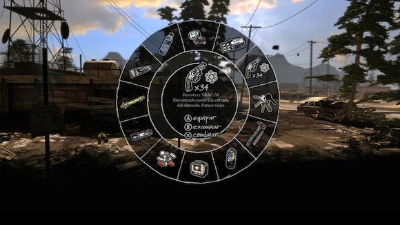
Deadlight's inventory system
As a game designer, the first time I heard about this feature, it totally made sense for me. Randall was a survivor in a zombie apocalypse, and survivors need to make the most of the environment in order to maximize their chances of surviving. Looking for useful items in piles of trash, searching rotten bodies, carrying apparently useless items that suddenly are the solution to deadly problems -- these are clichés in the genre.
An inventory completely suited the mood and the concept of the game. Something necessary, a game mechanic that would support the direction of the concept -- perfect!
At the same time, it looked like it would expand our gameplay, providing us with a powerful tool to create hundreds of different variations on puzzles. Everyone in our team had played classic graphic adventures, where the inventory was key for solving the puzzles.
Finding, using, and combining items seemed it would be the solution to our problems. It seemed that it would allow us to increase the length of the game without relying upon the size of the levels.
And so we started to design graphic adventure-like puzzles. I still remember most of them; for example, at one point in the first act, the player needed to find a gas can, fill it with the fuel of an abandoned car, and then use the gas to fill the fuel tank of a fire truck. After doing so, it was possible to move the ladder of the fire truck and continue.
This is where the fire truck was
Deadlight is an old school game with an inventory, but it isn't a graphic adventure. Graphic adventures rely on players revisiting areas in order to look for missing items and to try new item combinations. And at that moment, we couldn't support this backtracking.
Firstly, we had already built a lot of the scenarios of the game (around 40 percent of the content was already there), and they simply hadn't been designed for it. They had been conceived as a completely linear, cinematic experience.
Zombies and traps were triggered assuming that the player will arrive from a specific direction; cutscenes were triggered on the same basis; even the navigation and the layout were meaningful and interesting only if the player was moving in a predefined direction.
That means that if the player decided to go back, he would find completely dead and empty areas without any interest. Backtracking would have been painful and boring.
Secondly, as Deadlight is a game that relies heavily on graphics, we had plenty of no-turning-back zones in order to deal with the streaming of Unreal Engine. If the player misses an object in one scene, we simply won't be able to go back for it.
In the end, we had already created an extremely linear, but appealing, game experience. And then it was supposed we should simply "add puzzles" to it.
We tried to include a few inventory-based puzzles, but we simply didn't have time to rebuild the levels. We had half a year for the alpha submission and we still had to finish the ranged combat system, the AI, the melee...
We desperately needed to close the layout of all the levels. We didn't have time to keep looking for solutions. So we decided to cut the feature. Our puzzles couldn't rely on an inventory system.
We changed our focus, starting to look in more detail at games of reference. At the end of the day, Limbo was an extremely successful game full of puzzles and no inventory.
Removing the inventory meant that the player would not need to look for and to carry items to solve the puzzles. But we still believed that making the player to explore and investigate was something really important to establish the mood of the game.
Moreover, our artists had already created dozens of evocative, highly detailed game areas, some of them off the main path, and it would had been painful to not guide the players to them.
They only thing we could do was to take the collectibles and the ammo picks and make them play this role. In this way, collectibles turned out to be something much more important than just an achievement or a trophy. Apart from their narrative role, they let us to populate every corner of our maps with something to reward the players and to foster that survivor-like exploration we were seeking.
The other big consequence of removing the inventory was that we needed to simplify the puzzles we had already built. From that moment, all the puzzles had to be solved using just the navigation system, simple combat actions, plus the standard interaction button: "Press A to do X," where X could be "open a door," "turn on the lights," "push the crate," etc.
In other words, we started to morph our graphic adventure puzzles to Limbo-like puzzles.
The good point here was that we could rely on game systems that were already (more or less) working, so we were able to playtest the puzzles as we were creating them.
We didn't realize this then, but now it's as clear as day: on the top of all the other problems, we were trying to create inventory puzzles with a completely unfinished UI.
Creating puzzles without being able to properly playtest them is impossible. This is something naturally assumed when dealing with combat or action situations, but it proved to be also true for our slow-paced puzzles.
Our puzzles didn't need complex dynamic systems working; they needed a nice UI, responsive controls, and clear feedback -- all features we didn't have at that time. Designing them without these was useless, and yet we weren't aware of that.
You need to see your player reacting to the puzzles and not fighting the controls or missing key information because of the UI.
Dropping our messy, work-in-progress, inventory UI from the puzzle creation process was something that, in the end, sped up development and to sooner enter the iterative loop.
At first, our natural impulse was to preserve the progressive complexity of the puzzles. In our previous approach, with the inventory system, our first puzzle was a simple as "use the only object you have." Next: "find an object, use it." Later "find an object, examine, and use." Find object A, use A, find object B, use A again, combine both A and B, use the new one," etc., etc.
As you can see, we were trying to follow the path of our beloved old-school graphic adventures. Even after abandoning the inventory system, we tried to preserve this progression.
Our first puzzle was an "interact", then a "go there, interact," then "interact, make noise, run, interact," etc.
But when we, the designers, playtested our new puzzles with the rest of the team, we discovered that even our simplest puzzles were challenging, obscure, and unintuitive. People didn't really get stuck, but they didn't know what they were supposed to do. They were simply playing, but everything was "grey," noisy, boring.
And the main reason for that is that the navigation and combat system were just too ambiguous.
One of key things to keep in mind while designing a puzzle is to minimize the number of variables that the player should evaluate in order find the solution -- those needed in order to make the game state evolve to the state that solves the puzzle.
The other key thing is clear feedback each time the user tries a solution, to let the player evaluate if his actions are correct or not.
If you are creating inventory-based puzzles both things are much easier to do: Either you have the item or not. Either you have tried it or not. If you try it and it's the correct item, it works. If not, it doesn't.
In a realistic game, like Deadlight, with puzzles based on the position of the player and the enemies, on their speed... the user cannot evaluate anything. Most of the game states look the same and he cannot check if he is performing the correct actions or not. The feedback is way too subtle to be useful.
Then, we tried to simplify our puzzles even more. To make them more binary: either you do the proper action or you won't be able to progress.
However, each time we playtested a simplified version of any puzzle with the team, we realized that it didn't work. At that moment the feedback we were receiving from our publisher, Microsoft, was exactly the same.
We made dozens of layouts and small variations of certain areas, especially at the beginning of the game; at the same time we felt that we could not over-simplify these situations. We were always trying to keep something of the elements that we believed puzzles should have.
But it didn't work. We keep simplifying and, suddenly, the most "over-simplified" situations turned out to be the most satisfying for the players. I could verify this firsthand when I showed the game at PAX East.
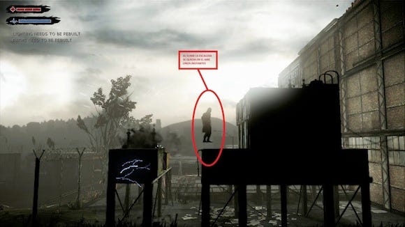
In this section I'm going to explain how and why we modified the layout of one of the sections in the first part of the game.
If you have played the game, you will probably remember this area:
This diagram represents it:
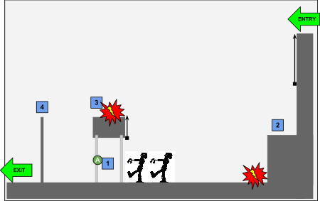
This part of the game can only be solved in this way:
The player can only access the exit by jumping over the fence (4) from (3).
At (3) there is a shock hazard that kills the player.
The player must interact with the contextual action (1) that deactivates the shock hazard of (3).
The contextual action is "guarded" by two zombies. At this point of the game the player is defenseless and must not come in contact with the zombies.
The only option for the player is to taunt the zombies from (2). Zombies are attracted to the player and get killed by the hazard below. The way is then free for the player to interact with (1), get to (3) and jump over (4).
If the player doesn't taunt the zombies from (2) and jumps over the hazard, the zombies start moving towards him with no possible exit.
On the top of that, as the player gets to (2), a huge "Tutorial Hint" appears on screen, inviting the player to taunt the zombies.
As you read it, it might sound a bit complex, but as there is only one solution and any other attempt always kills the player, which is the clearest feedback. The players are actually completely guided toward the correct solution.
"Guided," yes, but they feel that they have been smart enough to cheat two zombies, unblock his path and find the exit.
However, this area used to look like this:
And this is the diagram of this layout:
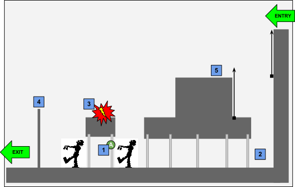
The idea behind is exactly the same as the other version: the player must attract the zombies to (2).
While the zombies are moving to (2), the player must go over the big generator (5), interact with the contextual action (1) to deactivate the hazard at (3), climb to (3) and, finally, jump over the fence (4) to access the exit.
It seems like it would make players feel smarter than the previous one, right?
This is what we thought, as designers:
The player can navigate the area and it is not restricted to a small safe zone: more freedom.
There's no need to use the "taunt" action. The player might walk near the zombies and then run away: more choices.
The player has to perform an action while the zombies are still "active": more challenge.
So more freedom, choices, and challenge -- that sounds great.
However, this is what's going on in the player's head:
There is not a clear place to start.
The generator (5) is something big, with a complex shape that seems to have a hidden purpose. In addition, it's not clear that the player and the zombies can walk behind the obstacle.
There is nothing that tells the player if what he is doing is right, wrong, or pointless.
No clear feedback and multiple solutions: Noise. The worst enemy of the designer.
This quick example shows how a simpler layout, even though it might look less interesting is, in the end, much more satisfying for the players.
Another example: a complex puzzle where the player needed to find two steam valves and place them in their correct places and use them, became a simple situation in which the player just needed to interact with a valve in order to lower the level of water of a tunnel and pass through. Of course, some zombies would try to grab him as he passes.
This "puzzle" became more of a "scene" -- something that the player experiences and not something that the player has to do. But this worked. It really worked for most of the players. They were engaged while playing through this scene.
And so, we kept transforming all of the puzzles we had. Then is when we stopped calling them "puzzles" and started to call them "gameplay situations" or just "scenes."
Some of them became so simple that, in the end, the player only needed to run forward, to press a button, to find a hidden spot in a room, or even just to jump over a zombie.
My favorite example is the scene where Randall finds the fireman's axe. It's extremely simple, but I could see the satisfaction face in every player as they get stuck in the fence -- maybe for five or six seconds -- and then realize that there is a fireman's axe stuck on a body. They grab it, watch Randall's animation, and then use it to break the lock of the fence and advance.
It's simple, it's easy to solve -- but it's rewarding. And the player feels smart.
The fireman's axe scene
And so we started to create these scenes, all through the game, exploiting the game systems we already had and adding different elements to each level to keep the game interesting and to create variations.
If a level had a helicopter, we had to create puzzles using the helicopter; if a level had traps, we had to use the traps. And so on.
We learned the path from the "depth of mechanics" to the "width of mechanics" the hard way. We reduced the complexity of the puzzles, but we increased the variety of them.
This is the approach that games such as Limbo or Amnesia take. Actually, Frictional Games' Thomas Grip has posted about this issue.
As old school players, we tend to look for games such as Braid or Monkey Island, which try to challenge players. But the kind of immersive, cinematic experience we wanted to deliver fitted better with the other approach -- and classics such as Another World and Prince of Persia did so, too, so it's not as if we're straying from our roots after all.
Deadlight got a 69 on Metacritic. We know that there are many things that we could have done better, but I believe that the overall "puzzle" experience has been positive for the players.
Read more about:
FeaturesYou May Also Like