Featured Blog | This community-written post highlights the best of what the game industry has to offer. Read more like it on the Game Developer Blogs or learn how to Submit Your Own Blog Post
Loot Quest: From Ruminations to Release
After nearly 2 years of development, it's interesting to look back at my old moleskine notebook with the 6 scribbled pages where Loot Quest was conceived. I'll reflect on how far it has come and where the iterations took us.

[Cross-posted at http://www.elliotmax.com/. Follow me on twitter @maxmillion]
After nearly 2 years of development, my team at Uken Games soft-launched Loot Quest to Canadian iPads. With that milestone, it's interesting to look back at my old moleskine notebook with the 6 scribbled pages where Loot Quest was conceived in September 2012.
I was driving from Toronto to Allentown Pennsylvania for a friend's wedding and got to thinking about what Uken's next mobile RPG could be. That weekend a bunch of the ideas swirling through my head began to take shape. Just before my drive back to Canada, while eating horrifyingly (see: deliciously) sugary pancakes at a Bob Evans, I began to jot down some notes.
The basic premise came out of looking at where the iOS RPG market was at that point. Led by Rage of Bahamut, Legend of the Cryptids, and Blood Brothers, a group of similar Japanese RPGs had been dominating the iOS top grossing charts. Most of these games were minor variations on each other. They used the structure of a CCG where each card was a unit/monster. The ubiquitous crafting system saw cards being sacrificed to improve other cards and then identical cards would be fused to raise their quality tier. Most of them had automatic tap-to-continue questing and instantly resolved battles, focusing all meaningful interactions into building your deck. I looked at those games and wondered where we could innovate and how we could expand the audience while preserving what drew in so many hardcore players.
Well first off, what if the basic collectible premise was rethought? Instead of units as the primary collectible, how about the more traditional RPG structure of collectible equipment for a smaller set of distinct characters. We could foster more emotional attachment to the characters (rather than replaceable monsters) while providing a lot of room for equipment customization.
This heroes-with-equipment premise probably has been most consistent from start to finish. We still have the choice of 3 starting characters, each with stats and a special ability, who can be equipped with upgradeable items. The number of stats and equipment slots did change over time. Initially we pared the stat list down to Health, Attack, and Speed stats for simplicity, but this also limited some of the strategic variation. To add clearer counter-play we divided "Attack" into "Strength" and "Intelligence" corresponding to Physical and Magic damage/resistance.

Pretty early on we settled for 3 equipment slots, trying to balance complexity of inventory management with enough variety. The Weapon and Body Armor slots stayed consistent but the third slot required a few iterations starting with an off-hand slot (allowing for weapon+shield, dual-wield, and 2-handed weapons). Managing those variations created some awkward flows and edge cases that we wanted to avoid, as a streamlined inventory was seen as one of the highest priorities. For a time we went with helms as the 3rd slot, but frankly we didn't like the visuals with hiding heroes' heads and mismatching armor. Finally we settled on an "accessory" slot where we could provide meaningful bonuses without needing to represent the items on the characters.
Next I moved on to the basic quest and combat interactions. Here's where the final product drastically diverges from the early concept. When pitching Loot Quest, we expected to use the core HTML5 engine Uken had developed for the earlier game Mighty Monsters. That meant significant limits on interaction complexity and responsiveness. We were expecting a presentation more along the lines of Blood Brothers with largely static 2d assets. But we knew we wanted more meaningful interactions than just the "tap-to-continue" gameplay of many other top RPGs. The solution we came up with was moving the focus to exploring the dungeon.
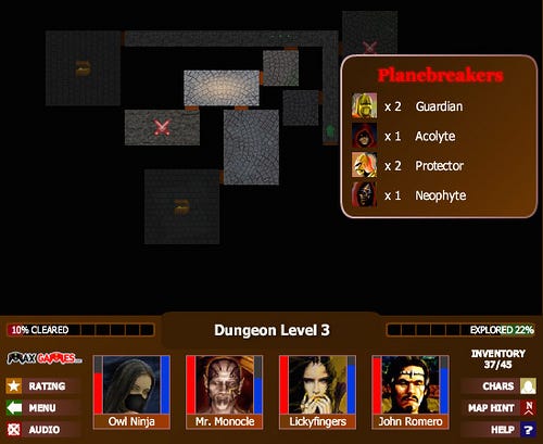
Inspired by the Monster's Den flash games and simple Rogue-likes, we wanted randomly generated dungeons where a single tap moves between rooms. The earliest mock-ups looked like a more colourful Monster's Den map. Battles, chests, and Diablo-style shrines would then animate in a more detailed zoomed-in pop-up.
By the time we started development, we had decided to make the transition from HTML5 to Unity. The new engine would greatly expand our options, plus the Loot Quest team would be able to learn skills and build infrastructure for any future projects that might be use Unity. Along with Unity came a very different visual style from what we proposed with HTML5. The goal was to set a visual standard far beyond the other mobile RPGs, drawing more on AAA titles like Diablo.

As you can see in the screenshot above, we moved the camera closer and closer to the action, until only one room would be focused on at a time. Combat became fully real-time with characters moving more naturally around the space. This approach had benefits as well as drawbacks, that are too numerous to cover here. In short: a more immediately appealing presentation that would appeal to fans of Diablo and other dungeon crawlers, paired with drastically higher complexity for implementation and art.
Crafting took a rather circuitous route over the course of development. In my notes, you can see how I was considering possibilities beyond the standard item-sacrifice Enhance & Fuse system of most mobile card-based RPGs. Back in the first photo of my notes, I suggested "Loot can be decomposed into parts". That would lead into a very MMO-like crafting system with a large variety of recipes and a focus on crafting items out of parts. The downside of that concept is, like with inventory management, we were very concerned about interface complexity during pre-production.
By the end of pre-production we had fallen back towards a straightforward Enhance & Fuse system. This was the first of 3 crafting systems to be completely implemented. Months later, we were unsatisfied with the presentation and felt we could make the process less unwieldy. We shifted to a system I nicknamed "All About Essence" where we replaced item XP with a resource called "Essence". Instead of sacrificing an item directly to another, you would first Extract essence from items into a single resource pool, then use the essence to enhance items a full level at a time.

A while later we again grew unsatisfied with the Essence system, especially with its lack of customization and how it flattened all items into the same resource limiting the reason to re-play specific dungeons. In a few days of whirlwind meetings, a new idea emerged that drew on some of the ideas way back in my original notes. Rather than "Essence", you would gain a variety of materials from deconstructing items and then each item would have 2-4 different "Upgrades" in order to allow for different builds.
Reflecting back at these very first notes reinforces how exciting the journey has been over the last 2+ years. So much is different from what I originally imagined, yet many elements are surprisingly recognizable. It's one of the joys of creation to not just envision what could be, but to actually take your vision through many iterations until it's suddenly real. Don't forget to take a moment, look back at the origins of your work, and appreciate how far you've come.
Read more about:
Featured BlogsAbout the Author(s)
You May Also Like




.jpeg?width=700&auto=webp&quality=80&disable=upscale)
