Level Design Using the Elements of Art and Principles of Design Part I
Applying the basic elements and principles of art and design to level design to create a world that is intuitive and balanced (or not, if you so desire).

I'll start this post by saying that I'm not an artist, but it's important as a game designer to be well-rounded and understand both the technical and creative side of the development process. If you're a programmer, don't limit yourself because you're intimidated by the artistic part of game design. Understanding the core properties of art and design is a different thing than being able to draw or model or texture, and can be learned at a surface level in a short amount of time.
In my Game Design and Development II class, another student asked how he could learn more about level design, which made me to realize that everything I know about level design I learned from the elements of art and principles of design. Everything in level design breaks down to the core techniques of design, and understanding them can shatter a lot of barriers in making your levels more fluid and engaging.
The Elements of Art
The elements of art contribute to the principles of design. In other words, you use elements of art to execute the principles of design. You use lines to create movement and use color to create contrast.
Line
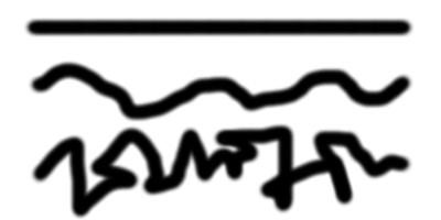
A line as an element of art is defined as a mark between two points that takes any shape between them. The line is one of the best elements to create movement in your composition.
Color
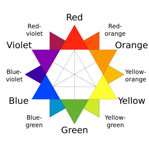
Color is relatively self-explanatory, but is also one of the most important and complex art elements. Color refers to the hue, value, and saturation of a mark in a composition. Color theory is a separate but equally important discussion. Just understanding that complimentary colors are good tools for contrast is enough for this surface-level discussion. Observe the color wheel and how the colors compare and interact:
Space
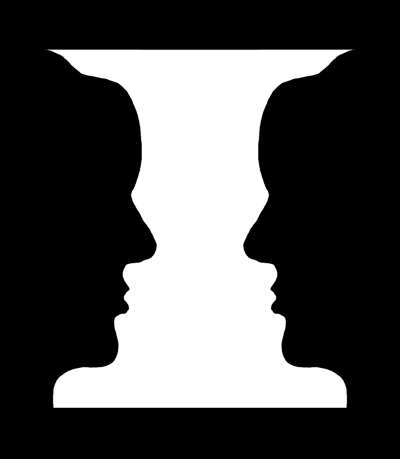
Space is the allocation of area in a composition for a particular purpose. Space can include the background, middleground and foreground of the composition and can include the distances between around and inside of things in the composition. Space can be positive or negative depending on which areas of the empty canvas are filled with marks.
Texture
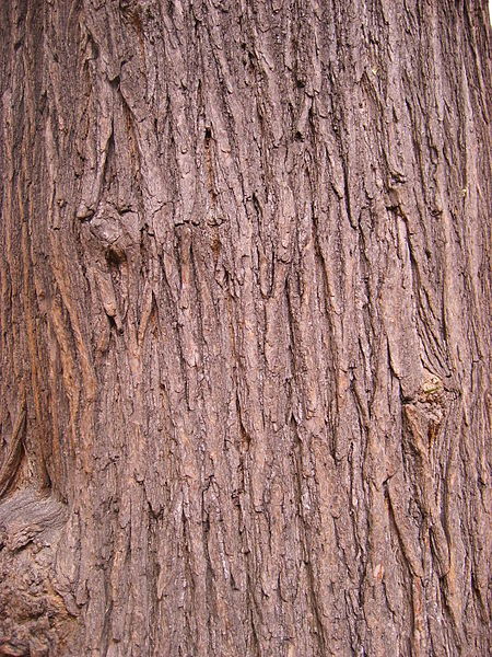
Texture refers to the quality of a surface. It is the visual portrayal of the sense of touch.
Shape
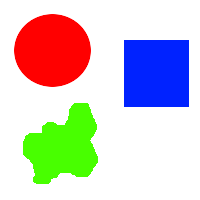
Shape is the use of area in 2D space, usually defined by an edge. This can mean using geometric shapes like circles or rectangles, or they could be organic shapes. Shape is defined by all the other elements of art.
The Principles of Design
The principles of design are guidelines for proper visual design that is aesthetically pleasing and effective at communicating the intended message to the viewer. In this section, I'll be providing examples of how the principles of design are effectively used in level design in games.
Balance
Balance is the state of equilibrium in a design. If a composition is completely balanced, it evokes tranquility and calmness, otherwise it evokes a sense of chaos and confusion. The same term is used in game design for game balance, and the concept is similar for levels and visual design.
Symmetry is an easy way to create balance. Most MOBA/ARTS games like DotA and League of Legends use symmetrical game maps to create near-perfect terrain balance between the two competing teams:
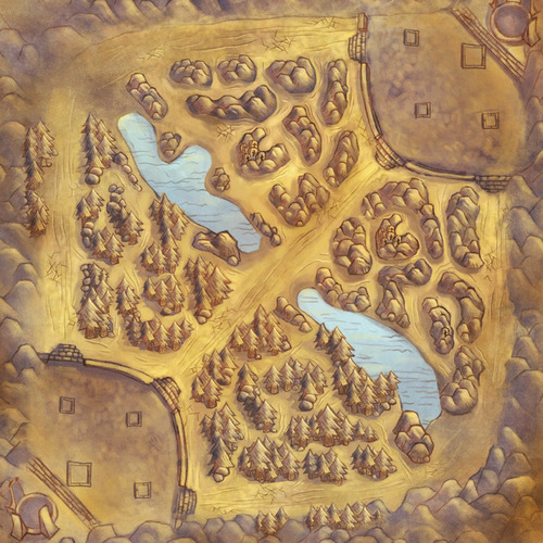
Teams start in either the upper right or bottom left corners of the map, and if you divide the map in half diagonally from north-west to south-east corners, the map is (nearly) symmetrical, facilitating gameplay balance.
While symmetrical balance works in games where both teams share the same competitive objective, asymmetrical maps lend themselves towards game types where one team has a different objective than the other. Gears of War's multiplayer map Escalation is a great example of an asymmetrically balanced map:
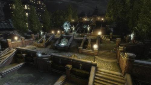
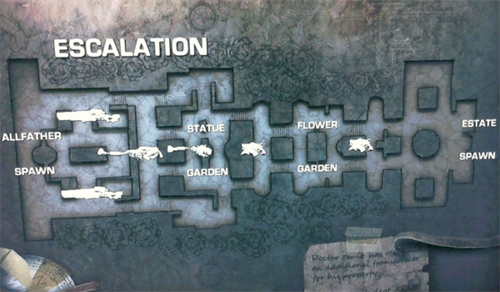
In a King of the Hill game type, this map warps the flow of play such that the team that controls the top of the staircase defends the "hill" from players at the bottom of the staircase. While the top team has the advantage of high ground, the low team is provided with sufficient cover and multiple routes of ascension to create a map with a very linear but nonetheless balanced state of play, despite the fact that the map is asymmetrical.
Note that asymmetrical maps can still supplement balanced gameplay. One of the most popular multiplayer maps in Halo 3, Guardian, is an asymmetrical map:
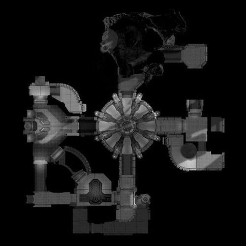
Guardian manipulates line of sight, advantageous weapon placement, and flow and choke points to create a map that is balanced and forces the players to adapt to a different style of play depending on where they are on the map. It takes an enormous amount of level design intuition, and a deep understanding of the other principles of design to create an asymmetrical map that is also balanced. An asymmetrical map that is balanced creates a level that is challenging to understand and strategize and even more difficult to master.
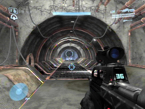
Balance can be used to guide the eye as well, and thus guide the player through the level. If the player sees an environment that is symmetrically balanced, the implication is that they should move straight through the level. The balance of the composition portrayed on the screen drives them forward through the level:
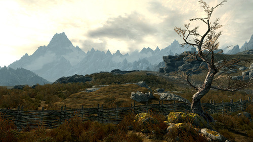
On the other side of the spectrum, if your level does not have symmetry you are not using balance to guide your player. In a non-balanced environment your player subconsciously looks to other principles of design for guidance. If there aren't any present, your player is loose in your environment without a guide. Unintentionally this can cause your player to get lost and confused, but if used effectively lack of balance in an environment can encourage exploration if your game has a more open objective or you want the players to discover the world for themselves:
Contrast
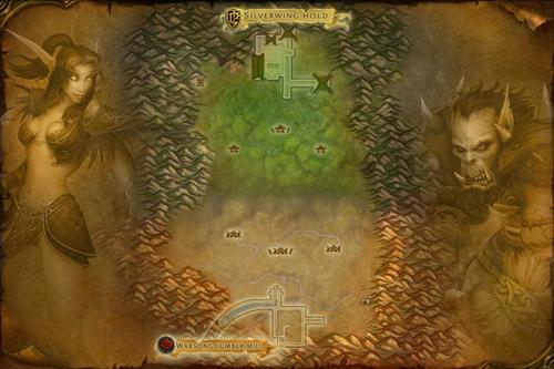
Contrast is the concept of implying visually that two or more separate elements of a composition are similar or dissimilar. Contrast is used very frequently in level design to imply a change of areas or tone. World of Warcraft's capture the flag map Warsong Gulch uses contrast through color to effectively differentiate team territory:
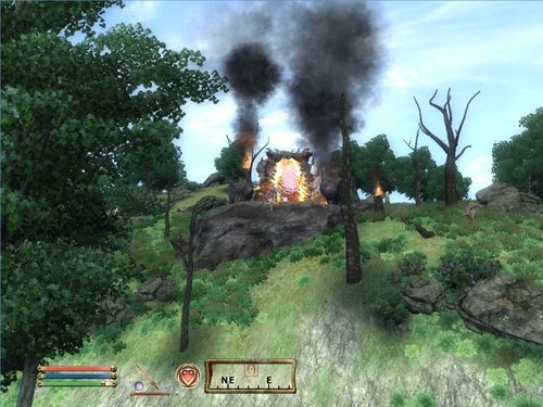
Contrast can also be used to guide a player through a level by emphasizing the destination and de-emphasizing the extraneous props and textures in the environment, or by introducing something radically different and unique in an otherwise homogeneous environment. In the fourth Elder Scrolls game, Oblivion Gates appear throughout the world that spawn demonic enemies and can take the player into Mehrunes Dagon's plane of Oblivion. Notice how the demonic shapes, rocky texture, and bright red color contrast the vertical grass and trees, lush textures, and flat green (red's compliment) of the forest environment:
To be continued...
Thanks much for reading.
~ Wes
Read more about:
BlogsAbout the Author(s)
You May Also Like




.jpeg?width=700&auto=webp&quality=80&disable=upscale)


