Trending
Opinion: How will Project 2025 impact game developers?
The Heritage Foundation's manifesto for the possible next administration could do great harm to many, including large portions of the game development community.
Internet usability expert Dr. Jakob Nielsen turns his gaze toward the interfaces presented by Microsoft's new Kinect system, and finds promise and problems in how players interact with the device.

[Gamasutra is happy to reprint, with permission, an analysis of the Kinect's interface, written by Dr. Jakob Nielsen and originally posted to his Alertbox, his bi-weekly column on his site, useit.com. Nielsen is an expert in usability and has become known for his insight and effort in improving the usability of the web.]
Kinect is a new video game system that is fully controlled by bodily movements. It's vaguely similar to the Wii, but doesn't use a controller (and doesn't have the associated risk of banging up your living room if you lose your grip on the Wii wand during an aggressive tennis swing).
Kinect observes users through a video camera and recognizes gestures they make with different body parts, including hands, arms, legs, and general posture. The fitness program, for example, is fond of telling me to "do deeper squats," which it can do because it knows how my entire body is moving. Analyzing body movements in such detail far exceeds the Wii's capabilities, though it's still not going to put my trainer down at the gym out of work.
Kinect presents a far more advanced gesture-based user experience than any previous system seen outside the fancy research labs.
Yes, I saw similar interfaces as long ago as 1985 at cutting-edge academic conferences — most notably Myron Krueger's Videoplace. But there's a big difference between a million-dollar research system and a $150 Xbox add-on.
On the one hand, Kinect is an amazing advance, especially considering its low price. On the other hand, the 25-year time lag between research and practice for gesture UIs is slightly worse than the usual fate of HCI research advances.
For example, 20 years lapsed between Doug Engelbart's invention of the mouse (1964) and the first commercially feasible mouse-based computer (the Mac in 1984).
Kinect exhibits many of the weaknesses Don Norman and I listed in our analysis of gestural interfaces' usability problems:
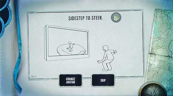
Sometimes options display as an explicit menu, making them visible. But there are no explicit affordances on the screen during gameplay for most of the things you can do. Primarily, users are forced to rely on memorizing the instructions shown before the game started. (Even though it's a key human factors principle to reduce reliance on the highly fallible human memory.)
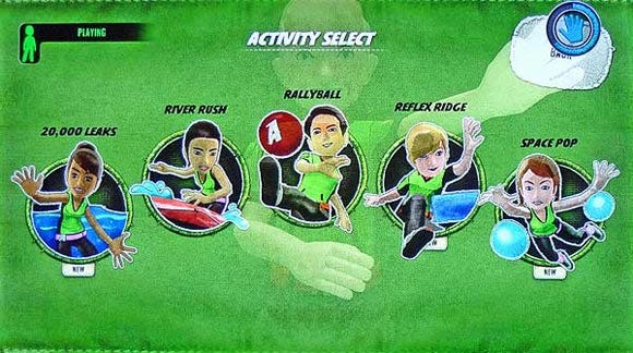
For example, how do you know to jump up to make a long jump in Kinect Sports, even though it's a completely illogical move (and would make more sense for a high jump)? By remembering what you read before your avatar entered the stadium, of course.

Read the manual before using the interface.
(Yes, it's a *cute* manual, but these are still instructions to memorize.)
(Kinect Adventures)
Kinect exhibits another type of visibility problem: on-screen alerts are easily overlooked because the user's attention is focused elsewhere. This rarely happens with mobile touch-UIs: because of their small size, you see anything that pops up on the screen. In contrast, it's common for users to overlook error messages on cluttered Web pages.
On Kinect, users don't overlook messages because of clutter, but because of engaging action. For example, in observing users play Kinect Adventures, I frequently saw a warning message in the upper left telling users to move to a different part of the floor. Yes, as the usability observer I saw this — but the game-playing users didn't. They were too focused on the compelling movements in the middle of the screen. They watched their avatar and the gamespace, and didn't notice the appearance of UI chrome in the corner.

How can users miss the huge "Move Forward" warning?
They miss it because they're fully engaged in steering their raft down the river.
(Kinect Adventures)
A similar, but less serious problem occurs in Your Shape: Fitness Evolved when you're trying to complete a hard cardio program. The number of reps left in the set counts down in the corner, but you tend to focus on your trainer and keeping up with her movements.
It'll be a design challenge to increase users' awareness of system messages without detracting from their engagement in the game's primary activity.
Related to the lack of visibility, it is hard to know why certain actions have specific effects because there is little direct feedback. In the table tennis game, making a smacking movement with your hand mimics hitting the ball with a paddle and you do get immediate feedback showing whether or not you "hit" the ball. But it's difficult to figure out why you sometimes succeed in making a hard smash. For sure, it's not dictated solely by hand-movement speed.
Other times, Kinect gives great feedback based on its direct observation of your movements. In Dance Central, you try to follow the movements of an on-screen dancer, whose body parts light up to indicate where your dance moves are lacking. This is better (and less disruptive) feedback than a voiceover saying, "move your left arm up more."
That there are no universal standards for gestural interactions yet is a problem in its own right, because the UI cannot rely on learned behavior. The Kinect has a few system-wide standards, however, which do help users.
For example, there is a standard way to pause a game to bring up the menu: stand with your right arm straight down and your left arm held at a 45-degree angle. Definitely not a natural stance — indeed, it was probably chosen because it will never occur in normal gameplay.
The pause gesture becomes the user's lifeline, but there are no standards for other, commonly desired generic commands, such as "back." This makes it harder for users to navigate the UI, because they need to figure out these basic operations every time. Less learning takes place when the same thing is done differently in different games.
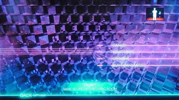
As the following two screenshots show, there's not even consistency as to which hand is used for "back," let alone which gesture to use or how the feature is presented visually.

"Back" in upper right; activated by holding hand still over button.
(Kinect Sports)

"Back" in lower left; activated by swiping left hand rightwards.
(Dance Central)
At least you can tell that the designers have done their usability testing: they've applied a Band-Aid to the UI in the form of a note saying "left hand" next to Dance Central's inconsistent "Back" command. Whenever you have to explain a GUI widget, it's probably wrong.
Within Kinect Sports, different movements are used to throw a bowling ball, a discus, and a javelin, and still different moves are used to smack a table-tennis ball and kick a soccer ball. However, this across-game inconsistency is less of a problem, because the design embodies external consistency: the game gestures are similar to those used to deal with these objects in the real world.
Kinect generally does a good job of protecting against the accidental activation we see so often when testing mobile devices. If your finger brushes against something on your phone or iPad, off you go — often without knowing what happened (because you don't know what you touched).
Kinect usually demands a confirmation gesture before it acts on user commands. This request for confirmation alerts users that something is about to happen, and prevents unintentional gestures from initiating actions. Unfortunately, the confirmations are inconsistent:
Hold your hand still over a button, while an animated circle is completed. (Most games)
After selecting a menu item, swipe your hand left — unless you want the "back" feature, in which case you swipe right. (Dance Central)
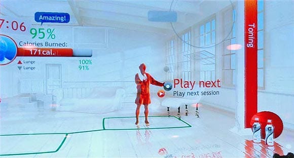
First select a command, and then keep your hand still over a small confirmation button that pops up next to that command. (Your Shape)

Touching a button doesn't activate it;
instead, this gesture brings up another button as a confirmation step.
(Your Shape: Fitness Evolved)
These confirmation gestures are annoying, even though I'm sure they save time in the long run by reducing accidental activation. (I still occasionally activated features accidentally by leaving my hand over something for too long. That's when the poor undo support and inconsistent "back" features become doubly annoying.)
Kinect has many great design elements that clearly show that the team (a) knows usability, (b) did user testing, and (c) had management support to prioritize usability improvements, even when they required extra development work.
This makes sense; the only reason for Kinect to exist in the first place is as a casual game system that's easy to pick up. It's not for hardcore gamers who are willing to suffer through contorted combos of button-pushes to make their game characters do moves. Kinect is targeted at the much broader masses, which requires strong usability. (Indeed, the sensor sold 4 million units during the first 6 weeks after launch.)
Good usability examples include the above mentioned on-screen hint in the exact spot of a command that would have been otherwise difficult to activate. How do the designers know where users need hints? From having watched real people play games and taken note of where they got stuck.
Another nice example of usability fit-and-finish is the snap-to effect: buttons feel "magnetic" and attract the cursor whenever your hand moves close to a button. (Thus enlarging the effective Fitts' Law size of the button and alleviating the impact of shaky hand movements.)
The most compelling usability advance is the way Kinect automatically signs in users after recognizing their faces. Step in front of the sensor, and "Jakob recognized" appears on the screen, after which the current game starts using my customized avatar.
This is the type of interaction technique I called a "non-command user interface" in 1993: You don't feel that you're issuing commands to a computer; you simply go about your business the way you normally would, and the computer does what's needed to complete its part of the task.
We know from researching enterprise portals that single sign-on is one of the most wanted (but least-delivered) intranet features. But automated sign-on is even better and eliminates an entire class of interaction steps.
We set up a Kinect system in the coffee break area during the recent Las Vegas Usability Week conference so that conference participants could experience this new UI paradigm firsthand. (We'll have it again at our New York City conference in February.)
People had great fun and were able to play the games after only a short demo.
As was clear in this situation, the same type usability issues that cause substantial problems in iPad user testing are brushed off by Kinect users. So how come Kinect's overall user experience works, despite its many user interface deficiencies?
The explanation lies in the difference in user tasks between the two systems. Usability is defined relative to two points: the users and their tasks. Comparing iPad and Kinect, even if the users are the same, usability will differ if people are trying to do two very different things.
Sure, people play games on iPad — indeed I have whiled away many hours in airports with Solitaire City and We Rule, and other members of Nielsen Norman Group swear by Angry Birds. However, whacky interaction styles in games rarely pose problems. What we really care about in tablet design are business-oriented user interfaces for things like e-commerce, stock trading, and information access. That's when inconsistencies and weird design reduce usage, and thus cost you business.
Also, Kinect users don't jump from one context to another every minute or two the way mobile users do. When you play a Kinect game, you're immersed in that game (often for half an hour or more) and don't see any of the other games. In fact, switching games is done not through on-screen navigation, but by swapping DVDs, thus reducing the load on the on-screen UI.
Finally, different games often have wildly different activities and goals, so it's okay to have varying user interfaces. Whitewater rafting and dancing to Lady Gaga's latest creation are no more similar than chalk and cheese.
On the iPad, whether you're shopping for one thing or another, you expect to be treated to best practices for e-commerce user experience as defined by the countless websites you've already used. Similarly, whether you're reading a magazine or a newspaper, you expect similarities in the UI for navigating among articles and for moving through an individual story's content.
And whether you're researching investments in your brokerage account, checking the weather forecast, or modifying an airline reservation, you expect similar interaction techniques for operations like filtering long lists or changing measurement units.
Purposeful use of iPad or gesture interfaces on other tablets and phones is comprised of fairly similar tasks, with strong user expectations and frequent context switches that penalize inconsistent design. Also, users have to manipulate large data sets with feature-rich commands and spend a fairly large percentage of their total time operating the UI. User experience quality is mainly determined by UI usability and whether the content easily satisfies users' information needs.
Playing with Kinect involves highly distinctive activities, where users focus on one game at a time and thus are better able to overcome inconsistencies. Here, users navigate a fairly small data space and spend most of their time playing with only the occasional detour outside the gameworld to operate the command-oriented part of the UI. User experience quality is mainly determined by gameplay.
A final difference is that mobile devices are the ultimate in individual use: your phone is yours and it's usually a solitary activity to interact with the device. Even when connecting to a social network, the on-screen actual user interface is being operated by you alone. In contrast, gaming consoles are often used in a group setting where new users get a gentle introduction to the new user interface by the more experienced users in the group.
This difference in usage circumstances means that consoles can rely less on having a self-explanatory UI, whereas a mobile UI must have extremely high learnability.
Kinect (+ other game consoles)
User's main goal | Entertainment | Getting things done |
|---|---|---|
What's being controlled | Self-contained gameworld | The real world |
Consequence of user errors | Your avatar "dies" & restarts level | Lose your job and investments |
Diversity of activities | Wide | Fairly similar operations across tasks |
Time spent within one UI | 1 hour per game | 1–2 minutes per site/app |
Navigation space | Small(except for gameworld locations) | Mid-sized (apps) toimmense (Web) |
Commands | Few | Many |
Data objects manipulated | Handful | Hundreds to millions |
Usage context | Often communal (experienced users help newbies) | Usually solitary (figure it out on your own) |
UX quality determinants | Gameplay | UI usability; whether content easily satisfies information needs |
Kinect is an exciting advance in user interface technology, but many of the user experience characteristics that make it so also mean that it's not the road ahead for the practical user interfaces that businesses, government agencies, and non-profit organizations need for their everyday websites, intranets, and applications. Design ideas that make Kinect fun could cost you millions.
Read more about:
FeaturesYou May Also Like