Daily news, dev blogs, and stories from Game Developer straight to your inbox
Sponsored By
HUD: Barrier for Immersion Hide the Numbers
Blog taken from person site. Think how we can use HUDs in exciting ways to remove that layer blocking connection and immersion and keeping the HUD grounded in the world.
5 Min Read

Hey guys, I am going to try and keep this short for my first blog post in a while. *Disclaimer* this blog will not apply to all genres/themes of games but still may provide a thinking point.
The topic of this is HUDs, and how it is currently used which may be another layer that is possibly being an extra step that slows players down from being fully immersed. I have not seen any case study on this subject but it hit me when I read this article from Gamasutra http://www.gamasutra.com/blogs/ChrisPruett/20160115/263292/The_Mechanics_of_Tension.php . Within this article it mentions how they “hide the numbers” from the player, so players do not focus on these and can focus on the game. As well as feeling as if they are in the game so when damaged in the game it feel as if they have in reality.
Now granted this is about a horror game in VR so there is still a lot that is to be learnt from designing in VR to other platforms. However I do not feel this is the case and we can take notes from this idea of “hiding the numbers”.
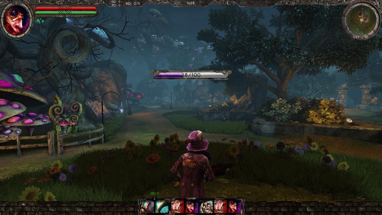
In one of the more recent showing of Guerrilla Games “Horizon Zero Dawn” they did a 7 minute video explaining their HUD (which I was truly unsure about as they were not doing anything new, health is on left side, numbers coming off enemies signifying damage done to enemies… but side note over). As I was watching this I just felt as if there was now another layer between myself and this crazy, amazing and beautiful world.
Which got me thinking about HUDs, it feels like it is something we have layered on top and not integrated into the games world. Instead of the players feeling scared when damaged they look away from the action taking place to check their health bar.
I have been playing “Ico” (still.. yes I am going to finish it) and there is practically NO HUD! Yet I felt something I hadn’t felt in a long time and that was closer to the world and its characters. Now it’s not just the lack of HUDs in this game which makes this feeling, “Ico” is a truly well designed game. Yet not having that HUD there did make me feel closer to the world.
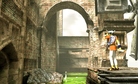
“Ico” is an extreme case of HUD minimalism, in which the creators have openly come back and said that they may have taken it too far.
Now before we go on, I want to stress that HUD is brilliant for our games and when done well it is another layer which adds to the experience! I just feel that we look at how everyone else is doing it and just dress it up with another picture.
This is not the case, I think there is still more for us to try, for us to experiment with and discover. A card game called “Gloom” has some great HUD and it’s a card game! Cards are transparent so when other cards overlay on top of one of your character cards players can still see all the needed info. This makes the game fluid as we don’t to keep count any markers or coins its always in front of the players.
![]()
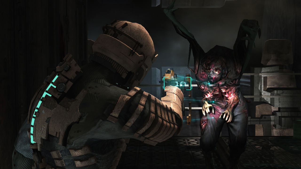
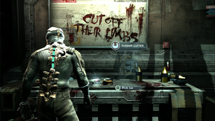
“Dead Space” to me was a game with HUD that just pushed everything in the right direction, in my opinion has the best HUD in gaming history. The health bar is built into the suit, with it running up the characters spine. It took away that extra layer on top of the game and grounded everything within that world. Players didn’t need to scan the screen for the HUD it was always there with them in all the action.
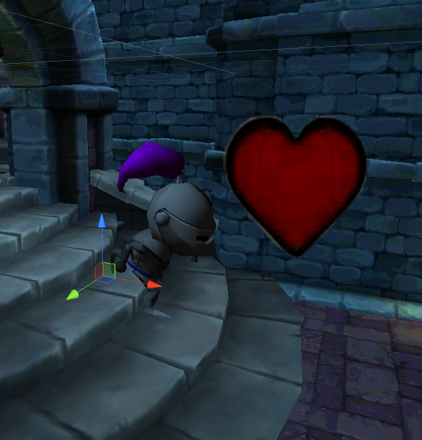
When designing “Chest Quest” I instantly went to the standard HUD, all the health and scores are in a corner. I sadly will not be changing it due to the time and with me intending to release soon. However as mentioned in my December part 1 blog I spoke about having a heart fly out of the character when damaged to show players that he has been hurt and to keep it grounded in the world.
When I move on to another a project I am going to take more care and time to think about how I can “hide the numbers” and make my HUD feel grounded within the world so players aren’t held back by another layer.
On that note I am going to end this post. My main point I am trying to make is when creating your HUD, don’t just play it safe because it is used by so many others. Challenge yourself to think how it can be grounded in the world of your game and remove that final layer.
Cheers guys, hope you enjoyed and I am excited for my next post as I think it will be an interesting topic.
If you guys want to discuss this with me or give me some cool examples then get in contact over social media
Twitter: @maxpears
Instagram: @max.pears
Read more about:
BlogsAbout the Author
You May Also Like