How to remove the frustration of reading in games
We speak with developers behind 80 Days, Sunless Sea, and Before I Forget about how they get players to actually read their text-heavy games.

Working on games featuring a lot of text can be challenging.
Regardless of whether you’re making a role-playing game, a visual novel, or a text-based adventure, you’re constantly trying to convince players that what they’re reading is important or worthwhile. And while you may presume a strong story or premise is enough to get your readers’ attention, unfortunately, that alone often isn’t enough.
Think about it: when was the last time you put aside some elaborately-written piece of lore in a game in favor of finding an abridged version online or skipped through lines of perfectly okay dialogue in order to try and save yourself some time?
It doesn’t take much to lose a player’s interest, and that is why strong editing, clever narrative design and intuitive UI is so important. There are a number of ways to make text in games more approachable, from cutting down on the amount of words you have on-screen at any given time to experimenting with different types of presentation.
To find out how different developers approach text in their games, Game Developer spoke to staff at Failbetter Games, 3-Fold Games, and Inkle. They told us more about the unique challenges they face as interactive storytellers, the designs that have influenced them over the years, and the importance of removing unnecessary barriers to reading.
Weighing the cost/benefit of reading
When it comes to narrative studios, Inkle, in particular, has gained popularity for its excellent adventure games: from adaptations of existing source material like Sorcery and 80 Days to original projects like Overboard and Heaven’s Vault. But, although critics and players have been fond of Inkle’s output over the years, its creative director Jon Ingold says this wasn’t always the case.
“When we [first] started, we heard a lot of people like, ‘Oh, people don’t read in games, they don’t like reading in games,’” Ingold recalls. “And we were [questioning], ‘Is that really true?’ And I don’t think it’s true at all. The presentation is hugely important. The editing is hugely important. Also, people read all the time. The idea people don’t read is wrong. People just need the right format that suits the mood that they’re in and then they’ll read happily.”
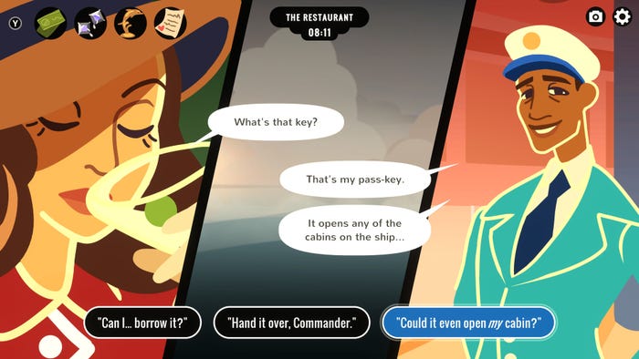
Overboard by Inkle
This is where Ingold highlights Twitter as an influence. There are people who struggle to read books, but who spend hours reading on the social media platform every day. Ingold says that what this ultimately comes down to is the automatic cost/benefit analysis of the reader. If you think about investing time into reading 300 pages of a book, the cost is typically very high and the benefit is hard to determine, whereas if you refresh your Twitter feed there’s always bound to be something to read that’s interesting, and if not, you can simply press refresh right away and try your chances again.
Ingold applies this theory to explain why so many people avoid reading lore panels in AAA games. In games like The Witcher, for instance, players can read additional essays about the world that do little to enhance the overall experience, if you’re not already invested. As a result, most will likely skip over them in favor of advancing the plot.
“We’re quite cynical about it,” says Ingold. “We have this sense that if you give people at least half an excuse not to read something then they won’t. Because they’re playing a game and it’s complicated and there’s half a million things going on. And they just want to simplify it down to what they need to do to actually make progress in this game.”
This isn’t a problem that’s exclusive to triple-A games. You can also see something similar in interactive fiction too. As Ingold notes, it’s not uncommon for readers, when presented with a block of text and a set of choices, to simply play the options without reading anything that preceded them. So, in order to get around this, developers need to constantly ensure their writing is brief, expressive, and gives a greater understanding of the choices being offered.
Inkle’s adaptation of 80 Days is a great example of this. Here Meg Jayanth’s script explores complex ideas around culture and empire, but the text is always delivered in short snippets that are easy to understand, or 100 words or less. At this length, the player almost reads the text by accident, while in the process of planning, reflecting, or thinking about their next move.
The importance of good UI
It should be noted that Inkle isn’t the only studio to take this approach. Failbetter Games -- the studio behind Fallen London, Sunless Sea, Sunless Skies, and Mask of the Rose -- also presents text in smaller volumes to convince players to pay closer attention to what’s being said. This is the case particularly in regards to the space-faring adventure game Sunless Skies, where gathering information is critical to accomplishing each one of the game’s three endings: wealth, fame, or truth.
Whenever you enter a new port in Sunless Skies, you are given various options on what to do next, inside of a large reading panel, but the text for each location and story is cordoned off into smaller subsections to make it more easily digestible. What this means is that players typically only have to worry about reading two or three paragraphs at a time, rather than scrolling through pages and pages of text to find the information or choices that are right for them.
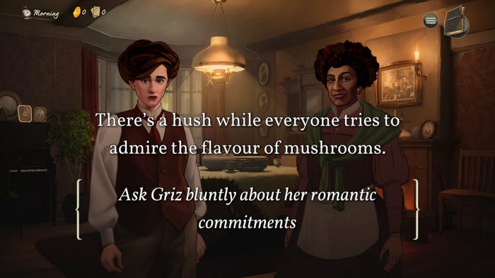
Mask of the Rose by Failbetter Games
“From [Fallen London’s] inception, we wanted players to feel like the text itself was a reward,” Hannah Flynn, communications director at Failbetter Games tells Game Developer. “Text is therefore metered out in very small portions, which means players focus on it intently and savor it a lot. That’s something we’ve carried forward in all of our work. The text is [always] something of great value and treated tenderly.”
A huge part of why this approach is so successful in Sunless Skies is not just down to the remarkable writing and editing, but how text is delivered to the player. In a blog named Reading by Gaslight: A Look Inside Sunless Skies’ UI Redesign, Failbetter senior artist Tobias Cook wrote about the creation of the UI and the struggles of coming up with a design that would encompass the game’s reading panel, mission journal, and multiple inventories.
Critiquing the original design, Cook writes, “One of the primary issues we identified […] was the off-center positioning of the reading panel. This was an aspect of the old design, a panel-based system which allowed users to open any combination of two interfaces in a left/right configuration.
“The intention was to allow the player to review their inventories whilst simultaneously interacting with story content, allowing simultaneous comparison of different inventories, and so on. The unfortunate result of this design was the pushing of the reading panel off the screen center, a sometimes confusing and unpredictable visual layout, as well as a general loss of real estate in which to display content.”
After recognizing these faults, Failbetter went back to the drawing board and altered the design to make for a much better reading experience. This included, among other things, moving the main reading panel to the centre of the screen, to ensure it occupies the most space of all the UI objects, to shifting the different inventories into a separate panel that can be toggled on or off.
The finished result makes the reading panel far easier to parse -- even with all the information being communicated onscreen – but the potential downside, according to Cook, is that the UI still has the impact of covering up most of the world when fully open. Regardless, it’s a whole lot better than the alternative, which is people missing out on fascinating quests or stories, simply because they’re struggling to comprehend what’s on screen in front of them.
A personal touch
Beyond taking a thorough approach to editing, or refining both the placement or positioning of text, developers should also pay attention to how they deliver text and what kinds of writing best fits the story you’re trying to tell.
Chella Ramanan is the narrative designer behind 3-Fold Games’ first-person exploration game Before I Forget, and is also working on the upcoming game, Windrush Tales, which looks at the lives of the Windrush Generation -- a group of Caribbean migrants who arrived in Britain in search of employment and a new life after World War II. In both games, reading is an integral part of the experience, with 3-Fold Games letting players explore personal ephemera like letters, postcards, and newspaper clippings.
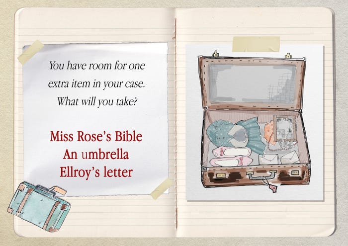
Windrush Tales by 3-Fold Presents
For instance, in the case of Before I Forget, players are given the ability to examine the belongings of the protagonist Sunita, who is living with dementia. As the player explores more of her apartment and uncovers more letters and documents, they will learn more about Sunita’s relationships, her condition, and the whereabouts of her family. It’s an approach that will be familiar to anyone who has played Gone Home -- Fullbright’s first-person exploration game about a sister returning home one night to find her family is nowhere to be seen. But it’s arguably just as effective here, with the short hand-written notes providing a relatable window into some fairly serious subject matter.
According to Ramanan, she took inspiration from a range of sources to decide at this approach, including her background in journalism and copywriting, as well as games like Life is Strange and Uncharted.
“We definitely looked at the Uncharted games because they have that mechanic with the journal when you’re looking at lots of artefacts and ancient scrolls,” says Ramanan. “And of course, we also looked at What Remains of Edith Finch – that was like the high bar of presenting text. It presented text so beautifully amongst the myriad of things it did extremely well […] but that was just something we couldn’t do, really.”
With Windrush Tales -- which is currently in pre-production -- she is keen to explore this more personal approach even further. Concept art for the project, for instance, implies text and illustrations will be displayed in a scrapbook, which again communicates to the player the personal nature of the story being told and invites the reader into a character’s own private world.
“I quite enjoy that -- presenting story through different kinds of writing,” says Ramanan. “Like political posters and all those kinds of aspects or layers of storytelling that you can add to games; it’s quite fun. [And] […] when you go and look at exhibitions about Windrush, there’s lots of letter’s home and postcards, and things like your passport and your paperwork. The way you choose your character, for instance, [in our game] is by opening your passport. So, we’re looking at different ways of presenting text and story.”
Although limited by its budget and scope, 3-Fold Games’ approach is just as effective despite its simplicity, because of how it bridges the gulf between these more complicated topics and the familiar and intimate ways text is presented to the player. In fact, speaking to Ingold, he revealed that this is ultimately what Inkle strives for: to find something simple and approachable that somehow manages to connect with players.
“We always wanted to […] make sure we kept things really mainstream and really accessible and really playable,” says Ingold. “This is so people wouldn’t feel it was too fussy or too complicated or that they had to be clever to engage with this stuff. But we also wanted to make sure that what we’re saying had the possibility of being interesting, rich, and complicated. Because I think it is possible to take the design part of it too far and say, ‘Okay, all dialogue has to be five words long. That’s how dialogue is in our game. We’re not giving you any more space than that and it’s got to be one idea per line and that’s your lot.’”
What’s remarkable about these three studios is how they manage to navigate this problem, providing text as something that is approachable for the average reader while concealing a greater emotional depth or resonance for those who wish to dig deeper.
Read more about:
FeaturesAbout the Author(s)
You May Also Like


.jpeg?width=700&auto=webp&quality=80&disable=upscale)


