

Daily news, dev blogs, and stories from Game Developer straight to your inbox
Sponsored By
How Firewatch's UI Enhances Player Immersion
A quick primer on video game UI and how indie darling Firewatch melds both diegetic and non-diegetic UI to serve its themes of isolation and exploration.
7 Min Read

This post was originally published on Medium.
 Firewatch slowly crept up on everyone and blew them away, like the video game version of a forest fire (erm, the good kind). A narrative-driven mystery light on game time and heavy on dialogue didn’t seem like everyone’s idea of a sure-fire hit, but players constantly found themselves engaging with the almost-real world of Shoshone National Forest.
Multiple GDC awards and 1 million unit sales later, there is general consensus that Firewatch aims for a niche and hits it pretty well. That niche is immersion. Firewatch wants to put players in the head of Henry, the fire lookout protagonist, and also wants to put players in the environment, with all its underpinnings of foreboding and isolation. And while the brilliant writing, believable voice acting, and gorgeous environments go a long way towards making this immersion happen, I think an oft overlooked aspect is the smart UI choices that Campo Santo made while designing this game.
Let’s run through a primer on video game UI and analyze why Firewatch’s UI choice helped them double down on their niche so successfully.
A primer on Game UI
A must-read article on game UI (without delving into research pieces) is this piece by EA Dice designer Marcus Andrews. I’ll explain some terms that are necessary to understand the intelligence of Firewatch’s UI:
Organism: This is you, player and all-round awesome human being.
Avatar: This is Mario, Sonic, Solid Snake, Henry the fire lookout. The in-game character that the organism controls is separate from the organism, no matter how realistic the gameplay or cosplay.
The UI is the plane the organism passes through to become the avatar. Since the avatar is traditionally dictated by game developers (if you play a space marine game, the hero is a space marine), the goal of UI is to make the organism feel adequately that he or she is the avatar.
With me so far? Let’s go a level deeper:
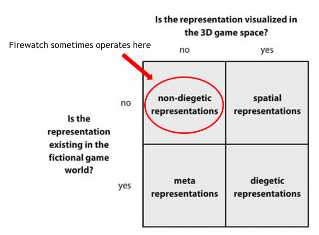
Diegetic UI: Interface elements that are visible both to the organism in the real world and the characters/avatars in the game world. For example, in the image below, both the GPS marker attached to the car and the map in the avatar’s hand are diegetic UI elements (because they are visible to you, the player, and also to every character in the game world). These elements usually offer the most immersion and form a seamless plane between the organism and the avatar.
 Non-diegetic UI: UI elements only visible to the organism in the real world and not visible to in-game characters/avatars. For example, in the screenshot from Uncharted 4 below, the ammo count, gun icons, and grenade counters on the bottom left of the screen are non-diegetic (because you, the player, can see them but in-game characters cannot). This is hardly the most immersive UI choice, but usually performs well with respect to functionality and getting the necessary information across to the player.

Spatial UI: UI elements that are presented in the game’s 3D space (whether they are visible to the characters/avatars or not). These can be diegetic or non-diegetic, they just need to be rendered in the 3D game space. The blue waypoint markers and crosshair in the Arkham Knight screenshot below are examples of spatial UI.

Meta UI: UI elements that are not visualized in the 3D game space (whether they are diegetic or not). For example, the on-screen blood splatter in the Gears of War screenshot below is non-diegetic (the player can see it, the avatars cannot) and meta (it is not visualized in the 3D game space).

Apologies for going all textbook-y there, but I think being aware of these UI distinctions and their respective utilities make it much easier to understand just how Firewatch got it right.
Firewatch’s UI
Enhancing immersion
Firewatch is a game where protagonist Henry volunteers to be a fire lookout in order to escape his demons and lose himself in Shoshone’s woodland environs. In order for the UI to convey these feelings of isolation and exploration to the player, Firewatch mostly sticks with diegetic UI choices.

For instance, the map. It’s not your standard mini-map on the bottom of the screen à la GTA or a digitized map that you bring up through the menu screen. This is as close to a real paper map as a game can get.

When you need to see the map, Henry will take out the map. He updates paths on the maps as the game progresses, circles areas of the map that are of importance; basically anything that a real fire lookout would do.
There are multiple occasions when you need to visit a new area of the forest based on radio conversations or external occurrences. Directions are given based on map landmarks, and players have to toil with map and compass to reach these places.
Is it tougher to navigate than non-diegetic maps? Yes. Is it worth it? Absolutely. It sells the feeling of forest immersion and exploration much better than an HUD map ever could.
Did I mention the compass? Because you have to literally take out a compass every time you want to orient yourself in Firewatch.

The same logic applies here. The player’s avatar is a fire lookout, and fire lookouts (especially those new to the job) don’t just automatically know where north is. Exploring Firewatch’s world would be much easier if a compass was constantly visible on some in-game HUD, but exploring Firewatch’s world shouldn’t be easy since exploring is the entire point.
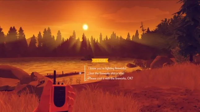
The radio, which forms a big part of this game, is also a pointed diegetic element. Henry can take out his radio to report almost anything of significance, reply to incoming messages, or just chatter with the enigmatic Delilah about the vicissitudes of life.

Firewatch keeps this desire for immersion through UI constant throughout its short adventure. Near the end of the game (when things get a bit weird), Henry has to follow beeping sounds on a tracking device until it reaches a certain frequency and the meter flashes green.

Striving for balance and functionality
There’s a reason non-diegetic UI is so popular despite its immersion-breaking characteristics. These UI elements are efficient and clear, giving information to the player in the quickest and simplest way possible. Firewatch does occasionally use these elements because exploring this world shouldn't be so difficult that players quit the game.
For example, the game visualizes when Henry can reply to a radio message by popping up a small radio icon on the left of the screen (visible only to the player, not to Henry).

Text markers will appear on the screen to identify any object that can be interacted with, reported on, or is of interest to the narrative.

Your various choices of radio conversation also show up as on-screen text (non-diegetic).
Firewatch’s UI isn’t perfect (non-diegetic elements do occasionally break the immersion) nor is it revolutionary (Games like Far Cry 2 have used diegetic UI elements to great effect before). But I think Campo Santo took player immersion as their lodestone, crafted as many diegetic UI elements as possible, and used non-diegetic UI as the supporting cast to fill in the gaps whenever there was no other option.
And for this honest attempt at making every part of the game — narrative, gameplay, and UI — consistent with their themes of isolation and exploration, I think they deserve our appreciation.
You can follow me on Medium here.
Read more about:
BlogsAbout the Author(s)
You May Also Like
Latest News

Trending


Featured Blogs


