Game UI Discoveries: What Players Want
EA DICE designer Marcus Andrews examines the UIs of several recent games and picks apart what's required for both a novel and player-satisfying interface -- one that serves the needs of the game and its audience.

[EA DICE designer Marcus Andrews examines the UIs of several recent games and picks apart what's required for both a novel and player-satisfying interface -- one that serves the needs of the game and its audience.]
I was recently asked to investigate the merits of immersive UI for the potential inclusion in future DICE products. Traditional HUDs live under constant scrutiny in ongoing efforts to make the UI as transparent as possible, allowing the player to immerse themselves into the game.
DICE had already made bold moves into the territory but it's a risky and difficult endeavor, and seldom 100 percent successful. UI is one of the areas where great progress can still be made.
My mission included understanding what "putting the interface in the game world" really meant. The easiest way to describe it to someone is to say "like they did in Far Cry 2" -- but what is it really and how can it be utilized? You can read the analysis of several games and my subsequent final conclusion in the article below.
Terminology
Before reading further in this article there is some terminology you need to be familiar with.
Diegetic: Interface that is included in the game world -- i.e., it can be seen and heard by the game characters. Example: the holographic interface in Dead Space.
Non-diegetic: Interface that is rendered outside the game world, only visible and audible to the players in the real world. Example: most classic heads-up display (HUD) elements.
Spatial: UI elements presented in the game's 3D space with or without being an entity of the actual game world (diegetic or non-diegetic). The character outlines in Left 4 Dead are an example of non-diegetic spatial UI.
Meta: Representations can exist in the game world, but aren't necessarily visualized spatially for the player; these are meta representations. The most apparent example is effects rendered on the screen, such as blood spatter on the camera to indicate damage.
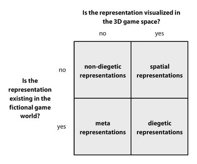
Terminology from Fagerholt, Lorentzon (2009) "Beyond the HUD - User Interfaces for Increased Player Immersion in FPS Games". Master of Science Thesis, Chalmers University of Technology
Game Analyses
Far Cry 2
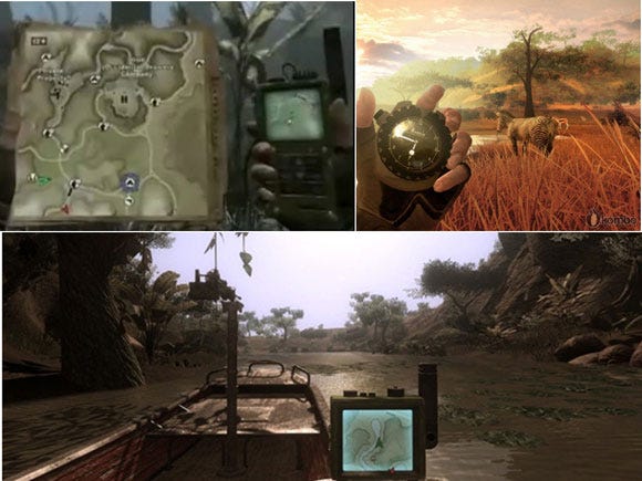
Far Cry 2 (Ubisoft, 2008) is an example of a game that goes to great lengths in making the interface diegetic, especially for being an FPS. The primary diegetic method in Far Cry 2 is making in-game gadgets take on roles typically associated with HUD interface -- map features, time of day, and the condition of your weapon.
Click for full size.
Above are examples of interface elements that are diegetic. Time is presented with a watch, and navigation with a GPS and physical map. It's worth noting that even though the map is physically represented in the world, the icons and indicators are moving and behaving based on game play.
What works?
The novelty factor
Visually it's cool to see the hero dig bullets out of his arm, and to look at a compass in your hand. Further proof of the novelty factor is how Ubisoft showed off the diegetic interface in the pre-launch marketing. It was considered a selling point -- a means to compete with other FPS games.
Interaction with other characters
Ironically, interacting with another character than yourself works great, since it allows you to see what that character is doing. This is particularly cool when a friendly character comes to save you when you are injured; that's a good snapshot example of immersion.
What doesn't work?
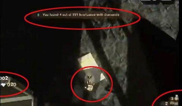
FC2 appears conflicted in its use of interface since it has a traditional non-diegetic HUD that indicates ammo, interaction opportunities, health etc, complimentary to the ambitious diegetic interface. This HUD is in its turn quite bluntly non-diegetic and very traditional.
In an effort to minimize the intrusiveness the non-diegetic elements fade in and out, out of the player's control, which of course results in a complete lack of control for the player. The screen below is captured in game and shows how non-diegetic HUD elements may show up during play.
There is a profound lack of real estate in FPS games on which to render interface beside the HUD, which shows in Far Cry 2. The camera simply does not allow diegetic representation of some things, especially if you restrain yourself to a realistic fiction.
Final analysis
Judging from Far Cry 2 it seems nearly hopeless to make the game playable and 100 percent diegetic, particularly in an FPS. Some sort of compromise seems to be necessary. The benefit of such compromise is likely greatest if a diegetic interface design is the goal from the beginning, rather than being forced in the end. If you find yourself adding complimentary non-diegetic UI to support a diegetic solution, you might have to rethink the solution as a whole.
Dead Space
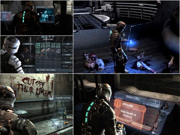
Dead Space (EA, 2008) is the most recent example of a fully diegetic interface. In contrast to most games, Dead Space has an explicit direction that all interface elements should be "in the game world".
The interface uses a fairly traditional HUD system with a big twist: it's rendered in the game as a hologram, a textbook example of a diegetic solution where the interface exists in the game world and can theoretically be seen by the game characters. The UI is explained as holograms created by the avatar's space suit. This "excuse" opens up the possibility of using almost any interface, as long as it's holographic.
Click for full size.
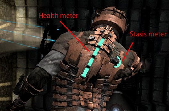
Beside the holographic interface, Dead Space also draws interface on the actual player avatar, a very appropriate solution for diegetic third person games.
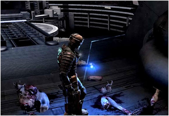
Above: A locator feature that plots the way where you are expected to go. This feature came about when the ambitious holographic 3D map failed to serve players, according to Glen Schofield, the game's executive producer.
What works?
Setting
Dead Space takes advantage of its sci-fi setting to make the interface diegetic. It could in principle be explained as "a typical UI, rendered atypically".
Perspective
Using the player avatar as a canvas to actually draw UI elements on, such as health and stasis, is a great way to promote immersion -- but seems largely dependent on setting, and a third person camera.
Preserving functionality
Dead Space clearly shows some the style benefits of a diegetic interface, and that such an interface can preserve the functionality of a traditional interface.
What doesn't work?
Functionality breakdown leading to complementary solutions
The holographic 3D map largely failed to aid player navigation. The failure to serve player needs likely forced the development team to implement a complementary feature, "the locator", that was not using the same diegetic method (hologram) but rather a diegetic spatial method (projected on the ground) -- once again "excused" by the sci-fi fiction.
Benefit?
It is hard to see an absolute benefit from the UI other than the functionality it provides. Given there has no doubt been a lot of cost involved in making the holographic interface, this needs to be considered.
Final analysis
Dead Space raises the question "How much is gained by implementing a diegetic user interface?" One could easily imagine all Dead Space's interface elements as traditional HUD elements. Dead Space could also be criticized for only translating traditional interface solutions from non-diegetic to diegetic, without making any real improvements to the traditional designs.
I consider Dead Space a valuable measurement of the actual benefits of going diegetic. There might be a greater benefit than that realized in Dead Space -- but deciding if the pursuit is worthwhile is a decision each development team has to make. Conclusively it can be said that Dead Space uses a fairly traditional interface rendered in a novel, diegetic fashion, and that the benefits were fairly subjective.
Team Fortress 2
Team Fortress 2 (Valve, 2007) is a game I chose to analyze because I think of it as a game with a very straightforward approach to interface. "Use whatever means to inform the player" seems to be the developers' modus operandi, as their interface solution is spread across all methods of interface design.
Information such as ammo, health, and critical game mode information is permanently displayed on static positions in the HUD (non-diegetic). There is a complementary second layer of static "pop-up" non-diegetic HUD elements that appear based on player actions, such as when the player stands on a control point or equips a construction kit.
On top of that, TF2 also uses a diegetic interface, particularly for the engineer class, who can build objects in the world. In this case a blueprint hologram appears in 3D that allows the player to know exactly how the object will appear when completed. It's worth noting that non-diegetic HUD elements co-exist on the screen at the same time.
TF2 also makes heavy use of "spatial non-diegetic" elements, like icons over players' heads, and other markers. It's worth noting that the name tag is not spatial but rather fixed to the observer's camera, just below the crosshair.
A little more unusual is the way which the medi-gun and its subsequent "uber charge" is portrayed. The colored ray that comes from the medi-gun is clearly diegetic, but at the same time a spatial marker for the bond between the healer and the one being healed. Likewise the "uber charge" coloring can be seen as a diegetic effect of being radiated with the medi-gun, but it's also a spatial marker for all players to be aware of who is uber charged.
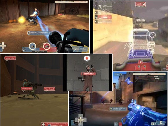
Click for full size.
What works?
Mixing UI elements from various categories (diegetic, non-diegetic, spatial, etc) can really allow for providing loads of information without having to put all of it in the HUD.
UI components do not have to follow an immediately obvious theme or be immersive to work.
What doesn't work?
For all the above reasons, Team Fortress 2 can sometimes look and be perceived as a little "messy". The "awesome factor" and novelty value suffers.
Final Analysis
Team Fortress 2 hardly makes the charts for diegetic qualities, but manages to be a hugely successful title and very playable nonetheless. Team Fortress 2 shows the strengths of a mixed interface where little or no regard is paid to a diegetic direction. Team Fortress 2 can also be considered an example of player tolerance for mixed interfaces taking away some of the validity of arguing that diegetic interface are better tolerated.
World of Warcraft
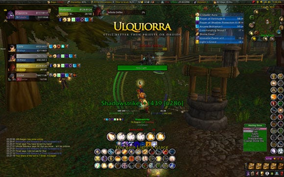
World of Warcraft (Blizzard, 2004) is a pioneer in the UI scene for releasing the UI code for third party development -- not only allowing players to move the various UI entities around the screen, but also allowing the creation if new UI elements. These can even show completely new data that isn't obtainable with the default UI. This bold move by Blizzard gave birth to a huge "add-on" scene, where players create stand alone UI elements that serve very specific purposes.
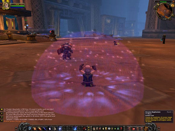
Not unlike Team Fortress 2, the World of Warcraft approach seems especially keen on giving players the information they might want with very little regard to esthetics or diegetic qualities. One thing that unifies almost all aspects of the World of Warcraft UI is that it is, with few exceptions, a non-diegetic classical 2D HUD complemented with spatial non-diegetic info -- nametags, health bars, etc.
Below is an image of the default WoW interface, a fairly traditional non-diegetic 2D solution complemented by spatial non-diegetic and meta elements.
Below is one of countless examples of customized interface in WoW with several add-ons providing information not otherwise obtainable.
What worked?
Customization
Having a freely customizable interface seems to greatly increase the tolerability of traditional 2D HUD elements even when the screen gets cluttered.
Aid to perform
Seemingly advanced and intrusive non-diegetic interfaces seem to be tolerated and even appreciated if they aid the player to perform his task, especially in the presence of other players.
Perspective
The third person perspective allows a 360 degree awareness that vastly helps player orientation and navigation.
What didn't work?
Stress to perform
Immersion isn't a big factor from an interface standpoint, and the scriptable interface is always subjects to exploits. It is hardly an option to play the game with the default interface if you wish to be competitive -- adding stress to players about getting the right stuff for their interface.
Final analysis
World of Warcraft could be an example where other developers might overestimate the importance of immersion or at least the forms immersion takes. WoW is a fantasy role playing game and is as such by no means extra suitable for complex or data heavy non-diegetic interface elements; still players seem to prefer them over the lighter default interface.
The cause and effect here are difficult to fully untangle, but it seems in the case of World of Warcraft, when given the choice, players want more information and more UI to aid them reach optimal play performance. However, how much of a choice it actually is can be debated given the competitive nature of World of Warcraft.
The success of World of Warcraft sends a strong signal that immersion might not, or at least not always, be in the consumer's best interest. Maybe they just want to perform at the peak of their ability in harmony with the game.
Conclusion
As I mentioned in the Far Cry 2 analysis, inclusion of non-diegetic interface elements seems almost required to reach the level of playability required in today's competitive market. The opposite does not seem to be true, judging from my analysis of Team Fortress 2.
My conclusion is that there is a fundamental rule for all games that must always be met regardless of the looks and functions of any given interface: The rule of functionality preservation and translation must be met.
The discovery is that the players exist in your game in two instances, the "avatar" and the "organism". The avatar is, of course, what is rendered on screen; the organism is what is left of the player after passing through the plane into the game world -- the preservation the game's functionality and its translation into in-game abilities.
In nature, there is no "avatar", since a creature's body is an exact representation of the organism's capabilities. In games, however, there is an inherent discrepancy between the two -- since the developer dictates in detail the embodiment of the organism. The game might dictate that the hero is a space marine; the challenge, however, is to design a user interface -- or let's call it "organism interface" -- that makes the player feel adequately that he or she is a space marine.
Imagine the opposite -- that the "avatar" is withheld from the player's perception, and that you as a developer are challenged to make the player describe themselves as "space marines" based only on how they feel when they play. The risk is that they describe themselves as hovering box with a mounted machine gun.
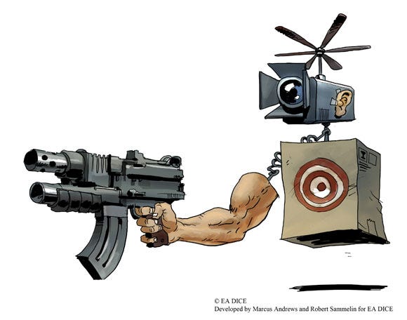
Passing through planes
The player becomes the organism when he passes through the plane between reality and your game. The UI is that plane. Take a prosthesis as an example -- a human is robbed of his right arm, a doctor fits a prosthetic arm to take its place. The prosthesis is the interface in this example, and the better the interface, the more right arm functions will be preserved. You could say that this person has crossed his right arm through the plane.
Now imagine the prosthesis designer had decided that preserved functionality was not as important as the authenticity of the rubber skin covering the mechanics. The person with the prosthesis would have a more authentic looking arm, with less preserved functionality. Since UI could be considered a virtual prosthesis, always make preserved functionality your main goal!
Regardless of your overall UI direction, be it immersion or a HUD your first priority has to be to enable the organism to operate in your game world, otherwise all else will fail. There is simply no viable strategy that allow for neglect of this vital aspect.
Designing Your Organism Interface
Look at your main avatar - "the hero". Describe how it feels to be the hero
Example: Badass, Confident, Fearless, Aware
Is your hero "aware" of being an elite soldier? You have to make sure the player feels aware! How do you handle enemies outside the screen, enemies behind the player, enemies behind trees, etc.?
List the functions you know must be present in the UI (without regard to how it will eventually be implemented)
Example: Crosshair, Health, Ammo, Mini-map, Weapons inventory, Objective locator
Start designing a preliminary interface
Map your "must haves" to different interface methods, diegetic, HUD, etc.
Review your preliminary design by asking: "Will this UI allow me to be aware of 1, 2, 3 and will I feel A, B, C when I do it?"
Iterate on your UI design until you can answer the above question "yes!"
Remember that UI comes in many forms, Audio, Animation, HUD, effects - mix it up!
(Where 1, 2, and 3 are your must have functions and A, B, and C are how it should feel to be the hero.)
In the last step you are bringing the avatar and the organism together by designing interface solutions that will make the player actually feel and behave the part assigned by the game.
It could be argued that "feeling badass" is not mainly achieved with UI but that depend mostly on the interpretation of UI. It might not be achieved with a 1999 HUD, but with a skillful implementation of various UI components from various categories tailored to fit the experience I would argue UI has everything to do with feeling badass!
Read more about:
FeaturesAbout the Author(s)
You May Also Like




.jpeg?width=700&auto=webp&quality=80&disable=upscale)


