

Daily news, dev blogs, and stories from Game Developer straight to your inbox
Sponsored By
Featured Blog | This community-written post highlights the best of what the game industry has to offer. Read more like it on the Game Developer Blogs or learn how to Submit Your Own Blog Post
Finding the magic in VR-centric design: Backpack Inventory
VR is all about iteration and experimentation, occasionally leading to magical design discoveries. This article covers what went in to creating a first-of-its-kind VR inventory, an intuitive backpack that players can pull naturally over their shoulder.
8 Min Read

Like most of our early VR designs in The Gallery, the backpack began pre-Vive. At the time, nobody was sure when motion controllers would be paired with virtual reality headsets, and most VR games were built to consider gamepad for that reason.
The backpack started as a Resident Evil, Day-Z, gamepad-inspired UI where you would press a button and have inventory would pop up in front of your face, floating static. You could then use the joystick to move through selection blocks and manage your items. It was a design that worked well for seated and standing VR–until the introduction of positional tracking.
With standing 180 VR, we could manage where the player was in 3D space; if a player locomoted up to a wall, they were constrained by stick movement. We could know at any time whether the backpack had enough clearance to come out because the player’s body was in a fixed position. But as soon as VR added positional tracking, players could now move their physical body at the same time as they activated their inventory, and the bag could end up stuck in a wall.
To solve this, we decided to give players influence over the bag in space, so they could physically control where they placed it after activation. From there, the initial thought was that players could drop the bag on a table or on the ground–that it would follow the other physical rules of our realistic game world. But it also had to be functional; we didn’t want players to feel the tedium of keeping track of or of rummaging through an actual backpack.
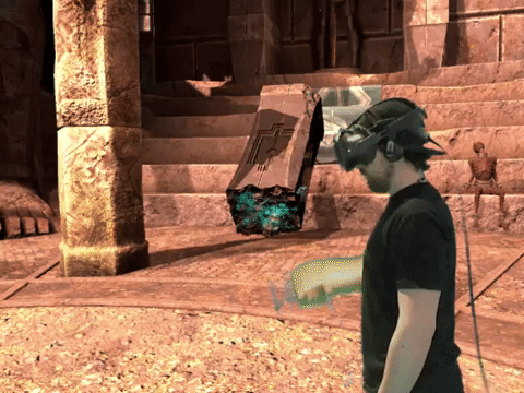
At PAX 2015 (shoutout to Valve, Intel, and HTC), we showed off our latest demo of The Gallery with a brand new solution. Instead of spawning the bag in front of them with a button, we told players to just reach behind their shoulder and grab. You could now activate and stow your inventory with a natural, immersive gesture: Reach over your shoulder and pull the bag out in front of you. A simple change that would go on to change our entire interaction system.
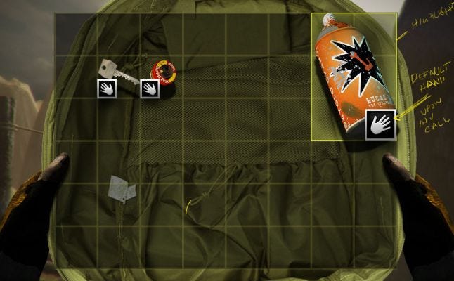
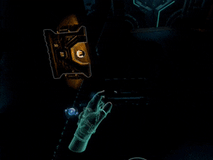
Pulling out the bag, you would see one object floating out front, a miniature 3D representation. Swiping at that icon with your hand would scroll through a carousel of items remaining in your inventory. When you let go of the bag, it would float in the air, completely breaking our laws of physics in favour of what felt right.
We were pretty confident in the mechanic until we let loose 400 people at PAX to go through the demo. While the over-the-shoulder came naturally, players struggled to swipe reliably. We couldn’t give enough physical feedback of where exactly they should swipe, and it wasn’t coming intuitively to even swipe in the first place. Instead of a rolodex, our inventory felt like a fandangle key ring. It felt like rummaging through a bag.
And then, suddenly, we were only a few months away from the original ship date for the Vive.
So, we went back to the basics. We returned to the grid UI, bringing with us the “highlighted icon” we made for the carousel version. We stuck a big circle in the centre of the backpack for the highlighted object to live, with a bunch of additional inventory slots around it.
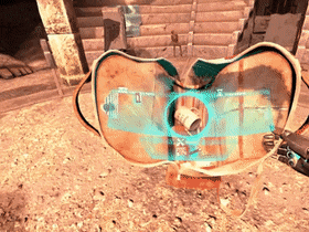
Selection was now a different beast entirely, as each inventory slot turned into what amounted to a button. Press the “button” for any inventory slot, and its respective item would appear, larger, in the centre preview circle. However, since we were using custom hand models, the default hand pose (and lack of finger tracking) made it difficult for players to know exactly where their fingers were in virtual space. We had to add a whole new hand pose just so players could “poke” at the buttons in the bag.
Now we had a bag you could pull out from over your shoulder, and a way to select items from within it. But we were still struggling with what exactly those items would be. The original thought was something Skyrim-esque, where you could pick up almost anything in your world and put it into your backpack. We were in VR after all, and few things can be more immersion-breaking than grabbing at an object and not being able to pick it up.
We knew we couldn’t compromise on what we allowed players to grab, so the question was how to telegraph which objects can be collected and why the others can’t.
Our answer came in the form of another question: What the hell do we do about this grip button?
As an idea, the grip button made perfect sense—it was there on each side of the controllers to grip and to grab. But coming out of our PAX demo, players were telling us it was too awkward to squeeze intentionally, and too easy to squeeze unintentionally.
But The Gallery had the perfect use case: a flare gun. If, like the other Vive experiences at the time, we used the trigger to grab objects instead of the grip, how would you fire a flare? The grip was there to grab items, and the trigger was there to use them. We had been building The Gallery toward this new VR hardware from its very beginning; we couldn’t just kill an entire input.
In a last-ditch attempt to make the grip work for every other object in our game, we implemented a latching system. You could press and hold the grip button to latch an object to your hand, and then let go of the button but still hold the object. But it was a nightmare to communicate, and it would be worse if we only used the grip for some items and the trigger for others. So we killed an entire input. As with most hard lessons in VR, the takeaway was that fewer physical inputs led to greater immersion and intuitive interaction.
Once we knew for sure that we were only going to use the trigger to both pick up and use objects, we came up with a classification we called the “Objective-based Item” or “OBI.” Every item in the game was classified this way, either as an OBI or a NOBI (not objective-based).
This new system could communicate to players not only which items could go in their backpack, but also which items were important for The Gallery’s puzzles. When a player picked up an OBI it would glow blue and latch to their hand, regardless of whether they kept holding the trigger.
When players knew they couldn’t let go of the item, they knew it had to go somewhere, either in a puzzle later in the game or stored safely in their backpack over their shoulder. The OBI system stopped our players from trying to put every little object in their backpack and it informed them in a direction as though the very presence of the item was a clue.
It also informed our backpack UI and how many slots we would need. Because we knew exactly how many OBIs were in the game, and because OBIs were the only objects that could go in the bag, we knew exactly how many slots the backpack would need–no scrolling and no rummaging. NOBIs could be picked up at any time, but they would never latch and could be dropped just like any normal physics object.
In my last post, I talked about our design approach to VR telekinesis in the second episode of The Gallery. It was an example of diegetic abstraction; empowering VR by replacing an abstracted control-scheme with in-game abstraction. I think a lot of the boundaries that we pushed with that design stemmed from what we learned developing the backpack.
With this type of design, we can get players to pretend, to immerse themselves in our worlds. All we need to say is, “You are wearing a backpack. Now grab it.” And players will reach behind them and grab it and be delighted. It’s the coin behind the ear, and the player is the magician; “I was wearing a backpack this whole time and I didn’t even know it!”
Part of that delight in the backpack is how it mixes diegetic and non-diegetic properties. It’s a menu, and it feels like a menu, but it also feels like you are the one interacting with it. Our first episode of The Gallery was always about that–a first step into virtual reality, grounding the player with the familiar while giving them a taste of the unknown.
The backpack was one of those moments for us that really proved to players why VR was different from flat games. It showed how this wacky virtual reality motion control thang could actually introduce not just new controls but new ways of abstracting those controls and creating gameplay. It put the question into players, “If VR can do that, what else can it do?”
Read more about:
Featured BlogsAbout the Author(s)
You May Also Like


.jpeg?width=700&auto=webp&quality=80&disable=upscale)


