Daily news, dev blogs, and stories from Game Developer straight to your inbox
Sponsored By
Evolution of Pokemon Designs – Gen 2
Pokemon designs have changed a lot over the past 20 years. In today's video, I take a look at the designs of Pokemon from Generation 2 (Gold, Silver, and Crystal) and see how they have evolved since Generation 1.
12 Min Read

The following is a reproduction, and has been modified for this site. The original article, and many more, can be found at RemptonGames.com
Transcript
Note: This video is comparing designs of Pokemon, and thus is heavily focused on visual information that cannot truly be captured in text. Therefore, watching the video is highly recommended, if possible.
What’s up designers and welcome back to Rempton Games. Today I am super excited to take a look at the designs of Pokemon in generation 2, and see how they have changed since generation 1. This is the second part in my evolution of Pokemon Designs series, so if you haven’t seen that yet you should probably check it out before watching this – I’ll put the link in the description.
For this portion we are going to be looking at several different things that influenced the designs of Gen 2 Pokemon. First, we are going to look at some general design trends that have to do with the themes of these games. Next, I want to look at how new technology and game mechanics have influenced the designs. Third, I want to take a closer look at the designs of legendary Pokemon, and finally I will end with a comparison between Pokemon that serve similar roles in Generations 1 and 2. Without further ado, let’s get into it.
Let’s start by looking at some of the general themes and trends of Generation 2. Generation 2 is pretty unique among Pokemon generations because it is the only generation that was really designed as a sequel to the previous generation. Gen 1 and Gen 2 are very closely linked, and this can clearly be shown by looking at the games themselves.
Gen 2 takes place 3 years after Red and Green, which matches the real-world amount of time that has passed between games. Many characters from Gen 1 appear in Gold and Silver, and the player is able to see how these characters have grown and changed. In addition, Gold and Silver are the only games (other than remakes) that allow players to explore multiple regions in 1 game – in addition to the brand new Johto region, players can also go back and explore the original Kanto region.
This close relationship between these two generations extends even deeper, to their early development. Gold and Silver were originally developed under the title of “Pokemon 2”, and as can be seen from an early demo that was shown at Nintendo’s 1997 Spaceworld convention Gold and Silver were originally developed in a modified version of the Gen 1 engine. Based on this evidence, it seems pretty clear that Gold and Silver were being developed while Gen 1 was still in development – probably beginning after the release of Red and Green in Japan, but definitely before the release of Pokemon Blue and Yellow, which were the first gen’s “enhanced versions”.
This close relationship between these two games certainly extends to the designs of the Pokemon themselves. Many Gen 2 pokemon, such as Slowking and Bellossom, are direct evolutionary relatives of existing Gen 1 pokemon. Many original Pokemon also likely have their roots in gen 1 – one example we know for sure is Gyaoon, a pokemon that was cut from Generation 1 that later got added to Gen 2 as Tyranitar.
Despite these close ties, however, there are a number of things that make Gen 2 pokemon distinct from their predecessors. One of the biggest, and most pervasive, was a narrowing and refining of the definition of what a Pokemon could be. In Gen 1 Pokemon designs came from a wide range of sources, and could pretty much be anything – they could have multiple heads or bodies, they could be based on inanimate objects, or concepts, or be very humanoid. In gen 2, however, this is no longer the case.
In generation 2, pretty much all of the newly introduced Pokemon families have pretty clear animal, plant or mythological origins. Mareep is a sheep, Sudowoodo is a petrified tree, and so on. While there are a few odd outliers, such as Unown and Wobuffet, which have more unusual inspirations, they are a small minority. For the most part, this generation has tried to choose more natural inspirations for it’s Pokemon designs.
I think there are a few reasons for this. I think the first is a cultural one – when Gen 1 was first released, nobody had any preconceived notions about what a Pokemon was supposed to be. However, by the time Gold and Silver came around Pokemon had been around for a couple of years, and the word “Pokemon” began to have very specific connotations.
While Pokemon were originally designed simply as monsters, due to the way they were depicted in media such as the very popular anime series, people began to think of them more as animals – with an ecosystem, predator-prey relationships, things like that. While there was certainly some of this in Gen 1, I think that the design philosophy probably shifted somewhat towards Pokemon that seemed like they would make sense in a natural environment.
Another reason for this shift, however, is due to the themes of the Johto region. In the first game players explore the Kanto region, which is based on a region of Japan with the same name. The Kanto region of Japan is the most industrial and urbanized region of the entire country, and includes the Tokyo metropolitan area. Similarly, the Kanto region in Pokemon Red and Blue represents a modern, technologically advanced Pokemon world. Perhaps because of this, the original 151 include many Pokemon with urban influences – Pokemon such as Muk and Koffing are based on pollution, while Pokemon such as Porygon and Mewtwo show the influences of advanced technology.
In contrast to this, the Johto region, which is the region introduced in this generation, was based on the Kansai region of Japan. The Kansai region is considered to be more of a center of culture and history, which fits in with the themes of the Johto region. The Johto region is much more rural than the highly urbanized Kanto, and is more influenced by traditional Japanese culture. This can be seen by looking at things such as the Brass Tower, or the Ilex Shrine.
Because of this rural Japanese influence, a large portion of the Pokemon designs seem to be animals that could live in a temperate forest environment. Pokemon like Stantler, Noctowl, Heracross, Ledyba, and Pineco all fit this description.
In addition to this trend away from some of the more unusual designs of Gen 1, generation 2 had a trend towards Pokemon that looked more “designed”, for lack of a better word. While generation 1 Pokemon have a very rough, jagged look to them, the Pokemon in generation 2 look somewhat more deliberate.
I think the best way to show this is by comparison. I think a good comparison would be Electabuzz to Ampharos – they are both electric types, and are both primarily yellow with black stripes. While the black stripes on Electabuzz were certainly a design decision, the way they are drawn they look like a natural part of Electabuzz’s “fur”. Compare this to Ampharos’s rings, which seem to be much more deliberately placed.
As a matter of fact, rings and loops seem to be a very common design motif among Gen 2 Pokemon
Another way to see this would be to look the different birds that appear early in the games. In Generation 1 you have the Pidgey line, which seem like pretty basic, relatively realistic looking birds with jagged feathers. Compare this to Hoot-hoot and Noctowl, which fill a very similar role in Gold and Silver, and you can immediately see the differences. The newer designs seem much less natural, especially with the clock-like design on Hoot-hoot’s face, and have a smoother, more stylized look overall.
Now that we have looked at some of the general themes and trends that affected Gen 2 Pokemon, let’s look at how mechanics and improved technology have influenced these designs. Gen 2 introduced a number of gameplay features that would go on to become staples of the series. This includes two new types – Dark and Steel – which were added to help balanced the battle system. The introduction of new types means that new Pokemon had to be designed to fill these types. Some Pokemon were changed from their original typing, such as Umbreon which was originally designed to be a poison type. Others, such as Skarmory, seem like they were clearly designed for these new types.
Another new mechanic added in Gen 2 was Pokemon gender, and yet male and female Nidoran are still treated as different species for some reason. However, with the addition of Pokemon genders came Pokemon breeding, and to show off the new breeding mechanics many Pokemon were given new “baby” forms. These baby Pokemon can only be obtained by breeding their more evolved versions, and basically just look like cuter, more simplified versions of the original Pokemon.
When it comes to specific, repetitive design traits, Gen 2 is much less defined by these than Generation 1. While it does still have some of the same eye styles that were used for the original 151, they are much less common. Angry anime eyes, for example, are mostly reserved to Pokemon like Ursaring, Houndoom and Tyranitar that are designed to be particularly aggressive or threatening. In general, Gen 2 has a much wider variety of eye styles, and is more open to experimental styles such as Chinchou, Xatu, and Dunsparse.
However, if I had to choose a style that seems the most common, it would probably have to be eyes that consist of a dark circle or oval with a small sparkle of light. This style was used a few times in Gen 1, most notably on Pikachu, and is used several times for Gen 2 Pokemon.
Other Gen 1 features, such as the three-clawed hands and feet, are also much less likely to be seen. Instead, Gen 2 has more of a trend towards “nub-like” arms, with little to no definition.
Technical limitations have also had an effect on these Pokemon designs. While Pokemon Red and Blue were released for the Original Gameboy, Gold and Silver came out on the Gameboy Color. While this didn’t really change design limitations in terms of sprite size or complexity, it did give designers much more freedom in terms of color.
While Pokemon in Gen 1 tended have very simple color schemes with one main color, and usually a lighter or darker accent color to provide additional detail. Gen 2 Pokemon, in contrast, tend to have a color scheme that consists of 3 or 4 main colors. This is largely due to the graphical limitations of the Gameboy color. While it was capable of showing color, it’s display abilities were still limited. Each sprite was limited to a single palette of 4 colors, and one of those colors was required to be transparent. Since battles always take place on a white background in Gold and Silver, these transparent portions always ended up looking white.
This limited the sprites to only having a few main colors, but this still allowed the designers to use color in ways that they never could before. One way that the Gold and Silver designers expressed this newfound freedom was by designing Pokemon with vibrant complementary colors, or simply designing more colorful Pokemon overall. Good examples of this include Ariados, Togepi, Xatu, and of course Ho-oh.
Speaking of Ho-oh, that brings us to our next section – the design of legendary Pokemon. From developer interviews and design documents it is clear that the concept of “legendary” Pokemon, or something similar to them, was around pretty early in development of Red and Blue. However, even after Red and Blue’s release I don’t think the concept of Legendary Pokemon had been fully fleshed out yet. When it comes to these early games, Legendary Pokemon basically boiled down to being powerful and hard to catch.
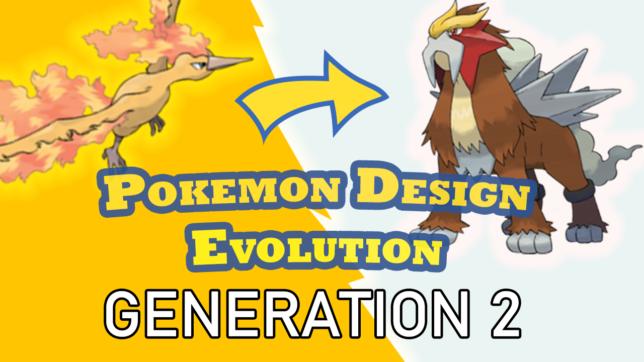
In Gold and Silver, however, the concept of Legendary Pokemon evolves somewhat. First, we actually hear legends about these Pokemon – specifically, the tale of Ho-oh and the burned tower. For those who aren’t familiar, this tells the story of three Pokemon who died when lighting struck what is now called the burned tower. Ho-oh, who used to roost in the tower, revived these three Pokemon (which were widely believed to have been the original eeveelutions) and they became the legendary beasts trio.
I believe that giving these legendary Pokemon this backstory really gives them a sense of power and mystique, but their designs also reflect this. While I think Mewtwo’s design does a good job of conveying it’s role as a powerful mutant alien that is not to be messed with, I think that the designs of the legendary birds look relatively ordinary, sort of like what you would get if you evolved Pidgey with elemental stones.
Compare to that, the legendaries of Gold and Silver I think do a much better job of conveying their “legendariness”, as they don’t look like anything else in the generation. No other Pokemon in the first 2 generations has the same level of detail in their designs as the Legendary beasts, and this starts a clear trend for legendary Pokemon going forward.
Finally, I think a good way to really see how the designs have changed from the previous generation is to show a side-by-side comparison between Pokemon that share similar roles in the games. Pokemon has a habit of repeating similar types of Pokemon that fill the same niche in their games, and by comparing these counterparts I believe you can get a good apples-to-apples comparison of their designs.
Thank you so much for watching. If you liked this video please leave a like, and subscribe so that you don’t miss future entries in the series. If you haven’t seen part 1 you should definitely check it out, and if you want to see more you should take a look at my other videos like my last one on Fractal Game Design in The Legend of Zelda: Link’s Awakening. I also have over 100 articles on the RemptonGames blog, which you can check out at the description down below. And join me next time for the first video entry in my “Game Designer Spotlight” series, focusing on designer Sid Meier. Until then, thank you so much for watching, and I’ll see you all next time.
Read more about:
BlogsAbout the Author
You May Also Like