Daily news, dev blogs, and stories from Game Developer straight to your inbox
Sponsored By
Featured Blog | This community-written post highlights the best of what the game industry has to offer. Read more like it on the Game Developer Blogs or learn how to Submit Your Own Blog Post
Doing an HD Remake the Right Way
Let Final Fantasy V's recent "HD remake" be a cautionary tale. We lay out some best practices for HD remakes from our own experiences.
32 Min Read

I also blog at Fortress of Doors, follow my stuff here:


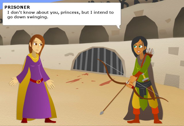
Final Fantasy V just came out on Steam. This is a beloved classic game, but the way they've done the HD upgrade just makes me cringe. This particular version is a port from the mobile version, and the even more beloved Final Fantasy VI had the same questionable treatment.
Here's the problem, as eloquently laid out by my good friend Bill Stiernberg from Zeboyd Games: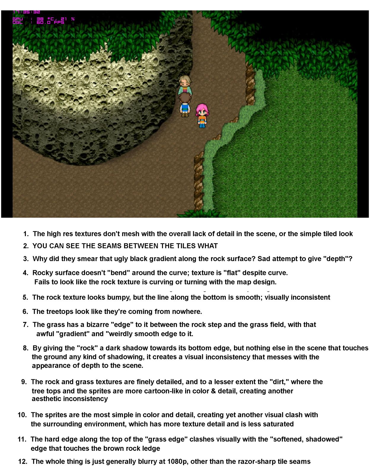
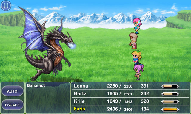
The man's right, just look at this detail: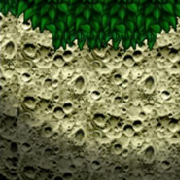
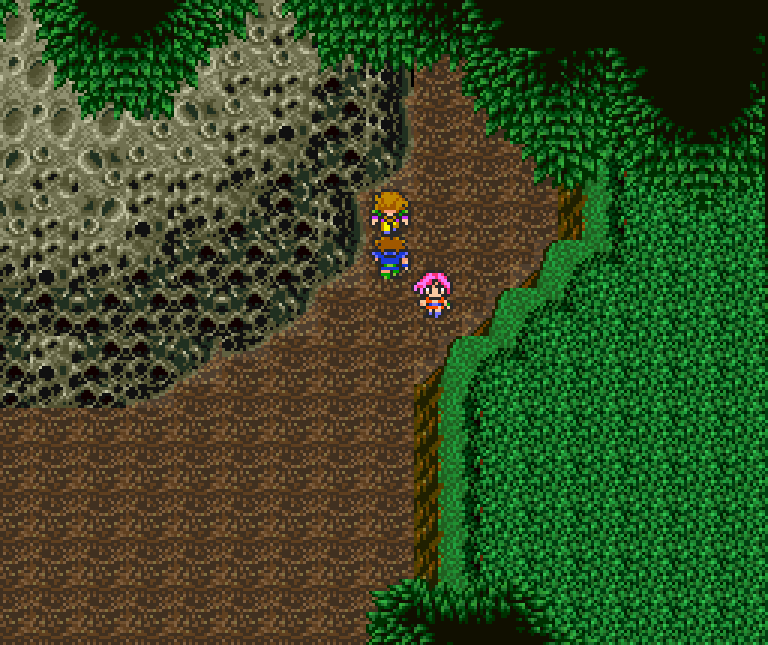
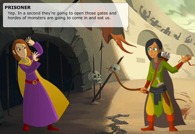
Compare that to this screenshot from the original game:
I know some people have an aversion to pixel art and may find the top image looks better despite all its faults simply because it isn't pixelated. My point isn't to argue that pixel art is better than HD art. My point is that nobody should settle for this awful style of HD art, when Square Enix can clearly do better.
Just look at Final Fantasy IV's PSP remake (source):
Here's the original SNES version (source):
I'm not done yet, here's a before and after of Final Fantasy I, the NES and the PSP respectively (source, source) :
The HD version is clearly inspired by and faithful to the original artwork, but it's also actually well done.
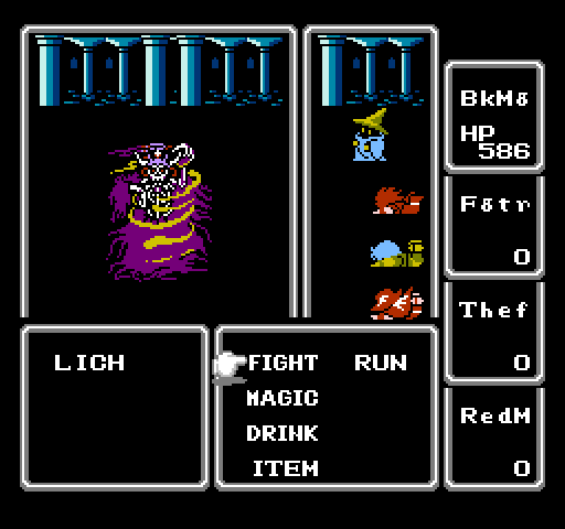
For comparison here's before and after of FFV's battles (source, source):
The dragon is well done, the background is nice, the user interface is okay, and the character sprites are bland. More importantly though, none of this feels like a cohesive whole. Notice how the characters are just kind of floating in space and don't feel anchored to the ground? In high res the effect of perspective is more prominent so it just looks wrong. Scroll back to the FF1 screenshots and notice how the characters really look like they're actually in that environment.
If your only criteria is "doesn't have pixel art" then I guess it's "better" than the original, but the original actually feels like a coherent composition. Compared to what Square Enix is (or was) capable of with the PSP version of FF1, this is just a hot mess.
As someone who's working on an HD remake myself, I feel I have some relevant experience. In this article I'll share some of the artistic and technical lessons I've learned working on the Defender's Quest series.
There are so very many ways to screw up an HD remake and hopefully this guide will keep more developers from "pulling a Squenix".
First and foremost...
Keep the old graphics as an option!
I really hate how the game industry pushes "new and improved" as equivalent to "old is garbage." I mean, I like a good HD remake as much as the next guy, but sometimes I want the "original theatrical experience", and I don't want to have to go to insane lengths just because George Lucas doesn't have an editor who can stand up to him anymore.
The obvious solution is to just pack in the original "legacy" version of your game with the HD remake, and that's what we're doing. But players might reasonably want to use the original sprite art in the new engine too, and so we're doing that as well.
I can tell you from experience that ANY art change, even when done masterfully, is going to piss off some subset of your fans, and they're not wrong to feel that way. Human beings fall in love with things they're familiar with, so why take it away from them? Treat your existing fans with the respect they deserve whenever you court new ones. This is also a good safety valve in case your new art style is simply not as good as you think it is.
With that said, let's talk about HD upgrades.
Resolving Resolution
These days your game is expected to be "resolution independent" -- meaning it can natively scale to any display size and still look good and behave well. Text shouldn't appear tiny and unreadable at 1080p or 4k, and if you're feeling especially fancy your game should handle both 4x3 and 16x9 aspect ratios.
The most common solution is to pick a new "native" base resolution for your HD upgrade, and produce master assets that appear at 1:1 magnification at that scale, and dynamically scale up or down from there if the user picks a different resolution.
However, your original game's base resolution will have a huge impact on your available choices for your new base resolution.
This table shows the scale ratios you get when going from one vertical resolution to another:
240
240 | 1.0 | 2.0 | 2.5 | 3.0 | 3.2 | 4.5 |
|---|---|---|---|---|---|---|
480 | 0.5 | 1.0 | 1.25 | 1.5 | 1.6 | 2.25 |
600 | 0.4 | 0.8 | 1.0 | 1.2 | 1.28 | 1.8 |
720 | 0.33 | 0.67 | 0.83 | 1.0 | 1.07 | 1.5 |
768 | 0.31 | 0.63 | 0.78 | 0.92 | 1.0 | 1.4 |
1080 | 0.22 | 0.44 | 0.55 | 0.67 | 0.71 | 1.0 |
Any value greater than 1.0 but less than 2.0 is awkward -- nearly all scaled pixels will fall between gridlines in the new resolution and therefore appear smudged. As you can see from the table, the lower your original resolution, the more flexible your choices are. A 240p game can upscale nicely to pretty much anything, just look at Shovel Knight:

If you open that in a new tab and inspect it at 100% zoom you can barely even tell that it has smudged pixels, because the ratio is 4.5:1.
Zooming in you can see the smudging. But even blown up at 2x it's pretty subtle:

Shovel Knight obviously doesn't have "HD," hi-res sprites. But if you were using it as the basis for an HD upgrade, you would have a very good foundation to start with.
The original SNES version of Final Fantasy V had a resolution of 256x224. Let's look at their options:
240
Although none of these end on clean fractions, 1280x720 and 1920x1080 make the most sense as they are standard display sizes and are only about 0.2 off from a whole number ratio. Perplexingly, they picked 1280x768 instead, a 5:3 ratio. According to this review, that's the only display mode you can use without letterboxing.
Everything about this is so weirdly non-standard:
It doesn't match HD standard, that's 16:9.
It doesn't match the original iPad standard, that's 1024x768 (double for retina).
It doesn't even match the original SNES game, which was 8:7!
The tiles are 60x60 when the original were 16x16 (why not a clean 4x at 64x64?)
Furthermore, most modern game engines are flexible enough to show the player a variable amount of the screen, but FFV can't. If you pick a resolution with any other aspect ratio (including all the most popular sizes), it'll appear letterboxed or pillarboxed. And since it's extremely unlikely you have a native 1280x768 monitor, picking the "native" display size results in a distorted and smudged image.
My last nitpick is a decision that's sadly common -- the game renders at a fixed resolution and then just scales the whole thing to match whatever your display is, instead of scaling the assets individually and natively rendering a scene at your target resolution. This is fine for pixel-art games, but it has a lot of drawbacks for HD games. If you're going to go with this method, you really need to pick 1080p as your native resolution so that you're only ever scaling down (4K monitors aside). You might be able to get away with this on a console where the player is sitting at least 10 feet away on a couch, but for a 2D game that's right up in your face on a computer monitor? No way.
Open this image in a new tab and fullscreen it at 100% zoom. This is an official screenshot from the game's steam page, and it's both pillarboxed and blurry.
Now to be fair, the original version of Defender's Quest doesn't look great at 1080p either, and it's locked to a 4:3 display ratio -- but that's why we're doing an HD upgrade. In the process, we ran into a lot of the same issues that FFV did, but I feel we made much smarter choices.
For instance, the original Defender's Quest's resolution was 800x600. What options does that give us for picking a new HD base resolution?
240
Hmmm.
Even at 1080p, we don't have a clean 2x scale we can round down to. If I could go back in time I definitely would have picked something easier to work with, but what's done is done.
The naive solution is to pick 1080p as our new base resolution, upscale everything by 1.8x, clean it up, and call it a day. There's several problems with this:
What about "original art" mode? It won't upscale cleanly to 1080p.
Sprite upscaling algorithms generally ONLY work with whole numbers (2x, 3x, etc).
Nearest neighbor upscaling by a fraction means way more cleanup work.
Refactoring old game code with a 1.8x resolution difference is a pain.
Our solution was to pick a base resolution exactly 2x the original, or "1200p". Now, 2133x1200 is a weird resolution and I highly doubt any displays support it natively. However, a clean 2x resolution difference makes refactoring much easier and makes the new art asset pipeline simpler, and some clever engine programming and UI design takes care of the rest.
We made our HD master assets 2X the size of the original and the game scales them down at runtime to match whatever the user's resolution calls for. This works really well in practice, keeps the math clean and easy, and lets us natively render at any resolution without cheaping out and scaling the entire framebuffer instead.
Upscaling Algorithms
Okay, so that takes care of the resolution issue. But what about the assets themselves?
One way to do a quick-and-dirty HD upgrade is to make use of graphics upscaling algorithms. You're already familiar with the simplest of these if you've ever used Photoshop -- Nearest Neighbor, Bilinear, Bicubic, etc. But these aren't very suitable for fancifying pixel art. Fortunately, there's much better algorithms at your disposal.
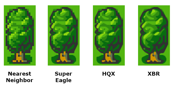
Emulators are famous for their fancy upscalers, which often run as a final post-process step on the game's video output. Two of the most popular historical methods are SuperEagle and HQx, though my personal favorite these days is XBR, which you can read about here.
The main problem with running an upscaler at runtime -- besides the performance cost -- is that the algorithm gets a giant screenful of pixels rather than individual sprites. As such, it's hard for it to distinguish background details from characters, and the same exact sprite will look different depending on which pixels happen to be neighboring it on screen. The effect is particularly bad with animations.
Upscalers can be a great part of this balanced HD breakfast, but here's my recommendations:
Use the upscaler as an authoring tool, not a post-process effect
Isolate objects and upscale them individually
Clean up any artifacts manually
Also, the higher your asset's original resolution, the better results you get from upscaling algorithms:

Another thing to keep in mind is that pretty much all upscalers have trouble dealing with alpha channels, and you'll get artifacts if the edges of your sprites are touching the edges of the image. For best results I recommend wrapping your upscaler algorithm in a utility that does the following:
Add a 1-pixel transparent border to the image on all sides
Split the image into 2 images: flat RGB (matted white or black) and Alpha
Apply algorithm to flat RGB image and Alpha image separately
Compose flat RGB image and Alpha image together
Remove the transparent border (size is now 1 x scale_value)
Delete the temporary images
My tools that do that sort of thing are here if you're curious, but please, do not, I repeat, do not email me asking me how to use them!!! They are super janky and just functional enough for me to use myself.
That said, an excellent and user-friendly utility written by somebody else that combines all the popular upscaling algorithms can be found here, it's has both a GUI and a command line interface and it's what I use with my tools.
Finally: algorithms are not artists.
Even when they do the job well, algorithms are bad at interpreting the intentions embedded in your artwork, and pixel art is naturally ambiguous. Notice Megaman 1's derpy frown in the above image? Even though the original sprite has a flat mouth, the end of it is touching a black pixel outlining his face, which the algorithm interpets as a diagonal line. It takes a human eye to sort these little details out.
Upscale and Cleanup with XBR
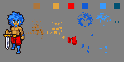
Here's an example of the large character portraits in Defender's Quest HD:
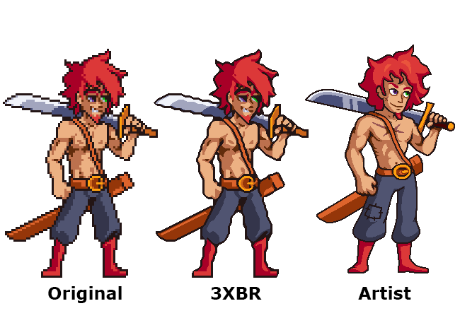
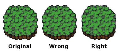
The original art is run through the XBR algorithm at 3x scale with anti-aliasing turned off. Our artists then use that as starting material for a cleaned up image.
After a lot of experimentation we found that we got the best results if we created "archival" master assets at a higher resolution than we would ever ship in the game, and told the artists to not anti-alias the final results -- stick to the exact palette of the original art and only use block shading. The reason for this is that "jaggy" pixel art is surprisingly flexible -- at resolutions this high, there's lots of ways to anti-alias it automatically with good results, and aliased art is much easier for our automated tools -- particularly when detecting color regions. This becomes very important later on when we get into run-time recoloring.
As far as the engine is concerned, we only need this asset to be 2x the size of the original, so we can create a shippable asset just by scaling it down to 67% in photoshop with bicubic resampling, which adds natural anti-aliasing. Even then it will most likely be shrunk by another 10% to go from 1200p to 1080p resolution, which adds another final bit of smoothing.
A further bonus of leaving your archival assets aliased is that you can easily trace them into vector images! An image with this many high-resolution, aliased pixels is very easy to vectorize in Flash, Illustrator, etc, without having to fight with the settings and that gives you easy cleanup options if something comes up later or if you need to create a really big asset for a poster or merchandise or something. Alternatively, since you've now got an even higher-res image made of clean pixels, you can always run it through XBR again.
Tile Artifacts
Okay, let's get back to this train wreck:
Look at all those boundary line artifacts!
The cause for this is pretty simple: these tiles were probably decomposed into a strip and then scaled as a strip. It doesn't matter whether you do this at runtime or author-time, it causes the same issue. For example, here's some grass tiles from Defender's Quest, in original and upscaled (no cleanup) form:
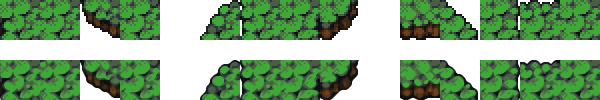
You should never naively apply a scaling algorithm to a strip of tiles as a single image. It screws up the boundaries, because any scaling algorithm takes each pixel's neighbors into account, and in a strip the neighboring pixels on each tile's edges are not what you will visually expect when the tiles are composed together. This is where those harsh lines come from.
What you should do instead is compose your tilesets into visual layouts that preserve the natural tile boundaries, do the upscaling, and then decompose those compositions back into strips afterwards. This takes more work, but it can be automated with the right tools.
Seriously, even I figured this one out, and I'm some random dork making an indie game with a few buddies and a modest budget. Square Enix has no excuse.
Sprite Atlases
So, here's the next problem with HD remakes -- all your bad habits from pixel art games come back to bite you. When your screen is tiny, it really doesn't matter if your sprite sheets are really wasteful and have tons of transparent pixels just to give yourself some breathing room.
However, whenever you double the linear resolution, you quadruple the number of pixels. This adds up quick, because each and every one of those pixels unpacks (in theory) to 32 bits of memory. The original Defender's Quest had some sprite sheets that were as big as 1280x1472 -- or about 7.2 megabytes. Double the resolution and it's about 29 megs. For one sprite sheet. I don't know how we got away with this in the original game, but there's simply no way it would fly in the HD version.
The solution is sprite atlases. Fortunate the framework I'm using, HaxeFlixel, has excellent support for them.
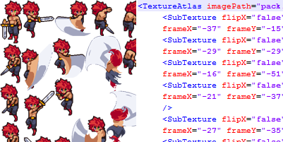
A sprite atlas takes each frame of your animation, crops them down to the tightest minimal boundaries it can, and packs them all together like tetris pieces. You also get some metadata that keeps meticulous track of how to unpack those frames. In short, you maintain a "logical" sprite sheet that has the same layout as your original, but uses much less memory.
There's a million tools that will to this for you, such as Texture Packer.
For sprites that don't need to be recolored, you just run the original spritesheet through the texture packer, set up your game to process the metadata, and you're done.
Recoloring
Here's where it gets a little more complicated.
The original Defender's Quest let players customize the colors of recruited characters, and made liberal use of palette swapping with enemies. How do we achieve this in HD?
For starters, the original method of directly swapping pixel values is out -- the HD assets that ship with the game are antialiased, and even if they weren't, there's still up to four times as many pixels to swap. We need a faster and cleaner method appropriate for this kind of art.
The solution I eventually settled on was layering -- split each major color group of the sprite into a monochrome layer, and tint that at runtime with a user-supplied color.
Notice that the first layer (skin) and the third layer (pants) include both white and grey pixels. These layers, when tinted against the user color, will produce both a base color and a shaded region automatically. However, you'll notice the skin and hair hilights are their own entire layer. This is because tinting monochrome layers forces them to all share the exact same hue value. To get the best results, we let the user pick a color swatch for each logical layer, and then do some magic underneath.
A color swatch like "red" will actually contain separately defined shadow, midtone, and hilight colors, and a logical layer like "hair" can actually consist of several separate sprite layers. This way we can apply a specific hilight color to a hilight layer and a specific midtone color to a midtone layer. This is especially important for colors like yellow that look terrible when darkened without shifting the hue towards orange:
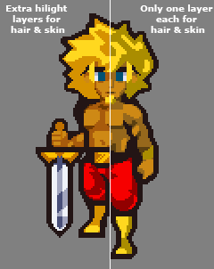
This color-swapping method can be done at runtime very efficiently without having to crawl over every single pixel and change the color directly, and it doesn't matter whether the final pixels are antialiased or not, so long as they're separated into monochrome layers (Although the examples above are left aliased for clarity, the master assets we use in the game are antialiased and 67% smaller).
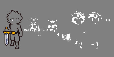
However, the more layers you add, the more memory you're consuming, as you need an additional sprite sheet for each layer. And certain layers, such as the eyes, look especially wasteful -- nearly all the pixels will be blank!
This is where texture atlases come to the rescue in a big way. It turns out that if you split each frame into a bunch of different layers, they pack down into an even smaller final image (imagine how easy Tetris would be with 1x1 blocks instead of Tetrominoes!)
For instance, here's the texture atlas for the Berserker's eye layer, it only needs 32x20 pixels:

The other layers are larger of course, but it illustrates the power of atlases -- without packing, the eyes layer would have taken up exactly as much space as the original sprite sheet. So not only do texture atlases save memory, they make it much easier to justify adding tiny artistic details like this.
Automated Fanciness
Remember how I said before that high-resolution aliased art can make recoloring easier? Here's how. As soon as I get the new sprite from the artist, I color code each individual layer using some color keys:
In this particular setup, anything with a pure red, green, blue, magenta, cyan, or yellow hue is detected as a separate layer. Since there's no antialiasing it's easy to set it up in 2 minutes with the flood fill tool in photoshop, and it's easy for the tool to perfectly judge where the boundaries are. The tool then separates each layer, transforms it to monochrome (red becomes white and dark red becomes grey for instance), runs the texture packer, and spits out the properly packaged & antialiased layer atlases and metadata files.
So that takes care of sprites.
Cutscene Art
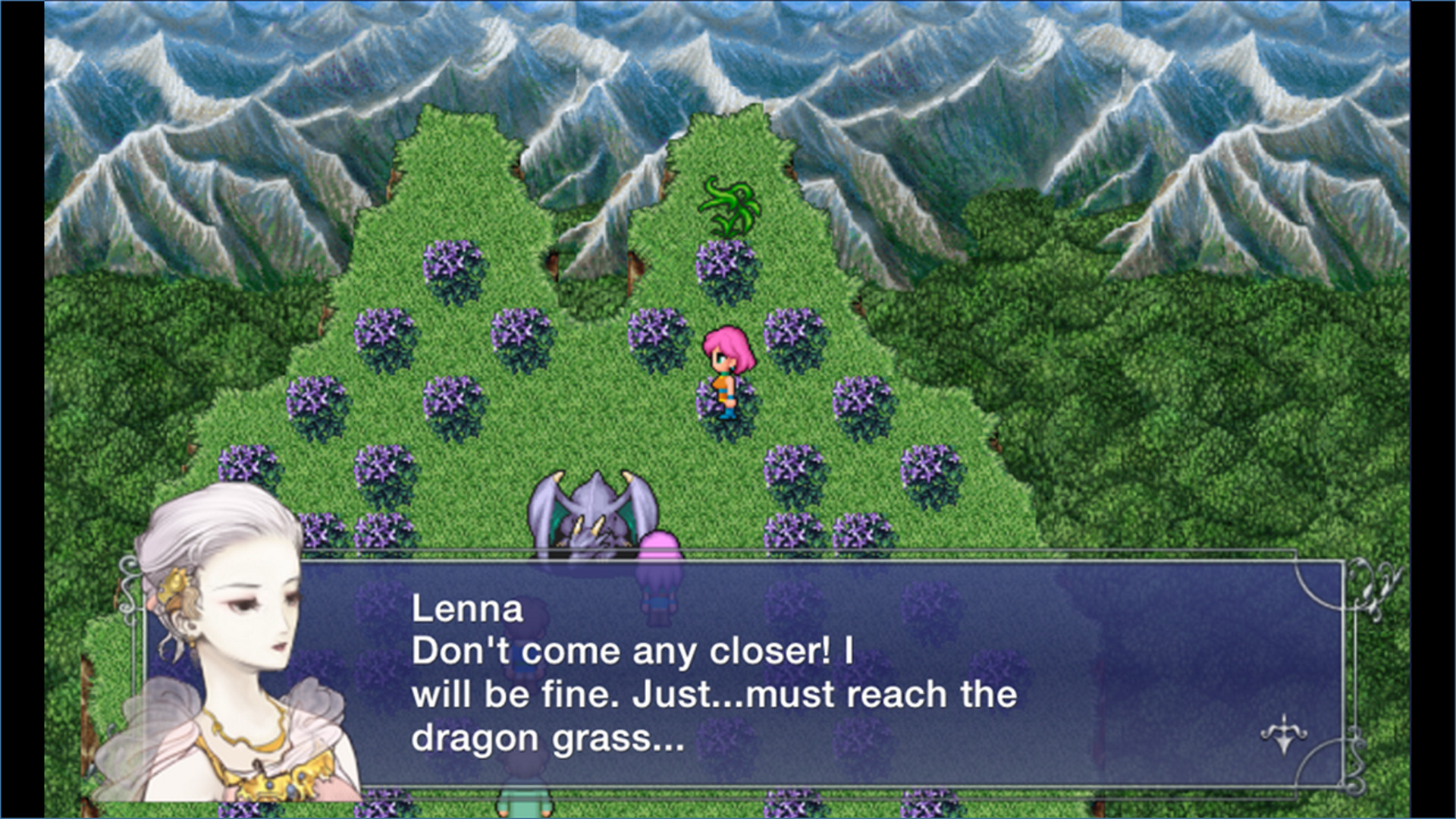
Let's go back to Final Fantasy V for a minute (source):
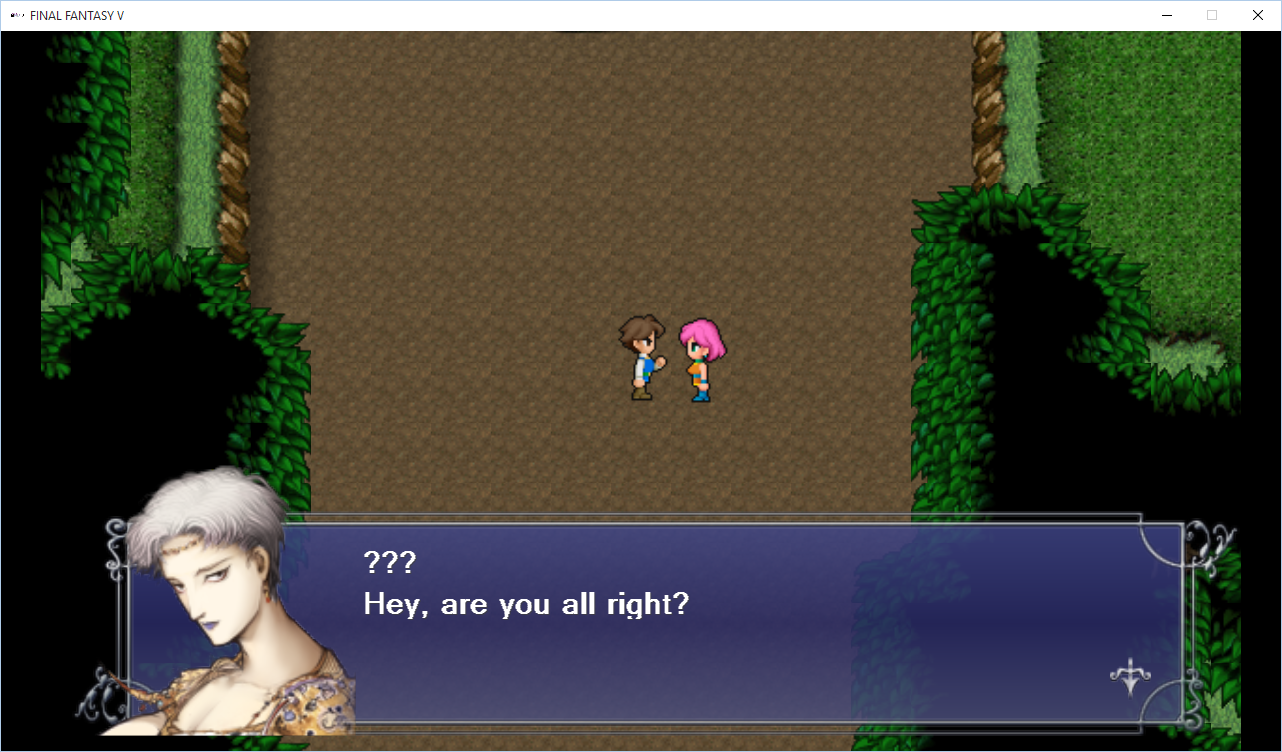
There is a huge disconnect between that character portrait and the sprite art. Just to be clear: that portrait is supposed to be the brown-haired boy on the left, Bartz. You would be easily forgiven for thinking it was meant to be the pink-haired girl on the right, since the art style is androgynous and the hair doesn't actually match the color of either sprite.
Here's what's going on -- this character portrait is one of many pieces of (beautiful!) concept art originally done by the legendary Yoshitako Amano. The vast majority of this character art never made it into the original Final Fantasy games, nor was it intended to -- usually you only saw it in an instruction manual or a strategy guide or something.
Even when character portraits did make it into a few games in a pixelated form (such as in the party menus of Final Fantasy IV and VI), they never appeared alongside dialogue bubbles in cutscenes, and they were tweaked a bit from the original watercolors and brought more in line with the sprite art, here's Terra from Final Fantasy VI:

Amano's art is gorgeous by itself, but from a practical standpoint it just doesn't match the style of the sprites that are on-screen. I think what happened was somebody on the remake team said, "Hey, do we have any portrait art for this character?", and then they just grabbed the Amano concept art and stuck it right in without a second thought.
We actually ran into some similar issues with the original Defender's Quest -- the biggest thing people complained about was the cutscene art.
Once upon a time our cutscene art looked like this:
It was simple and cute and meant to look like paper cutouts from a storybook. Some people liked it, but a lot of people hated it.
Later, we found the budget to update our backgrounds, but given the enormous amount of character portraits all we could afford was a bit of shading:
This was definitely a big upgrade, but it left us with a mish-mash of styles. I'm still somewhat fond of it -- as our many of our fans -- but we still get complaints. Here's the new style:
This is a big improvement in coherence, and just to please everybody we're keeping the old art as an option, with cutscene art a separate toggle from the rest of the HD art upgrades so players can mix and match.
However, keeping the old art gives us a problem. The new engine can go full HD, and so the old art needs to look crisp at 1920x1080, even though it was only ever intended for 800x600. I still have the vector source files, but they're such a disorganized mess that I can't just press a button and export new stuff in one go. It would take forever to export new hi-res assets by hand.
What about the upscaling the image files like we did the sprites? Unfortunately I get terrible results using XBR on the original cutscene art, and even worse with the other algorithms. What to do?
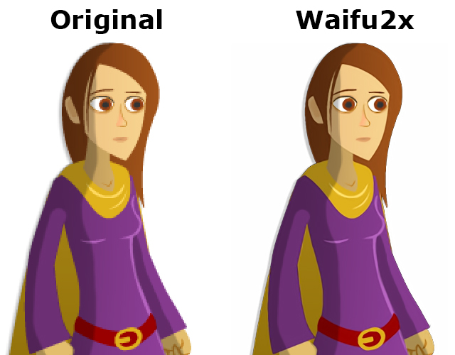
Enter Waifu2X.
Weird name aside, Waifu2X is a powerful upscaling algorithm based on deep convolutional neural networks, and specifically trained on anime. This algorithm is mostly used as an offline tool to cleanly upscale Anime videos.
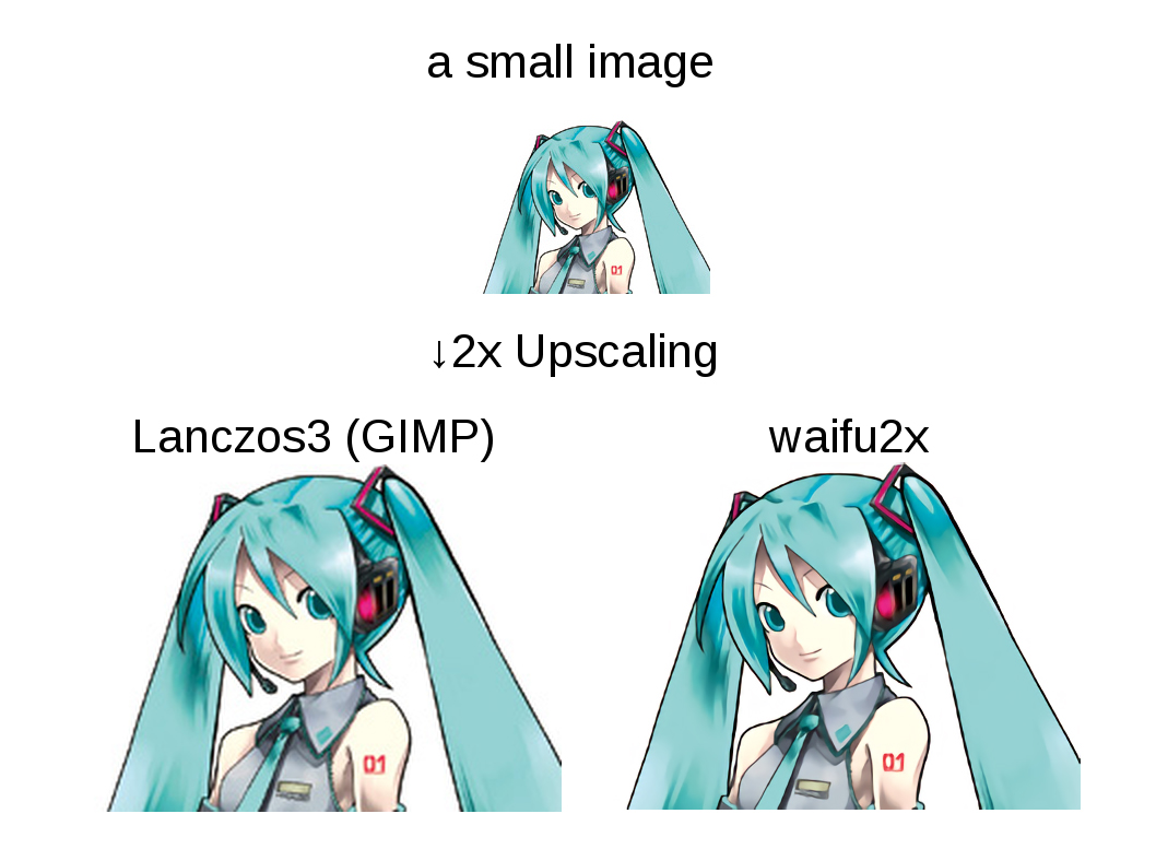
To get the full effect here you really need to open that image in a new tab at 1:1 zoom (just click on it).
The original art in Defender's Quest is reasonably close to anime in style, so I gave Waifu2x a try, and the results were good!
Note that the same limitations that apply to XBR also apply to Waifu2x -- it doesn't deal with alpha transparency well unless you wrap it in a tool that splits off the alpha channel and recomposes afterwards.
There were also a few images that needed some artifact cleanup, but for the most part it was smooth sailing and this was a lot faster than going back to the original sloppy Flash source -- this was a pure in-place upgrade, exactly what I was looking for.
There is one thing to note -- Waifu2X is slooooooow. By contrast, XBR is fast enough to be applied at runtime. To upscale a few hundred cutscene assets with Waifu2X, I had to let the tool run all night and all day. But it was worth it, I just set it to chug whenever I was going to be away from the computer, so I didn't have to spend much of my actual attention on this problem.
Update 9/29/2015: A helpful person writes:
The issue of Waifu2x being slow is only if you're using the original Waifu2x with a CPU, and not if you use it with Nvidia's cuDNN or a video card that supports CUDA. Upscaling images takes seconds on a GPU.
If you haven't heard of or used Waifu2x-caffe, I highly recommend it! It's only in Japanese, but easy enough to figure out (English translation). It also supports alpha channels, but ymmv.
User Interface
The last obstacle in our path was User Interface design. The original game was hard-coded for 800x600, used a unique image asset for every different size of button, and every single UI element was positioned by hand using utter garbage code like:
someButton.x = otherButton.x + 43 - somethingElse.width/2;
Needless to say this was not a flexible GUI.
The original game was coded in ActionScript 3.0 using Flixel, but for the new engine, we switched to the Haxe language and the HaxeFlixel game framework. HaxeFlixel is a Haxe port of Flixel, but it also has a lot more features and a very active community. The first thing I wrote with it was a brand new user interface library.
To my surprise, the HaxeFlixel team took notice, invited me on board as a core contributor, and now my little user interface library has been officially adopted, re-christened as Flixel-UI. So all of the cool things it can do that I'm about to tell you about are available to everyone who uses HaxeFlixel!
Flixel-UI's most relevant features for an HD upgrade are:
Separating layout from code
Scaling elements based on screen size
Dynamic layouts
9-sliceable chrome & buttons
Separate layout from code
See the Flixel-UI documentation for full details, but I'll summarize briefly here: instead of defining UI positions in code, you just have XML markup for your elements. You can specify variables like x, y, width, height, and can supply either absolute values, formulae, or anchor points that define one object's position in relative terms to another. Keeping layout information separate from code makes it much easier to edit and maintain, most especially because you don't need to recompile your game to see small tweaks to your UI.
Scale elements based on screen size
In Flixel-UI you can define a "point" as some value, and then specify object positions and sizes in terms of that point -- like x="12pt" instead of x=12. The former means "set x to (12 * value_of_point)" and the latter means "set x to exactly 12 pixels".
In the new Defender's Quest, I set a point to be screen.height/600. This means that at 600, the same vertical resolution of the original game, all the UI elements will have the same positions (since 1 point will = 1 pixel). However, at 1080p, each UI element's position and size will be 1.8x the value in the original game, at 720p it will be 1.2x, and so on. This means that for most of my UI elements, all I had to do was tack a "pt" onto the end of every absolute position and size value.
Font sizes can also be defined in terms of these screen points, so a font with "size=12pt" will actually resolve to "size=21" for 1080p. Legibility matters -- when you have a bigger screen, you should have bigger buttons and text!
Dynamic layouts
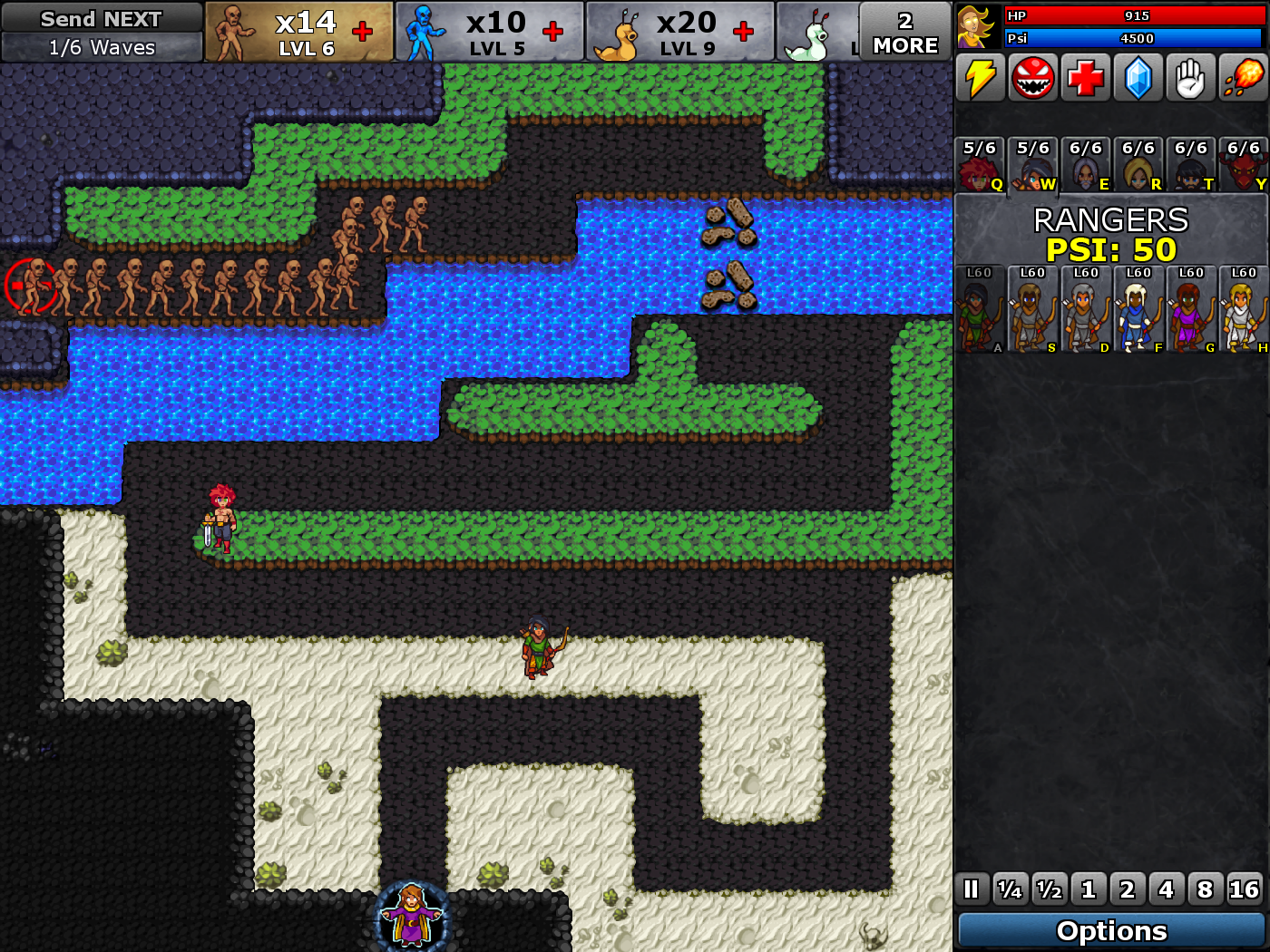
Flixel-UI can detect the current screen ratio and selectively load a different user interface layout accordingly. Most screens could be accomodated pretty easily -- just add some empty space, or stretch out a horizontal element or two.
The battle screen required a little creativity, as it had a giant square element in the middle. Eventually I found that moving the wave bar over to the left side of the screen made the best use of the extra horizontal space:
 Direct link for closer inspection
Here's the 4x3 layout for comparison:
 Direct link for closer inspection
There's another area where we had to get creative, and that was in figuring out what to do with the original sprite art in large resolutions. We couldn't "just double it" since that requires a minimum resolution of 1200p, which is 120 more vertical pixels than 1080p.
So we went for a selective approach. At 720p, we display pixel art at 1:1 scale, and box the battle with empty space. The sprites are still large enough, but using black for the empty space looked bad. So we wrote an algorithm that "fills" the dead space with relevant "wall" tiles from the level. The battle still has the same playable area, but it's less obvious where the blank "filler" space begins and ends.
![]() Direct link for closer inspection
Direct link for closer inspection
This solved our issues for intermediate sizes, but we still had a problem with 1080p. The original game consisted of battle squares 40x40 in size, and a map of 14x15 squares. This meant at double size, our battle map would be 1120 pixels tall, which would be 40 pixels too many for 1080p - a discrepancy of half an entire battle square!
We could offset things so that only part of the top and bottom were cut off, but that was unacceptable. We noted that each battle square consisted of four subtiles, 20x20 in size. So if we scrunched each of these to 19x19 using nearest neighbor scaling, we'd get battle squares of 38x38, which would be 1064 pixels tall. That neatly fills the screen with 16 pixels to spare!
Technically it would mean we'd have a few "ugly" rectangular pixels in our tiles, but it would be only one row out of every 20. I did a few quick mockups, and the artifacts weren't even noticeable unless you really strained to look for it. The character sprites needed no such trickery, so we just gave them a clean double scale.
![]() Direct link for closer inspection
Direct link for closer inspection
Thanks to this little "cheat" we were able to squeeze in nice, crisp 2X sprite scale for 1080p (Obviously, the HD art doesn't have to worry about problems like this as it's not dependent on whole-number scaling to look good).
9-Sliceable chrome and buttons
Have you ever taken a UI element, scaled it, and it looked like garbage because the borders got all scrunched? 9-Slice scaling prevents that by carving the image up into 9 slices and using them to preserve the appearance of the borders and corners. This technique is essential for a proper resolution-independent user interface.

Flixel-UI has built-in support for these, and besides being visually pleasing and convenient, they save you from having to make separately sized art assets for every unique button.
However, 9-slice scaling still needs to be used correctly. If you rely on 9-slice scaling but only increase the dimensions of the button itself when your display size increases, you'll wind up with buttons with anemically thin borders:
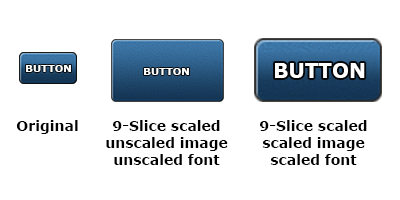
Flixel-UI can deal with this too; Just as you can scale fonts, you can also scale the underlying 9-slice image asset, and of course this action automatically scales the 9-slice grid coordinates to match.
Summing Up
Maybe I'm just anal, but all these little touches constitute craftsmanship, and I think a legendary game series like Final Fantasy deserves better than a rushed port job that violates every single best practice I can think of. If a bottom-feeder like me can figure out all these techniques just by messing around, then a huge AAA company holding the IP reigns to some of the most important games in RPG history should know better.
But I don't just want to cast aspersions, I want to help fix the problem, and that's why I wrote this article, and why I make sure that all of the tips & tricks I figure out eventually make their way back into HaxeFlixel's's open-source codebase.
Links:
Reddit thread that started this whole thing off
Use at your own risk (and please don't email me!):
Read more about:
Featured BlogsAbout the Author(s)
You May Also Like


.jpeg?width=700&auto=webp&quality=80&disable=upscale)


