Daily news, dev blogs, and stories from Game Developer straight to your inbox
Sponsored By
Featured Blog | This community-written post highlights the best of what the game industry has to offer. Read more like it on the Game Developer Blogs.
Designing Fake Illusions' Accessibility
I talk about my accessibility-first design approach and how I applied it to a (potentially inaccessible) game idea about optical illusions, by thinking about simplicity, progression, difficulty and more.
8 Min Read


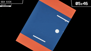
There have been a lot of games about optical illusions recently, but most of these have focused around impossible geometry in Esher-esque environments. However, many more interesting visual phenomenons are still unexplored in games. I had the idea of hiding "fake" optical illusions inside real ones, and having the player point out the cheater. After an initial prototype with a few illusions, I've spent the last year and a half working on expanding this idea, and I'm currently preparing it to launch on Steam soon!
Because the game idea is so unique and visual-focused, it runs at a high risk of being very inaccessible to play, for example for people with bad eyesight, colorblindness, or other handicaps. I have some experience with this subject when designing the accessible precision platformer Mobility, so I wanted to ensure the same accessibility for this game, even though the two game ideas are wildly different. Today, I'd like to run through my design choices for keeping Fake Illusions accessible while still embracing minimalism and surrealism.
Simplicity
Fake Illusions features very little text: the logo, an epilepsy warning and the credits. This makes a couple of things more difficult to design for me (mostly the tutorial and menus), but it generally pays off since players are not required to speak a certain language to play. Also, you don't have to worry as much about font sizes & contrast, but just to be sure, all text in the game is always rather large and has an outline.
Similarly, the game can be controlled completely with just the mouse and left mouse button, with Escape being the only other recognized button. The simplicity of the controls allows players to focus on the game instead of on the input methods.

The game features almost no dexterity elements—quite the opposite, the game rewards concentration and thoughtful answers instead of brute-force or quick reactions. The number next to each illusion allow multiple players to discuss the puzzle more easily. Any time the player changes a setting or makes progress, the game autosaves so the player can quit at any time without losing progress.
Most of these features were implemented and standardized rather early, and as such, all of these seemingly small design choices really bring accessibility into the core of the game's design.
Colors
Most optical illusions require the maximum amount of contrast you can get to achieve the strongest effect, meaning you're often required to use black or white. I expanded this monochrome style even to illusions that do not necessarily require it, making the game as colorblind friendly as it can be with this gameplay. In the rare case that an illusion type still trips someone up, the player can simply skip the illusion (we'll get to this later) or change the settings.

Sometimes the game breaks from this style for contrast colors: crosses are red while check marks are green. There's also a single case where an illusion in the game does not work in monochrome, and keeps its original colors. Altogether, this allows for an art style that looks minimalist and uses a lot of primitive shapes, which has the added side effect of keeping the scope of the artwork small enough so I can make all of the game's art assets by myself.
Difficulty
Since this game is very focused on spotting visuals, you have to take into account that not everybody's eyes or screens are equal.
One of the playable illusions in the game is the Hermann Grid, where players have to find an actual gray square in the intersections between larger black squares. When I was playtesting the game during a network lunch, I noticed that the "faker" gray square was not visible on this screen. Apparently, the monitor ignored the very light shade of gray and turned it into full white. For this reason, the brightness slider was very important to add.

This game has a difficulty slider that indicates how much the faker is allowed to stand out. At the default level it offers a fair challenge, but it can be set much harder but also much easier. The range on the slider is actually pretty wide, with the extremes making the puzzles either trivial or nearly impossible, to suit every type of player. I think this offers a much more dynamic control over difficulty compared to Easy/Medium/Hard settings that are currently the standard in many games. The slider appears in the settings menu, but also in-between levels while playing the illusion.
If the player changes the difficulty beyond a certain point, a smiley (or frowny) in the interface indicates this. This is mostly to make sure that the player knows it's a globally applied setting and to remember them they've set it to a non-default value, and that they can follow a breadcrumb trail to the settings menu where they can adjust it back.
Progression
To complete Fake Illusions, you only need to beat around half of its content. Meaning you don't have to play every illusion if you don't want to, for whatever reason.

The game encourages the player to take breaks, or at the very least, switch between illusions from time to time. There's an intermission screen each time the player beats a level of the illusion, and if the player has unlocked something new in the meantime, an exclamation mark is displayed on the "back to menu" button. Then the same exclamation mark is displayed on the thing the player unlocked in the level select.
At first the progression worked that only a fully completed illusion would unlock others. But I changed it so that every completed level (each illusion has around 5) would add up to unlock things. Players can still beat everything if they want, but it gives those who might get stuck more freedom to continue towards the end of the game.

As a final detail, the last level in the game is the Shuffle mode, which gives the player hard versions of random illusions. The player will only encounter illusions here if they've already beaten the first difficulty of that illusion earlier, to make sure they only get puzzles for which they've already been onboarded. It's a small feature, but one of which I'm certain will ease frustration.
Scaling
One thing Fake Illusions has that not many games do, is having a fully re-scalable window. The game tries it's best to fit in at a 16:9 resolution, and also fills parts of the window that would normally be outside the 16:9 range. As a result, the game's graphics fit no matter at which resolution you play.

There's also a zoom slider, in case you'd prefer to play the game at a different or pixel-perfect zoom level. The slider only appears when the window is larger than its default resolution (which is 1280x720), because the window can also scale a bit smaller than that for smaller windows or screens. (The Steam Hardware Survey is a very good guideline for knowing exactly what kinds of screen widths and other features to support.) I can imagine people will want to set the zoom level low, since they'll have to move the mouse less, so most of the buttons and hitboxes in this game are quite big to help these players.
Final Words
The final thing that I'd like to talk about, is advertising your accessibility features on your store page.
When looking up info about games I'm interested in, I generally like to know which settings are available in the game so I know how accessible it is and how much I (as a player) am allowed to tweak. But for most games, this info is not readily available, requiring me to dive into reviews or social media to figure out what I can or can't change.
.\"")
So if you want to signal that your game was designed to be accessible, please put this info up on the store page, front and center! The Game Accessibility Guidelines also recommend you put this info in an easy-to-find location (preferably also in-game). You cannot make the game accessible for everyone, but at least you can expand the range of people who can play the game, and set the expectations for your users so they know what they can (or cannot) expect.
Thank you for reading, and let's make all games more accessible!
Learn more
Wordy tutorials need to end. Why Game Designers should take a "Vow of Silence" by Hamish Todd
Game Accessibility Guidelines
Includification by AbleGamers
Read more about:
Featured BlogsAbout the Author(s)
You May Also Like