

Daily news, dev blogs, and stories from Game Developer straight to your inbox
Sponsored By
Featured Blog | This community-written post highlights the best of what the game industry has to offer. Read more like it on the Game Developer Blogs or learn how to Submit Your Own Blog Post
Composition in Level Design
When designing a level you're able to freely compose your virtual environment with any objects you want. A level designers' work can be compared to that of a painter. Now let's see the level as the art gallery and the level vistas as paintings.
30 Min Read

Originally posted at: LEVEL-DESIGN.org Knowledge Base.
Article by: Mateusz Piaskiewicz
Composition in Level Design
When designing a level you're able to freely compose your virtual environment with any objects you want. This distinguishes level designers from the landscape photographers. You don't have to adopt to existing elements of nature or architecture. You can affect the scene dramatically. A level designers' work can be compared to that of a painter. Now let's see the level as the art gallery and the level vistas as paintings. It means that a player can traverse from one composition to another.
When you should care about composition? Well, I would have to say that you have to do it all the time but that’s simply not possible. It's very time consuming and sometimes there's no need to build mind blowing compositions in the middle of nowhere. The good news is that building pretty compositions is very simple and will easily become your second nature. A lot of designers I've met can make awesome levels but they don’t know how or when to apply these compositions. In this article I'll present you with my way of planning and implementing beautiful environments.
When and where you can apply composition rules:
Environment Composition - Big picture, everything that the player sees, both visual and gameplay areas. You can compose single corridors and rooms, towns, landscapes, far horizon views and stunning backgrounds. That kind of composition is often seen from only few directions, that makes planning of the composition easier.
Environment Elements Composition - Set dressing, details, groups of objects that are parts of the big picture. Garbage around the dumpster, rocks on the ground, stuff on a desk. That kind of composition can be seen from arbitrary angles.
Visual Feedback & Navigation - Highlight the objective, show the way to the objective, guide the player through a specific area. If the player's objective is to get to the chopper and you need to navigate the player there or you simply want to show the player where he should go then you can apply composition rules to highlight something that will catch his attention and change his wandering course.
There's a thin line between composing everything you can and imitate nature or natural mess. You can create composition of leaves that wind blew by the wall but the result might be simply overdone and unnatural. Composition is used to arrange space into appealing picture. Leaves are only background, there's no need to compose that unless that's an important pile of leaves that should get player's attention. Nature is creating beautiful compositions, let's simulate the power of nature instead of faking it.
Composition Basics
Composition is an arrangement of scene elements. Scenes with applied rules of composition presents a harmonic idea that is easy to understand and isn't confusing to the observer. Harmonic composition smoothly guides the player's eye through the image's elements just as we planned. Harmony has a huge impact on the understanding of an image. In order to achieve a harmonic scene you need to set down the components of your scene and emphasize some of its elements by using color, lighting, proportions, direction and position. In other words, you can show the important part of the screen and hide things that are only background.
The opposite to composition is chaos. On chaotic images it's hard to determinate which element acts as dominant. In this situation the player can focus attention on relating parts of the scene. In this article the player and observer interchangeably.
Composition Layers
Composition can be divided into three main sets of layers: Foreground, Center of Interest and Background. Additionally you can include the staffage layer in your composition.
Example composition - layers | Perspective view of example composition - layers |
Red cube - Dominant; Yellow cubes - Composition elements; Green cube - Observer; White cone - Observer's eye sight; Gray plane - Terrain |
Foreground Layers
Layers that are the closest to the observer. This set of layers acts as a prelude and creates a frame for the composition's dominant. It's commonly overlooked in games. Foreground is used to focus the player's attention on the most important layers - Center of Interest. Remember that composition elements from the foreground have to have a logical connection with the rest of the composition. Brightening foreground objects can separate this layer from other layers which creates an effect of scene isolation. Darkening objects on the foreground gives the feeling of space because the contrast is enhanced in regard to the rest of the layers. Often, only a silhouettes of objects are visible and you don't have to worry about that, on this layer you shouldn't show details and colors.
Foreground layers | Dark foreground made of bushes, grass and tree branches - Call of Duty: Ghosts |
Center of Interest
A layer or layers on which the composition's dominant is placed. Dominant is the focal point of the composition, it can't merge with the rest of the scene's objects but it still has to be consistent with those objects, it should be brighter and set in a advantageous position to stand out from other elements. Thanks to the dominant it's possible to quickly name the theme of a scene, for example: "Winter scene with the ruins of a medieval guard tower in the mountains" where medieval ruins are the dominant and mountains are the background. You can use dominants to tell a story of the scene and build the unique identification of the scene. You need to plan your composition so that the dominant will be the first object which the observer will notice. Make sure that there are no obstacles that heavily cover the dominant but don't worry about the objects that overlap other layers. Center of interest can hold more than one dominant. The other dominant in the composition is called the counterpoint. As an example it could be a scene "Fountain on the market square with a wreck of a tank". Fountain is the first dominant but the tank wreck also asks for attention. When the observer will get to know all the dominants he'll start to look for a details on the center of interest and the background layers.
Center of Interest layers | Lone tower (Dominant) and adverts on the wall (Counterpoint) - Dishonored |
Background Layers
Layers that are closing the composition. Mostly background layers which main contents are the horizon and sky. Background layers are marked with calm and moody color scheme and less detailed objects. This helps keep the observer's eye on the dominant. The purpose of these layers is to bring out the dominant's silhouette, impress with the scale of the scene, create depth and eliminate the impression of scene isolation. An effect that can emphasize the depth is aerial perspective (also known as tonal or atmospheric perspective). Avoid using strong colors, sharp lines and lots of detail.
Background layers | Few layers of mountains in the background - Rage |
Staffage
Optional layer with living elements, for instance human or animal figures. Mostly used as a scene diversion, a scale and proportions reference or the eye guiding element. Pay attention to the figure's pose or face direction. It is a big eye catcher and it can compete with the dominants. You can use it to guide the observer's eye by showing the figure's line of sight. The observer will notice the figure's face and will check what he's looking at.
Alyx watching what is happening on the horizon. She helps determinate the proportions of the scene and her line of sight draws attention to the event on a horizon. - Half-Life 2: Episode 2
Observation Parameters
Let's start from the observation places (spots or zones) from which the player will be watching the composition. Before you add observation places think under what vertical and horizontal angle the player will approach the composition and how many observation spots the player will be able to reach.
Sight Angle
This angle defines how player will be able to observe the dominant. You can change the sight angle to achieve bigger impact by modifying the dominant's size, height or placement.
Low Angle - Dominant is seen from above. The image can show depth and perspective. This angle gives the player a great visibility on the composition layers. You can use it as the player's advantage and allow him to plan his tactics or exploration route.
Flat Angle - Dominant is seen from the ground level. Scene feels flat and boring. Mostly used with strong dominants and high composition angles. You can fake the perspective and depth by smoothly lowering the height of the terrain between player and the dominant.
High Angle - Dominant is seen from the bottom and is literally dominating the composition. It gives impression of being small when compared with the dominant.
Low Angle | Flat Angle | High Angle |
Red cube - Dominant; Green cube - Observer; White cone - Observer's eye sight; Gray plane - Terrain |
Composition Angle
Angle in which the observer sees the composition layers. By changing this angle you're able to adjust the perspective and depth of the scene.
Front Angle - This angle performs really good when composition layers are far from the observer, for instance hills on the horizon running straight up to the line of sight. When the layers differ from themselves it draws a nice depth. Compositions that are close to the observer can get flat and monotonous because of barely seen perspective.
Half-Front Angle - Angle on which perspective starts to be visible. Great angle to use in narrow spaces.
Half-Side Angle - Angle on which perspective performs its best. Most commonly used angle.
Side Angle - This angle perfectly shows the pattern running along with the distance. However, without a strong dominant and pattern this type of composition angle can be monotonous.
Front Angle | Half-Front Angle | Half-Side Angle | Side Angle |
Red cube - Dominant; Green cube - Observer; White cone - Observer's eye sight; Gray plane - Terrain |
Observation Spots
Building the composition is very simple when the observer is not able to move and he's watching the composition elements that we want to show to him. Things are getting complicated when the observer can freely traverse through the scene. Compositions in video games can be watched from arbitrary angles and positions. You have to make sure that the player is able to reach the composition from places you've arranged.
To guide the player you can use choke point or funnel methods. Both are the types of corridor-like spaces where actually nothing special happens. Thanks to that boring tunnels we can be sure that the player is not focused on gameplay events or details. In such spaces player will just traverse along the path looking for interesting things. If you caught the player in such a corridor you can smoothly change its angle to guide the player to the composition's dominant. This method works perfectly on linear levels, you're able to design the composition's frame and make sure that the player will see your composition as you wanted to. The place where player has to stand to see the composition is called the observation spot.
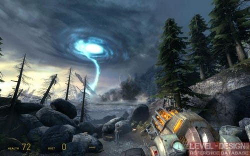
Funnel and observation spot | Monument with the screen and a skyscraper in the background - Half-Life 2 |
Red cube - Dominant; Green circle - Observation spot; Green cube - Observer; White cone - Observer's eye sight; Gray plane - Terrain |
Let's look at the screenshot above. Screen and the tower in the background are perfectly fit with the line of roofs and the shape of a city square. This composition looks best when the player is leaving the train station (behind). A perfect observation angle is achieved by leading the player through the funnel - a door that is the only exit from the station.
On half-linear levels we need to worry about more than one observation spot. The composition should be built in a way that it will look appealing from every observation spot.
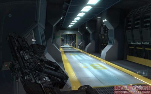
Composition in Doom 3 BFG: Resurrection of Evil | Composition in Doom 3 BFG: Resurrection of Evil | Composition in Doom 3 BFG: Resurrection of Evil |
In Doom 3 BFG: Resurrection of Evil you can see how the designer took care about the composition. This dominant acts as a navigation helper and looks nice from every side.
On open world levels the observation spot gets really big so checking all the angles where players can observe the composition is very laborious. A composition can look perfect but when looked at different angle it can quickly turn it into mess. It's hard to use small composition elements when you don't know where the player will be coming from. Even then it's possible to apply main composition rules like a standing out dominant, asymmetry and balance on the biggest elements in the composition. You can always pick a few main paths and build a composition that will work if seen from the selected observation spots on the main paths.
Funnels and three observation spots | Village composition in open world game - Skyrim |
Red cube - Dominant; Green circle - Observation spots; Green cube - Observer; White cone - Observer's eye sight; Gray plane - Terrain |
Composition Elements' Positioning
Positioning
The position of the dominant can dramatically change the reception of the composition. That's why it's very important to follow a few basic rules to make sure that we'll achieve the effect we wanted to. Painting or photography has a set of rules on how the composition should be build. You can pick the golden ratio or rabatment of rectangle rule as an aid.
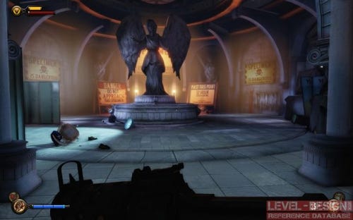
Static (Symmetric) Composition - Dominant is set in the middle of the frame. Composition seem to be synthetic, made by human, clean. Use it when you want to highlight patterns or architecture.
Symmetric position of the dominant | Monument at the town square - symmetric composition - Bioshock: Infinite |
Red cube - Dominant; Yellow cubes - Composition elements; Gray plane - Terrain |
Dynamic (Asymmetric) Composition - Dominant is aside from the middle of the frame. The position set down by one of the positioning rules. Composition feels organic, made by nature, dirty. Use it to simulate nature scenes. Make sure that you leave a margin between a dominant and the edge of the screen.
Asymmetric position of the dominant | Asymmetric composition, a path to the castle - Dishonored |
Red cube - Dominant; Yellow cubes - Composition elements; Gray plane - Terrain |
Balance
Placement of composition elements is dictated by balance. In other words, the attractiveness of each object in the composition. More attractive objects will catch the observer's attention. Too attractive or too heavy objects will create the feeling that the scene is simple and boring. To balance your scene you need to determinate what is the visual weight of each object is. I don't mean the physical mass but its color brightness and intensity, size and detail. Visual weight is something that we all feel but not everyone can recognize it. Compare the elements' parameters and you'll be able to tell which objects are lighter and which are heavier.
Heavy visual weight - Large scale, detailed, dark color, intensive color, heavy contrast.
Light visual weight - Small scale, stark appearance, light color, soft color, light contrast.
Delineate a vertical line that will divide your composition into two pieces. Define the visual weight of your composition's elements. Dominant should get the highest weight, small and faded elements should get the lowest. It means that the dominant's heavy weight has to be equalized with a few low-weight elements on the other side of the composition. Move the objects around the composition's frame to get the balance you want to achieve. You may want to have the visual weights equal on both sides or get a more aggressive composition by moving the weight close to the dominant or far from it.
Very asymmetric composition. You can see that the balance turns dramatically to the right side of the frame | Asymmetric and balanced composition. Notice that both sides are different but the visual balance is equal | Well balanced composition of the almost symmetric elements positioning and symmetric dominant |
Red cube - Dominant; Yellow cubes - Composition elements; Gray plane - Terrain |
Eye-Catchers
Sometimes you'll need to make sure that your composition's dominant will get the attention it deserves. You can use a few additional tricks to catch the player's eye.
Details
The detail density method is based on a contrast of detailed and bland spaces. The detail-rich spots will get the player's attention simply because there are things to watch. By detail you can consider a place where you're using more objects or more rich textures. You can also use symbols, text, posters, graffiti, paintings and a figure to catch the player's attention.
Silhouette of the man, detail density and text used to attract player - Bioshock: Infinite | Portraits of missing people attracts player to know the story of a place he's exploring - Bioshock 2 | Text banners used to inform player about the places he can explore - Rage |
Lines
By setting elements of the composition to draw lines in certain directions we're able to guide the player's eye. We call it the leading lines. You need to emphasize those lines and set their direction. Even a small change of player's position or camera angle can dramatically change the reception of the scene. There are two types of lines in the composition:
Practical lines - Visible lines drawn by edges and composition elements.
Virtual lines - Not obviously drawn on the composition but made by composition elements that draw directions like staffage's line of sight. Those lines are drawn in our imagination. You can use that to enrich your composition and emphasize
The lines' direction should calmly and softly flow through the scene in or with the dominant's direction. That makes a feeling of harmony. Often the composition elements are set to draw a line that guides to the dominant but there are some open compositions where lines are softly led through the scene without showing the dominant. Those lines are mostly in Background or Foreground layers. Hard lines and edges are reserved for dominants or other important composition elements.
Horizontal Lines - Used to bring out breadth and depth to the scene. Static, stable and calm. Works perfectly on horizons. You can use it to build impressive, wide and monotonous scenes. Avoid using a lot of horizontal lines on foreground and center of interest layers. Even if you're designing a parking lot you'll need the cars and other object to break the parking's horizontal line.
Horizontal sea line makes the scene feels calm - Dear Esther
Vertical Lines - Used to highlight the height and strength of the composition and create the impression of enormous size or monumental scale. You can use it for the objects that have to impress the players.
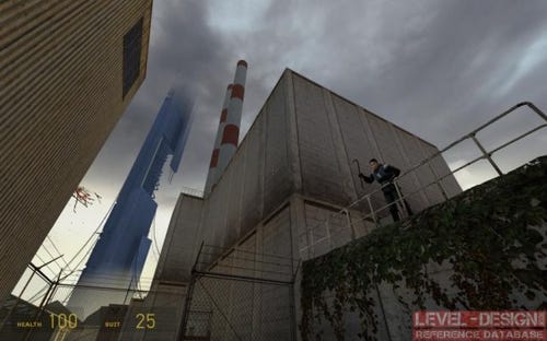
Vertical lines drawn by chimneys and edge of the yellow building supports leading line of the skyscraper - Half-Life 2
Curved Lines - I like to use a "Line of Beauty" term from landscape architecture for that. It's a curvy "S" shaped serpentine that smoothly runs through the composition. It makes the composition feel soft and natural.
Curvy and wavy path line drawn by rocks - Call of Juarez: Bound in Blood
Angled Lines - Angled lines will give the impression of dynamic and active scene.
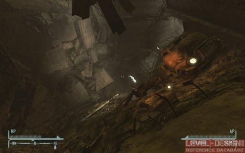
Inside collapsed tunnel - Fallout: New Vegas
Colors
You can use contrast and color saturation to catch the player's eye. Color is one of the most important methods to communicate with a player. That communication is called the visual language. Picking an intense color or making heavy contrasts can make a big impact on your composition or on your level's navigation. Make sure to pick a color that fits your color palette and that it won't collide with the visual language of your game. Sometimes to catch the player's eye you'll need to pick a color that stands out a bit from the game's color palette.
Barn color is completely different from other elements of composition. Still this color is well saturated and fits into the scene - Alan Wake
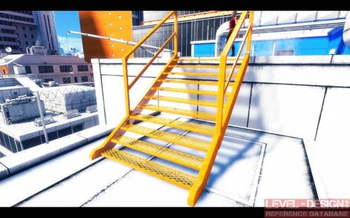
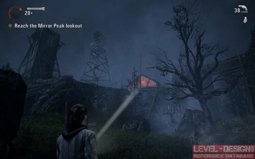
Intensive orange catwalk stairs used to navigate the player - Mirror's Edge
Lights
Contrast between lit and shadowed surfaces builds the mood and depth of a scene. Composition without the contrast would be considered flat and boring. You can use light contrast to emphasize some of the composition's elements by lighting the front of the objects or its silhouette to get a light glow around the object. The most important objects should be well lit, the rest of the composition's elements should be covered with shadows or lights with smaller intensity. You shouldn't invert that effect, players are mostly not accustomed to look at very dark spots to find something interesting. Make sure that there's a visible difference of light intensity, color and direction. The light you've used to highlight an object should follow the art direction, color palette and scene lighting rules. With this method you can navigate the player to the exit doors or show him an item to pick up.
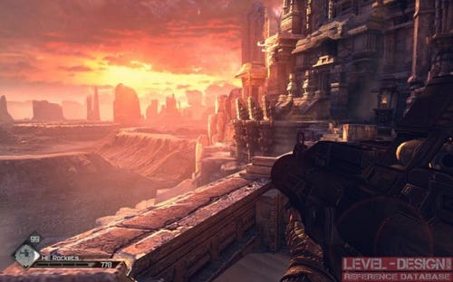
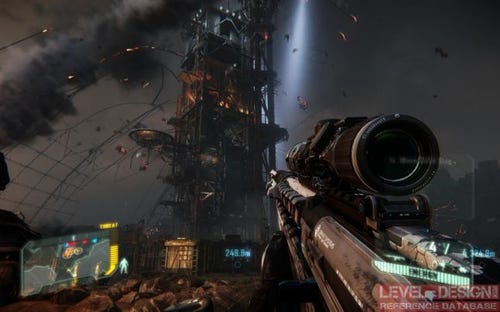
Strong light used to show beautiful horizon and emphasize the depth - Rage
Color and light used to guide player through the corridor - Call of Duty: Black Ops 2
Silhouette used to emphasize the composition. Blue light is used to make the stature readable - Bioshock: Infinite
Scale
Bigger composition elements will get more attention than the rest of the scene. Objects that are all the same size will make an impression of a flat and chaotic scene. You can change each object's proportions so the bigger objects will catch the player's eye. That could be the large radar dish on the top of a mountain or a skyscraper. Such an object will always stand out from the scenery. You can also invert that rule. The most important object in a composition could be the smallest but it's a bit risky. The big elements cover a bigger screen space and get attention more naturally.
Giant building construction that gets player's attention - Crysis 3
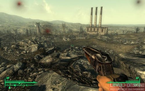
Chimneys are catching player's eye, an electric poles are leading the player to the city - Fallout 3
Motion
You can make your dominant stronger by adding moving elements to your composition. It could be a flag, smoke, fire, bird or walking human.
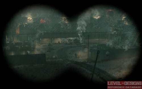
Smoking steam train as the only moving element in the composition - Sniper Elite V2
Hints
Keep your composition consistent on every layer.
You can blend the foreground layers with other layers (roads, object placement).
Give the player a few seconds to notice, analyze and understand the composition.
If the dominant is above the observer's line of sight you can build the scarp or stairs. On a slanted terrain the player will naturally look up and notice the dominant.
Composition needs space. Watch for narrow streets and buildings. If it's too close to each other there will be no way to set up an observation point.
Use one composition theme and avoid telling to many stories at a time.
Dominants should be well lit, detailed and colored. Background and foreground areas should get less detail and color.
Too weak dominants or too chaotic compositions will quickly lose the player's attention.
Scale down the objects on a background layer to imitate that the objects are further away than they really are.
Keep the player's interest on only one thing a time. Make sure that after the fight there's always time to take a breath and admire the view.
There's nothing wrong with compositions that don't fit in the observer's field of view. Just make sure that the dominant isn't hidden in the corner or behind an object.
A lot of games are using different Field of View (FOV) angles. For First Person Perspective (FPP) games the FOV angles oscillate from 60 to 100 degrees. The higher the angle is the more you can see in the FOV but objects will get smaller and the scene will give the impression of being stretched.
If you'll plan too many composition layers it may get too messy, the composition elements can get really chaotic.
It's easier to fit the composition into existing gameplay than break the gameplay just to have a nice view for a moment.
Bibliography
Read more about:
Featured BlogsAbout the Author(s)
You May Also Like


.jpeg?width=700&auto=webp&quality=80&disable=upscale)


