

Daily news, dev blogs, and stories from Game Developer straight to your inbox
Sponsored By
Common Pitfalls in Game Tutorials
An analysis at common pitfalls done during game tutorials, and ways of fixing them. Uses the recent showing of Cuphead at PAX 2017 as example.
5 Min Read

One of the games I'm looking forward to the most of this season is Studio MDHR's Cuphead. The blend of tricky platforming and stunning 1920's-1930's cartoon aesthetic is a killer recipe for someone who grew up with old-school platformers and classic Disney cartoons like me, and every showing of the game thus far seems like it will fulfill that promise.
However, there is one small section of the game that recently left me a little bit worried, and that was the tutorial, shown during this weekend's PAX. The source of my concern was this picture:
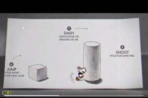
This is a screenshot of a playthrough where the journalist struggled for some time on how to get past the obstacle shown here. Even though the game says you need to press Y, what you really need to do is jump back to the cube you just passed, make a running jump and perform an air dash in order to pass the cylinder. It's a simple puzzle, but one more than enough to perplex people who are just starting the game for the first time. In other words, the dash command isn't introduced in the most appropriate manner.
Does it make sense? Yes, it does. Is it intuitive? No, it isn't, and intuitive is what you should be aiming for when designing a tutorial, and this is something that all kinds of games make. Obviously, this is easier said than done, because making tutorials is FREAKING HARD. Since tutorials were the brunt of the work I did while at Disney Interactive, they are something I deeply care about, and a great tutorial can be the difference between sticking around with a game for the long haul or asking for a refund.
Why this tutorial isn't intuitive?
1- Ambiguity Between Command Explanation and Required Use of Command to Progress: This is a mouthful, but it boils down to this: The text prompt says the dash provides a quick evasion, but you're not really evading anything in this section as getting a movement boost to surpass an obstacle. The text prompt hints at an air dash, but it is at the very end, hinting at a secondary use of the dash, which is the required use to continue onwards.
2- Conflicting Communication Channels: The secondary communication channel used in the tutorial is an arrow to the right of the button prompt, above the cylinder. This hints at the possibility of making an air dash, making it an effective communication channel, but it enters in conflict with the text prompt of the command itself that hints at evasion rather than movement boost. The most effective tutorials communicate the same message through all channels like visuals and audio, but here the visuals are in conflict with each other. Which should I trust: the arrow or the text?
3- Unintuitive Gameplay Flow: Most tutorials are structured like a gauntlet, where you go on a linear path from A to B without any sort of backtracking. They might sometimes give you the illusion of exploration, like Dark Soul's Undead Asylum, but even then the intended flow goes in one direction. In the screenshot above, that isn't the case - as said before, you are supposed to climb back to the cube you have already jumped over and left behind in order to progress-. This isn't a bad puzzle per se, but it's not the type of puzzle you want to place in the first minute of your game.
How can this tutorial be more intuitive?
1- No Ambiguity Between Explanation and Required Use: In other words, if your text prompt suggests at evasion, make the player actually evade something. It doesn't have to be an enemy that may kill the player, but rather an obstacle that can only be bypassed by dashing, like a windmill or a treadmill. Another option would be to change the prompt so that it emphasizes the extra movement speed instead of evasion - one example can be "Y Dash: Extra speed in ground and air"-.
2- Make Sure All Channels Convey the Same Message: If they all say the same thing, that increases your chances of the player getting the message. I'm a pretty big fan of having images in the background that show what should happen when pressing the prompts, since they don't take control away from the player. The picture below from Spelunky is a good example of this.

3- Avoid Unnecessary Backtracking in Your Tutorial: The problem with the example from Cuphead is that the necessary cube players need to jump over is behind an obstacle they've already passed, so they don't think it's a relevant part of the level anymore. Always present one problem at a time when designing a tutorial, multi-part puzzles are best saved for a bit later in the game. For Cuphead, possible solutions would be to either place a second cube closer to the cylinder -so that they take the whole 'cube + cylinder' in one chunk- or extending the first cube until nearly reaching the cylinder - giving them the necessary height to pass the cylinder with an air dash-.
This is just a cursory glance at game tutorials, but I hope it's enough to spark a discussion on common pitfalls that can happen when designing one. The article linked below is a pretty good description of the different types of tutorials, with their pros and cons, definitely worth a read!
Read more about:
BlogsAbout the Author(s)
You May Also Like


.jpeg?width=700&auto=webp&quality=80&disable=upscale)


