Daily news, dev blogs, and stories from Game Developer straight to your inbox
Sponsored By
Featured Blog | This community-written post highlights the best of what the game industry has to offer. Read more like it on the Game Developer Blogs or learn how to Submit Your Own Blog Post
Bigger phones require GUI redesign
As touch devices, specifically mobiles are getting bigger, we need to reconsider how we design gui and how we can deal with this in various way. Here is one suggestion.
3 Min Read

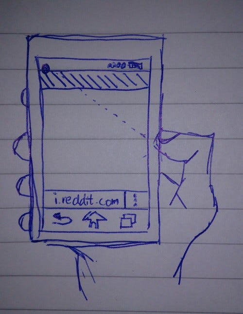
(“art” by me)
My thumbs are aching and I’m getting tired of my big Sony Xperia Z. It is a 5” Android with 1080p screen. Nothing wrong with that except that I can't actually fully use the phone with one hand. And sometimes I really want to do that. Since screen sizes don't seem to become any smaller on phones, what should we do?
Well, app developers need to stop putting all the buttons and search fields at the top and place them at the bottom instead (yeah, I know we don’t fully do this yet in Minecraft - Pocket Edition. Will propose a fix to the team ;)). Another reason why this is good is because you don’t actually need to cover majority of your screen when you will do different tasks in the apps! This also works well in landscape mode. Especially on tablets your hands need to travel quite a bit when buttons are at the top, putting buttons at the bottom will make you travel less and you can hopefully hit all the buttons with your thumbs if your tablet is around 8".
Seems like windows phone has already done this in IE and other parts of the OS. I like that. But I’m not ready yet to change to WP. I have also seen other apps implementing swipes to change screens but there is usually some element in the way to get a clean swipe to change screen.
What do you guys think? Or maybe I just have very tiny thumbs...
Read more about:
Featured BlogsAbout the Author(s)
You May Also Like
.jpeg?width=700&auto=webp&quality=80&disable=upscale)