

Daily news, dev blogs, and stories from Game Developer straight to your inbox
Sponsored By
Featured Blog | This community-written post highlights the best of what the game industry has to offer. Read more like it on the Game Developer Blogs or learn how to Submit Your Own Blog Post
6 Game UI You Should Study
The six unique games that solve complex problems with style and excellent design.
12 Min Read


Many User Interface designs look pretty, some are comfortable to use, some blend really well with the game visuals and others are innovative. Very few games have all of those qualities combined, but the ones that do are worth paying close attention to. With the help of screenshots from gameuidatabase.com we’re going to explore six games you should learn from and what they do right.
1. How to implement multi-feature, broad appeal UI - LittleBigPlanet 3

A unique-looking game series that aims to bring together a broad audience of all ages. If that wasn’t challenging enough, it also has a lot of diverse features. There’s building, character customization, platforming, social component, store component and multiplayer.
Unlike similar games, LBP 3 does not have the luxury of overcrowding its screens with information. It aims to include very young kids who can’t read well and people older than 60, who will have trouble with small text. The solution? A hybrid of mobile and desktop solutions.

The UI uses solid, happy colors and soft edges that appeal to kids. Icons are big, menus are easy to navigate with a simple structure. Buttons and windows have lots of room for text that is often bold and easy to see contrasted against the background. It’s a perfect solution for a game world that is full of textures, shapes, effects and movement variety. Instead of settling for a minimum impact design that would detract from the fun atmosphere of the game, the designers went the extra mile and figured out how to give the UI design character while retaining usability.

The game also has an incredible UI solution for same-screen multiplayer customization and handling large content lists. It brings in the metaphors and tools of a mobile UI to allow 4 players to open a menu on the same screen and still be able to use it simultaneously with comfort.
These menus can have hundreds of items in them and there’s no cursor to allow for fine selection. Instead, each highlighted item in a list is magnified to make navigation easier. Sections of content can be closed or open and sorted appropriately. These and all the other features are handled seamlessly and without breaking the fun and friendly theme of the game.
2. How to maximize immersion in a survival game – The Long Dark

A stylish survival game that aims to immerse the player in its atmosphere of harsh winter, exploration, struggle and desperate survival. All the usual complex systems are there for the player to manage: stamina, temperature, thirst, warmth, injuries, inventory, crafting etc. Complexity is the enemy of immersion, so interface design becomes a struggle between visual presentation and usability.
While there are many solutions to this problem in other survival games, most of them are a compromise. But what if compromise is not an option? Iteration, testing, optimization and using all the UI elements to their full extent.
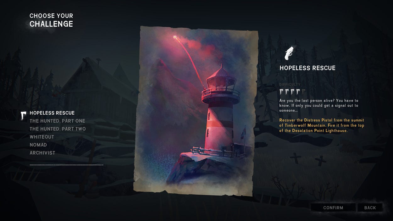
Games seldom get font design right or realize its potential, so it’s great to have an example of what that looks like. The Long Dark has a custom font that does most of the work when it comes to directing player attention. The full range of font styling is realized here, from color, to letter height and size, to boldness. It’s expertly used to communicate information importance and hierarchy with style, color and position.
Spacing plays a big role in helping each element work efficiently. Leaving enough room for lines of text to stand apart has the same effect as color would – providing contrast and drawing attention. When text needs to be crowded in a small space, icons are used as visual anchors to increase readability.

The whole UI went through several stages of improvements - from visually rich and decorative to the current subdued and minimal. The results of this process can be seen even in the game inventory management system.
Several small improvements make this complex inventory easy to use. A list of items has to convey a lot of different information in a small space. To help this, every item has its own distinct silhouette and color that make it easy to spot at a glance. Navigation is separated visually from item types to avoid crowding and confusion. Different element groups have different backgrounds, color and style. All of this still looks like a single visual unit that belongs together.
3. How to combine modern design with a retro aesthetic - Alien: Isolation

A first-person horror game that is a love letter to the Alien movies of the 80-s. Immersion is a big part of the experience, but so is retro technology. The hardware that is iconic to the movies has to be in the game. There are modern systems like inventory and crafting that cannot be represented as old-school devices in the game world. Both have to blend together without creating a feeling of two separate games.
Implementing the old computer terminal UI in the game would bring its usability problems with it. Creating a modern solution would detract from the old-school style. Knowing which parts to keep and which to discard is key. This game shows us exactly how that can be achieved.

Instead of simply going with a generic sci-fi theme, the designers extended the old console look to every UI element. The fonts is uppercase letters with a pixel square look, but used in such a way as to still be readable and clear. Lines are sharp and most visual elements are rectangular just as early vector graphics were. This helps add to the feeling of tension, cold efficiency and indifference of the game’s world. The colors are rough and limited just like the ones in retro hardware, but used sparingly enough to be pleasant to look at.

Even the crafting system has been reimagined to fit into a retro aesthetic. It uses a limited color pallet and sharp lines to create a sterile, harsh looking interface. There’s no elaborately decorated inventory with item pictures or the player model performing crafting operations. We get a sparse interface with vague component representations and a line-art image of the final item. Even the icons are made to look pixelated and restrained. All of this is still comfortable to use. The design emphasizes the principles or retro UI - practicality, limitation, lack of visual decoration, with modern user experience techniques.
4. How to make an MMO look stylish and refined – Destiny 2

There’s a lot of praise for this UI and with good reason. The game’s theme is exploration, futuristic technology and discovery. The challenge is that it’s a Massive Multiplayer game. It has to manage a vast amount of systems and functions smoothly and quickly, look good on different screen resolutions and play great with both gamepad and keyboard. All of that has to be done with style that compliments the stellar visuals of the game world.
Many MMOs go for the easy compromise. They either embrace UI complexity and the steep learning curve, or let players customize the windows and panels themselves. Destiny 2 innovates instead, by building an easy to use UI and expressing style and character with attention to small details.

Almost every screen in the game has a lot of information it has to convey, this makes it hard to create a beautiful design that would not compete for the player’s attention. It’s the reason why this UI lacks any large graphics or rich textures – it has to focus attention on the content and help it stand out. Despite the limitation, the designers found a way to breathe character and elegance in to the elements that are already there. There are little touches that give it character and a unique style. The careful font design and variety to denote element hierarchy. The small notches on top and bottom separators that create the same effect as a box frame would. The zoomed-in item images that make it easier to distinguish one element from the other. The rounded corner of an item category frame that breaks the monotone straight lines of the rest of the UI. The subtle background texture that creates a sense of depth and helps solid colors stand out against it.

The HUD of the game focuses its design on being useful first. It gets out of the players way as much as possible and lets game world visuals take center stage. Most elements are contextual and disappear when they are no longer relevant. Even in the middle of a fight, where numbers are flying around, special effects are numerous and there is chaos on screen, the UI never overwhelms the player or takes away from the action. Due to a careful color design, the necessary information is easy to see and the lack of decoration on it helps keep players immersed in the game. That doesn’t mean there is no character to it. The same fine lines the rest of the UI has are here too, thin and semi-transparent but still visible.
5. How to make extreme complexity beautiful - Civilization V

It’s easy to make a beautiful UI for a simple game. But what if the game is a spreadsheet management simulator with all the complexity of real-world accounting work? Civilization V is not only a challenging game with a steep learning curve, it also has a strong, loyal following. This limits the number of solutions that can be introduced without alienating already existing fans. Add to that the need to represent game information like multiple resources, processes, units and cities, events, several types of progress and opponents.
It’s hard to believe that anyone would try and make the complex UI for such a game look good. Civilization V does just that and manages not to impede usability in the process.

This design understands where to use lavish visuals and where a more subtle approach is needed. When there is a lot of text, the game uses a solid dark background to increase visibility. There’s and additional visual aid in distinct-looking icons that help understand the text faster. There are no complex visual effects in these menus – less is more. The decoration is displayed subtly on the framing and outside elements. A dark-green color paired with a gold gradient gives the game a feeling of grandeur and importance. A subtle city image at the bottom right of the screen indicates a city-view. Subtle Art Deco elements are on the button borders and panel bottoms.

If there’s no way to make the core gameplay visually exciting, adding graphics as a reward is a good solution. This game does that with game events and achievements. When something truly grand happens, the player is treated to music, a beautiful illustration of the event and a famous quote. This could have been made in to a notification in a simpler UI, but instead it makes receiving information a reward, a treat for the senses. The same approach is used with country leaders, who each have their own animated in-game model. This makes discovering these interactions interesting and satisfying, adding needed variety to the gameplay.
6. How to turn a simple concept in to an exciting experience – Hearthstone

This game has a very simple premise and mechanic – a standard magic card game. This makes it easy to create a comfortable interface for it, but there’s another problem – how to make it stand out from the competition? After all, there are many other similar games and all of them provide a similar experience. Hearthstone spices up its gameplay with different modes and stories, but that still leaves a game that will start to feel boring after a dozen matches. The solution - make every action and moment of the game as visually appealing, as rich and interactive as possible!
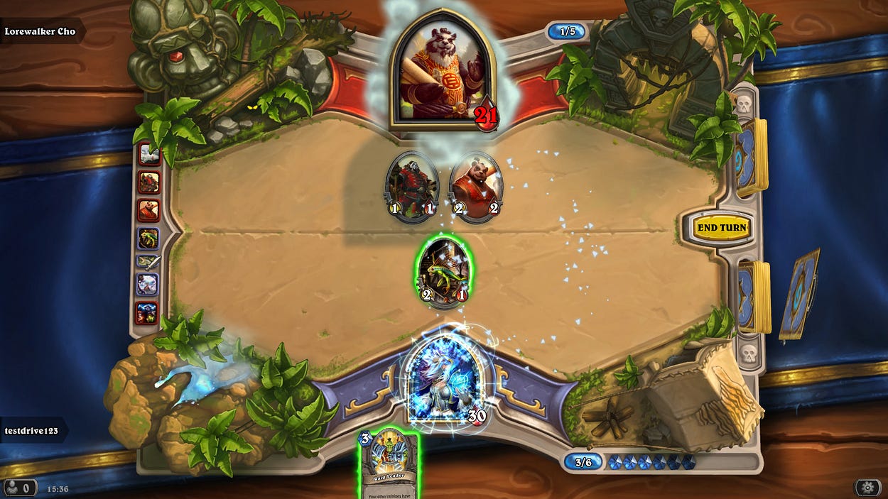
This is a great example of how visual effects can help a game shine. No matter what action is performed, it has an interesting visual effect. Spell cards blaze with fire or ice. Power-ups make cards glow, pulse or change color with different effects. Cards and characters move around the board to match the action. Even the board itself is alive with subtle animation of waterfalls, glowing candles, pulsing magic. As an added bonus, you can interact with many of these background images by clicking on them. This breaks the monotony of playing cards and turns it in to a rich experience that makes the player want to discover what comes next.

Outside the game board, every screen is bathed in gorgeous visuals, rich colors, interesting textures and effects. Every UI element is an opportunity to show something beautiful the player will want to interact with. It makes exploring the different modes and screens a visual treat. All of this is achieved with stellar visual consistency. It’s not just bright color or over-the-top effects, it’s a smooth and stylish design that blends together really well.
Can you remember other games that taught you something useful? How about games that did the opposite and had terrible design? Mention them in the comments below.
Read more about:
Featured BlogsAbout the Author(s)
You May Also Like


.jpeg?width=700&auto=webp&quality=80&disable=upscale)


