

Daily news, dev blogs, and stories from Game Developer straight to your inbox
Sponsored By
Featured Blog | This community-written post highlights the best of what the game industry has to offer. Read more like it on the Game Developer Blogs or learn how to Submit Your Own Blog Post
5 tips to make your game animations better
I'm the maker of Spryke, a deeply crafted platformer about a deep sea cyberfish who discovers the joys of dry land. One of Spryke's highlights its highly detailed animation style, and I'm sharing 5 animation tips with you that I've learnt over the years.
15 Min Read

I'm Dave Bleja of Volnaiskra. For the past 3 years or so, I've been making Spryke, an immersive and deeply crafted platformer about a deep sea cyberfish who discovers the joys of dry land.
As the only full-time member of the Spryke team, I'm responsible for many parts of the creative and technical process. Some roles are tedious, most are enjoyable. But my favourite has easily been the animating, and I'm about to share with you five animation tips that I've picked up over the years.
TIP 1: SOMETIMES, QUANTITY MAKES QUALITY
The phrase "Less is more" is such a well-worn cliché that it feels almost controversial to suggest what I'm about to suggest. OK, brace yourself. Sometimes, less is.....less!
There's no substitute for quality, and as artists we should always strive for it. Having an idea of how anatomy, physics, and lighting work in the real world will improve your game graphics; not knowing that stuff will harm them. But occasionally, one of the most important building blocks of quality is simply quantity, and this is especially true of animation.
On a fundamental level, animation is about quantity. The animator produces hundreds of still images, crammed so tightly together, that the mind can no longer process them individually, and the magic of movement is created. This same principle often applies to making animations that move well.
Take these bubbles. They look pretty good, right? (Of course they do - they're from Spryke, which is awesomeballs and you totally should go and back it on Kickstarter right now!)
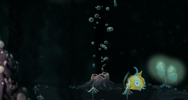
Wait, where was I? Oh yeah, the bubbles. They look good, but the base bubble graphics themselves are incredibly simple - basically just circles. What makes them look good is quantity. But not just the large quantity of bubbles - also the large quantity of things that are happening to those bubbles at the same time. Let's break it down:

(1) bubbles with varied opacity and size
(2) + slightly varied shapes
(3) + randomised quiver and smaller origin
(4) + randomised trigonometric (ie. curvy) movement
(5) + multiple origins
(6) + water refraction, bubbles move and split into smaller bubbles upon player collision.
Each step of this process is simple (the quivering and veering movements use some light trigonometry, but nothing too crazy). On their own, none of the steps are particularly impressive or believable. But when all stacked together, they make a complex, compelling whole. By the time you get to #6, there are too many things happening at once for your conscious mind to keep track of separately, and the individual components of the animation melt into a pleasing, dynamic whole.
I want to stress that this doesn't just apply to objects that are numerous, like bubbles. The same "quantity makes quality" approach applies when animating just about anything. Most things in the natural world tend to move in myriad, often subtle ways. Closely watch someone standing still and you'll likely observe a dozen little movements, from blinking to swallowing to a shift in the hips. Watch someone walking and you'll see almost every part of her body and face move in some way - not just her legs and arms.
In general, the more things happening at once in an animation, the less mechanical it seems, and the more organic and interesting. This can also apply to objects that are actually mechanical, such as this door:

About a dozen things are happening in this door animation, and most of them are very simple: parts moving up/down, lights blinking on/off, screens glowing and changing color, and basic smoke particle effects. But because these simple movements contrast with each other (some things move up/down, others side-to-side; some flicker, some glow), and because they're all timed slightly differently, they combine to create a complex whole.
The extent to which you can add complexity to your animations will depend partly on the animation method you use. In-engine animation is probably more limited in this regard (though it has other advantages, like randomisation and dynamic reactivity...see the bubbles above).
Spryke herself uses primarily pre-rendered animation, which allows me to really ramp up the complexity beyond what would be practical in-engine. For good pre-rendered animation, I highly recommend a program like Toon Boom Harmony Premium that lets you rig a character using nodes.

Spryke, despite only appearing at roughly 70x70 px in-game, is composed of 30+ moving parts, all controlled and interconnected using some 250 individual nodes. This allows for very flexible, nuanced movement across a variety of poses.
TIP 2: UGLY FRAMES CAN MAKE YOUR ANIMATION MORE BEAUTIFUL
As we know, much of the magic of animation happens at the borderlands between the conscious and subconscious. This fuzzy sweet spot is where an animation 'melts' into your subconscious and becomes greater than the sum of its parts. But in some cases, an element of an animation must be kept strictly beyond the conscious to be effective.
A good technique for getting more oomph or zip out of an animation is one that the Warner Bros animators particularly excelled at: that of the single, highly exaggerated frame. The trick here is to pick a moment of impact or quick movement, and slip in one (and only one) frame that shows the pose in a highly caricatured state. Seen consciously, this frame would seem over-the-top and inaccurate. But when merely 'felt' in an animation, it pulls the rest of the animation into a more satisfyingly wacky place.

That one extreme frame of the scared snail critter doesn't look very convincing when viewed as a still (ie. consciously). But if you put your hand over the slowed version on the right and look only at the left, you don't really notice how 'wrong' it looks. Instead, it gives the animation a satisfying extra little jolt.

In this exaggerated frame of a coyotebug (that's what I call them, in honour of Wile E. Coyote!), I distorted the various bodyparts so much that the illustration actually 'breaks'. But this brokenness doesn't really register in the real-time animation, and that frame just enhances the drama of the moment.
TIP 3: BLURRY, SMEARED FRAMES CAN SAVE YOU PRECIOUS MILLISECONDS
Just as you can add extra oomph to an animation by smuggling in a caricatured frame, you can add extra whoosh by smuggling in a blurry, 'smeared' frame. This technique lets you create a very fast movement in a very short amount of frames, which makes it ideal for many game scenarios where control responsiveness is paramount.
The trick here is to take two outside frames of a movement, and then combine them into a 'smeared', blurry, third frame that sits in the middle.
There are a couple of things to keep in mind here. Firstly, the blurred frame should feel like a composite of the start and end frames, not an average. In other words, the area it covers should roughly correspond to the area covered by both the start and end frame (this will make the object in the blurred frame bigger than usual - that's ok).
Secondly, pay special attention to small, key components of your character, such as the eye. If the eye is very far apart in the start and end frames, then placing it in between the two for the middle frame will result in choppy animation that loses fluidity. So instead, smear the eye from start to end in that middle frame, as in the example below:

This mid-movement frame looks dreadful when seen consciously, but enables a very quick, whooshy transition when animated (cover the right side with your hand to check!), helping Spryke to feel like she grabs that wall really fast. The smeared eye helps the eye travel smoothly from starting to ending positions.
TIP 4: REMEMBER THAT THE NINE OLD MEN NEVER PLAYED VIDEO GAMES
If you haven't heard of the 12 principles of animation, you owe it to yourself to read up about them. They're sound principles developed by the masters of animation at Disney, the so-called Nine Old Men. But in certain video game contexts, some of these principles can actually be problematic.
Take the highly effective principle of anticipation. This principle observes that most movements should be first telegraphed by a countermovement: a pitcher throwing a ball forward first pulls his arm back; a person shouting will first inhale and clench her facial muscles. Incorporating such anticipation movements into your animation makes them feel more lifelike and satisfying.
Unfortunately, this principle is sometimes at odds with the needs of good game design. When players press jump, they want the character to immediately jump. If you cushion that jump with several frames of anticipation, it might look better, but it'll feel worse (less responsive). Same with the principle of Slow In and Slow Out: a jump animation that has significant ease-in might look nice, but it likely won't feel right.
Therefore, many games simply omit these principles in some of their animations - even beautifully animated games such as Rayman Legends. Notice below how Rayman has anticipation when he punches the ground, and NPCs have anticipation when they jump, but when it comes to Rayman's jumping animation, he suddenly loses his usual rubberiness and instantly rises from the spot as if he were a chess piece being picked up. While this results in a supbar animation, it results in better responsiveness, and hence better gamefeel.

While Rayman's jumping puts responsivenes before animation, the original Prince of Persia did the opposite. Notice below how when jumping to a ledge, there's almost a full second of anticipation. It looks good, and it's faithful to the physics and anatomy of how people jump in real life, yet it introduces a delay that the player must endure each time she wants to jump.
I'd argue that this was actually the right decision in Prince of Persia, which was all about wowing us with an unprecented level of realistic animation. But it's not something many players would put up with today.

When animating Spryke's jump, I worked out a compromise that tries to incorporate a bit of anticipation without hindering game feel. The solution here was to make Spryke jump immediately, while making her animation contain a bit of anticipation. So, Spryke visually registers a sense of anticipation, even though she already starts shooting forward the moment the player hits the button. This isn't as effective as a few frames of pure anticipation, but I think it's a decent workaround.
The timing and movement of these two sequences is identical. In the animated one, notice how Spryke's overall mass jumps immediately, just as the non-animated version does. Yet within her animation, she has a bit of anticipation: she recoils a little, transferring her weight from her centre to her back. This in turn causes her antenna and crests to fling forward for a few frames, before they eventually fling backwards.
Notice, however, that while most of her body recoils with that little bit of anticipation, her eye does the opposite: it projects forward immediately and charges ahead to her desired destination. I found that this helped to accentuate her instant upward movement, even while the rest of her body showed subtle signs of anticipation and delay.

Along with anticipation, the principle of slow in and slow out (a.k.a. "easing") is one that can interfere with gamefeel. Take a look at these two animations from The Witcher 3:

It's hard to deny that the animation on the left looks better: the movement is more believable, and has more weight and masculinity. The one on the right is zippier, but it looks highly unrealistic and kind of silly. It makes Geralt look light as a feather, and makes the world look like it's missing some physics. There are a few different things going on here, but one of the main ones is simply the less pronounced ease in/out that causes Right Geralt to zigzag with barely any inertia.
The left version is what The Witcher 3 started out with. But due to popular demand, CD Projekt Red patched in the alternate movement on the right. When I first tried the alternate movement in my playthrough, I was shocked at how much it damaged the realism and immersion of the game. Suddenly this game full of gritty gravitas began feeling like an arcadey Darksiders.
Yet, although it broke my heart a little, I stuck with it for the remainder of the game: the newer movement simply felt better. I'm all about immersion, as both a gamer and a game developer, but the needs of control responsiveness and gamefeel are so paramount that even I wasn't to willing to compromise them.
TIP 5: DO MECHANICS, THEN ANIMATION, THEN MECHANICS AGAIN
Animation isn't just something that sits over the top of mechanics - it fundamentally alters the mechanics.
A great piece of game design advice that's at least as old as the first Mario game is to first make your game with no graphics - just blocks. Only once those ugly blocks are fun to play with should you think about beautifying them. Otherwise you might mistake fun graphics for fun gameplay and end up with a game that doesn't feel as good as it looks.
Spryke spent a good 3 or 4 months in pure block form. I knew I wanted to create a platformer with especially agile and compelling movement, and I endlessly fiddled with inertia, acceleration, jump curves, ceiling and floating mechanics until moving that little square block around the level started to feel addictively fun.
At this stage, Spryke the character hadn't even been conceived yet, and her design eventually grew out of the requirements of the abstract mechanics of that block. It became clear early on that the best shape to get the sort of agile, zippy movement I wanted was a small square of about 50x50 pixels. So when it came time to design Spryke, we knew she had to be small and somewhat ball-shaped, so she could be agile in all directions.
We then worked through many iterations of her design until her character and personality started taking shape, at which point I animated her various movements.
An interesting thing happened at this point: playtesters began to remark how much better the mechanics were. They said the controls were much more responsive and tight. The thing is, the mechanics were identical - nothing had changed except for the animations. I realised that my experience of the mechanics had always been colored by the rough vision of the animation I always had in mind - while my playtesters would have played without this.
You can see the difference in the comparison below. Without animation, Spryke looks and feels like a bowling ball. She sticks to the ceiling as if magnetised, and clunks and thuds along the ground when she jumps. Her jump itself feels like a somewhat artificial parabola. When the exact same movement is animated, Spryke becomes squishy and zippy. Her jump appears more natural (possibly even feeling a little longer), and she appears to bounce along the ground with a spring in her step.

Technically, nothing about the mechanics changed, yet it may as well have. The animation altered the gamefeel, and Spryke effectively became a different game.
Since animation is so powerful in changing the feel of a game, it doesn't make sense to stop the design process after it's done. Instead, this is the time when you should reasses the mechanics from the ground up: is your initial vision of the mechanics still shining through? Do some variables need to be tweaked? Has the animation exposed something cool that you should further enhance by revisting the mechanics?
In our case, most of Spryke's movement felt great - more like a fullfillment of the stage 1 mechanics than a reinvention. The main exception was the floating mechanic. Spryke had always had a floating mechanic that let you slow down mid-fall to avoid a danger or better reach a platform. But once I had animated this mechanic in a bubble, it took on a life of its own. The floating felt so different that it no longer looked right. The existing mechanics had it as basically just a speed reduction that could be triggered in mid-air, yet this new bubble animation begged for it to feel somehow lighter and springier.
I ended up redoing the floating mechanic from scratch. I created a new physics component that lets you swoop as if on a cushion of air, using your own momentum to propel you. The new instabubble has a very satisfying feeling to it that I don't know how to describe other than to say that it feels very...whooshy.
The instabubble is now one of the most unique things about Spryke, and one of the most enjoyable core mechanics of the game. And it was born of animation! Or, more precisely, it was born of a process that first let function determine form, but then allowed the resulting form to improve the function. First, mechanics. Second, animation. Third, mechanics.

OK, that's it. I hope you enjoyed my 5 tips, and I hope that they've been useful to you! And if you like what you've seen of Spryke, please support us and back Spryke on kickstarter - we need your help to get Spryke to the finish line!
Read more about:
Featured BlogsAbout the Author(s)
You May Also Like


.jpeg?width=700&auto=webp&quality=80&disable=upscale)


