


Daily news, dev blogs, and stories from Game Developer straight to your inbox
Sponsored By
Featured Blog | This community-written post highlights the best of what the game industry has to offer. Read more like it on the Game Developer Blogs or learn how to Submit Your Own Blog Post
Selling packs: Evaluating and improving store through UI/UX methods
Heuristic evaluation is a powerful tool for analyzing possible UI/UX design drawbacks. Used mainly for apps, it may be applied to games too, and in this article I made an attempt to analyze Star Wars: Galaxy of Heroes currency and IAP shop with this tool.
20 Min Read

User experience design is cornerstone of, basically, any computer system, including, but not limited to different operational systems, business software and, of course, games. Now I see how you rolled your eyes and directed mouse arrow to the “close” button of the article. But, please, wait a second! Even if you think of UX as something alien to game design, you may benefit from the article itself.
So, why do we, game enthusiasts and developers, may apply UX design principles to assess our games usability and accessibility? One of the vivid examples, is how developers may apply heuristic evaluation methods to evaluate and change Event system of a game was told during GDC 2017 UX summit. Principles, that underlie UX design are universal, and based on studying of human heuristics, biases and other cognitive functions. That`s why a one may use these principles to design better products. If you are still in doubts, you may read about few misconceptions about UX in video games or watch several videos on the topic.
In the following article I would like to apply ideas behind the already mentioned heuristic evaluation to assess possible drawbacks of Pack store of one specific game - Star Wars Galaxy of Heroes by Electronic Arts.
Heuristic evaluation is a process of identifying usability issues in the UI of a software application, the game in our case, via using so called heuristics or, in other words, a set of certain principles.
The method was introduced by Jacob Nielsen more than 20 years ago and has been widely used since then. Several other researchers and practitioners also presented their principles and classifications. We will use particularly the last one, classification which was introduced by Susan Weinschenk and Dean Barker. Why this, but not the initial, Nielsen`s one? It`s based on several researches done by authors and unite best practices from Nielsen`s, Apple and Microsoft guidelines, so it seems to be more up to date and comprehensive comparing to initial guide.
Before we start I need to mention that HE is not a magic wand and if a one may conduct, for example, a playtest with independent users who may provide their feedback they should use all possibilities and don't use HE on it`s own. Another drawback of this methodology is that one person is not enough to cover all possible existing problems, i.e. it`s somehow opinion-based and only a group of professionals with different backgrounds may find as many issues as possible. You will need at least 3 persons to make evaluation process effective. So, let's start.
First of all we will take a brief look on the UI layout of the Store and then go step by step thru 20 points of the HE list and applying them to the UI and UX of the Pack Store of SW: GoH.
UI of the Pack store consist of two main parts:
1. Entry point from the Main Menu of the game:
1.1 Main Menu of the game
Store - is exact what we are interested in, it`s a place where all packs are being sold. Red circle with number one means that one free Pack is available.
Shipments - this is a store where individual items placed. Like separate shards for collecting characters, modules, tickets for automatic mission completion etc.
2. Store itself.
1. 2 Data Cards section of the Store and its entry Menu
Data Cards - section where all Bundles are placed, including IAPs, HC and SC priced, as well as Free;
1.3 Example of different packs: IAP, HC and SC respectively
Resources - a place where one may find resource packs, HC priced;
1.4 Several resource packs
Crystals - IAP store where HC is being sold
1.5 Example of HC packs: subscription on the left and two regular ones
And now, when you have some understanding of Store in the game we will start our evaluation.
1. User Control: The interface will allow the user to perceive that they are in control and will allow appropriate control.
There is no problems with User Control in the game. I.e. user may freely navigate and tap on each of the elements of the Store. I found no issues with this point.
2. Human Limitations: The interface will not overload the user’s cognitive, visual, auditory, tactile, or motor limits.
The UI doesn't overload human limitations, but it pushes users to make unnecessary calculations and cognitive efforts. Here is example.
1.6 HC Packs: Subscription, lowest pack, highest pack
The game, like any other F2P game, offers several IAP packs with HC, starting from the cheapest $2 to the most expensive $100 one, and each next pack gives to a user more HC per one dollar spent. The first pack gives 110 HC per dollar and the last last one around 157 HC, or 30% more. But the game gives no clues on it. A user needs to make this calculations on his own and I think it`s not the best way to spend a one`s cognitive efforts, while they may be used for something more fun - gameplay itself.
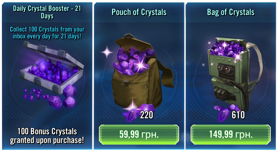
Moreover, the game does have mechanics to present benefit from purchasing, for example, Daily Crystal Booster. On tap on the Booster icon the pop-up appears which clearly state how much more HC a user will earn upon purchase. At the same time nothing happens when you tap on HC pack, i.e. no pop-ups appear, the only action you can do - tap on a button with a price and purchase it.
1.7 Daily Crystals Booster (Subscription) pop-up
Solution for this controversial flow is simple - to add visual tag that would indicate benefit from purchasing one or another pack. Moreover, the game already has them! For example, that`s how some of the resource packs look like
1.8 Resource packs with Discount layout
So, the only actions that is needed to be done is to apply similar mechanics on IAP packs.
3. Modal Integrity: The interface will fit individual tasks within whatever modality is being used: auditory, visual, or motor/kinesthetic.
Audio modality in Store packs play very minor and supportive role and doesn't involve directly to the purchase process. Visual modality is ok as well and doesn't require any complicated or confusing actions.
4. Accommodation: The interface will fit the way each user group works and thinks.
The game doesn't use any specific UI layouts that would be familiar to some group and totally alien to any other.
5. Linguistic Clarity: The interface will communicate as efficiently as possible.
The game tries to communicate with users and explain what they will get upon purchase one or another Pack.
1.9 Example of explanation menu of an IAP Pack
6. Aesthetic Integrity: The interface will have an attractive and appropriate design.
Overall, aesthetics of the Store follows game style and doesn't contradicts with it. All existing badges and visual layout looks stylish and doesn't overwhelm a user with different colors or shapes. Though, some minor changes may be applied to improve visual perception of some information. For example, on the picture 1.9 you may find example of IAP Pack layout, including white pricing text on the white frame visual. While this white frame is used to distinguish IAP Pack from HC Pack that has the same character on it, except the frame and price, some solutions like special button may be used to highlight the difference in price/currency of packs.
7. Simplicity: The interface will present elements simply.
There are no complicated elements in the UI and UX of the Store.
8. Predictability: The interface will behave in a manner such that users can accurately predict what will happen next.
In the most cases actions lead to what you expect on tap - redirection to another menu, pop-up appearance, activation of IAP. Though, sometimes different outcomes happen on tap in the same sub-menu, but this mainly touches one of the next points - Consistency, which we will take look on in a few moments.
9. Interpretation: The interface will make reasonable guesses about what the user is trying to do.
I didn't face any issues with “bad guessing” interface in the game at all, not only in the Store.
10. Accuracy: The interface will be free from errors.
The Store doesn't contain any errors.
11. Technical Clarity: The interface will have the highest possible fidelity.
The Store UI fulfills this point as well.
12. Flexibility: The interface will allow the user to adjust the design for custom use.
Usually, games doesn`t allow users to customize interfaces of the Store and it`s something that would be unnecessary. I.e. there is no obvious reasons for such functionality and many possible technical issues that may occur if users will start to tweak elements of the Store.
13. Fulfillment: The interface will provide a satisfying user experience.
While overall experience is ok, there is some irritating moments. For example, there is one separate pack, gacha-based Bronzium Data Card, that may be purchased for one of SC types that exist in the game, Ally points, and it may be opened for free 5 times a day with some short time in between.
1.10 Bronzium Data Cards: Free and paid respectively
And each time if a user wants to open this Free pack, he needs to scroll thru all other packs in the section, what can be kinda frustrating, especially during some Time-limited sales, when overall number of packs may be more than ten. Due to this I`ve stopped to open these free packs, i.e. trade off between the reward (minor) and necessity to scroll thru several other packs that are not interesting to me is not in favour of Free pack. While I may assume that such solution was introduced to push users to check special offers every time they enter the Shop, but it seems not very user-friendly on a long-term run. Some packs may be live for several weeks and dig thru them for several times a day is not something that average user would like to do.
The most obvious solution in this case would be to move Free pack in the beginning of the section. I.e. when the pack is available to be opened for free - move it to the first position in the list. In this case users still we see part of exclusive offers but will not have to scroll thru them each time.
1.11 Bronzium Data Card reward and purchase schreen
Another minor issue is an opening sequence of Bronzium Pack. A user may open only one pack at a time which takes around 10-15 second from taping on “Buy” button, to see all the animations and so on. There is no possibility to purchase several packs at once, but, for example, I own more than 250k of Ally Points and price of one is just 250. So, you can imagine how many times I need to buy the pack one by one to spend the pile, and this pack is the only place in the game where user may use it, beside very rare special Time-Limited events that are based on this currency.
This is something that could be easily fixed, by addition “Buy 10” button, which may be found in many games that use similar mechanics, especially in Japanese gacha-based games.
14. Cultural Propriety: The interface will match the user’s social customs and expectations.
The game follows branded SW universe look and doesn't use any specific cultural patterns or symbols that would be specific to one existing group and completely odd to others.
15. Suitable Tempo: The interface will operate at a tempo suitable to the user.
I didn't face any issues with a pace of UI operation.
16. Consistency: The interface will be consistent.
Consistency is something that confuses me the most in this UI. You may recall description of Subscription and usual HC packs in the Item 2. So, Subscription pack has a pop-up with very detailed description of what user gets upon purchase of it including discount ratio, but usual IAPs has no explanation or such pop-up at all. In the same section of the Store there are two different packs with such differences. While it's ok to have subscription and usual IAP packs placed together, as there are no reason to move Subscription to a separate screen, there are no obvious reason why not to add the same pop-up that would explain benefit of purchasing higher packs to a user taking into account that such functionality already exists! Or, not to overload the game with pop-ups, to add visual label on the pack, by using already existing mechanics from the Resource pack section of the Store.
1.12 IAP packs: real in-game (left) and fake mock-up with discount ratio (right)
Moreover, some inconsistency is being observed in the Resources section of the Store as well, both visual and UI.
1.13 Different resource packs in the Store
The game has 5 different types of resources, all of which are placed in the same section in the order you may see on the picture 1.13.
First of all I would like to point out the Galactic Gear Pack, which has very distinctive color from the surrounding packs. While such painting makes it very noticeable, it totally breaks color consistency of the section. I.e. surrounding palette is some mix of background cold colors - dark blue and violet, but GGP background has warm mood - orange and yellow. The simple solution would be to change the pack background to be more like other resource packs in the section.
The second weird thing about this, though it`s not UI issue, is that this pack is only one of it's kind but all other have two versions - small and big, and big one, as usual, is more expensive in absolute value, but provides user with some discount per item received. This would be not only consistent in terms of all other packs, but also should have positive impact on monetization. Either to push ARPPU, by offering more expensive pack with better chances of getting rare and expensive Gear, or Conversion, by offering less expensive and less valuable one for Minnows.
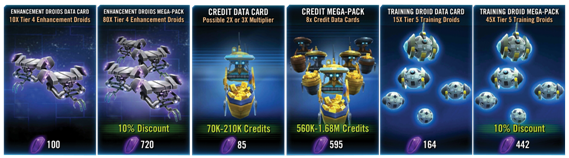
The next point is about discount labels. Again. But this time for Resource packs. As you may notice, Training Droids and Enhancement Droids do have these discount labels clearly visible in the main sub-section of the Store, while Credit and Ship Building Material packs don`t.
1.14 Mega-packs packs - with and without discount ratios/labels
You may say something like “Hey, but Credits and Ship Building Materials are currencies! Therefore they don`t have the labels and place of them is occupied by information of how much currency a user will get upon a purchase!”, and to some extent this would be valid. Until you dig a little bit deeper. When you check the top lines, for instance, of the Credit Mega-Pack you see “8x Credit Data Cards”, but this has no sense in terms of pushing sales. There is no such measurement is the game as “Credit Data Card”. All the times you see exact sum of credits on your account - either 100 credits or 10 million. A one will never see a message like “You have 10 Credit Data Cards on your account”, and prices are exactly in credits, not in Data Cards. Therefore this line bring no value to a user, because a user doesn't know what exact Credit Data Card is and what value it has. It`s not any medium of exchange, but credits are. As possible explanation could be that Credit Packs don't provide exact amount of credits, but within some range (gacha), but it's also not a reason, because when you tap on the pack, it redirects you to a menu where discount is being indicated!
1.15 Inside Credit Mega-Pack. Discount rate on the right text bar
So, the game already has all needed numbers, mechanics, layouts, everything that is needed to clearly represent discount ratios and be consistent, the only thing that is needed to be done - revise existing mechanics and adjust them to a single standard.
1.16 Existing (left) and potential (right) layouts of packs
So, why the potential layout is better from the UI/UX perspective? First, now Credit Mega-Pack has its own Discount tag. Second, now the packs have Discount labels and content description on the same level, while before they were on different heights - on top on the Droid and on the bottom, of the Credit. And third, now important information for a user is clearly visible and highlighted with the green-yellow color.
Finally, the last point about inconsistency of the UI. As you may notice Credit and Enhancement droid packs have two types of visuals to distinguish small and big packs with different amount of Droids and Credits on them. This would indicate to a user that the pack has more content inside thus it`s more valuable. But Training Droids packs has the same visuals for the big and small packs.
1.17 Enhancement droids, credits and training droids with different visuals
The solution for this is simple and obvious - to tweak number of training droids on the both packs, to have less on the small one, and more on the bigger.
17. User Support: The interface will provide additional assistance as needed or requested.
The UI provides some assist to explain a user what he will get in case of purchasing one or another pack, it happens in a form of pop-up or additional menu, examples of which you may find on pictures 1.7, 1.9, 1.15.
18. Precision: The interface will allow the users to perform a task exactly.
No problems with this as well. There are no ambiguous elements or buttons in the UI that would disorient or mislead a user.
19. Forgiveness: The interface will make actions recoverable.
Some of the actions are, indeed, recoverable, but requires additional efforts. For example, a one may restore all his purchases or ask for a refund of his IAPs. Though, there are no simple “Ctrl + Z” combination that would undo previous actions, in our case, purchase of some pack. Similar functionality may be found in all F2P games, so it's just a convention, not something unique for this game.
20. Responsiveness: The interface will inform users about the results of their actions and the interface’s status.
In most cases UI of the game additionally informs a user about what exactly awaits him upon a purchase or on a tap on a button. Example of such explanation you may see on screenshot 1.9.
Also it has different indicators that notify user about some special status of certain packs. Examples you may find on pictures 1.1 and 1.10, in a from or number one it a red circle. Though these indicators are very limited and for many special occasions they are not suited. For example, the only indicator that exists for the Store section is red circled number counter for Free Bronzium Data Card and very-very rare for some special limited or free Data Cards, some gifts, for instance.
Conclusions
Game evolution process is complicated and in case of such a complex products it`s easy to miss some elements, forget some mechanics or lose consistency or any other component of qualitative UI/UX. That's why it's important to conduct such evaluations from time to time and refresh/improve elements of UI and mechanism of their functioning.
Developers of SW:GoH do such changes.
The game, beside Pack Store, has eight other Stores with different items, shards, modules etc. A couple of month ago there were no single entry point to navigate thru all of them and players had to spend a lot of additional time and taps to check them. But developers added navigation panel to all different item stores which allow users to quickly jump from one to another.
1.18 Additional navigation bar on the top
Despite the fact that such improvements in many cases cannot be assessed directly in term of revenues, they are crucial for positive retention and usability impressions.
List of references:
User experience design
https://en.wikipedia.org/wiki/User_experience_design
Heuristic evaluation
https://en.wikipedia.org/wiki/Heuristic_evaluation
'Ice Age Adventures': UX Diagnosis for a Live-Ops Game (Case Study)
http://gdcvault.com/play/1024139/-Ice-Age-Adventures-UX
GDC 2017 UX Summit - Overview http://www.gamasutra.com/blogs/CeliaHodent/20170323/294339/GDC_2017_UX_Summit__Overview.php
10 Usability Heuristics for User Interface Design
https://www.nngroup.com/articles/ten-usability-heuristics/
The Cognitive Principles of Gerhardt-Powals: Ace your capacity to understand human behavior!
What's the difference between a heuristic evaluation and a cognitive walkthrough?
How to Conduct a Heuristic Evaluation
https://www.nngroup.com/articles/how-to-conduct-a-heuristic-evaluation/
How Japanese Mobile Game Makers Go After Whales: 5 Popular Gacha Mechanics
Read more about:
Featured BlogsAbout the Author(s)
You May Also Like


.jpeg?width=700&auto=webp&quality=80&disable=upscale)


