

Daily news, dev blogs, and stories from Game Developer straight to your inbox
Sponsored By
Featured Blog | This community-written post highlights the best of what the game industry has to offer. Read more like it on the Game Developer Blogs or learn how to Submit Your Own Blog Post
How To Make Booth Art As An Indie!
From concept to realization, here's the booth art we produced for our upcoming indie game Lake Ridden, which was displayed at EGX in Birmingham, in front of 80 000 visitors.
9 Min Read

This blog post is all about how we at Midnight Hub made the art for our booth at EGX 2017. It worked really well for us and as an indie studio, we were happy and excited to see people line up to play our game Lake Ridden! Here I'll share the process behind the artwork. Originally published on our dev blog.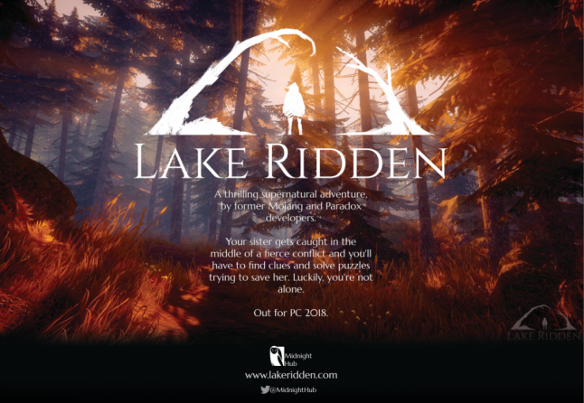
This is the final booth art we used to promote Lake Ridden at EGX in Birmingham 2017. Below I'll talk about how we arrived to this!
Lake Ridden is a puzzle game filled with mystery and exploration, made by a bunch of former Minecraft and Paradox developers. Comments and feedback on this piece are always welcome here, or you can find me, Sara (the producer) on Twitter!
Exhibiting Your Game
Before you decide what event to visit as a game developer, you need to nail down your goal. Why are you going and what do you hope to achieve? Traveling to GDC, NGC or Pax takes a lot of time, money and energy. And all that time spent on the event is time spent not developing your game. Our goal with visiting EGX in Birmingham 2017 was to meet with consumers and let them have a go at the demo, to increase visibility for Lake Ridden and meet with journalists. The core target audience for Lake Ridden is women and men in the age bracket 25-35, who likes puzzles, story and creepy atmosphere. They speak English and probably live in the US or UK.
When exhibiting at a conference or expo you’ll quickly notice that there are a thousand things happening at once. There’s usually music blasting from a dozen stands, big screens running trailers, people screaming, talking and laughing everywhere. Banners and promotional material in every corner. It’s usually some kind of organized chaos. We need to make sure people can find our stand and play our game.
The Booth Background Banner
When you sign up for an event like EGX or GameConnection you should provide the organizers with a print file, so that they can print your booth poster for you (or you can choose to bring a print with you if you live close by). Sometimes this is included in the price, and sometimes it is not. It’s ALWAYS better to ask than to assume. So for EGX, we had a stand featuring two monitors and chairs, in a long row of other games on display.
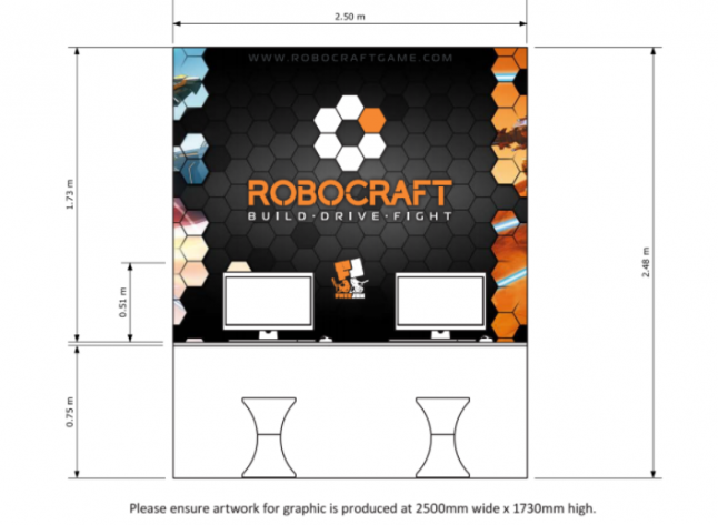
This is the template provided from EGX, how our stand will be built, its most basic measurements.
So when you know the measurements of your booth you need to take into account that the bottom part of your big poster will be partly obscured by screens and people hanging around. Never print anything crucial on this area, like the name of the game.
The part of the booth with the best visibility will be the top. Place important things as high up as possible to make it easier for your players to locate your booth in the sea of posters, roll-ups, and booths. Also, if possible, try to find photos or video of booth setups from earlier years since those could give you a hint about lighting conditions in the area. This impacts the visibility of different colors on your poster.
If you’re like us you don’t really have a dedicated graphic designer on your small team (we're a team of five). Please remember that the common skills needed to make general game art or paint concepts are very different from what a graphic designer does. A lot of graphic design is about combining images and copy to sell or market something. It involves typography, print knowledge, and layout design, just to mention a few core skills.
In our case, we got a lot of feedback from a graphic design friend of ours, and then our art director and I worked with that. Here are some of the iterations we went through!
.png/?width=646&auto=webp&quality=80&disable=upscale)
Iteration 1: We tried some different layouts and had all these things we wanted to communicate, like six different screenshots, a big block of text, the logo above each gaming station and so on. This does not work! There’s just way too much going on. What is the viewer even meant to focus on? And nobody will read such a long text in a badly lighted room.
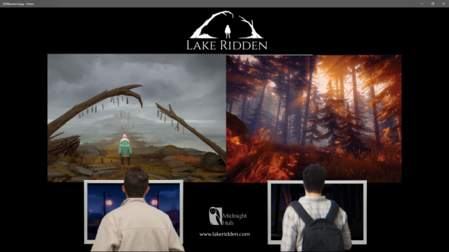
Iteration 2: We removed a lot of the visual noise, trying to narrow down the important stuff. We took our most liked images and placed them next to each other, still trying to communicate how much the game as to offer. But the painted image and the screenshot just look way too different from each other, almost like two different games standing next to each other. Not good!
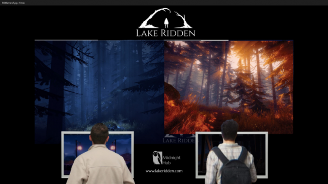
Iteration 3: OK, so we tried unifying the art direction of the poster by going for two screenshots instead of a painted image. But as you probably can tell it still looks like two different games, right? Like one of the game is about a forest at night, and the other about a sunny forest. Or perhaps the viewers will get the impression it’s a co-op game where you choose to play as night or day? We still had the upper part of the banner in all black, to make the logo stand out more.
.png/?width=646&auto=webp&quality=80&disable=upscale)
Iteration 4: Getting close! This is our most liked and shared screenshot, and also kind of the one Polygon chose when writing about us earlier in 2017. It grabs the viewers attention and it’s just really beautiful! It’s dramatic to look at. We still tried placing the logo on top, against the dark background, but it just looks very amateurish, if you compare it to the final result below. This layout is clear to read, it communicates well and it has some space for the copy as well!

Done! This layout should work. Less is more! We have a beautiful screenshot that tells the viewer something about the look of the game, we have a logo that tells them the name, and if they are hooked they have a short text that answers three important questions:
1. What kind of game is this (is it the kind of games I usually like to play?)
2. Who are making this (do they know what they are doing?)
3. When can I get it (is this a demo or something I can buy?).
At the bottom of the screen, there is room for our logo and the web page if the player wants to know more or subscribe to the game in any way!
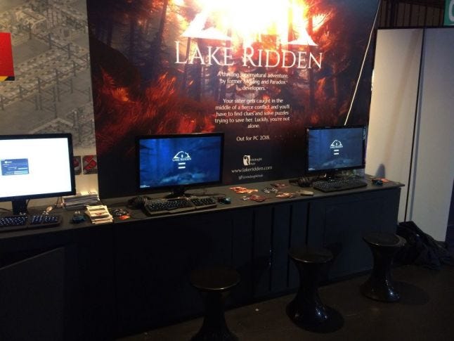
In real life, at EGX 2017! As you can see the spotlights at the top burns the logo in this photo. The token cards are placed next to the game to help people grab some!
Another goal of the booth art was to single out certain elements of the game, like “puzzle”, “adventure”, “story” and very active verbs such as “unravel”. We have been moving away from labeling the game as a horror or walking simulator. Hopefully, this sells the game much more as the thriller adventure it truly is!
Lake Ridden Token Cards
Previously we have exhibited Lake Ridden on 4 other occasions (to other game developers); Nordic Game Conference, Game Developer’s Conference USA, Game City and GameConnection USA. At these events, we have not had any kind of physical item to offer testers.
I’ve read a lot of developer blog posts that people don’t really want any extra junk or flyers after playing, they just litter and take up space in their pockets. However, at Nordic Game Conference a lot of people picked up a personal business card from the table just to get a token with them, they said they wanted something small to remember the game by and look it up when they got home. People even took photos of our roll-up to remember the game they had just tried.
With this in mind, we decided to order 1000 small, Lake Ridden business cards to place in the EGX stand. We toyed around with the idea of having our most memorable screenshots on the cards, or to use symbols from Lake Ridden.
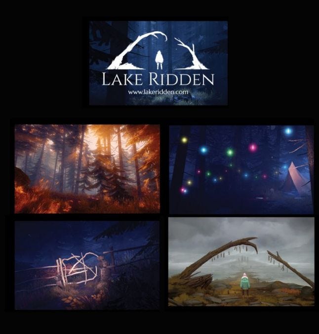 Option 1: All Lake Ridden business cards next to each other, with the common back side at the top of the image. The idea was to pick our best screenshots and images we had already pushed in our marketing material.
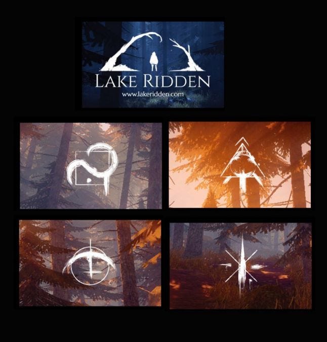
Option 2: Our art director took our screenshot of the sunset and cropped it into small details, then placed Lake Ridden symbols over them. They all share the same backside, the blue image on top.
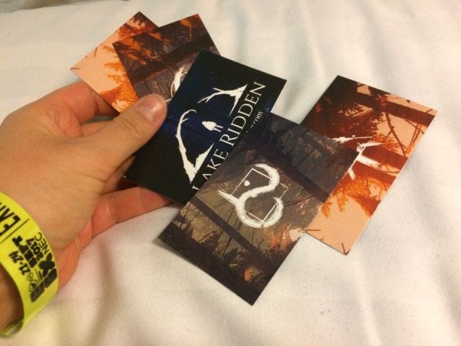
The token cards in real life! Our visitors really loved them!
We decided to go with Option #2! In my opinion Option #2 looks much more tied together, and the symbol really emphasizes the demo that the players have just tried. So we printed these + the one concept art of our protagonist Marie looking out over the lake. We actually run out of cards at EGX, players really loved choosing one of the designs to take with them after playing!
Shirts & Roll-Up
The final marketing materials we’re brought is the roll-up we used at Nordic Game Conference and our personal Lake Ridden branded shirts. At GDC a lot of people managed to find us due to the shirts!
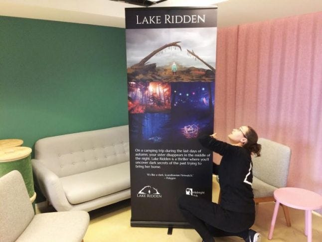
In addition to our printed token cards and the big booth background, we had our Lake Ridden roll-up to EGX, to help attract players to the game!
None of us are graphic designers here at Midnight Hub, but I think we have done the best of what we got! If you have any feedback just let me know in the comments!
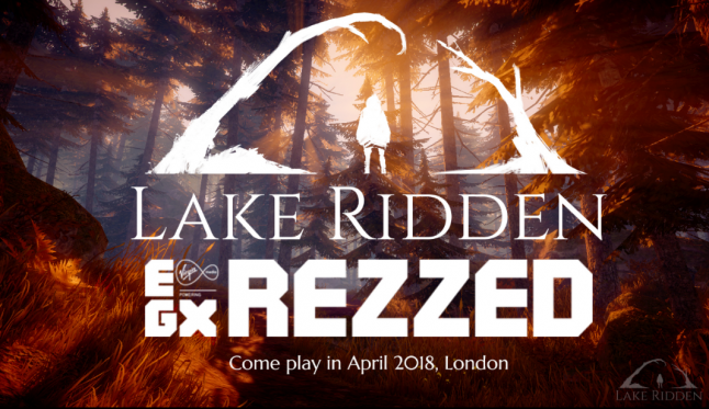
Our next event will be EGX Rezzed In London this April. If you're there and would like to play Lake Ridden, just drop by!
Cheers,
Sara (Saxen8 on Twitter) & The Lake Ridden Team
Read more about:
Featured BlogsAbout the Author(s)
You May Also Like


.jpeg?width=700&auto=webp&quality=80&disable=upscale)


