Featured Blog | This community-written post highlights the best of what the game industry has to offer. Read more like it on the Game Developer Blogs or learn how to Submit Your Own Blog Post
Games and Visual Identity
This week I woke up to news feeds announcing a new trailer for Bethesda’s Rage 2, and after watching it, it really got me thinking again about the importance of creating a strong visual identity for your game.

This week I woke up to news feeds announcing a new trailer for Bethesda’s Rage 2, and after watching it, it really got me thinking again about the importance of creating a strong visual identity for your game.
The original Rage is now known mostly as an oddball footnote in Id Software’s career. A drab brown shooter released when the industry was up to its neck in drab brown shooters. Around the same time, another very, VERY similar game in terms of gameplay structure had come out, but whose visual identity had a fresh punch and energy to it. Borderlands had famously reshaped its whole tone and art style some way into development and wound up carving a whole new identity (and a successful, well-known franchise) for itself because of it. Now here we are years later, and Bethesda has clearly caught on that if a new Rage is going to hit the market, it needs to come with a face of its own. A new, punk-rock infused, vibrant face at that.

And honestly, it’s working on me. They’ve managed to distill what the feel and tone of the new Rage is primarily by using a limited but carefully picked color palette. A warm Yellow – to represent the grime, sand-blasted rotten side of their apocalypse, and a neon Pink - to represent the wild, fun, throwback elements that come with that punk rock aesthetic. This isn’t a game meant to make you feel like Mad Max, this is a game meant to make you feel like Tank Girl.
And this is something I think can be easy to overlook, for indies especially. Carving a strong visual identity for your game isn’t just good for helping your game stand out among the increasingly crowded market, its meant to ensure your game is unmistakably yours. Any stray screenshot, logo, promo image or hell – even the color of your booth cloth, should scream out your game to viewers, and your game alone.
This inspired me to take a little critical dive into other games that I think have strong identities, and more specifically those that make clever use of color to differentiate themselves, to see what I can learn from them.
Blizzard‘s Flagships


What better place to start than one of the masters of strong visual identity, Blizzard. I’ve cropped here the header images of some games from Blizzard’s own Battle.net client to highlight one of the most obvious examples of using color to create distinct identities for each of their flagship franchises. Here they have almost literally pared them down to the primary colors – Red, Yellow and Blue. We get a rising sun yellow contrasted with a little mystical blue to highlight the high fantasy epic that World of Warcraft promises, a deep but rich blue to sell us on the tactical late-night keyboard matches of Starcraft 2, and the demonic deep reds and heavenly gold light of demon-slaying sim Diablo 3. Even these slivers manage to tell you a lot about what makes each game special - and coupled with their always-tangible logo treatment and hand-rendered style, what makes Blizzard special as well.
Wolfenstein

Not to toot Bethesda’s horn again so soon (though it will certainly happen again by the end of this article), one of the franchises that immediately came to mind when I was trying to think of striking and memorable brand identities was the recent series of Wolfenstein reboots. Looking at it, it couldn’t be simpler, yet it stuck with me all the more for it. A starkly contrasted red/black/white Nazi flag color scheme, along with the stormtrooper imagery, immediately tells you this isn’t just another World War 2 themed game where you fight Nazis, this is a game explicitly ABOUT Nazis. In THIS Wolfenstein, Nazis and Nazi imagery aren’t the set dressing so much as they are the set itself. Brilliantly simple, yet it shows you immediately and clearly what makes this reboot different.
Slime Rancher

In brighter territory, I remember Slime Rancher being one of those games that I just couldn’t help but be drawn to anytime it appeared on my recommended feeds. Something about the fruity Gushers-esque pink crowding out your view of a calm blue sky really grabbed me. And wouldn’t you know it, this art did indeed highlight everything that makes Slime Rancher so special. The relaxing backdrop of your regular farm sim is here, but it’s contrasted by an in-your-face cutesy chaos, like a Grapefruit-in-the-eye breakfast alternative to your standard eggs-and-bacon farming experience.
Dragon Age

For new IPs coming into established well-worn genres, visual identity will sometimes come about in slightly more subtle ways. Looking back to the first Dragon Age for instance, one can see Bioware was making a conscious effort to make Dragon Age out to be the bloody, adult version of high fantasy. Emphasis on the bloody. Anytime I would see screenshots of this game, everything was always drenched in speckles of blood. This identifier was reflected in promo art too, with clean white surfaces being bloodied by the shape of a dragon, who was also made of deep red blood. Then they speckled some blood on the logo too for good measure.

As Dragon Age became a better-known franchise, this “bloody” identifier seemed to become less important over time, though the “dragon silhouette” motif stuck around as something close to the series’ icon, thanks to the memorable promo work of the first installment.
Elder Scrolls

At last, talking about Bethesda again, this time regarding their own in-house franchise, The Elder Scrolls. These have formed quite the interesting brand identity over the years, in a progression I can only describe as Men’s Cologne Syndrome.
We begin simple enough with where this trend seems to have started with Morrowind. In Morrowind the title is displayed prominently and boldly over a simple golden-brown parchment backdrop, hinting at the game’s aura of sophistication and history in its lived-in fantasy world, something that would come to define the franchise. Then in Oblivion, this motif is repeated, this time with tears in the lighter, seemingly fresher parchment, and the logo now emboldened and tangible, given its own space and prominence beneath the title, emphasizing its importance. The subtitles for the games being given more prominence than the franchise name itself is something to note as well – seemingly claiming some degree of authority as a piece of individual art. Displayed as something to be respected.
Then we get to Skyrim, and the Men’s Cologne Syndrome has settled in full. The tangible parchment gone, now replaced with a practically brand new black leather texture, and a polished chrome logo demanding your sole attention. This is a box that says “I don’t need to prove anything to you. I have already won.” It has a certain simplistic elegance and yet an uptight sophistication. I feel like an asshole reviewing wine trying to describe what I feel when I look at it, and yet that’s the only way I feel I can describe it. Skyrim, and the Elder Scrolls brand, now seems to be mainly defined by its “Premium-ness,” or at least that’s the message that the marketing seems to be conveying.
We could keep going down this rabbit hole, but I think you get the point. Short story is – we need to be better about giving our games the identity they deserve, and finding a way to communicate that with strong color choices is but one tool to achieve that, albeit a powerful one in itself. Alternatively, just make your game purple. It’s what all the cool kids are doing.

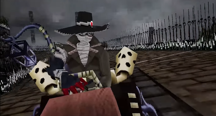
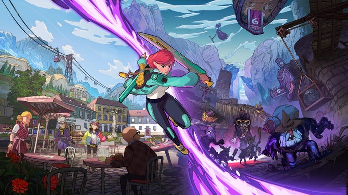
INDIES LIKE THE COLOR PURPLE. A LOT.
Thanks for going on this little journey with me, and if you know of any other cool examples of games that do a great job showcasing a distinct visual identity for themselves, feel free to tweet me @SlickNickLives, I eat this stuff up like candy.
Nick Lives is the co-creator/art director of indie crew sim We Need To Go Deeper, among other titles.
Read more about:
Featured BlogsAbout the Author(s)
You May Also Like




.jpeg?width=700&auto=webp&quality=80&disable=upscale)


