Daily news, dev blogs, and stories from Game Developer straight to your inbox
Sponsored By
The spookiest postmortem: WayForward's Til Morning's Light
A console-quality horror adventure on mobile, for a publisher that had just gotten into games? Adam Tierney, the game's director at WayForward, tells the tale of its creation.
22 Min Read

Adam Tierney is game director at Wayforward.
Beginnings
I think I’ve always loved horror video games. I can’t remember a time when spooky games weren’t a big part of my life, going back to titles like Alone in the Dark on PC (1992), Castlevania on NES (1986) and before them all, Haunted House on Atari 2600 (1982).
I work as a designer/director for game studio WayForward, most commonly associated with cheerful, cartoony games like Shantae, Mighty Switch Force!, and DuckTales: Remastered. But lately, we’ve also been quietly building up a sub-genre of WayForward horror games with LIT (WiiWare), Aliens: Infestation (DS), BloodRayne Betrayal (PC, consoles), and Silent Hill: Book of Memories (Vita). One of the cool things about WayForward is we’ll tackle just about any style of game, so long as it’s got solid gameplay fundamentals and interesting characters.
Around the summer of 2013, Amazon came calling -- more specifically, Amazon Game Studios, a brand new game division within one of the largest companies on the planet. They wanted to work with WayForward and asked us what original concepts we would be interested in for an opportunity like this.
Our creative director Matt Bozon and I immediately thought of the same concept. Somewhere in the dusty, virtual bins of unrealized WayForward games was Til Morning’s Light, a horror game concept I’d written about five years earlier, with concept art by Skullgirls lead animator Mariel Cartwright. The game followed a cute, slightly-punk teenage girl named Erica trapped in a haunted house by mean-spirited classmates, who must survive monsters and ghosts for 12 hours until she can emerge the next morning -- hence the title.
Amazon Game Studios liked the concept, and after some discussions and additional documentation, our two studios partnered to begin production on the game in the fall of 2013. The year that followed was an exciting, inspiring, and exhausting development experience.
The ultimate payoff? Releasing the game and having players call it “a spooky good time” and “brilliant” made all of the work worth it.
So without further ado, here are some of the notable highs (and lows) from the development of Til Morning’s Light. Enjoy!
What Went Right
1. High Quality VO Casting and Performances
Til Morning’s Light is a very story-driven game that revolves entirely around the main character Erica. She’s in every scene, she drives the story, the humor, the drama, and the tension, so it was absolutely crucial that we nailed casting her actor. If gamers didn’t immediately love and care about Erica, then the game as a whole wouldn’t work.
I’m pals with Cristina Vee, an accomplished anime and games voice actor, who’d previously directed VO on the fighting game Skullgirls. Cristina and I had worked on a few WayForward demos together, so when we began discussing the VO for Til Morning’s Light with Amazon Game Studios, I knew immediately that I wanted Cristina to be our VO director.
Normally on a game, we’d just pick the voice actors we wanted, reach out to them, and if they were available then that would be that. But Amazon Game Studios thought casting a wide net per role would help us find exactly the right people for the right parts, so between the approximately 15 speaking parts in the game, Cristina ended up wrangling over 100 VO auditions -- by many of anime and gaming’s most beloved voice actors.
 The part of Erica ultimately went to Stephanie Sheh (pictured left), who I always loved as Mamimi in the anime “FLCL.” Stephanie brought a humor and dorkiness to Erica that made the character immediately lovable, and actually changed how I wrote Erica’s dialogue for future pickup sessions. Although the runners-up for that role also delivered great reads, I can’t picture anyone but Stephanie as Erica now.
The game’s villain was a pompous, theatrical, British ghost and I had my heart set on Cam Clarke (Liquid Snake from Metal Gear Solid) before starting the script. Cristina reached out to Cam and luckily his audition was as good as I’d hoped, so Cam got the part.
Every one of our dozen actors blew me away with their performances, and Cristina, being an actor herself, knew exactly how to get what she needed out of each line read. Upon release, the game’s VO has been cited as a high point in player and media reviews, and we owe a great deal of that to Cristina’s excellent casting and direction, and Amazon Game Studios pushing us to do those numerous, early auditions.
2. Keeping Inputs REALLY Simple
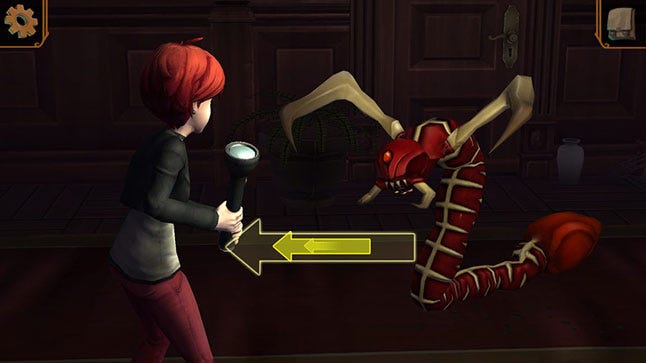
Til Morning’s Light is the first mobile game I’ve directed. Previously, all my games have been on console, handheld, or PC. Mobile games present a challenge to doing any sort of complicated gameplay because of the lack of tactile buttons. And here we were, ready to attempt our homage to games like Silent Hill and Resident Evil, each of which typically uses every button on the controller. How do you do survival horror well on a touch screen?
Rather than attempt to cram every ounce of functionality from games like those on a tiny screen, we opted for the opposite approach - reducing everything in the game to its most basic. Essentially, everything in Til Morning’s Light is a series of single screen touches. We never require the player to use more than one finger at a time, which allows them to hold and control the game however it feels most comfortable to them. Erica is controlled with a virtual analog stick, but you can place that anywhere onscreen and it follows your thumb, so you can always make quick turns. And if you STILL hate it, you can ignore that style of input altogether and move Erica by tapping locations to auto-walk her around.

Surprisingly, players always seem split 50/50 on which input is preferred, which is part of the reason we left both in. We noticed that players more focused on completion and puzzles tend to rely on tapping, whereas users more focused on the story and Erica tend to use the virtual analog stick. I think this is because you're able to steer Erica around more naturally and 'act' better with the virtual analog stick, as opposed to tapping, which is more of a straight rush to each objective.
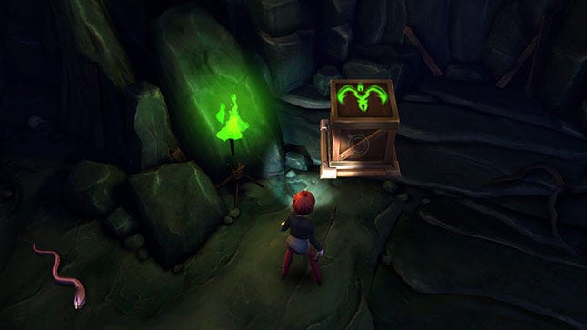
With object interaction, we boiled everything down to a single interactive icon - spot an icon, tap it and see what happens. This was used for opening drawers, depositing items, interacting with puzzles, and so on. Erica has no foreknowledge what anything in this house does, so allowing the player to experiment by tapping these icons to see what happens made sense and felt very natural.
I don’t remember whether we considered a more complicated input system, but if we did, it was dismissed very early on. The end result of moving Erica around each room, tapping icons as they appear, then deciding your next step after you’ve seen what the room has to offer, makes for a more cerebral experience that pretty much any gamer can enjoy. If you want to see what a clock does, touch the clock. Want to run to a door? Tap the door. Everything is simple and straightforward.
3. A Map System with Lots of Guidance
One problem with survival horror games (or any big adventure games, really) is that it’s easy to lose track of where you are, where you’re headed, and why you’re going there. I know whenever I play through a game like Silent Hill, if it’s been a while since I last played, I might waste up to an hour wandering around, trying to remember what I was supposed to be doing, because of the open world. We knew that problem would only be compounded on mobile, where players are more prone to short, infrequent gaming sessions than to longer, continuous play sessions.
So we decided to address this with the game’s map system:
Any unvisited room is black.
Any visited room is white.
Anytime the player tries a locked door, the room on the other side turns red...
...AND an icon appears of the key needed to get inside.
Finally, any locked (red) room the player holds the key for will pulse on the map.
With this setup, players can open the map and immediately know where they’ve been, where they haven’t, what keys are needed, and (if holding a key) where they should go next. But this is done by reinforcing what they’ve already done, not leading them or giving things away before their discovery.
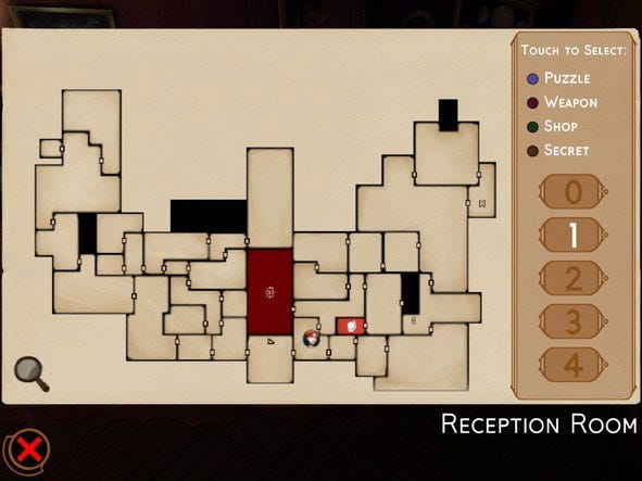
The map system was a real success, we got great feedback from gamers and critics with one saying “the game features an excellent map system” with over 100 unique locations, dozens of puzzles, and hundreds of enemy encounters, we needed to make sure players would never be confused or frustrated about their progression through the game.
4. Regular Team Playthroughs and Creative Leeway
Early development involved a lot of me hovering over individual work desks, working with team members one-on-one. But once we got enough of the game hooked together to be able to play through the entire experience (albeit roughly), we began doing group playthroughs with all the designers and project leads.
This proved to be an invaluable practice because team members could see how other players experienced their sections of the game, and we could talk as a group about what worked, ask questions, express confusion or excitement, and come up with ideas as a group for improvement.
The risk with a puzzley adventure game like this is that it’s entirely possible to have portions of gameplay that make 100 percent sense to you (the creator), but stump everyone else who plays the game. By getting the entire team playing through the game as a group, we ran into confusing and problem areas early and were able to address them before the game’s release.
Another team-related aspect that worked well was providing team members with as much creative leeway as possible (so long as we served the greater game and story). On a much smaller game, I might just design everything myself. But on a game of this size, we had a design team of about five people (in addition to myself). I would hash out the broad strokes of puzzling and progression with Nick Garcia (our lead designer), then Nick would work with the other 4 designers to flesh out and implement those concepts as creatively as possible.
A lot of the game’s best moments came from what our design team individually came up with. Allowing each of our designers to own different areas of the mansion, implement their own sets of puzzles, story sequences, and boss battles yielded more varied and creative results than if we’d attempted to design every little detail from the top down. Team creativity was rewarded, rather than squashed, and I think that yielded a pretty creative end product.
5. Figuring Out Erica on Paper First
As I mentioned previously, the entire game revolved around the player’s connection with the character Erica. So we knew that constructing her would need to be done very carefully, especially since Erica grows and evolves as a character over the course of the game.
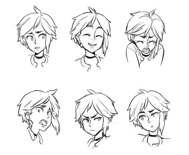
Artist Mariel Cartwright and I co-created Erica, with Mariel handling all visual development and me driving all story and dialog. Beyond just concepting Erica’s appearance, we went on to concept pretty much everything Erica does in the game. Mariel drew copious expression sheets for Erica, as well as reference imagery of how Erica might stand when holding a flashlight, versus a sword, versus an axe, etc. Mariel sketched Erica attacking, pushing and pulling crates, climbing, sneaking, taking damage, dying, and anything else we could think of. This artwork was then given to our artists and animators to use as reference for modeling and animation.
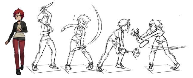
Because of this process, I think Erica as a character became very consistent and maintained a distinct, visibly discernable personality throughout the game. Since Mariel set the tone for how Erica would do everything, it prevented us from getting any animations or poses back that felt out of character for her. Even when Erica performed something as basic as sliding open a drawer, it always looked exactly how an introverted teenage girl would believably slide that drawer open. Animators never started anything from scratch without some sort of reference.
Although concept art is nothing new, this was the first game I worked on for which we produced concepts for animation, and it really paid off. Any future projects I tackle with a similarly strong central protagonist like Erica, I’ll definitely be inclined to take this approach again.
What Went Wrong
Of course, not everything goes as smoothly as you’d like on a project. Here are five pitfalls we encountered during our production.
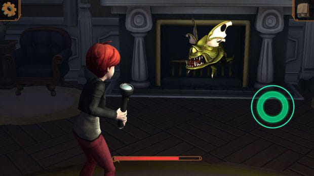
1. The Slow Discovery of Our Combat
The combat in Til Morning’s Light employs a variety of 2D rhythm-based inputs the player must react to as they appear and animate onscreen (similar to games like Elite Beat Agents or Buddha Finger). Each input the player successfully completes causes Erica to attack the enemy she’s battling, and each input missed (or keyed in too early or too late) causes the enemy to attack Erica, in an almost back-and-forth RPG style.
The combat largely works, and taking this approach allows Erica to appear vulnerable and uncertain, while also showcasing her up close (to counteract the more distant exploration camera).
Unfortunately, this approach to combat wasn’t our first instinct for the game. It was our fourth. Which meant that we spent several initial months on combat approaches that ended up getting abandoned or retooled. And any lost effort on a one-year-schedule always hurts.
If memory serves, our first three stabs at combat (and why each was discarded) were:
Direct Attacking: The first type of combat we attempted was, naturally, letting Erica fight in the same camera view that she does everything else. This version of combat was similar to fighting in the Lego Games, with the player touching an enemy to run Erica over to it, after which Erica would auto-attack until the enemy died, or you led her away from it. Tapping the enemy during an attack caused Erica to attack more aggressively.
Ultimately, this style of attacking just wasn’t very fun. It felt like assigning a single unit to battle in an RTS game, then watching them attack, which made for a pretty bland combat experience.
Group Attacking: Next, we tried an approach that added more gameplay to the fight and made things less automated. Still working in the standard exploration camera, we programmed enemies to group around Erica in a circle, evenly spaced out from one another. The enemies would then take turns attacking her, giving a brief visual cue. Erica would then need to block that incoming attack, in between attacking other enemies.
In essence, we went full Arkham Asylum with our combat. And although it was fun and challenging, Erica felt like WAY too much of a badass. To get the animations reading clearly at that camera distance, and moving fast enough for the new system, Erica moved more like a ninja warrior than a frightened, average teenage kid.
Enemy Countering: For the next iteration of combat, we decided to separate combat entirely from the standard exploration mode. We pushed the camera in much closer and behind Erica (the same view in the finished game). We created a touch screen mini-game where players tapped inputs as they appeared to damage enemies (pretty close to where we ended up).
The major difference between this version and the final combat is that in this version, we kept the countering/blocking from the second iteration combat, so that Erica would need to anticipate and block an enemy’s attack first, stunning them, and THEN attack until they became unstunned again.
This setup worked pretty well. Erica didn’t seem like such a badass anymore, and since she was shown up close, we could make her attacks feel clumsy or uncertain, knowing they would read clearly onscreen. The main problem is that waiting and countering enemy attacks before you could attack yourself was a SLOW process. It made every enemy encounter a chore.
In the end, we went with a similar combat system to the third iteration, except nailing touch inputs meant Erica would attack (once per input) rather than waiting for her turn. Where we landed with the combat felt good, but it took a long time to get there.
The most common negative in reviews for the game is that combat isn’t varied enough early enough. By the end of the game, the number and speed of inputs gets pretty frantic, but it’s a slow build (too slow) up to that point. Were combat finalized earlier in development, it would have provided us with more time to make the system deeper and more varied than it ended up being.
2. Late Start and Bad Estimates on Cinematics
Although most of the game’s storytelling is handled through VO that plays during gameplay (allowing the player to remain in control as often as possible) we did produce 20 short cinematic sequences for the game. These were typically used to set up a new character or boss, so that the player is introduced to that character up close and personal, and can later (in their mind) apply those features and mannerisms to the characters in the more distant exploration camera view.
These sequences were written by me, storyboarded by Mariel, and VO directed by Cristina. WayForward did all prep work on the assets, then collaborated with an external cinematics studio (Hydrogen Whiskey), since our internal animation team was focused on gameplay animations.
The working relationship between Hydrogen Whiskey and WayForward was great. The problem is that cinematics started much later than they should have, due to the time it took for all planning, VO recording, editing, storyboard illustration, and asset preparation. This in turn gave myself and the game’s art director, Elyse Bromser-Kloeden, limited time and rounds of feedback to work with Hydrogen Whiskey on finalizing each scene.
I was pleased with the end results, and Hydrogen Whiskey did an excellent job at capturing the personality of each character. But there are plenty of minor details in these scenes that Elyse and I would’ve loved to have ironed out if there was a bit more breathing room in the schedule.
Another cinematic wrench in the works came in the form of a disparity between the length of our temp and final VO. To get our storyboards and animatics going as early as possible, I recorded temp VO for all characters. As the writer of our script, it made sense that I could adequately approximate the length of these VO lines.
But when we got the final VO back from the real actors, each scene ran about 20 percent longer than they did with my temp VO. I think this was due to the actual actors giving much bigger, more theatrical performances than I attempted into my little USB mic. We didn’t have it in our schedule to accommodate an extra 20 percent of cinematics past the original estimates, so we needed to make some creative edits, rework some lines, and play with the timing to get the overall play-lengths down to something that was feasible in the time available. On future projects, I think I'll just add a +25 percent buffer to all time estimates to avoid this.
3. A Lack of Critical Items in the Shop
Throughout the game, Erica is collecting coins and gems, all of which can be spent with the creepy little shopkeeper she bumps into occasionally. He’s a fun character and the shop system didn’t cause any major headaches during production.
Unfortunately, the actual items you buy at these shops (which include various boosts and character improvements) were a relatively late add in the game. By the point they went in, everyone on the team was used to beating the game without them.
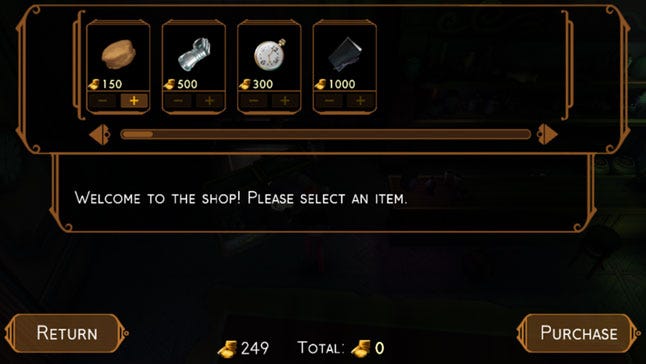
So although individually useful, none of these items felt essential because we’d balanced everything without them. When I play through the game, I find myself stocking up on health kits almost exclusively, then buying a few select items, like the Blood Pack and White Feather, for the final boss. But most of the shop’s items feel somewhat optional.
In hindsight, we should have balanced the game around needing these items from the beginning, even if their early implementation was rough at the start.
4. Forced Backtracking for Weapon Swapping
The game features a variety of weapons and having previously dealt with a frustrating-to-implement weapons inventory system on Silent Hill, I was resolved to keep weapons in this game SIMPLE. Erica would hold one weapon at a time, clearly visible in her hands, and if players wanted to swap that with another weapon, the previous weapon would be dropped at the swap spot (and marked on the player’s map).
Silent Hill: Book of Memories
On paper, it works pretty well. But in practice, we ran into situations where the player might be 10 rooms away from a weapon they wanted to get back to. Although we’d stamped out most standard-progression backtracking in the game (through semi-linear room progression and the addition of shortcuts), getting back to a desired weapon often involves a whole lot of room loads.
If we were to do it over again, I think some kind of a weapons locker system would have been ideal, where the player can have access to any weapon they’ve ever held (but still only carry one at a time). An approach like that would have ensured our plot and progression never lagged whenever the player felt a need to revisit one of their dropped weapons.
5. The Ultimately Cut Ghosting Minigame
One of the best things about this project was Amazon Game Studios allowing WayForward to make the kind of game we wanted and not forcing us to cram in a bunch of “mobile features.” The fact that Til Morning’s Light plays more like a traditional console experience, without any IAP (in-app purchases), energy drains, advertisements, or any other annoyances common in mobile games today, is somewhat of a rarity.
But early on, we had some trepidation that the long-form style of play might not provide players with a ‘quick fix’ if they only felt like playing for, say, 30 or 60 seconds. With this in mind, we got to work creating a “Ghosting” minigame.
.jpg/?width=700&auto=webp&quality=80&disable=upscale)
This was a cute, cartoony 2D minigame in which there’s a 5x5 game board, and on each of the 25 squares, the player could spend money, collected in the main game by Erica, to resurrect a ghost. That ghost would idle in place and either be happy, neutral, or angry, based on what other ghosts were around them (and in which directions each ghost projected happiness and anger).
The gameplay was inspired by Capcom’s wonderful PlayStation game One Piece Mansion (a favorite of mine). There were 25 different ghosts you could spawn into the minigame, but to do so, Erica would first need to locate and capture each of these ghosts in the main game (which later evolved into the Crowes Sword side-quest).
Everything worked pretty well, but as we neared the end of development, the minigame wasn’t completely finished. And since it wasn’t a critical aspect of the game, it ended up getting cut. Had we known this game wouldn’t make the end product, the effort we spent to design, animate, code, and balance it would have definitely been better spent elsewhere.
Conclusion
Til Morning’s Light is the most satisfying game project I’ve ever been a part of. I love the end result, I think our team was full of absolute rock stars, and the game’s story is the most personal thing I’ve ever written.
At the same time, it was a tremendous undertaking in the time we had available, so naturally aspects of the production could have gone more smoothly or efficiently, elements could have been more polished or better balanced, and less effort could have been wasted going down paths that weren’t destined for the final product.
But I’m sure this could be said of most productions. As we work in this industry, all we can do is learn from our mistakes, learn how to work more efficiently, smartly, and confidently, so that the next game benefits from everything we learned on the previous one.
Til Morning’s Light is the culmination of my experiences, successes, and failures on a decade of previous WayForward projects. And now the lessons the team and I have learned on this game will make the next project (and the next, and the next) even better.
Data Box
Developer: WayForward
Publisher: Amazon Game Studios
Release Date: May 21, 2015
Platforms: Fire Phone, Fire Tablet, iPhone, iPad
Size of Development Team: Approx 30-40 people
Length of Game Development: Approx 1 year (core development)
Time From First Concept to Production Start: 5 years
Favorite Dev Fuel: Pastries from Porto’s Bakery
Sailor Scouts in our VO cast: 2 - Stephanie Sheh (Sailor Moon) and Cristina Vee (Sailor Mars)
Development Tools: Unity (engine), Visual Studio, Photoshop, 3D Studio Max, Ableton Live 9, and more
About the Author(s)
You May Also Like