Daily news, dev blogs, and stories from Game Developer straight to your inbox
Sponsored By
Deep Dive: The art of Foundation
Art director Olivier Latouche explains the thoughts and technical process behind updating the game's visual style.
9 Min Read

Game Developer Deep Dives are an ongoing series with the goal of shedding light on specific design, art, or technical features within a video game in order to show how seemingly simple, fundamental design decisions aren’t really that simple at all.
Earlier installments cover topics such as designing for impact and narrative variance in Roadwarden, curating meaningful choices in multiplayer narrative games with Doomsday Paradise, and an exploration of how the artists of LEGO Bricktales recreated the diorama-based building experience in a virtual setting.
In this edition, art director Olivier Latouche talks about how he assessed and improved upon the art of Foundation after assuming his role on the project earlier this year.
Hi, my name is Olivier Latouche and I have been working in the video game industry since 2012. I have since contributed to many different projects ranging from larger, more mature PC games, to lighter mobile games for kids. During these years, I have worn many hats, which in return allowed me to gain a lot of experience in several different spheres of game development.
In March 2022, I had the opportunity to join the amazing team here at Polymorph Games. They had a clear artistic vision in mind but were looking for someone to help them refine and materialize it. The talented art team had already gone through many iterations to try and find Foundation’s very own style, therefore, it was (and still is) very important to me to respect that process. So I set out to give myself a few rules: build upon what you already have, tie up loose ends and use the team’s strengths.
Before getting my hands dirty, the first step was to get up to speed with the rest of the team and understand what was working and what wasn’t.
Getting up to speed
After numerous meetings, hours of playing the game, and meticulous archeological searches throughout the documents archives, I finally had a good grasp of what Foundation had gone through and where it was going. However, as I had limited time to go through all this, there were still things I didn’t completely understand so the next step for me was to develop a sense of ownership of the visual identity of the game.
To achieve this, I took a few steps back and synthesized everything that I had learned from my previous research. I then documented the visual fundamentals of Foundation in a way that is concise and easy to understand so it stays relevant throughout the rest of the production. This not only helped me make Foundation’s art direction my own but I think it also helped the team take a step back and get a global view of the current state of the game at the time. Sometimes it’s easy to get narrow-visioned when we are so focused on a single thing for a while.
The mission
Early on, directors Phil and Léo were very clear as to their expectations. First, the game’s visuals worked so far to showcase the game’s potential, but were not on par with their vision of the game’s aesthetics and visual quality. Second, the art pipeline at the time was not optimized to achieve modern visual quality standards.
So, with that in mind, the art team and I worked in parallel to tackle these two issues. While we continued to establish how other aspects of the game should look, we also looked into other tools, software, and techniques to improve our art pipeline. Then, a building benchmark was made to test the new look and pipeline.


Visuals do not represent the final version of the game and are subject to change.
After successful tests, re-planning milestones, and re-prioritizing responsibilities, I felt pretty good about where this was going. I have to say that I am very proud of the team for their open-mindedness to revisit old visuals, learning how to use new tools and software, and getting used to working together. All of this in a very short period of time. It’s never easy to go back and redo previous work let alone while learning new skills.
That being said, the real challenge was yet to come.
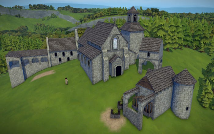
Remaking the Monastery
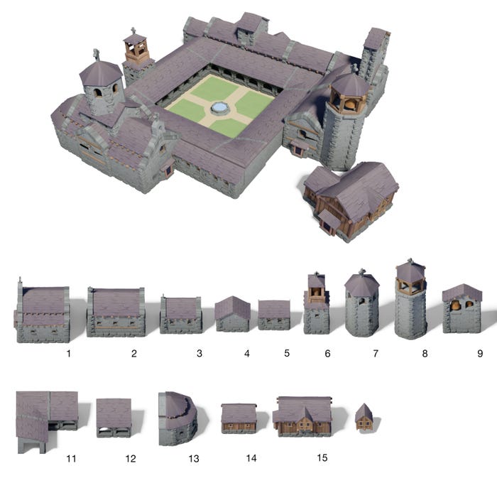
Although our benchmark was a success, we still had to apply these newly acquired skills and knowledge to something we could quickly roll out to the players so we could gather their opinions. Being literally at our doorstep, Update 1.9 was a good candidate, as it features a lot of important content—including a focus on the Clergy estate mechanics. It was only natural that we would cut our teeth on something “small” and “easy,” so that’s why we chose the entire monastery and its three-part sets. Joking aside, we remained pretty conservative and careful with this choice to mitigate risks. We chose a few select parts that would let players test all the available functions of the monastery while keeping the scope realistic for us.
The monastery is what we call a “Monument”. Monuments work differently than standard buildings, whereas players have complete freedom to use and place most parts the way they choose to create their very own building and express their creativity. Therefore, monuments are designed with versatility in mind, meaning that most parts should not be too complex or unique so they can be used in various ways. Think LEGO bricks.
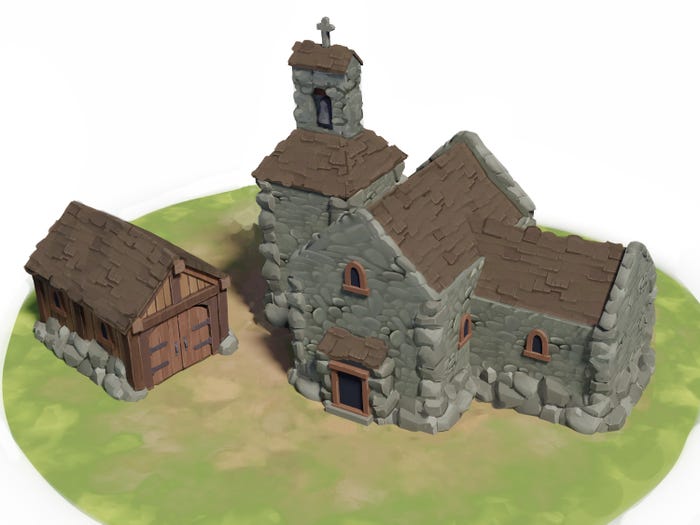
The old monastery part set
We decided to start with the rustic part set as it is the first set players will be able to unlock while progressing through the Clergy estate. The first step was to go back to the drawing board and find the right style and architecture.

Concepts by Lucas Ambs
As you can see, we went all in for “rustic” but not so much for “monastery”. To give a bit of context, prior to 1.9, most monuments were separated by quality so you could’ve had a “rustic monastery” and a “modest monastery”. This means that you could build a rustic monastery, later unlock a modest monastery, build the modest monastery, and find yourself with two separate monasteries with the same functions which, most of the time, rendered one or the other obsolete. Now, with our new “Monuments 2.0” system, you can still do that if you so choose. But instead, you only have access to a single monastery that contains all quality sets that become available as you unlock them…letting you add new parts to your existing monastery! Pretty neat.
Going back to our rustic monastery, we knew that all three quality sets would have to coexist so they would need to blend well together while looking distinctive enough. We had to make the rustic set look a bit more like a monastery and less like a shack so, using a lot of references, we got something much closer to what we were looking for.

Concept by Lucas Ambs
This would become our basis for the next iterations and also the modest and abbatial set.
Meanwhile, we continued to fine-tune the art direction and how buildings should look like. Establishing the shapes, silhouettes, colors, values, and so forth, helped us focus our efforts on the main characteristics of a building. In other words, what has the most impact on giving “personality” to a building. I’m using the word “personality” for a reason here. One of the core aspects of game development is establishing the 3Cs in your game: characters, camera, and controls. It would only be natural to think that the villagers would be our characters. But in the case of a city-building game, oftentimes, the real main characters are the buildings themselves. That’s why we design our buildings in a way that players will recognize them by their “personality”.
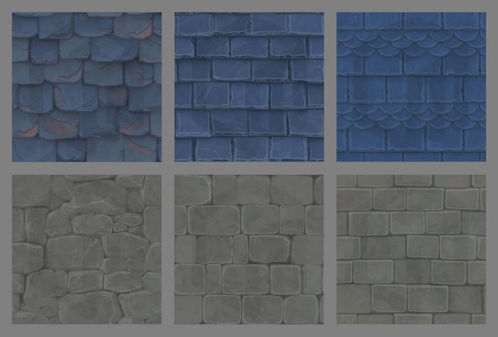
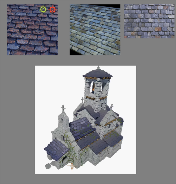
As the game is mostly seen from a bird's eye view, we put a lot of our focus on the roofs. What materials are they made out of? What color are those materials? How detailed do they have to be? Those were some of the important questions we had to answer to establish the buildings’ personalities, convey clear messaging, and keep a coherent and bold style.

We decided to go for blue stone slabs for the monastery, as it is also reminiscent of the blue of the Clergy estate.
As I mentioned earlier in this article, all three quality sets of the monastery have to blend well together while remaining distinguishable. By keeping similar colors but toying with saturation, values, contrasts, details, and structure, we found a formula that helped us clearly message the quality of a building. In short, lower quality buildings, aka rustic buildings, generally have less details, are less saturated, and are more chaotic than higher quality buildings.
Work in progress. Not representative of final visual quality. Textures by Vincent Longpré and Pierre-Luc Lavoie
Here’s a concept comparing the old texture with the new one.
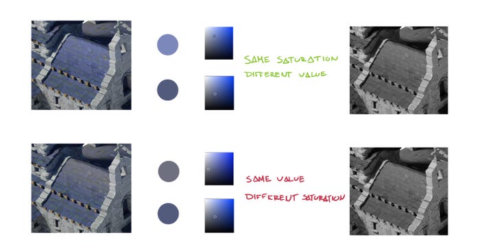
Art direction of roof color gradients.
And here’s the “final” result.

I say “final” because making video games is, in best-case scenarios, an iterative process. We will continue to elaborate and polish the art direction, we will tackle other aspects of the game like the environment, and we will get precious feedback from you, the players. Which means there is always a chance we will go back and tweak different aspects of the game to make the best product we possibly can.
What’s next?
Some of you might have already been able to test out the monastery’s rustic set from the public preview of the 1.9 Update. The feedback has been really positive so far, and we are really excited for the next things to come. At the time of writing this article, the modest set and abbey set are well on their way, and you should be able to test them all together once 1.9 officially releases.
Something that might not be known to all is that Polymorph Games has also been building its own engine, Hurricane, from the ground up. It is indeed a big challenge, but it also gives us the freedom to build the tools we need to make Foundation the game we, and hopefully you, want.
The monastery is just the beginning. Everything that we learned from this, we will apply to the other buildings and the environment. We plan to overhaul the majority of the game’s visuals, so expect to see a lot of changes in the coming updates.
I’ve only skimmed over the process of making the monastery, but there’s so much more that went into remaking the monastery and what’s to come. I hope you liked this sneak peek into making the art of Foundation, and if you haven’t already, you can join our Discord and share your feedback and ideas there. We read everything, so your opinion really does make a difference.
About the Author(s)
You May Also Like


.jpeg?width=700&auto=webp&quality=80&disable=upscale)


