

Daily news, dev blogs, and stories from Game Developer straight to your inbox
Sponsored By
Featured Blog | This community-written post highlights the best of what the game industry has to offer. Read more like it on the Game Developer Blogs or learn how to Submit Your Own Blog Post
An approach to understanding art styles
Let's try to figure out what style is and how we can draw in different styles.
14 Min Read

 (a) What are STYLES and how can we label them?
Try to put it in a simple sentence
As far as I can see, a style is the systematic repetition of decisions regarding art elements (a.k.a shapes, values and colors).
Ok, there's a lot of information here. Let's first make sure we understand ourselves when we talk about art elements. Then we we'll talk about the visual decisions we make when creating an image.
Art elements
This first part may sound very basic for you, but bear with me as I try to find some common language with everyone reading this.
Visual art is generally broken in: dot, line, shape, form, value, color - some people would also add texture, space, rhythm, composition and a few more.
On a daily basis I get myself mostly thinking in 3 of this: (1) SHAPES, (2) VALUES and (3) COLORS.
I may not be the most reliable source on this, but here's a 101 about shapes, values and colors:
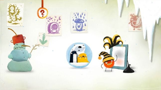
(1) SHAPES - The most simple elements of visual representation are dots and lines. Whenever you organize dots and lines in "perceivable chunks" you start to have shapes. They can be organic or geometric, simple or complex, they can represent form tridimensionally (rendered in 3D) or bidimensionally (flat 2D). Shapes can also be organized in a canvas in order to imply rhythm. Lastly the absence of a shape can form a shape in itself (see the 4 circles/ 1 star example bellow).
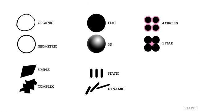
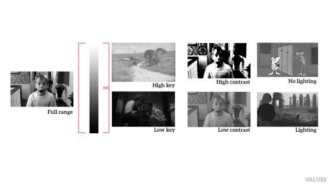
(2) VALUES - They are all the grey range between pure white and pure black. Imagine you take away all the hues of an image, all that is left are the black, greys and white values.
I tend to organize images according to the use of values in 3 ways.
a) They can be high key (most values are closer to white), low key (most values are closer to black) or use the full range.
b) They can be high contrast (only a few grey areas) or low contrast images (most image is grey, with few whites and darks).
c) They can be organized to simulate lighting or not.
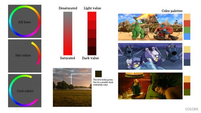
 (3) COLORS - These are all the hues that make up the color wheel. They can be saturated or desaturated and always work together with values. They can be organized in hot or cool colors. They can also be arranged in color palettes (this palettes have different names depending on the colors position in the color wheel - Complementary, Analogous, Primary, Secondary, etc). Never forget that colors are not perceived independently, they always suffer influence from the surrounding colors.
Let's make some decisions!
Whenever you're creating an image you have to make decisions (consciously or unconsciously). Say you're going to draw a character. Will you draw it in an action pose, or will it be sitting straight? Will you draw it in complete darkness and the only things visible are its cigar and glasses or will it be a sunny scene in the beach?
Of course decisions can go much farther than that: will you draw with a 6B pencil or an HB automatic pencil? Will you draw free hand or with a ruler? Will you detail everything or jus the character's eyes? Will you use vivid colors or only grayish ones?
There are many decisions that will affect the result of your image. Some are related to basic art elements (shapes, values and colors), others can be related to technique (digital or analogue), medium (oil, photography, watercolor, collage, etc), theme (fantasy, Sci-fi, etc) or even time constrains that you can set (draw a portrait in 30 seconds, 1 minute or 5 minutes).
The moment you keep repeating some of these decisions, you start creating a style.
As time goes by, the artist starts to be very comfortable working under a set of constraints. That is, some decisions are so obvious to him/her that he/she doesn't see them as decisions anymore but as "rule" of how he/she does things.
How many styles are there?
Well, they are probably infinite (I really have no idea). But if you take a step back and look at the big picture, you can start to see some style patterns that allow us to categorize them.
I generally see people trying to sort styles in a linear range from "realistic" to "cartoon" (and everything in between is called "stylized").
This works "OK" for exaggerated comparisons like Call of Duty and Super Mario or State of Decay cinematic and Asterix.
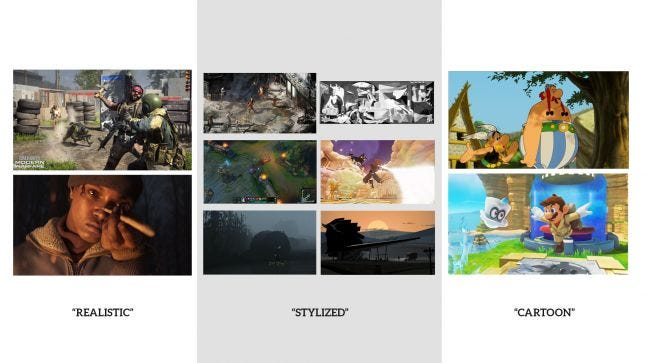
It starts to get messy when you add the so called "stylized" examples. Kingdom Hearts, Kentucky Route Zero, LoL, Inside, Disco Elysium and a cubist painting are between Call of duty and Super Mario. Yet they are very different from one another and it seems that their difference is not only about being realistic or cartoony.
My bottom line is: the linear classification from Realistic to Cartoon is too simple to be useful for two reasons: most styles end up falling in the "stylized" label and it isn't practical to order them in a Realistic to Cartoon fashion.
But how do we order them?
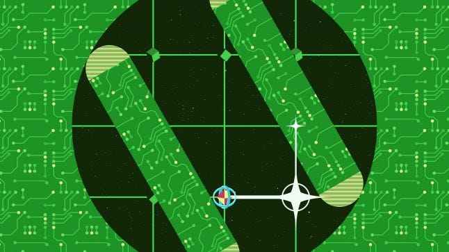
The best way I find to put some order in this chaos is to use the pyramid presented by Scott McCloud in his book Understanding Comics.
He basically envisions a triangle in which you have reality, language and the picture plane in each vertex. Reality is the concrete world we perceive (a photo is the closest to reality an image can be). Language are the written words (the closest an image can get to this is a simple, concise doodle). The picture plane is pure abstraction, when there is no commitment in portraying anything.
Take a look at the image below, it may be easier to understand. But if you're still not confident, I strongly suggest you buy Scott Mccloud's book and read it.
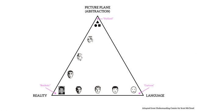
What I like the most about this approach is that "Stylized" (Picture Plane) isn't just the half-way from "Cartoon" (Language) to "Realistic"(reality). It is another end in itself.
Let's try to fit the above examples into this triangle: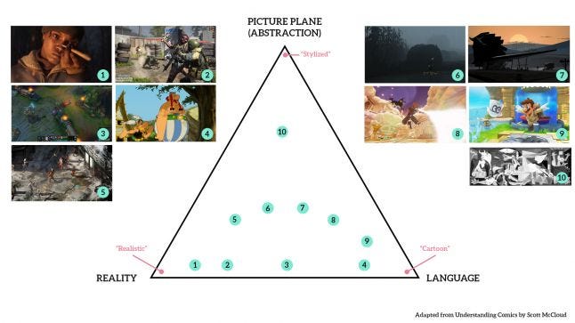
Now it feels like everyone has a proper place.
This may be an overstretch, but as I keep looking at this organization, I start to perceive 2 tendencies that could be represented as gradients (please don't take them as rules).
The first has to do with the overall age appeal. As far as I can see, younger audiences tend to be drawn to styles closer to the bottom right corner. As the representations start to get more realistic or more abstract they start to appeal to older audiences.
The second is about how popular a style can be. My perception is that the closer to the upper corner the less mass appeal a style has.
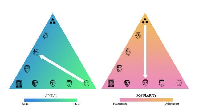
Please bear in mind that Appeal and Popularity are highly subjective and what I'm pointing here is what my overall professional experience has shown me. I myself enjoy Sponge Bob, we all have a 40-year-old friend who plays Pokémon and Bronies are exceptions to these "gradients" too.
BONUS: while talking to my friend Bruno Luna (he's an art director - https://brunoluna.com/) he explained me how he organizes styles. It's actually linear, because he looks it in a more historical way, focusing on the semantics for the viewer.
He actually opens the triangle in a line
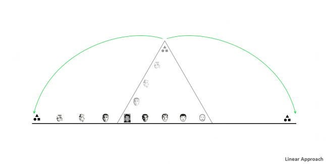 Let's flip it just for didactic purposes.
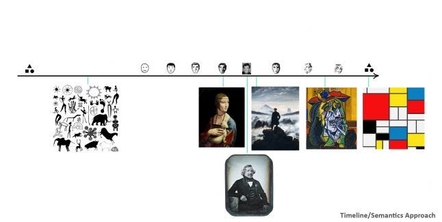
I'm not an art historian, so bear with me:
You can think of the far left as the first attempts of human kind into pictorial representation. We slowly traveled to more realistic forms of representation (of course it was not a straight line).
In the 1800s we have the invention of photography (a reliable way to achieve realistic depiction). We also have painters starting to worry more with expression and the depiction of emotions (the romantics and subsequent art movements).
From there on, we could say art has transcended the depiction of reality and, for many reasons, artists have started to intentionally synthesize, subvert or completely ignore reality.
Taking the viewer (or consumer perspective), what it means is that after complete realism is achieved, people tend to enjoy to view certain forms of simplification and abstraction. It tends to be entertaining on its own.
Perhaps an example will help make it more clear. Take for the example the video bellow from Chromosphere Studio. Though it shows nature (and it uses aspects of reality like depth and lighting) it does so in an intentionally simplified and abstract way. Making the way that things are represented engaging and entertaining on its own. It looks so complex, yet so simple.
(b) How can we draw in different art styles
If you try yourself to pin some styles to the "style triangle" above, you'll see that it's almost intuitive (especially if you already have images in the triangle you can compare to). But knowing what makes an image "realistic" or "cartoony" or "stylized" can be handy. Let's try to analyze examples of art closer to the corners and see if we can find patterns in shapes, values and colors.
Please, realize this is pretty much my observation and interpretation, so take everything I say with a grain of salt and let me know if you feel I'm wrong.
Realistic
As close as an image can get to reality. It tries to represent reality as is. Be aware that most of the time even the most realistic renders are edited (contrast, saturation e color balance) to look more appealing or "cinematic".
Shapes - Are three-dimensional and complex (or detailed). They are organic (even architecture and industrialized products have cracks and bumps that break their perfect straight lines). They tend to be subtle (not exaggerated, people are 6 to 8 heads tall). Shapes obey perspective. Since we are used to seeing images through cameras, it's also valuable to know about camera lenses (and the types of distortions they create).
Values - Work with physics accurate lighting (you should understand how light behaves in nature to render the values consistently). Some things you should be aware: how light intensity behaves (it's inversely proportional to the square of the distance) bounce light/color bleed, subsurface scattering, hard and soft light differences, fresnell effect, ambient occlusion, rough and smooth surface differences, etc). The tonal range is generally bellow 50% black and it never gets 100% black (but remember you can overexpose or underexpose an image to get different effects). You must be aware that perspective also affects values. Values can also be influenced by lenses (or film).
Colors - Are rarely pure (one "green" grass leaf can actually have several colors), they bounce from object to object. They are mostly bellow 50% saturation and, as the above, get influenced by lenses and films.
Cartoon
As close as an image can get to the meaning. It tries to represent things in their essence.
Shapes - Tend to be simplified (a head becomes a sphere or even a circle, hair strands become hair locks). Can be flat or present some simplified way of lighting (sometimes not cohesive in the whole image). Proportions get reduced (people are 5, 3 or 2 heads tall). Exaggeration is very welcome.
Values - In its extreme, values are completely absent (think of a line drawing on a white piece of paper). You can also have hard values (simply used to differentiate one shape from another). There's a tendency to work with high key values (especially if there's line work involved).
Color - Colors are generally saturated. Tend to work with primary and secondary colors (red, blue, yellow and green).
Stylized
Not concerned with representing anything. The artist is consciously aware that he is moving pixels on a screen (or paint on a canvas).
Shapes, values and colors can be.... anything really. For the sake of readability I would suggest considering the Gestalt principles (respecting and breaking them when needed). They are: proximity, similarity, closure, continuity, symmetry, common fate and continuity.
Great, but is any of this useful?
I believe so! An artist working on a production environment (like games and animation) will face some problems regularly. You get into a production and you have to draw in the same style as everyone. Or you need to explain how you achieve certain visual quality to other artists. Maybe someone asks you to draw some qualities from the work of other artists. Or you are in the beginning of a project and you need to figure out what style best suits the movie/game you are going to do.
In any of this cases, being able to label images, realize why they worked (what was their appeal) and how could I extract their essence (or sometimes copy it) was essential.
A practical example
In order to visualize this better, let's pretend we are making a game, we a have a prototype and now we are going to try to visualize the art direction.
To represent the prototype, I'll pick a screenshot provided by Unity of one of their tutorials. It shows a racing game.
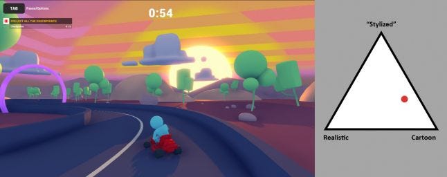
We can see that though this image has some consistent light direction (which generally 3D softwares provide easily) the style lays between cartoon and stylized. Though the image is representational (and not abstract), most things are represented on a simple way. The sky is a giant striped box, trees are mat green primitives and so on.
To make the comparison easier let's keep some things the same for all images: Its a 3D game, it has to have a driver on a kart, making a left turn on a race track, close to a "checkpoint", during sunset.
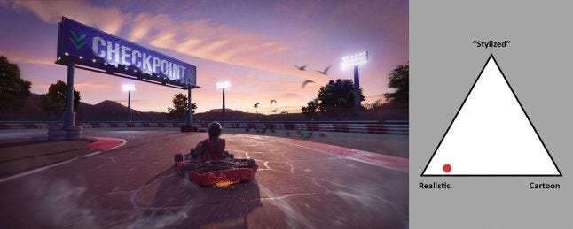
Taking the considerations from section (b), what should we change to have a REALISTIC image?
All objects have to be close to a 1:1 proportion
Light must have not only a coherent direction but also behavior. Materials have to interact with light accordingly.
We can add artifacts like grain, vignette, flare and motion blur to simulate a real camera.
The overall values are bellow 50% and saturation must be tone down (though I increased the contrast and saturation a bit to make the image more appealing).
We need to add details (like bumps and scratches).
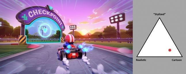
How about a CARTOON image?
Objects proportions are exaggerated, simplified and rounded.
The overall values are brighter (even though it's almost night)
VFX (fire and smoke) are clearly drawn.
Details on the asphalt look hand-painted.
Light direction doesn't relate to the time of day.
If I wanted to go full-cartoon, I believe I'd gave to draw a more flat, 2D image.
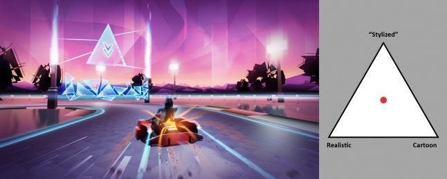
And at last, the "STYLIZED" version:
Every object is simplified to some geometric representation
Some elements are completely abstract (like the trees and mountains). We also insert graphic interventions (like triangles texture on the track or abstract shapes on the sky).
To go full "stylized", I'd probably have to leave the representation idea of kart, race track and have a more abstract image.
Conclusion
I hope this has helped you understand a little more about art and how to get away with it. Remember, there's no right way of doing it. This just happens to be how my brain organizes everything and how I happen to get my work done. If you have questions or if you think I missed something, please get in touch and let's chat (you can find me on instagram @ricbess).
Read more about:
Featured BlogsAbout the Author(s)
You May Also Like


.jpeg?width=700&auto=webp&quality=80&disable=upscale)


