Unity's big branding revamp brings new logos for company and its products
Unity has refreshed its logo to show "who we are, the evolution of our products, and where we’re going".
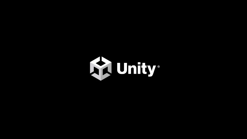
Unity is switching up its look, starting with a new take on the geometric logo that has graced the splash screens of many, many video games.
The company dives into the specifics of the new logo, pictured just above, in a blog post, explaining that it felt the time was right for a full logo revamp after years of only minor changes.
It explains that part of the reason for the change due to Unity's growth over the past 20 years from "a one-product company serving just the indie games sector" to a company with over "50 products and services serving "millions of developers, creators, and operators across a wide range of industries".
Unity's new brand aims to represent its relationship with that significant userbase, and how its technology enables creators to, well, create.
"To start, we completely redesigned the cube while retaining the essence and equity of the original," explains the post. "It’s now fully 3D; symbolically, it’s where our technology (the X axis), Unity creators (the Y axis), and the incredible experiences they create (Z axis) intersect."
"Importantly, we designed this new identity to reflect our living brand – a brand that leaves no creators behind as it supports and celebrates opportunity and diversity for all. Notice the three directional arrows: they represent the infinite possibilities that Unity puts in the hands of all who use our solutions."
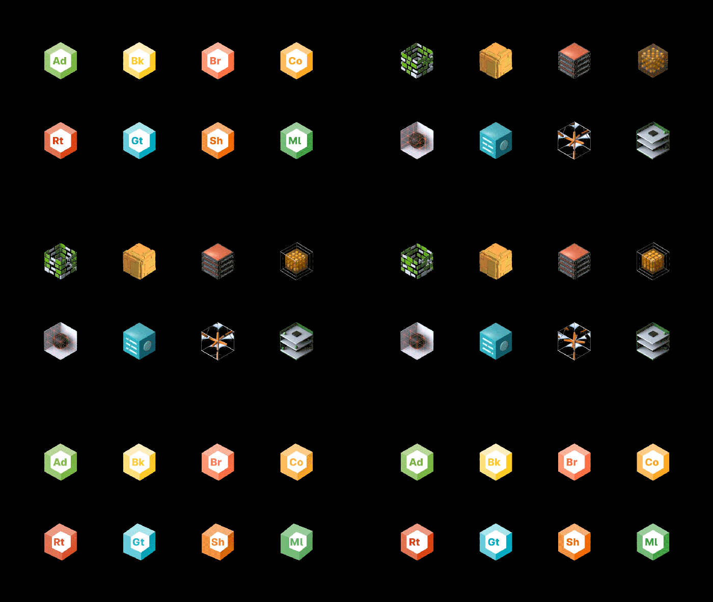
The branding update, as shown in the image below, also covers properties like Unity Forma, Metacast, Mars, and Backtrace and unifies those logos in a way that Unity says "makes it easier for our users to identify and find the products they need, and better understand our product hierarchy and the relationships of connected Unity products."
About the Author(s)
You May Also Like



.jpeg?width=700&auto=webp&quality=80&disable=upscale)
