

Trending
Opinion: How will Project 2025 impact game developers?
The Heritage Foundation's manifesto for the possible next administration could do great harm to many, including large portions of the game development community.
Featured Blog | This community-written post highlights the best of what the game industry has to offer. Read more like it on the Game Developer Blogs or learn how to Submit Your Own Blog Post
2.5 years of character development pitfalls you can learn to avoid in 5 minutes.
Hey there, this is Scott from SIGONO, the studio behind OPUS: Echo of Starsong. Today I’d like to share some of the lessons and pitfalls we ran into when we were designing our characters. Hopefully some of you out there will find this helpful, or entertaining at least!
[This post was co-written with our art team]
For some context, we’re an indie studio that focuses on narrative puzzle adventures with visual novel-esque storytelling. Our latest title, OPUS: Echo of Starsong, is a space opera heavily inspired by East Asian mythology.
With that out of the way, let’s get into what we’re here for:
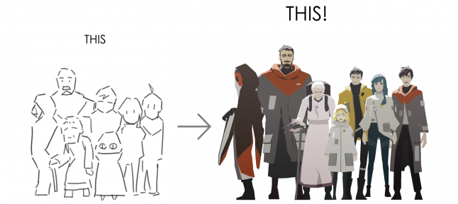
How we created characters from scratch and integrated them into our game
Follow these simple steps, and you’ll get results like this!
It's super easy (for you, we hope!)
So, the first thing we need to do is…
To kick-start the whole process, we first go to our writer, who highlights the personalities and traits of each character as we go through a basic draft of the story. Based on this info, we start coming up with directions for their appearance and features. At this stage, we’re mainly concerned with gathering reference. No pen on paper yet!
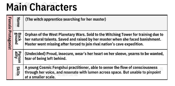
Early character document for the female protagonist, including her personality and goals.
Because the visual theme of this game is Asian sci-fi, we researched traditional and modern takes on Eastern clothing, sci-fi aesthetics, and cyberpunk.

Research has shown that human vision prioritizes shapes. So we started with silhouettes when we moved on to visualizing our characters. Using the references we gathered, the goal is to create shapes that capture an Asian tech aesthetic.
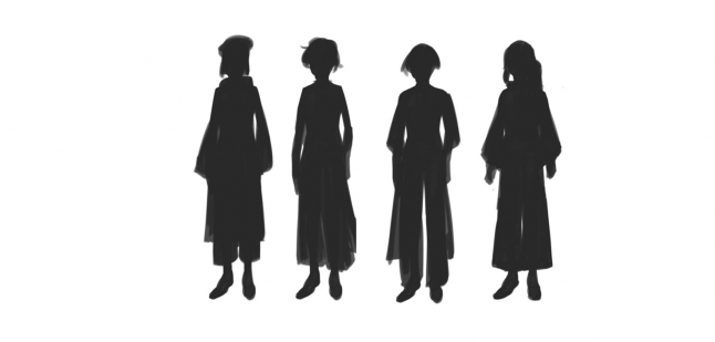
Some of the first silhouettes of Eda, our female protagonist. These all look pretty similar and didn’t leave much room for the imagination.
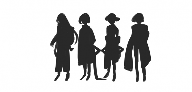
Second batch of silhouettes had more variation. This helped us decide which directions we could take them in.
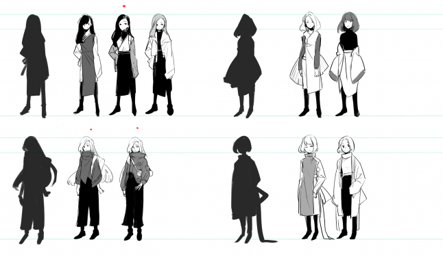
Once we have some good silhouettes to work with, we can move on to the outfits. Here, it’s important to stay focused on core requirements such as the Asian tech feel and the character traits. For example, one of our protagonists, Eda, is a space-faring adventurer who’s also the captain of her ship, so it’s important that she appears to be an independent and capable person.
Director: We should go with long, black hair.
Artist: Is that your thing?
Director: …No.
Artist: …Righto.

We felt that the long hair better portrays her as someone who keeps their cards close to their chest. So we picked a few that’ll fit the hairstyle.
Here’s what we settled on at the time. We later toned down her Asian features after her backstory was tweaked, and removed the more flowy lines to further emphasize her independent and adventurous nature.
Now it’s time for the color palette. Although Eda is capable and self-reliant, she also hides a low self-esteem, and yearns to feel wanted. So we avoided bright colors, and tried palettes with low saturation.
Trying on different color combinations. At this stage, blue and purple seemed to better fit her personality.
Director: Wait, my spidey sense is tingling, can we stick her in an environment?
Artist: Righto.
We placed Eda in some of our concept environments to get an idea of how she would look like in game, and immediately noticed that she became one with the background. It was clear that an entirely low saturated palette wasn’t ideal.

It's kinda hard to see her...
Using something more saturated will allow her to pop, but doesn't quite fit the character.
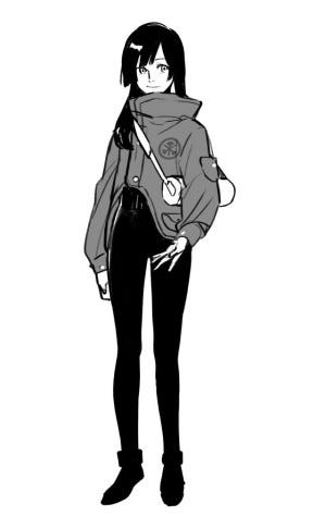
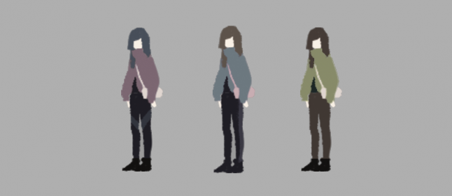
We ended up with a bright, but greyish blue palette for Eda.
The grey blue palette gives Eda an added air of rebellion and mystery. It also provides enough visibility for her in game.
There you have it. Once we have the main characters down, we can move on to other characters…
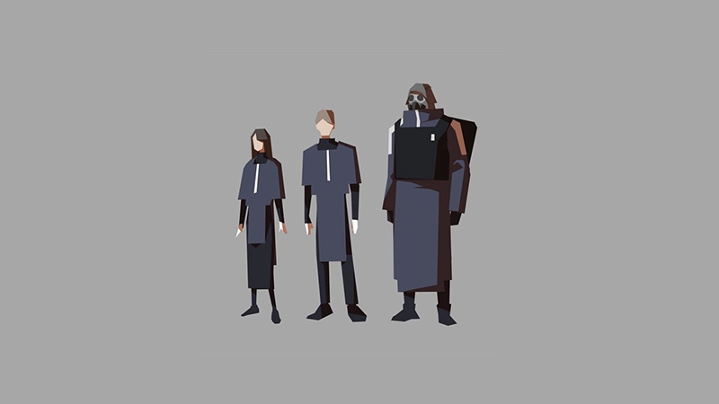
The main setting of the game, Thousand Peaks, is meant to be a big cultural melting pot where travelers from all corners of the galaxy cross paths. So to ensure that players can easily recognize where each character belongs, we need to establish a basic visual language for the main factions.
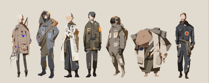
Thousand Peaks: Lots of pockets and patchwork, low color saturation, jagged outlines and more um, species.
United Mining: Dark blue, square shapes, right angles, geometric contours.

East Ocean: Red, white, and black as basis. Prominent Asian style clothing and appearances.
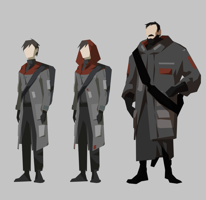
The male protagonist and his companion are exiles who escaped East Ocean, so we had to conceal the East Ocean elements a little, while maintaining the connection.
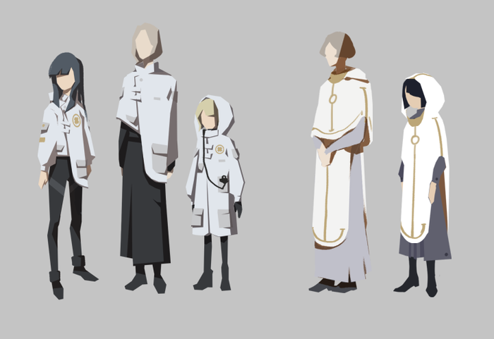
Uniforms for the spaceship Red Chamber, which were designed to resemble garments worn in the Witching Tower, but with some unorthodox designs to signal their defiance towards the Tower’s doctrine.
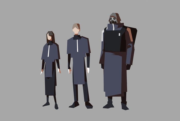
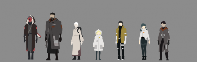
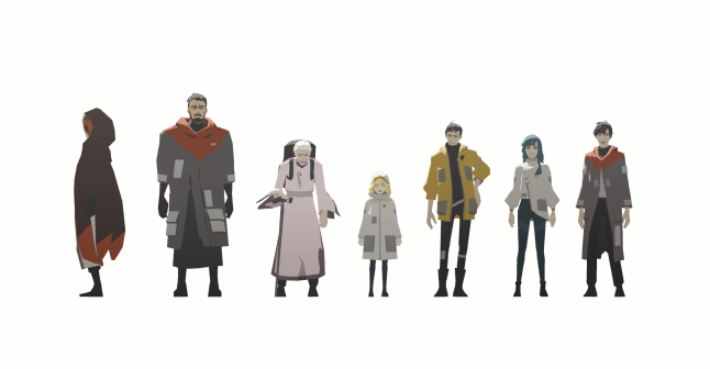
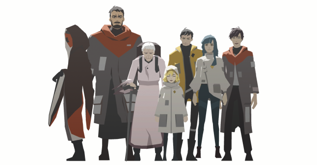
After a few rounds of tests to establish the overall look of each character, we throw them into a height chart. This has a few advantages:
Provides a clear reference
Ensures they can easily be told apart.
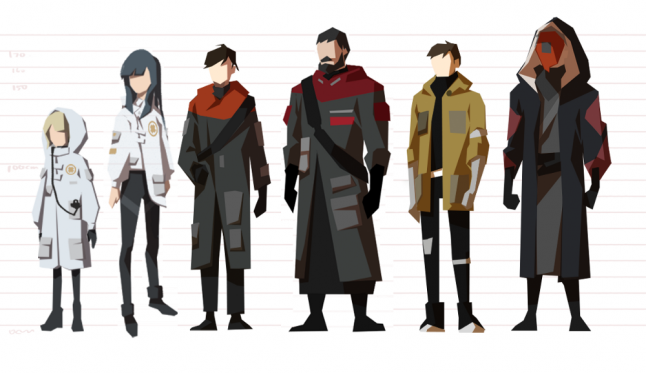
Height chart version 1
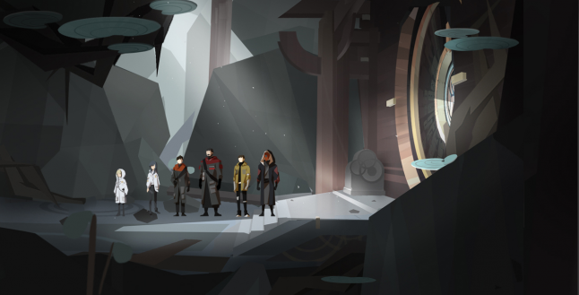
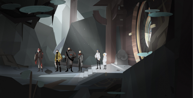
After placing them in a scene, we notice that their difference in size is a little hard to tell.
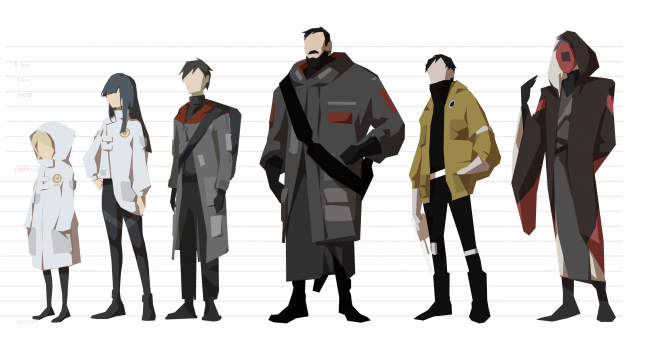
Adjusted height chart.
Much more readable!
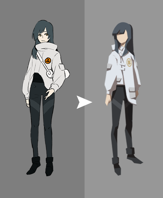
At this point, the 2D character designs are more or less nailed down. Now we have to bring them into the game.
System Alert: You got 3D characters.
We're gonna leave out some details here. Always remember to be super nice to your 3D artists, kids!
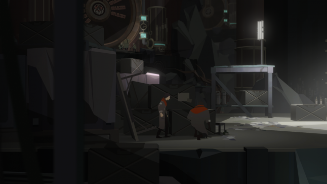
System Alert: You got 3D environment.
hmmmm...
Director: Hmm… Something feels off.
3D Artist: Maybe because the character doesn’t pop?
2D Artist: Righto.
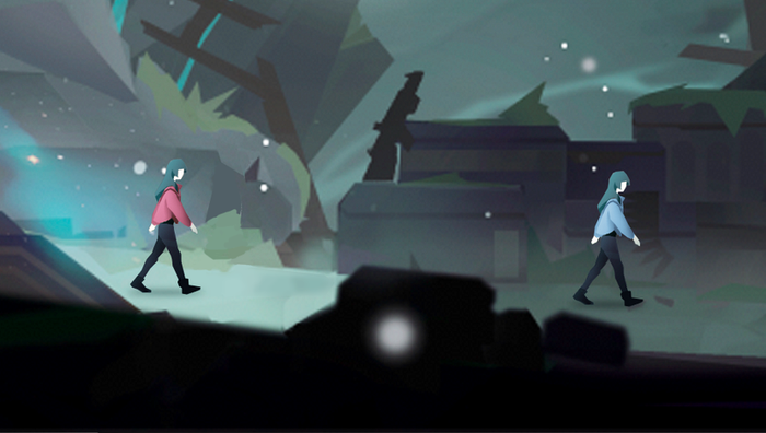
After some analyzing, we found that the issue arises from the character’s inability to draw attention, especially when they aren’t moving, since there isn’t much motion in our environment as well, they end up blending into it. So we came up with a few solutions:
Add slightly more detail to the characters to help them draw focus.
Add some lighting to the edges, so the character can pop even against similarly colored environments.
Add self-illumination to the character material, so they can be visible even in the dark.
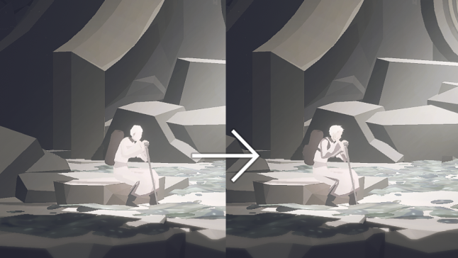
Increasing detail helps draw the player's focus.
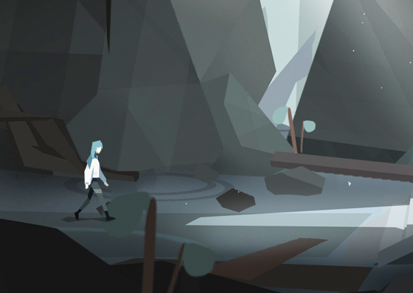
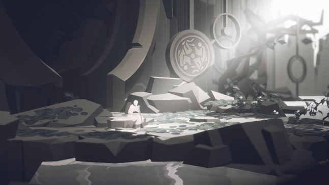
Different lighting conditions in game may also affect the character's visibility.
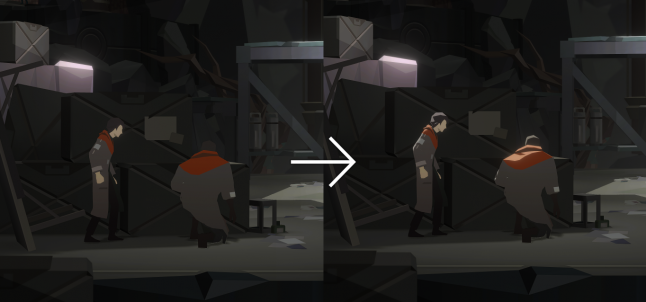
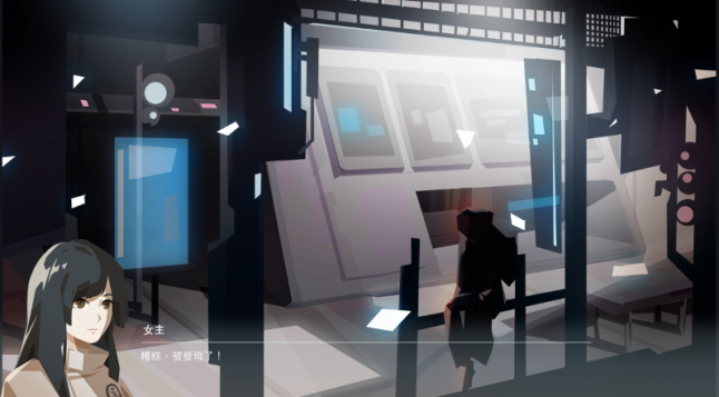
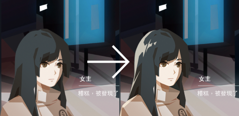
We tackled this issue by adding a rim light shader and a bit of self-illumination to the character's material.
Now let's do a before & after to see what the changes look like in motion!
Tada! MAGIC!!
Even though I made it sound like this was all done in one go, the whole refinement process actually spanned a year and a half (sweats).
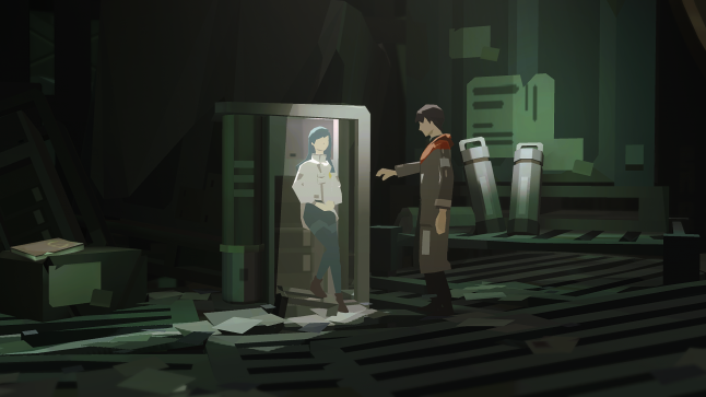
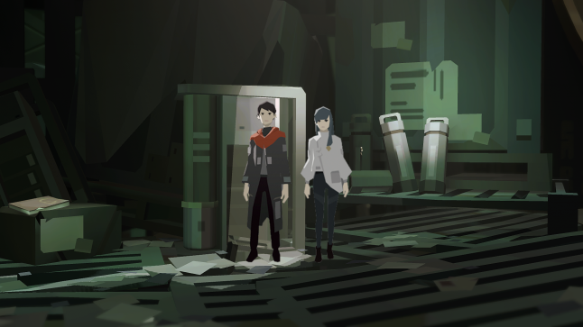
Now let’s talk about another part of the game where the characters played a crucial part, the dialogue portraits!
Some of the rules we had to establish early in development were how we distribute color, how we define edges and curves, and the ratio of light and shadow.
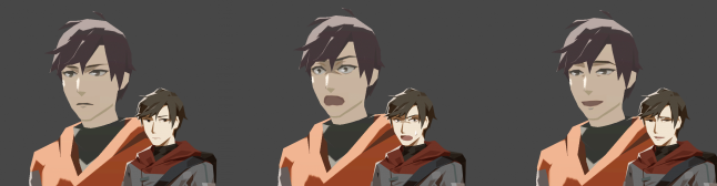
Is it just me? Something about the portraits from this phase creep me out a little.
This is the lighting direction we ended up going with. All done!
Director: Wait, shouldn't we test this?
Artist: R-righto.
In order to identify any potential issues as early as possible, we would do mockups of in game dialogue using the portraits and other concept artwork.
Early Development: We found out early on that the portraits wouldn’t stand out without some highlighted edges.
Early Development: Having these high contrast edges allowed them to stand out from any background.
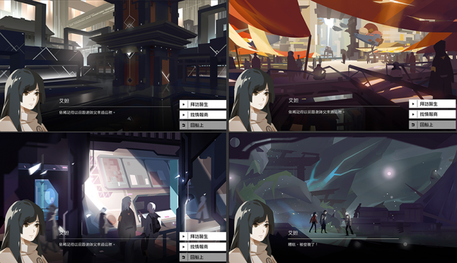
Early Development: Apart from background images, we place the portraits over concepts of cutscenes and environments to make sure they don’t look out of place.
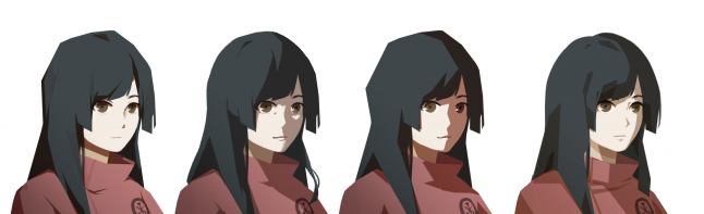
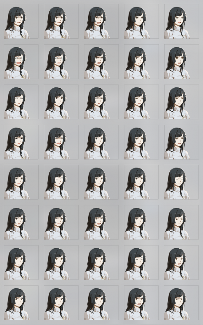
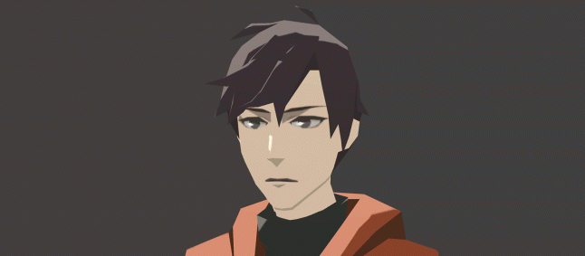
After multiple rounds of testing and tweaking the expressions, colors, and lighting, here’s our result!

After we determined the details of our style, we enter production.
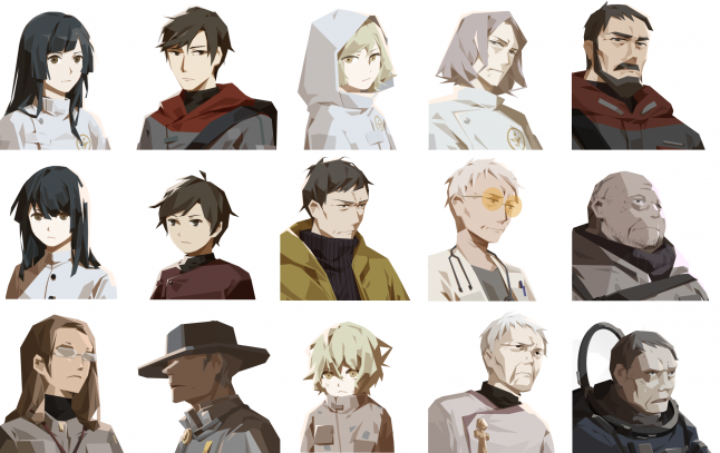
Some of the more prominent characters.
Although it adds up, the expressions weren’t done in a single burst. Instead, we completed them in phases, starting with basic emotions like happy, sad, and angry. These were added to the game so we could see how they actually looked when we tested the dialogue. Only then did we choose other expressions that felt necessary, increasing them over time.

The earliest portraits were just simple shapes with expressions tacked on.

The second batch shows the actual character, along with the same basic expressions.
Additional expressions were added over time, but only when required. Adding content because it "might come in handy" could easily result in wasted effort.
What I saw before I drew my last breath, because I drew them, get it?
Once the expressions are more or less done, we can map them to the character models, otherwise they would look a bit spooky up close. To stick to the art style, we first tried simplified faces.
The characters actually started out without faces.
We tried simplified faces but it was hard to tell what their expressions were.
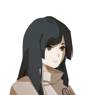
The faces were actually added pretty late in development, when we were sure that there wouldn’t be any new expressions. This allowed us to count how often each expression was used, and pick the most commonly used ones to map.
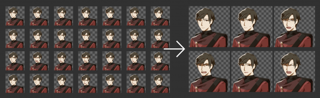
We picked the most common expressions to map onto the models.
The model's expression changes along with the portrait's expression
We are now approaching the end of development.
Director: Um, aren’t we adding a little too much detail?
3D artist: But we’re running out of things to do.
2D Artist: Righto (??)
Look at our magnificent children!
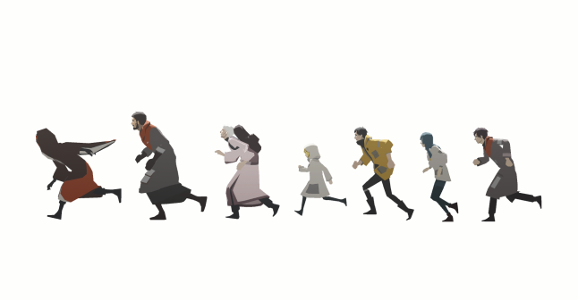
Look at them run!
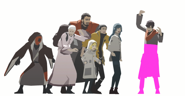
Look at them break!
Everyone's alive! Hooray!
Thanks so much for joining us! I think over time we realized that no matter what you’re doing, whether it’s character concept design, or 3D character integration, every development process follows the same basic principles:
Always break it down into steps, and build on top of the previous step.
Develop methods to test your designs, so you can identify issues early on.
This helps avoid the awkward dilemma where you only realize there’s a problem when everything is completely done, and you’re forced to make painful decisions. I hope our experience helps someone out there avoid some of that pain!
Echo of Starsong is a narrative puzzle adventure game. Asteroids emitting a sound known as “Starsongs” have become the center of conflict for the immense power they hold. Determined to claim asteroids of his own, a young man ventures out with a girl who can imitate starsongs, lending her voice to unravel an ancient myth deep in the heart of space.
If you’re interested, you can check it out here:
https://store.steampowered.com/app/1504500/OPUS/
This article was originally published at https://medium.com/@sigono?p=1d9d8a7b256b
Read more about:
Featured BlogsYou May Also Like


