The design and philosophy behind ephemeral game exhibition HYPER//ECHO
"Remember, none of this lasts forever. Nothing ever did."

HYPER//ECHO is a playable video-game-slash-art-exhibition that explores how our shifting relationship with technology has become intertwined with our intrinsically human desire to create and pass on a legacy of our own.
The exhibit, created by Australian digital art collective Firepit, was commissioned for ACMI's virtual installation Gallery 5 and will be live and playable until July 1, 2022. The title itself invites players to explore a web-based zone and leave something behind in the form of a building or message.
Over the course of HYPER//ECHO's three-month lifespan, however, those virtual constructs and etchings will become overgrown ruins and illegible scrawls, succumbing to the annals of time to eventually meet the same inevitable fate as their flesh-and-blood creators.
To learn more about design sensibilities and wider philosophies behind HYPER//ECHO, we caught up with key members of the Firepit team -- Cecile Richard (art and design), Brandon Hare (engineering), Krystal McDonald (web design and programming), Andrew Gleeson (art and programming), and Jonathon Tree (music and sound design) -- and found out how the experimental title was wrestled into being.
Designing HYPER//ECHO to explore concepts of creation, legacy, and delay
Cecile: A lot of these concepts have been on my mind for a long time. But what really prompted me to decide to use these as the driving theme behind this particular project is talking to ACMI’s Time-based Media Conservator Candice Cranmer about what it means to preserve digital artworks, and how so much of it is extremely difficult to do because of failing hardware or incompatible proprietary software. It reminded me of the total ephemerality of the internet’s infrastructure, as illustrated by my own experiences trying to read old websites and only being able to access them through the Wayback Machine, but only if someone had the presence of mind to preserve them. As this was all occurring to me, the whole ridiculous Web3 blockchain crypto-boom exploded with the acceleration of exploitation for the sake of personal profit under the guise of untenable promises of eternal, ‘immutable’ digital assets.
I suppose it felt right to make a piece that is a bit of a memento mori. “Remember, none of this lasts forever. Nothing ever did.”
The parallel idea of making a browser-based multiplayer online game came to us naturally as this is work we’ve done before (the Freeplay ZONE was a digital space made as an alternative to being isolated at home), and putting philosophical concept and mechanical concept together was surprisingly easy. The idea of logging on, exploring the world, and leaving something behind as your legacy that then decays was there since day one.
Conceptualizing the project and evolving through development
We have a whole lot of both design docs, meeting notes and concept art.
Here are some:
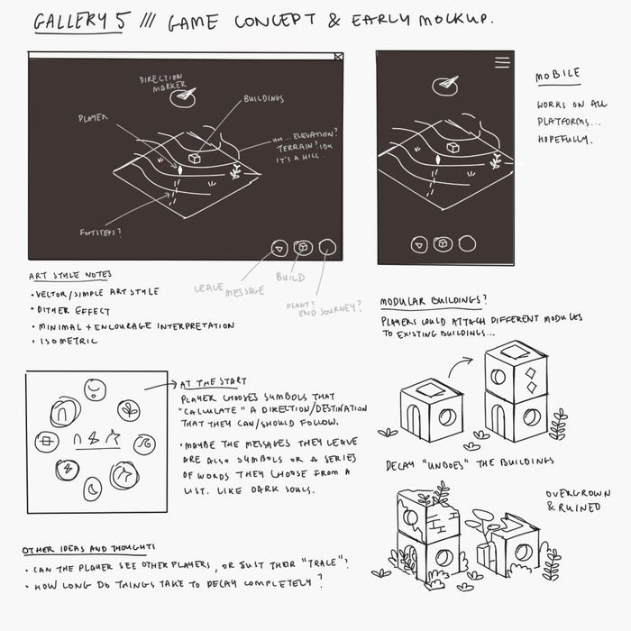
↑ Early game ideas / concept art by Cecile Richard
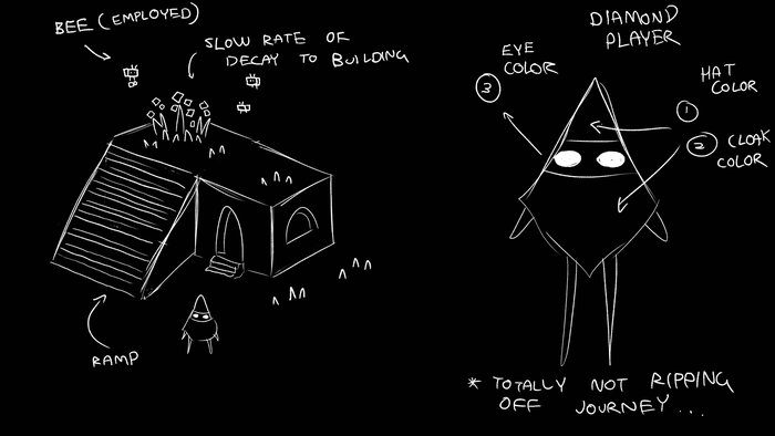
↑ Early character design concept by Marc Pagliuca
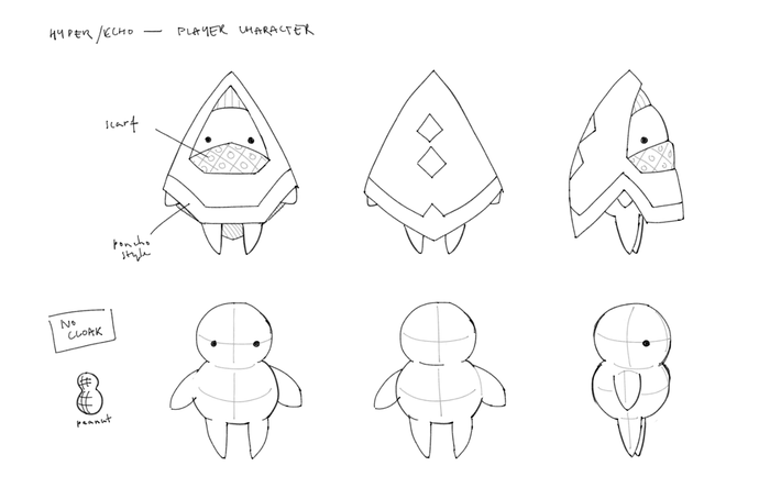
↑ More character concept art by Cecile Richard
↑ Decay stages concept mockups by Andrew Gleeson
Gleeson: In terms of gameplay, we planned to have cliffs and stairs that players could walk on - even on top of buildings - but it became a technical mess trying to manage depth-sorting for a 2D isometric game. We had a working prototype where everything sorted correctly but it made the art pipeline incredibly more complex - ruins would need to have simpler shapes, or they’d need to be split into a bunch of different, tiny assets in order to work. We ended up deciding against doing any complicated depth-sorting as it created too many other problems (player interaction, other edge cases).
Brandon: It was cool to see the game evolve as we added features and worked through prototypes! Seeing how the game felt at every stage was crucial to understand what we really wanted the game to be. One of our first prototypes had usernames and a text chat function and as soon as we saw it in action it was pretty clear that it didn’t fit. Personally I was excited to find ourselves building entire cities at even the earliest stages, that’s how I knew we were on track. From a technical side I don’t think we had any major pivots past the first prototype, just lots of new features and tweaks.
Cecile: While the core features of the game were pretty much set in stone from the get-go, maybe the biggest feature which came a bit later on that defined the direction of the game in a big way is the “repairing buildings” action. Wild to think that wasn’t in there from the beginning! As I was designing the different buildings I was thinking about how funny it is to have people repair buildings that are kind of pointless, like the spiral staircase. It made me think about the concept of Hyperart Thomasson, the idea of a useless structure that is somehow still being preserved, and it becoming an accidental piece of abstract public art as a result.
Krystal: I miss the earliest prototype where we were all in an empty void as stock photos of a businessman.
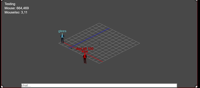
↑ The earliest prototype where we were all in an empty void as stock photos of a businessman.
Perfecting HYPER//ECHO's building and messaging systems
Krystal: The messaging system was an interesting challenge, there were a lot of glyphs that Cecile created that needed to be presented to the user in an approachable way. The way they are laid out on the keyboard in distinct categories.
To make the messages decay visually I first tried replacing glyphs with Xs so that it could not be read. I think we settled on putting a noise texture stretched over the message box, and then using CSS filters and blend modes to adjust the brightness and contrast to adjust how visually decayed it gets.
A lot of the systems in this project were really designed around enhancing the players ability to explore and establish a connection with the virtual space. The starting area was created from iterating over concerns we had about how first time players would experience the space. Oh no players can get themselves trapped in buildings, lets let them teleport to spawn whenever they want. Uh oh! The players can trap first time players in the spawn area, ok lets prevent building too close there. Oh! It’s not clear why players can’t build in certain places, ok let’s use ferns and grass to designate that you can’t build there. Solving design problems in aesthetically pleasing ways is interesting to me.
Gleeson: The buildings in HYPER//ECHO are all created from lots of small assets - letting us do depth-sorting and reuse assets for all the different stages of decay and overgrowth for each building. But in order to get it all working, I made a tool that would let me align all these small assets for every building’s ‘state’, which then exported all this data so we could use it in-game. It was a tedious but very meditative process to align all these building pieces correctly - I’m certainly proud of the tool I made.
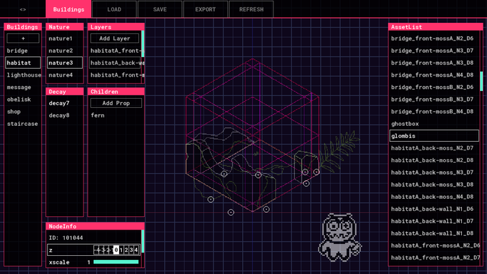
↑ Gleeson’s sprite tool, made in Game Maker
Gleeson: Early on we were concerned about the hypothetical scenario of people making crude graphics with the buildings - since it’s all grid-based and would be easy for bad actors to do. It ended up being a pretty long discussion - do we try to come up with clever rules to restrict building to prevent this, or do we keep an eye on things ourselves and manually moderate the world? We ended up doing the latter - anything we would come up with would ultimately get in the way of people who would usually be doing the right thing.
Cecile: Initially, we pictured the messaging system as a pool of actual words that the player could pick and form messages with (like in Dark Souls and other FromSoftware games), and then as we thought about it more, in terms of both technical feasibility and moderation concerns, we ended up going for a more abstract approach. I was specifically inspired by Emoji poetry such as the emoji garden, and how ubiquitous these little symbols are in our everyday language nowadays. The set of glyphs itself is heavily influenced by the original 1999 NTT Docomo emoji set by Shigetaka Kurita, and Susan Kare’s Macintosh icons from the 1980s.
We worked out that the easiest way of including custom glyphs onto a web page is making a custom dingbat font (like Wingdings), which calls back to the earlier years of the Internet where those fonts were a lot more common due to technical limitations. Being a graphic designer and having the tools to do this it was actually quite easy to put together! As we were playtesting, we figured out that there was a need for glyphs such as a way to refer to the player themselves, or ones that pointed to actions such as repairing. The collection of glyphs grew very organically as a result, which feels strangely akin to how real languages evolve.
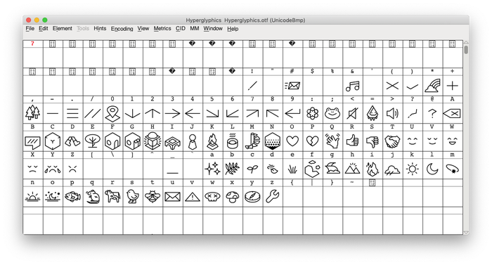
↑ making the custom font, Hyperglyphics.
Overcoming technical challenges along the way
Brandon: I don’t think we had any particularly insurmountable problems during the project, partially because we were quick to cut anything we didn’t have time for, but we certainly had lots of little challenges.
Our biggest obstacle was probably 2D isographic depth-sorting as Gleeson mentioned. It’s not a coincidence that pretty much everyone who’s attempted the style has complained about it in some way, but I guess we had to see it for ourselves to understand the reality of it! Thankfully limiting ourselves to square shapes simplified the problem immensely and kept us on schedule.
A boring challenge we faced was dealing with "engine" limitations including web browser quirks (especially safari) and our rendering engine PixiJS making it slightly too difficult to add some features we wanted (like a performant custom dither shader). The most annoying part was getting audio to work consistently, I think every browser has different rules on when you can play sounds. That’s half of the reason the game begins with a big “JOIN” button since we need to play an audio clip in response to a click to unlock sound for the rest of the page! We also discovered that zooming in/out functioned differently if you were using a mouse wheel vs a mac trackpad, as well as lots of differences between real mobile devices and their desktop browser simulators. I’m glad we were all working on different platforms simultaneously to be able to notice things like that in the first place!
One thing I worked hard to polish was making the multiplayer experience as seamless as possible. Stuff like making sure entities had the correct orientation when spawning in or reloading the page, UI prompts showing up or updating correctly when other players would place or repair buildings/messages you were looking at, making the share links simple but non-spoofable to prevent teleporting unfairly, and making sure pathfinding had no hitches or exploits and looked the same for all players. I spent more time than I should have on pathfinding because I wanted to calculate and validate the final smoothed path all up-front (i.e. with lots of circle-sweep raycasts instead of normal delta-time collision) to try and reduce bandwidth and server processing. I ended up writing some custom A-star tweaks and raycast routines I hadn’t seen before, pretty cool stuff.
None of these little things were really required for the core experience but I like to prioritize them since I think they’re a critical contribution to the overall feel and immersion of a game.
Defining HYPER//ECHO's unique visuals and aesthetic
Cecile: HYPER//ECHO's art direction is quite minimalist and maybe even reminiscent of old vector games (Battlezone, Dungeons of Daggorath). I’d say there’s an inherent melancholy in the way the game looks, whether the world is empty or built up or full of decayed buildings, there’s a persistent sense of desolation, which is absolutely helped by the nicely haunting soundtrack by Jon and Marc.
From the get-go we wanted the art to be simple and easy to produce. I’m personally very drawn to internet low-tech aesthetics, which involves digital art/writing/websites with minimal colors, monochrome dithered images, and it felt appropriate to explore that sort of aesthetic for a project about the ever-decaying infrastructure of the internet, and the philosophy of creating and preserving an accessible, minimal and organic ecosystem.
Early on we had the idea of including shaders that’d add a whole bunch of nice dithering and noise as a texture, and also we toyed with the idea of using SVGs for the art for the clean lineart… but we ended up scrapping all that in favor of the current, gently pixelated style.
Our main inspirations visually are: these drawings by illustrator Carl Burton (who’s also the developer of Island: Non-Places which feels somewhat thematically related), the overworld when you go through the titular Zero and the Echo River in Kentucky Route Zero, and the similarly minimalistic and philosophically similar Library Of Babble by Demi Schänzel.
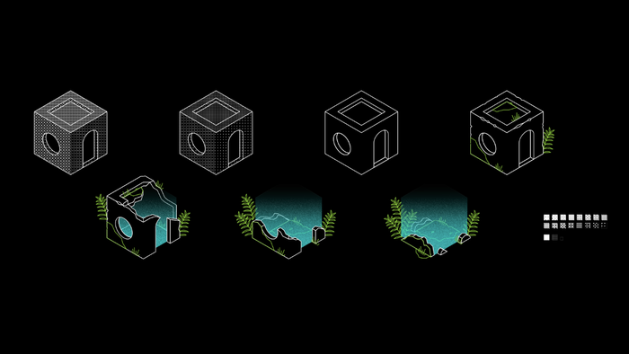
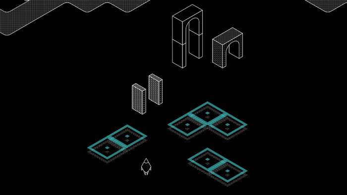
↑ early mockups by Cecile Richard
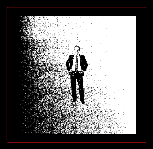
↑ Shader test by Jonathon Tree
Technical wins during development
Brandon: I think our biggest technical win was keeping the game architecture as simple and stupid as possible which allowed us to rapidly tweak and add new features. We definitely planned out a bit of the architecture for the core systems but most of the time we just added systems and functionality when we needed them and no sooner. A whole lot of our game logic lives directly inside the onClick callback function, we have global variables everywhere, and all sorts of other “bad-practice” or “non-scalable” code – but it’s all perfectly manageable for this scale of project as long as you keep it tidy and documented! There were definitely times when we were able to add features with just a few lines of code thanks to resisting the earlier temptation to overengineer or prematurely optimize the code. There are still some improvements I’d like to make but it’ll be much easier to build them up from the basics, plus everything’s working pretty well as-is!
I’m really proud of the tech in the game. Sooner or later I’m going to write some little blog posts going into great detail about all the little features, keep an eye out on our firepit Twitter account for that!!!!!!!!!!!!!!!!!
Gleeson: What we got right was getting Brandon to do it. If I did it, it would have been a mess.
Jon: Perhaps less technical, but something I think we got right was knowing when to pull the plug on some of the more elaborate leads we were pursuing. Some were pulled because they started heading in directions that conflicted with some of our goals (being able to identify other players via username, using English words instead of glyphs, etc.), some because they would unfold into more complex problems down the road (screen space dither shader that scaled and offset with camera movements and zoom), and others because the time and budget simply didn’t permit the additional work. It sucks! It hurt to cut some of those features, especially ones that members of the team really loved, but it let us focus on the core of the work and keep things coherent.
Bonus round -- some extra images:
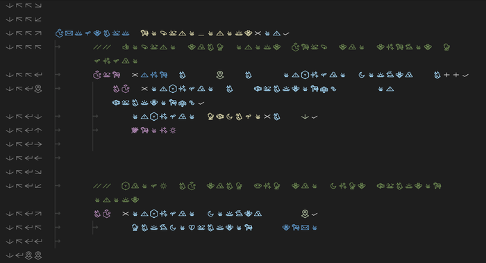
↑ Testing the font out-of-game for fun. I assume this is what javascript looks like to other people — Brandon
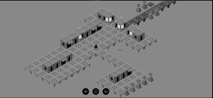
↑ Floating town we built on one of our first test sessions
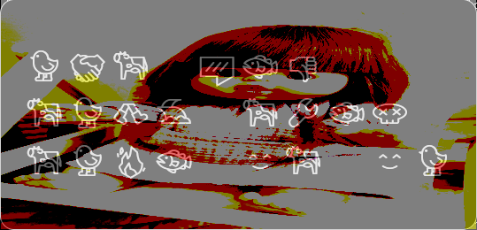
↑ Testing message decay graphics by Krystal McDonald
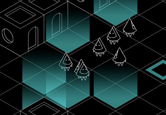
↑ One of the first multiplayer tests, everyone was very excited!
About the Author(s)
You May Also Like




.jpeg?width=700&auto=webp&quality=80&disable=upscale)
