The Art Of Braid: Creating A Visual Identity For An Unusual Game
In this fascinating deconstruction, artist David Hellman explains his creation of the evocative, painterly art for Jonathan Blow's acclaimed downloadable game Braid, which debuts tomorrow on XBLA.

[In this fascinating deconstruction, artist David Hellman explains his collaboration with Jonathan Blow to create the evocative, painterly art for acclaimed downloadable game Braid, which debuts tomorrow on Xbox Live Arcade.]
Braid had already appeared at two GDCs before I ever got involved. Jonathan Blow, its creator, showed Braid's time manipulation puzzle-platformer gameplay at a couple Experimental Gameplay Workshops, and an Independent Games Festival, where it won an award for game design. Minus some polish, it was nearly a finished game: playable, coherent and individualistic.
Visually, though, it was primitive. Its blocks, spikes and ladders were utilitarian, communicating merely the elements of platformer-ness. It could have remained a visually simple game, but it already contained hints that it wanted to be more, to express itself across the full multi-media palette available to video games.
The fragments of fictional prose introducing each level indicated Braid's ambition. They mused on the nature of relationships, regret, and temporal paradoxes. World 2 introduces a limitless rewind mechanic -- you can reverse any mistake, erasing the concept of "failure" -- framed by a wistful reflection on perfect forgiveness between lovers.
It sounds grandiose in summary, but it's not. The connection is never forced. These things simply co-exist, and they mingled in my mind as I enjoyed a lively, at times slapstick, eminently playable platformer with acknowledged debts to Super Mario Bros.
Hired as visual artist in the summer of 2006, my challenge was not only to clearly present Braid's mechanics and behaviors, but to help tell a story that was anything but literal: part anecdote, part artifice, part philosophy. This article explains the process of developing visuals for a nearly-complete game with a highly idiosyncratic identity, the challenges encountered, and some of the nuts-and-bolts of our methods and tools.
No Shame in Tracing
To start, Jonathan sent me a screenshot and asked me to draw over it.
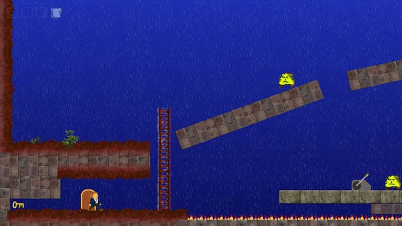
Here it is, in its programmer art glory. Though visually crude, the game was actually pretty advanced, from a functional perspective. Keys, switches, ladders, spikes, monsters, and a guy in a suit - it was all there. For dessert I'll show you how little (or much!) this screen changed in the final game.
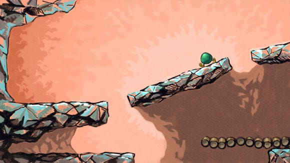
Here's my first try. I deliberately got away from the materials and palette in the screenshot. This looks kind of like some areas in Yoshi's Island, on SNES. The background was meant to radiate gently. In an e-mail I described the atmosphere as "ethereal"!
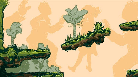
Again, something really different. Strangely, the background is full of dancing figures. Jonathan had used the phrase "thought-conjecture-worlds" to describe Braid's setting, so I was trying to be non-literal about space.
Why not compliment the foreground with something topically different but thematically related? (How are dancing people related at all? Not telling.) We didn't use this idea, but we did support the story in multiple not-literally-relating ways. More on that later.
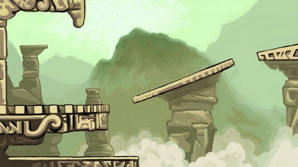
Ancient ruins (TM).
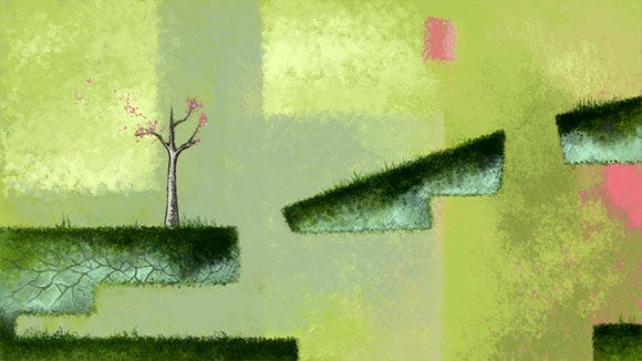
The best thing going on here is the color palette. That chalky blue, pea green and salmon mingle delicately. I like putting together colors with shaky self-esteem so they all end up deferring to each other.
For instance, that chalky blue isn't really blue, but a gray with equal amounts of green and yellow. In context, though, it looks blue-ish... to me, anyway. There are more dramatic examples of this sort of thing. Joseph Albers did loads with it.
With the abstraction, again I was trying to suggest a world of ideas. I wrote to Jonathan that we could build the background out of different parallax layers, so the more distant ones would be variously eclipsed by others drifting in front.
Lots of games use this effect, but I wanted to avoid discrete background objects, so everything would have a fuzzy edge and blend in with stuff around it. We did use this idea; the game has watery background spaces that flow together ambiguously.
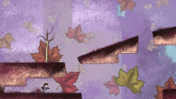
Ah, Hue Slider. The times we've had. The only significant change here is the leaves. I had this idea that leaves would drift towards the screen and settle on it, as though the background were a view looking up.
Again, it's a spatial ambiguity / thought-conjecture-world thing. But it would have been way too "in your face".
When I sent these to Jonathan, he jumped on the rectangular "cut out" on the bottom of the center platform. It was a conspicuous geometric variation in a puzzle game where the player will assume everything has been placed for a reason.
It would be bad for the player to get stuck trying to figure out the puzzle-solving purpose of something with purely aesthetic value. As we went along, I got more disciplined about eliminating stuff that might distract or confuse the player.
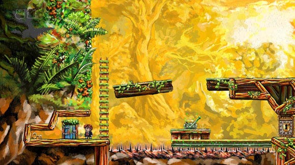
Now this is jumping way into the future, but here's how that long-ago prototype has morphed into a nearly-finished game. Hooray!
"Hang on, Hellman," you are probably thinking. "You said you were going to eliminate stuff that was purely aesthetic, and I can see you got paid to draw a million little fronds and algae. Isn't that intellectually dishonest?" Not at all!
The trick is to make all that foliage cohere so the player sees it in a generalized way as "a load of foliage," and doesn't waste mental energy combing it for functional, puzzle-solving items. I think the game introduces its important concepts pretty gracefully, so you learn what to look for. But I would be interested in others' perspectives on this.
World 2 Comes First
After that series of divergent concepts, it was time to bang out some useable assets and see how they'd work in the game. Jonathan had already written an engine for building level maps from irregular chunks of any size.
He asked me to take a concept like the ones I'd already done, and break it down into pieces that could be copied and pasted to create the first world. (The first world the player encounters, for reasons initially unexplained, is World 2.)
Behind-the-scenes features sometimes create a false impression of ease and inevitability, like those glib "evolution" pictures showing a fish stepping out of the ocean, becoming a chimp, homo erectus, and then Groucho Marx.
Of course it only looks easy if you ignore all the species that died out over millennia of natural selection. For every image you see here, assume a half dozen variations that would have diluted this article but were nonetheless important.
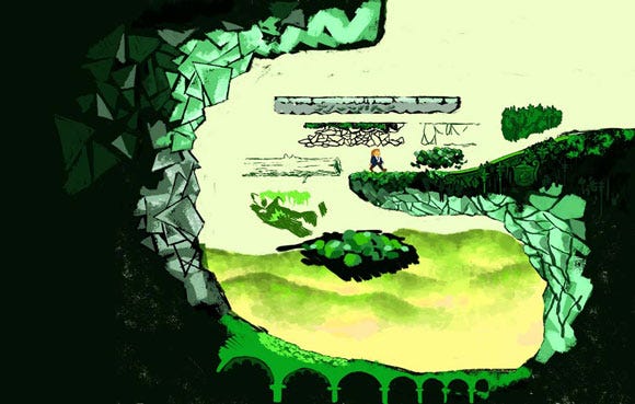
And certainly some stages of a process go more smoothly than others. Looking at this overwhelmingly green concept, it's safe to assume I was not happy during its creation. The rock walls struggle from one approach to the next, looking like amphibious skin in one place and shattered glass in another. It was time to settle on something, but was what I'd come up with good enough? I kept searching.
This search led me back to the favorite from that earlier batch of concepts:

I adapted that pea green and chalky blue to a more detailed, physical approach. The grass looks soft and grassy, the rocks rocky. The background is partially abstract but incorporates white line drawings of houses and a cathedral.
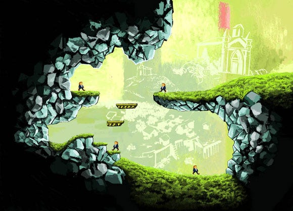
I felt some relief; it was looking better. But Jonathan said the mood wasn't right for World 2. The colors were pretty but unnatural, slightly toxic. World 2 is the optimistic start of the adventure. It gently introduces the fundamental player actions, like jumping and climbing.
Most importantly, the featured time behavior is "rewind," the ability to take back a mistake and try again without penalty. It's a very forgiving world. The art had to add to that sense of forgiveness and positivity.
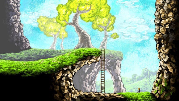
That lead to these more "normal" colors: brown rocks and a blue sky. The problem with this concept is the intrusiveness of the background. I was trying to create more "visual interest" by adding an arch in the background, and showing the field on the left rising above the foreground, as though it were receding three-dimensionally.
But as Jonathan explained, and as I appreciated more and more over the course of the project, there was no point adding visual interest in a way that was contrary to the gameplay. The things to reinforce were those things true to the gameplay.
For example, when the player comes to the edge of the cliff, with the ladder leading down, what matters is the cliff and the ladder. In this concept, the background extends the cliff further right. This interferes with the immediate perception of the cliff the way it really is.
Likewise, the bright yellow of the tree is very attention-grabbing, although it has no gameplay purpose.

Meanwhile, I was still trying to find the right look for the rocks and grass. You can see different approaches being tested in different parts of these pictures. Gradually I settled on something and started breaking these concepts down into pieces. These pieces would be imported into the game and arranged, copied and pasted using Jonathan's development tools. I'll explain that in more detail in the future.
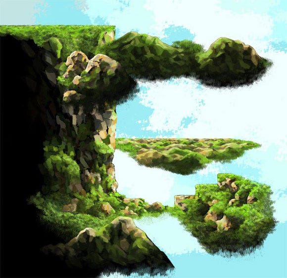
Some of these early pieces were on the big side, or overly specialized, and therefore not super flexible. Those steps, for example, were made for a certain place in 2-1, and didn't really fit anywhere else.
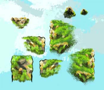
Some wall and corner pieces.
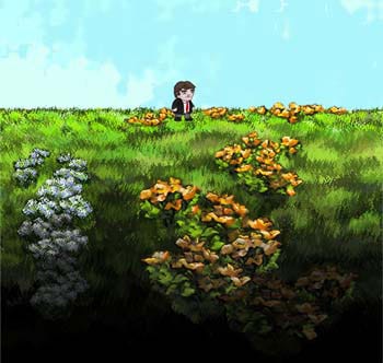
Since it would be kind of boring to see nothing but grass and rocks, I drew some flowers. (By the way, at this point the prototype character sprites were getting replaced by Edmund McMillen's designs. These, too, have been replaced for the final game.)
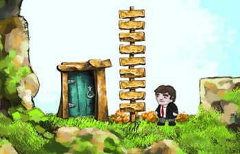
And a door for coming and going. And a ladder, although we didn't stick with this design.
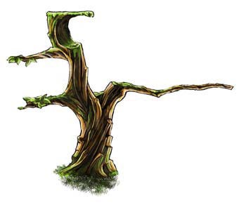
And a tree. I had this idea to make the tree really useful with these Swiss Army Knife-like appendages. The extensions were separate pieces, so they were all optional. As it turned out, there wasn't much use for them at all! The tree is still in the game, but without the branches.

Here you can see how those pieces fit together into a level layout. This is still just a Photoshop mockup, though. The grass, rocks and flowers are in a foreground layer, and I was painting the vista in a background layer. It was important to work with the foreground right there, to ensure all parts would relate properly, just like different elements of a painting.
Even though the background was early, I wasn't entirely satisfied with the direction. It looked too cartoony and literal, with clear outlines.
All along I'd wanted to do something abstract or different, not to make it look like a literal, clear depiction of a place. It can be hard, though, not to get in a very literal mindset, when the things you're producing are discrete and defined. Especially in games, where you are generating discrete objects with explicit functions. But I wanted things to flow together more.
I was thinking about the foreground/background issue, and how to differentiate them more. Maybe the foreground would be rendered in higher detail than the background?
And background objects would be roughly-defined, with ambiguous edges. In other words, the more gameplay relevance something had, the more detail it would have.
Objects with no gameplay relevance would dissolve into the atmosphere, contributing aesthetically but not intruding into the player's perception of his physical surroundings.
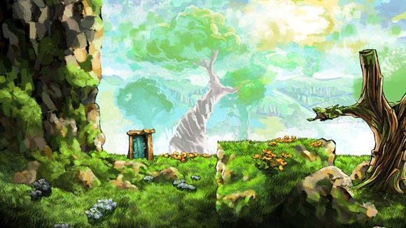
This painting convinced me it could work. The blue from the sky merges into the leaves of the tree, as the green of the leaves merge back into the sky. Just above the door, a tree is shrouded by a blue haze, which also drifts right...
But how was I going to take this painting and break it down into components without destroying its improvisational, case-specific nature? It wouldn't suffice to bring in the whole painting as a flat background and just wallpaper the level with it. I wanted the backgrounds to have depth, with a prominent parallax effect, so far away objects would drift by slower than nearby objects.
With edges irregular and often undefined, how was I going to decide where objects started and stopped? Creating a cohesive, intermingling impressionist background with discrete cut-out shapes was a challenge I continued to grapple with all the way through the project.
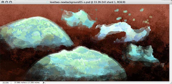
Here are some pieces of the sky getting edited in Photoshop. I feathered the edges with the eraser tool so they'd appear contiguous when overlapped.
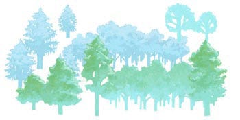
Trees.
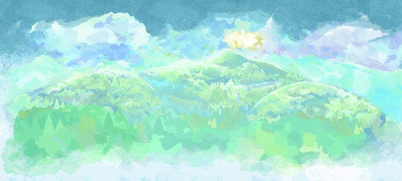
All the background elements for World 2 were ready to go...
Developer Mode
Let's take a look at how those pieces of rock and grass got assembled into playable levels. This section shows the developer tools created by Jonathan, which I used to build Braid's landscapes. It's a backstage tour cluttered with scaffolding and pulleys. (Disclaimer: The text on the buttons is too big because we changed the font at one point and just never fixed it.)
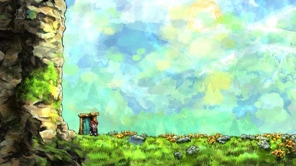
This is the beginning of 2-1, the first level the player visits after the home world. You can't tell from a screenshot, but there are a lot of animated particles bringing life to different parts of the screen. More about particles in a moment ...
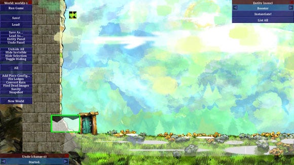
With the press of a secret button, we enter Developer Mode! Tim disappears and a number of control panels and developer-only items become visible. We can now toggle visibility of different elements, so let's take them one at a time.
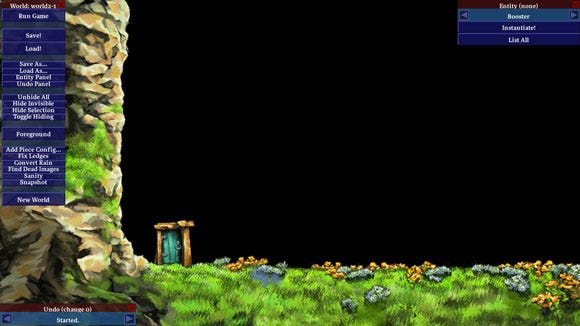
Foreground: Here we're just looking at the foreground area that Tim scrambles over. Notice how there are fewer highlights on the grass and rocks, and how the shadowy areas are somewhat less shadowy? That's because the particles are gone.
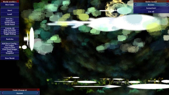
Particles: Now we're looking at the particles by themselves. In Developer Mode, each particle object bears a large "arrow and dot" icon which is usually invisible. For those who don't know, a particle object generates many instances of an image, or series of images.
For example, some levels are set in an autumn forest, the background full of drifting leaves. I drew a handful of leaves, and threw them into a particle object. The particle object creates hundreds of leaves, each one rotating and falling. There are various parameters you can adjust to dramatically change the end result. Pretty much any movement you see in the landscapes of Braid, except for discrete objects like characters, is particle-based.
At the bottom you can see how particles have been used to add highlights to the grass. The surface of the ground is populated by individual blades of grass, and further down there are fuzzier, zig-zag/wave-shaped particles. When everything is put together, these don't stand out so much, but blend with the grass to make it look more vibrant and alive. That's the intent, anyway.
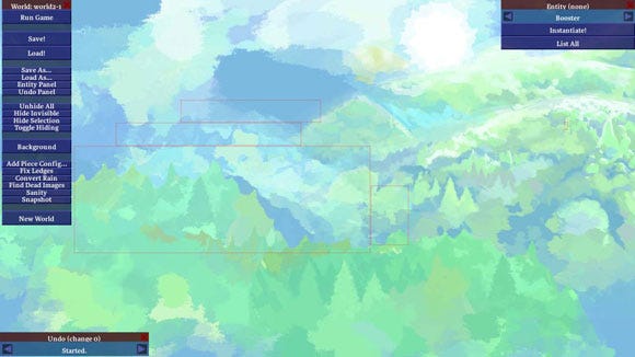
Background: This is the background. The red bounding boxes delineate one piece of the sky. To reduce the number of empty pixels, irregular images are automatically broken down into rectangular sections.
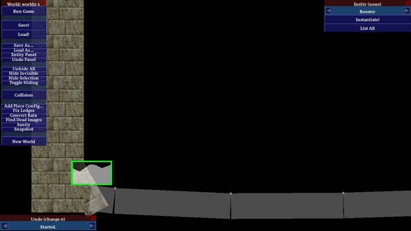
Collision: This part is usually invisible, but it's the most important. It defines the actual physicality of the world. Without this, you would fall right through the floor.
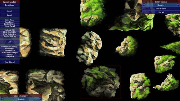
So how does the "magic" happen? I start by creating a new file and importing a group of pieced images. They all appear in a pile. One by one I lay them out side-by-side like this.
Luckily I have a lot more than one screen; I can zip around with the WASD keys. Spacebar allows me to flip back and forth between this and the level I'm working on. I literally just copy and paste (ctrl-c, ctrl-v) these pieces from one file to another, as needed.
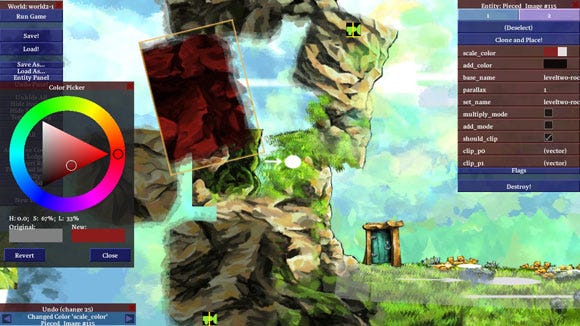
Each piece can be scaled, rotated, clipped or tinted. Each one also has a depth value which determines whether it's in front of or behind surrounding pieces. You can see that piece below the red tinted one is clipped (it has hard edges on three sides). It's just there to fill in a gap between two pieces that go on top of it. Clipping makes pieces a lot more versatile.
Tinting usually isn't as dramatic as here; most frequently it's just used to darken pieces further from the active play area.
For me, this stage of the process is a lot of fun. After the hard work of coming up with new art, I get to play toy blocks and see how it looks in action. Back in the days of creating custom Lode Runner maps on NES, I wouldn't have thought it could be a job!
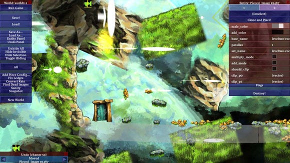
Nooo! All my hard work!
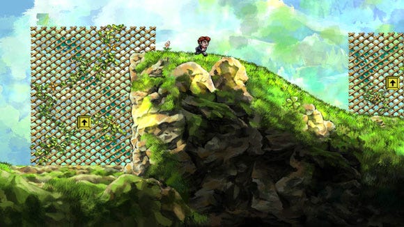
That's better!
Braid was finally finished in June this year. Thanks to a reluctantly compromising perfectionism ("uncompromising" is too idealistic), it took longer than expected, but I'm proud of the results. I hope players will feel the care that went into this game.
Read more about:
FeaturesAbout the Author(s)
You May Also Like




.jpeg?width=700&auto=webp&quality=80&disable=upscale)
