Daily news, dev blogs, and stories from Game Developer straight to your inbox
Sponsored By
Successful Playtesting In Swords & Soldiers
Dutch usability research house Valsplat's Jeroen van der Heijden shares details and insights from playtesting Ronimo's popular WiiWare strategy title throughout its conversion to PlayStation Network.
13 Min Read

Swords & Soldiers is a critically acclaimed WiiWare side-scrolling RTS -- and it's about to be released for PlayStation Network. The new controls required a user test. For this, the game's development studio, Ronimo, collaborated with Valsplat, a usability research company. Here is how we at Valsplat set up the test, what Ronimo did with the results, and what we learned from the experience.
The Game, Its Developers, and the Test Company
The goal of Swords & Soldiers is to destroy the opponent's tower and defend your own. You build soldiers with gold you've dug. Your soldiers attack enemy soldiers and their tower. Magic automatically builds up, and is used to cast spells on the enemy or to heal your own people. You can also sacrifice your own people for more magic. As you progress, soldiers and spells can be upgraded to more powerful ones. There are three tribes to play with: Vikings, Chinese, and Aztecs.
The game was released last year on WiiWare and met with positive reviews, resulting in a Metacritic score of 84.
The use of the Wii Remote plays a big part in the chaotic fun. The point-and-click controller enables you to quickly and easily build soldiers, cast spells, and scroll back and forth across the battlefield -- or as IGN put it, "Swords & Soldiers was built for Wii, and as such it plays very well on the system."
Now, Ronimo is releasing the game for PlayStation Network. One of the main challenges is to make the game as easy to control as the Wii version.
To test if players understood the controls, Ronimo collaborated with us, Valsplat. We're a Dutch company with a wide experience in website usability research, but relatively new to game testing. In this playtest we applied our experience from the web, but also tried some new things.
Test Goals and Research Questions
Together with Ronimo, we established the test goals; these formed the base of our tests: These goals let us focus on the main objectives and largely determined the setup of the tests.
The main goal was to test the usability of the in-game controls and HUD. Since the quick and semi-conscious point-and-click is arguably more difficult with the traditional Sony controller than with Wii Remote, Ronimo had to rely less on aiming and more on button combinations. The new controls also required a new HUD. Therefore, we wanted to know if the button mapping and screen display info felt intuitive enough to leave precious mental resources for snap strategic decisions in a chaotic battle.
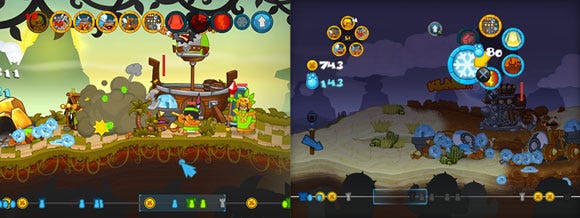
Left: With the Wii, you point-and click the desired spell or soldier. Right: With the PlayStation, you press and hold L1 for building soldiers, R1 for casting spells. This opens a radial menu in which you select the spell/soldier with the right analog stick and submit by pressing X.
Our research questions were:
Can players quickly and easily build soldiers and cast spells?
Can they scroll the battlefield?
Do they understand the upgrade menu?
How do players figure out controls, through trial and error, do they read tutorial instructions or access the pause menu?
What is the learning curve -- how long does it take to get the basics?
A secondary goal was to determine the usability of the game menu. Point-and-click was replaced by tabbing navigation using the right analog stick. Would it work? Can players adjust settings, and easily start a game? Do they read and understand the popup text explaining a menu item?
Things like bugs, level balancing story development weren't the scope of this test, but of course we stayed alert for unexpected findings. You never know what a player might do or try.
Test Setup and Fieldwork
The right players. With the test goals in mind, we designed the test setup. A website is usually tested with five to 10 users. Six users, as a rule of thumb, identify about 90 percent of usability issues. To our knowledge, there isn't such a rule with playtesting, but we estimated that with eight players we'd answer most research questions.
With only eight participants, it is essential to test the right people. Together with Ronimo, we determined characteristics of the target audience. This included: familiar with PlayStation controls, aged between 14-30, RTS players.
Valsplat has a database with about 5,500 people. We e-mailed a sample of 140 people, aged between 14 and 30 years, saying there was a 45-minute test for a new game. We also named a test date and the incentive. When interested, people could click a link leading to a questionnaire which asked them to name the consoles and RTS games they played, their gaming frequency, preferred game genre, and job or line of study.
To minimize bias, we excluded players if they had a job or study related to gaming such as game design or game art. Out of a response of 35, we selected eight players: seven guys and one girl. After Ronimo approved the gamer profiles, these players were invited for the test.
Game Lab: Observing Natural Gaming Behavior
Play sessions were held in our game lab, which looks like a living room, in order to make the player feel at home -- or at least more at ease and less self-conscious than they would be in a sterile lab setting, or playing at the developer's studio.
When a gamer can play undisturbed, without people looking over his shoulder and taking notes, he's more likely to relax and play the game as he normally would.
The lab is fitted with the following observational tools: an inconspicuous camera which focused on the player and his face to monitor player experience.
Another lightweight camera was attached to the controller to keep track of the buttons which are pressed. The eye tracker, a Tobii T120, looks like a regular 17-inch screen but has an infrared camera following eye movements.
It displays the gameplay and the player's gaze. Game audio and spontaneous player comments were also captured.
From a separate observation room, Ronimo and Valsplat observed gameplay and behavior, using a list of research questions.
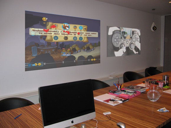
The observation room, with gameplay and player gaze projected on the left, controller and user cam on the right.
Overview of a Play Session
Each session took about 45 minutes. All eight sessions were held consecutively, with breaks between sessions to recap with Ronimo and tweak the test set-up.
A session started with the participant signing an NDA; then I configured the eye tracker and explained the test. To make the player feel relaxed, I explained that it's not the player, but instead the game which is tested, and we need the player's help to improve the game.
Also, I emphasized my independence from the developer: I won't be offended if they tell me the game sucks. The only instruction I gave was to play the game as they normally would. Thinking aloud was not encouraged, since it may interfere with normal gaming. Then I joined my colleague and two Ronimo developers in the observation room.
When we felt we learned everything from the participant, usually after 30 minutes, I re-entered the lab for an evaluation interview. In this semi-structured interview, participants were asked about the game, how the controls felt, and if they could work with the interface. Also, participants were given a few tasks, such as changing game difficulty or setting up a multiplayer game.
Then, the player received his incentive and could go home, and the lab was prepared for the next session.
Gauging the Player Experience: Part Art, Part Science, Mainly Minefield
Reliably measuring player experience is hard. For a solid scientific measurement, biometrics can be valuable, but this requires at least 40 players and (expensive) tools to measure psychophysical data like brain activity, sweat, or heart rate variability. You also need strict conditions and must invest quite some time in data analysis afterwards. This isn't feasible for this kind of playtest -- but we wanted some kind of real-time, quick and dirty way to see what a player experiences.
With a previous playtest we had an ear clip measuring heart rate variability (HRV), which can indicate emotional state. For example, an HRV spike can signify stress or happiness. The ear clip was non-intrusive but not always accurate (shaking your head distorts the data). Nevertheless, the tool gave us some easy to interpret real-time charts which needed to be interpret in context of the game. For this test however, we didn't measure HRV: we figured that yet another display would be too much to keep track of.
Instead, we gauged the player experience by watching a participant's body language and reading his or her facial expression, in context of the game. Simply put, we watched if players were bored, concentrated, excited or frustrated. But you can't rely on observation alone. Some people are very expressive when playing; others are more reserved. So after the test, we asked players how they felt while playing. However, this has disadvantages; it can be hard to accurately remember emotions you had half an hour ago, or verbalize them.
Eye Tracking: See What They See
The eye tracker is a useful tool when testing menu usability and in-game HUD. Even though no statistical conclusions can be drawn from the eye tracking data of eight participants, observing how a player scans the screen, what they see and miss, gives a better insight as to why someone completely misreads a menu or overlooks a button. For observing gameplay, however, it was less useful: it's hard to follow a user's eyes in a heated clash.
It was interesting to see how some guys automatically looked at the Viking women.
Results, and What Ronimo Did With Them
After the test, Ronimo implemented the findings into the final design according to the feedback we provided. Thankfully, there weren't many issues that needed fixing.
In-game controls worked well. The primary actions of casting spells and building soldiers worked like a breeze. Possibly, using two radial menus had a side benefit: it immediately clarified the distinction between spells and soldiers.
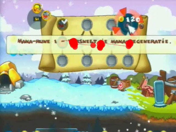
The most important issue was found when in the menu for upgrading soldiers and spells: the tooltip explaining a specific upgrade was displayed on top of the other icons, making it hard to quickly scan for new upgrades, pick one, and continue gaming. Ronimo elegantly solved this by letting the tooltip fade after half a second or so.
Players were caused some confusion by the game's depiction of gold as a golden circle marked with an X. Some players mistook that icon for the X button on their controller, and were trying to mine the gold by pressing the X button. This was fixed by changing the symbol into a plus.
We saw quite a few players barely read the tutorial instructions. Ronimo shortened that text, to make sure it was more to the point.
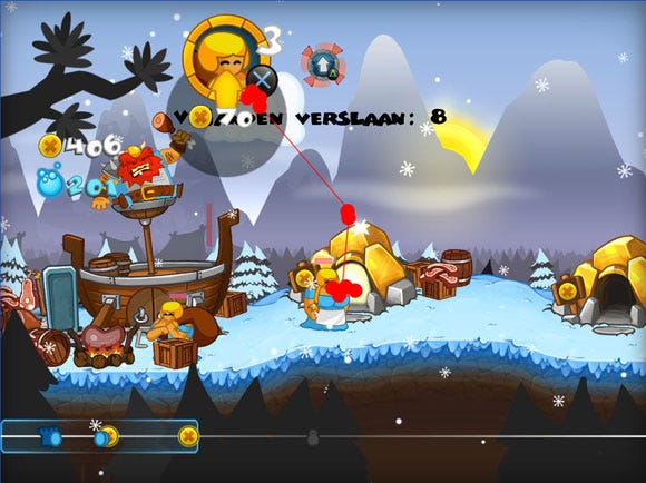
Eye tracking: this was a player in his tenth minute of playing. First a short fight, then building soldiers and upgrading. To see a video of this session, click here.
Menu Structure Lacks Feed-Forward. Overall, players easily navigated through the menu. Some players, however, overlooked options like changing the difficulty level or changing tribes.
This was possibly due to lack of feed-forward: the game menus didn't make clear what would happen when you clicked on an item. Since restructuring the menu wasn't feasible, Ronimo let the cursor start at the menu-item which was overlooked during the test. The idea is to focus attention on the button.
What We Learned
Eight players is more than enough. There was little extra benefit from the last two players. Six, maybe five, people would have sufficed to answer the most important questions. However, it's risky to generalize this "six is enough for a playtest rule", since the scope of this test was quite narrow (no focus on gameplay, multiplayer, or story) and games vary widely in size and complexity.
Nevertheless, based on this and some previous playtests, we feel that for a medium-sized game, usability issues concerning controller, menus, and HUD can be identified by observing about six players.
Controller cam only useful at post-test interview. Only during the interview afterwards, when participants explained their experience with the controls, did we find the controller camera to be of use. During play, it was almost impossible to keep track of which button is pressed at which specific moment while also focusing on the player cam and the gameplay. Also, the low framerate of the controller cam and the slight delay rendered it almost useless.
It would be good to have some form of real-time button logging, to display the buttons which are pressed in a timeline. Perhaps this can be done by building it into the game itself.
Player experience: observation is good, but crude. Observing body posture and facial expression to gauge player experience was useful but limited: you can generally tell if someone has a good or a bad time, but not exactly how good or bad, or what he feels. Of course it's possible we misread some clues, so we're looking for ways to improve our observational skills.
What we did see was that posture can predict boredom or concentration: When concentrated, a player leans forward, as he is literally into the game. A bored player is slouched. Facial expression is harder to interpret as it usually comes in two flavors: either a catatonic stare or a deep frown. The stare can signify boredom or concentration; frowning can mean concentration or frustration. An excited player is easily recognized: a player yelps, grins, and clenches his fist when he discovers the destructive power of The Hammer of Thor, one of the game's magic spells.
Next time we will probably monitor the HRV and not use the controller cam. This'll give us some more insights into the player's state. Afterwards during the post-test interview, we'll change the HRV-image for the controller cam.
Conclusion
Based on the findings, it seems the developers did an excellent job designing the button mapping for the remake of Swords & Soldiers. However, some adjustments had to be made in the HUD and menu to make the game more usable.
The playtest taught us that with six players, you can probably spot most game usability issues, but for broader gameplay testing you might need more time and players. To monitor controller use, a form of button logging would be more useful than a camera focusing on the controller. An eye tracker was found to be very useful when testing menu and HUD usability. Observing the player to gauge his experience is useful, but limited. Perhaps with some training and simple biometrics, we can get a better real-time insight in what the player is experiencing.
Read more about:
FeaturesAbout the Author(s)
You May Also Like


.jpeg?width=700&auto=webp&quality=80&disable=upscale)


