Daily news, dev blogs, and stories from Game Developer straight to your inbox
Sponsored By
Secretly console first: A better approach to multi-platform game UI design
This article is aimed at UI minded folks working on AAA/AA games with a view to helping them to avoid creating problems for themselves while still providing a great player experience.
16 Min Read

David Sinclair is a UX design leader who's previously worked at Carbine, Bungie, Crytek, and Sony Online Entertainment.
I want to take this moment between jobs in the shit-show games industry to talk about designing interface and information systems for video games in the context of multi-platform development. I first started thinking about this when I was working on Destiny as part of the initial planning team around bringing Destiny 2 to PC. Then later at Carbine Studios, I was working on a now canceled game which we planned to ship simultaneously on multiple platforms.
In this piece I’ll confine "multi-platform" to Console and PC games because that’s where I’ve focused a lot of my attention over the past couple of years. Though I do recognize the beginnings of a trend to bring core PC and Console games to mobile—PUBG and Fortnite are two examples.
This article is aimed at UI minded folks working on AAA/AA games with a view to helping them to avoid creating problems for themselves while still providing a great player experience.
Starting Off on the Right Foot
If you know you are going to make a multi-platform game that spans game consoles and desktop PCs, then it would be wise to take this fact into account from the outset when it comes to interface and information design. This is because designing and building twice is expensive and generally a stupid idea.
Waste is the number one problem that plagues the game industry—I’m not going to qualify it here; I’ll probably write about that in some detail if I remain unemployed long enough to get around to it. While employed, I tend to throw myself into it and not come up for air for months at a time.
Onward…
Two designs, two implementations, and if you really fuck it up—two UI teams. That’s what you’re looking at if you focus entirely on one platform in the development of interface and information systems. At best you will set yourselves up to face the various challenges that come with porting your game to another platform. It can get much worse if you actually decide you want to design and build two completely different systems from the get go (I’ve never heard of that actually happening in the case of PC and Console, but now I’ve put it into the Universe…). That’s how you’ll likely encounter the two UI teams issue.
Furthermore, I’d go so far as to claim that even if the original plan is to release on a single platform, still design for the likelihood that that it will make it to other platforms eventually. I triple down on that statement if you are using a multi-platform engine like Unreal or Unity—they make it so easy. The worst thing that could happen is that your UI is legible at any reasonable distance.
Many games have been designed with the sole focus on a single platform, then gone on to be very successful, warranting a release on another platform that has different user experience needs such as input options, screen viewing distance, device specific settings, etc. Anyone who has had to do a port will attest that it can be a real pain to do the work in general, and it’s much harder to do the new platform justice in terms of UX.
It doesn’t take much more effort to think this stuff through in the beginning in spite of current platform plans are. I believe that regardless, your design will be better off for it for reasons that may become clear later on
if I remember to qualify that statement.
The Central Problem
Designing interface and information systems for multi-platform games requires the team to consider what I believe to be the central problem at hand:
How do we design and build UI and information systems that look and feel appropriate for the platform and input scheme the player is using while being mindful of development resources?
The variables for consideration are numerous but most can be filed under two key differences between PC and Console platforms:
Consoles have limited input options for most players (controllers) while PC players are generally accustomed to a more versatile mouse and keyboard input scheme.
Console players at large tend to play on TV sets while sitting some distance away, while PC players more often than not are right up close to their monitors. The primary concern here is legibility of information—colored text at a font-size of 9 points barely flies when someone with great eyesight is hunched over their keyboard only inches from their monitor, let alone on a 40 inch TV on the other side of the room.
Interestingly, these are now fast becoming outdated generalizations born out of a time before:
the resurgence of 8 and 16bit-influenced indie games, many of which are very compatible with (and arguably best suited to) controller play
HDMI becoming standard for both monitors and televisions
casting technology like Steam Link
increasing awareness of accessibility needs
These factors have facilitated significant change in actual player behavior. More PC players have controllers and expect to have the option to use them when they please. Likewise there is increased support for the mouse/kb scheme on both PlayStation and XBOX consoles in recognition of greater attention needed to making games playable to people with diverse accessibility needs.
The truth for game developers, is that the lines between PC and console have become blurred and that the problems mentioned above are really just variance in input preferences and viewing distance.
The only immutable difference that currently exists between console and PC’s in gaming is the PC player’s need for more settings to best leverage their hardware, e.g. graphics. This something I’m not going to cover today.
In this article (which is already longer than I thought it would be) I’m going to recommend a specific variation of several “console first” approaches. I think this term is easier for people to get their heads around, but in truth I’m recommending an approach which focuses upon the most difficult problems first—larger viewing distances and limited input methods (controllers).
I feel that this distillation of the problem is helpful in focusing our design efforts.
Console First
I feel like for most people reading this, especially those already in games in a UX design role, it might come across as a bit patronizing to have me here saying “You guys should, like, design for console first.” as if it wasn’t already obvious. I can live with that.
For everyone else, this is why I recommend the already quite widespread practice of console-first UI and information design:
If something is legible at the 10ft view, then its legible up close—every time—unless we are talking about a Monet. This isn’t true the other way around.
If you can make your control scheme work on a controller, then you can adapt to PC. It’s harder the other way around when you have dozens of keys to choose from and a mouse. That’s how you get the classic MMO systems involving heavy keyboard use and window management.
In the wild
I think the best way to illustrate the approach that I’m going recommend at the end of this article is to go through some real-world examples of how others tackled multi-platform design. I’m about to get specific in referencing certain games and it’s very important to me that I make it clear that I’m not shitting on any of these games or the people who made them. I don’t do that; it’s a miracle any game gets released at all. Also every one of the games I’m about to call out are very successful.
With that let’s get to it. Here are some examples of solutions out there in the wild.
1. Simple Prompt Switch
It has been my observation that the most commonly used approach is what I call the Simple Prompt Switch. I’ve selected the wonderful Dishonored 2 to illustrate this approach. Here is a side by side of the console and PC versions of one of the menu screens:
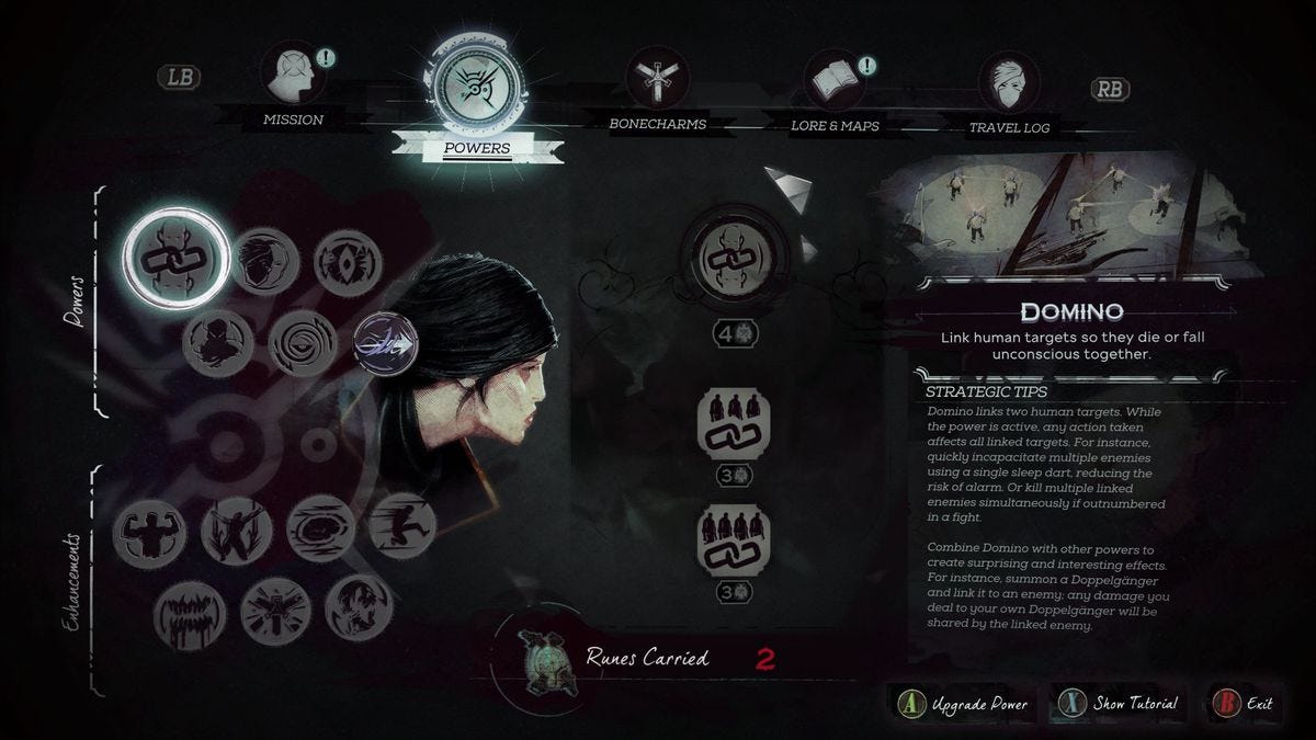
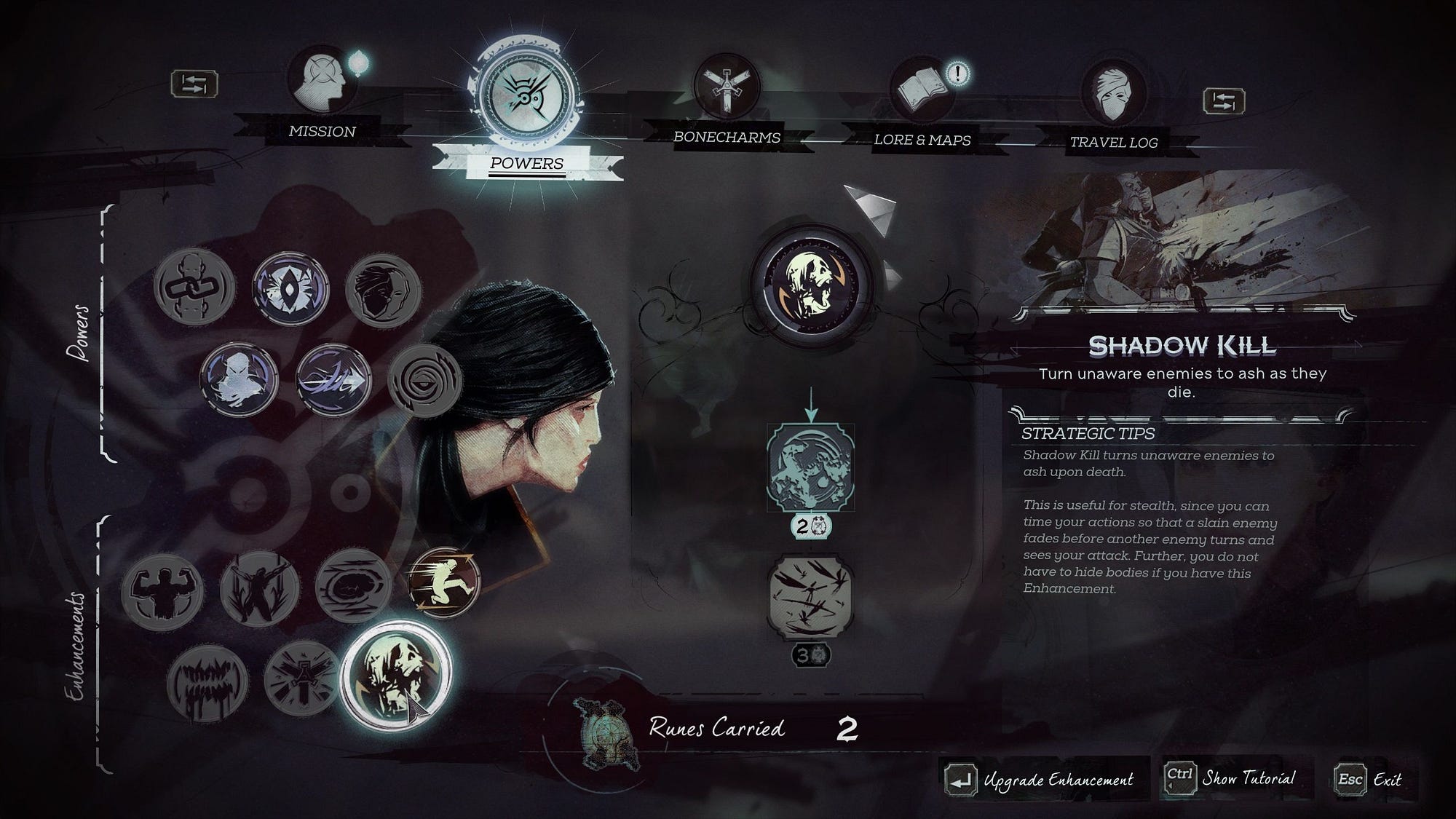
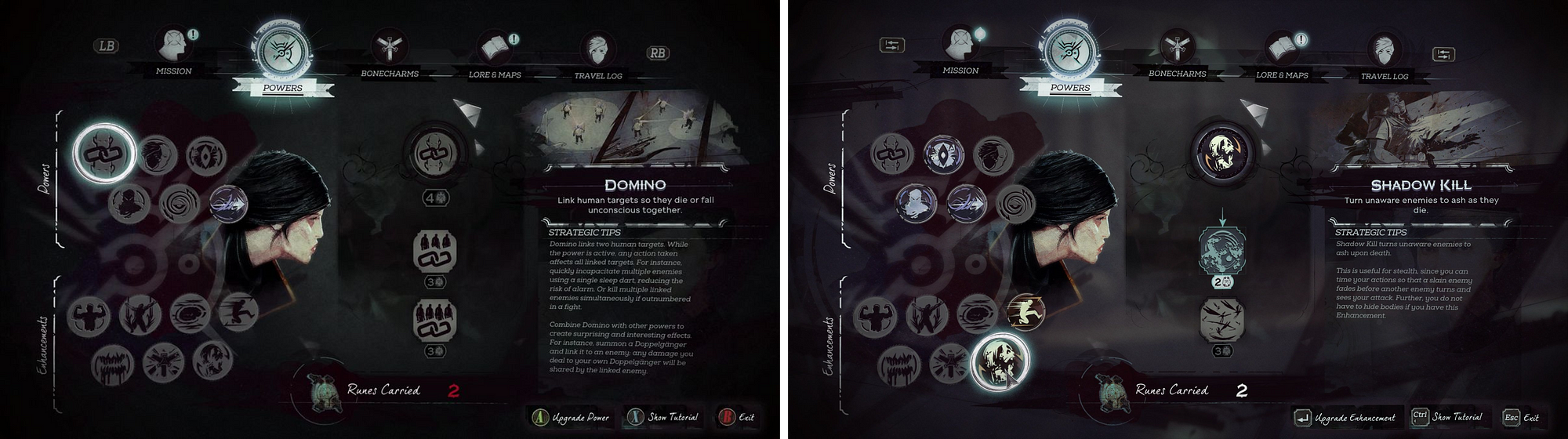 Dishonored 2 Powers Menu—Console (left), PC (right)
At a glance you could be forgiven for wondering what the difference is. This is because it is a single design with the only difference being that the button prompt icons and labels are specific to the current platform. While in this particular example there is an argument for poor legibility of some of the text due to size and font usage, this screen has been designed to be legible in the common console context of a greater viewing distance. The main giveaway that this is a console-first design is in the favored interaction method—specific button/key presses on both platforms, where a PC first game would emphasize direct input with the mouse, thus leaving the player with only the two mouse buttons to worry about.
Here are the same images posted individually for closer inspection:
 Console
 PC
PC
I think this approach works. I imagine its popularity is due to likely being the cheapest method. I also think that this method is a bit lazy; in favoring the controller input method this way, it puts a UX burden on the PC player to read over a bunch of key cues instead of encouraging a more natural direct input. Incidentally, this game and many other DO allow direct input, but in presenting these key prompts they are adversely affecting discovery on a platform where ‘hotkeys’ are typically an advanced method for the more adept players or those with an accessibility need for keys over mouse input. This is also true of the web. In a desktop environment, browsing the web is very mouse-driven affair, with systems like tab-indexing as a tool for advanced users or those who with accessibility needs.
2. PC Leaning
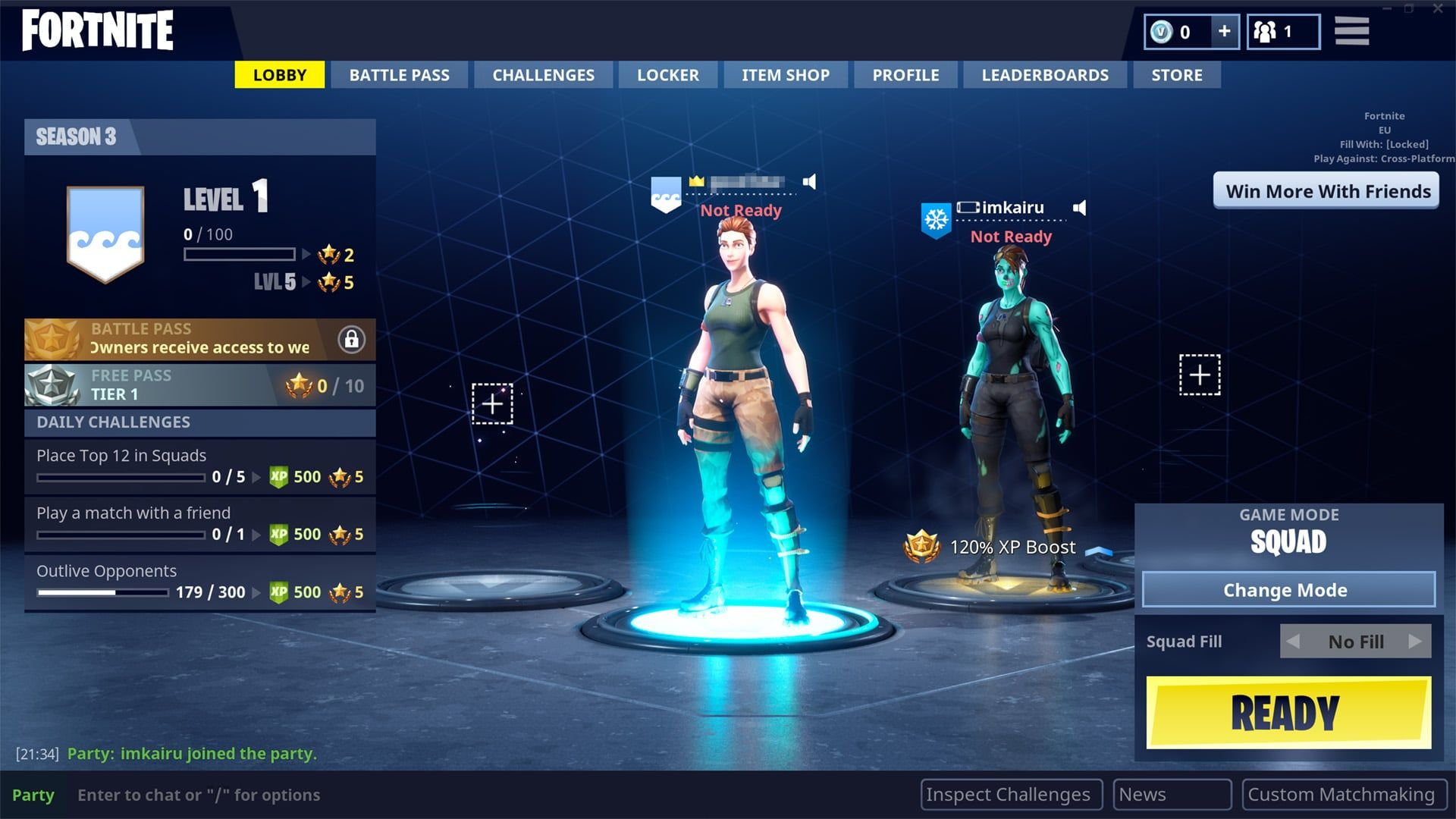
Epic Games’ Fortnite Battle Royale has been the talk of the town for the best part of a year now and thanks to their truly multi-platform development suite Unreal Engine, Fortnite is on all major consoles, PC, and touch screen platforms.
I describe the solution Fortnite uses as PC leaning as opposed to PC first for reasons I’ll get into after the following side by side view of the PC and console versions of one of the menu screens:
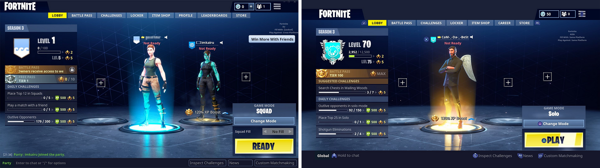
Fortnite Lobby screen—PC (left), Console (right)
It’s clear to me that the menu system in Fortnite was designed with direct input via a mouse as priority, and I hypothesize that the designers of the menu experience may have come into games from a web background—there’s even the used-to-be-controversial hamburger menu on there. Nevertheless, I hesitate to say this is an all-in PC-first approach for the following reasons:
Epic Games are the creators of the multi-platform oriented Unreal 4, if anyone has the vision to think multi-platform from the outset its them
Epic Games’ PR had the game releasing on consoles as far back as 2014
The general UI and information design both in the menus and actual gameplay read well at larger viewing distances and I doubt that this was an accident.
Here are the same images posted individually for closer inspection:
 PC
PC
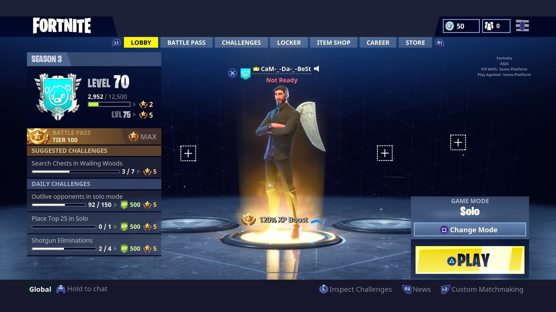 Console
The solve for the controller context is to augment the existing array of buttons peppered around the screen with button icon prompts. This “works” and probably works fine—I doubt the millions of Fortnite console players are descending upon Epic’s forums with complaints about this implementation. I however think it lacks the elegance of the Simple Prompt Switch of Dishonored 2, partly due to the inconsistent placement of controls across screens, requiring some scanning work to grasp what happening, and in some cases duplication of the button prompts in different areas of the screen like in banner edit screen (which I can’t find a screenshot of right now). There’s other little things that chip away at the console experience such as the use of non standard buttons for primary actions. Look at the start button on the PS4 image above and note that it requires a triangle press to start the game when it has become standard to use the cross icon for those kinds of actions.
In some screens there’s also a lack of a clear grid layout that is useful for the console-style select and commit model.
To be honest I remember this being much worse than what it actually is, but in the spirit of checking myself before wrecking myself, I just jumped in and played again under both control schemes, and while I stand by my assessments, it’s all pretty clear and learn-able.
In summary, I think that Fortnite’s PC Leaning implementation favors PC players to the extent that Dishonored 2’s Console-First approach favors console players. Both are solid and effective approaches, but I think we can go one better.
We are about to get to get to the meat of this whole 2000 word plus bowel movement (I don’t think I’ve written this many words in a single sitting since I was at university).
3. Secretly Console First
I used the term Secretly Console First in a work meeting while I was going over plans for the next milestone of the project I was working at Carbine Studios R.I.P.. “Why is it a secret?”, I was asked. It’s a secret because the goal is for the PC player to never get the feeling that console was favored in the development of the game. PC gamers tend to be loudly critical when they feel like they are playing a “shitty console port”. They still remember the original Borderlands port and have been hyper sensitive ever since. Dishonored 2 is by no means a shitty console port, but it clearly favors console/controller input in its messaging in the menus and the savvy PC gamer is going to feel that.
Overwatch exemplifies what it is to be Secretly Console First. To me it is the finest current example of a game that addresses the central problem of multi-platform UI and information design:
How do we design and build UI and information systems that look and feel appropriate for the platform and input scheme the player is using while being mindful of development resources?
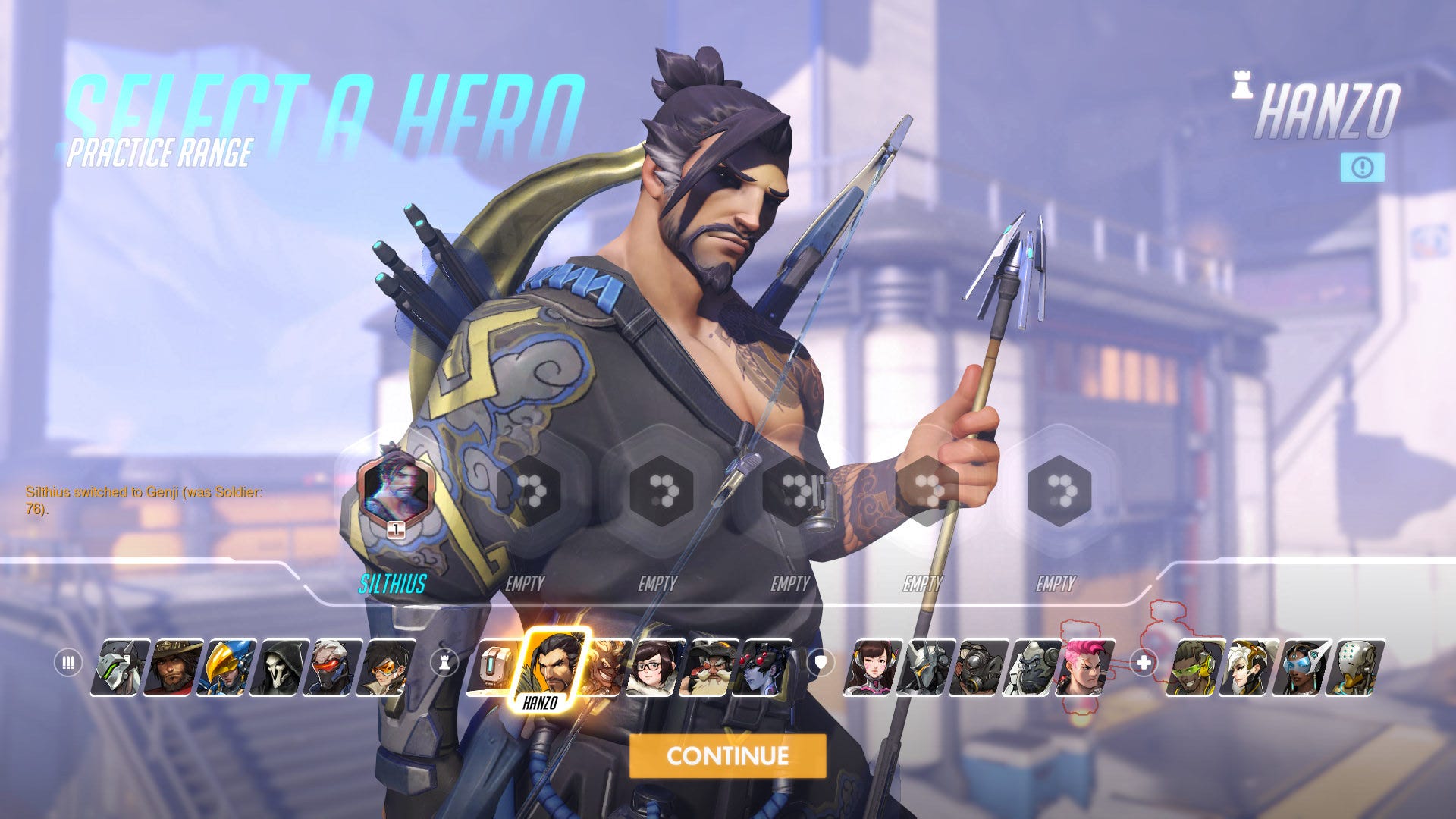
Here is a side by side of the ‘Select a Hero’ screen on Console and PC:
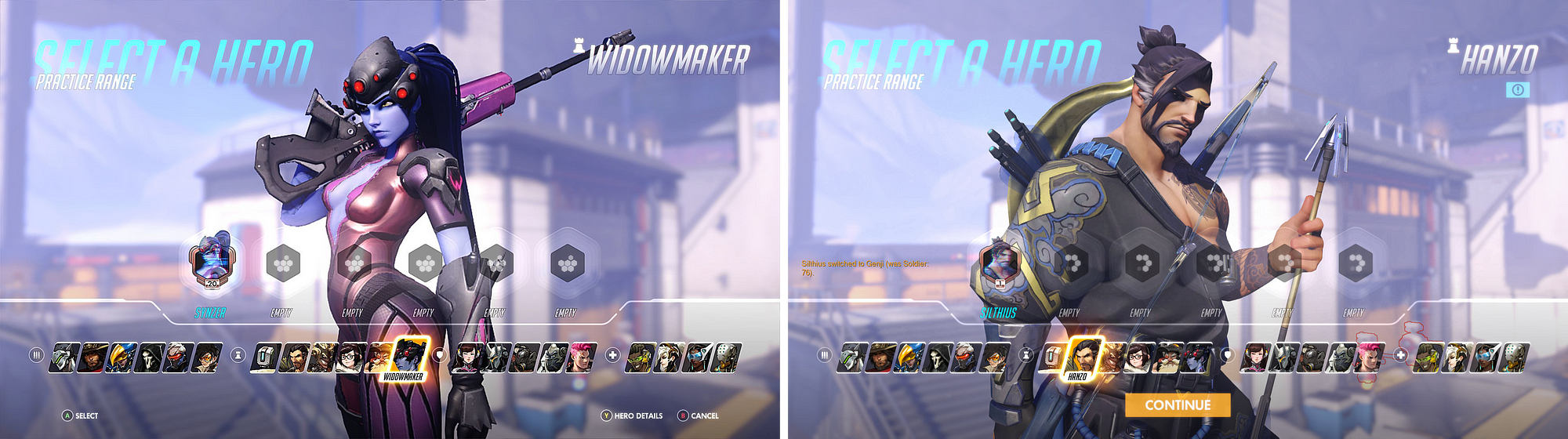 Overwatch Select a Hero Screen—Console (left), PC (right)
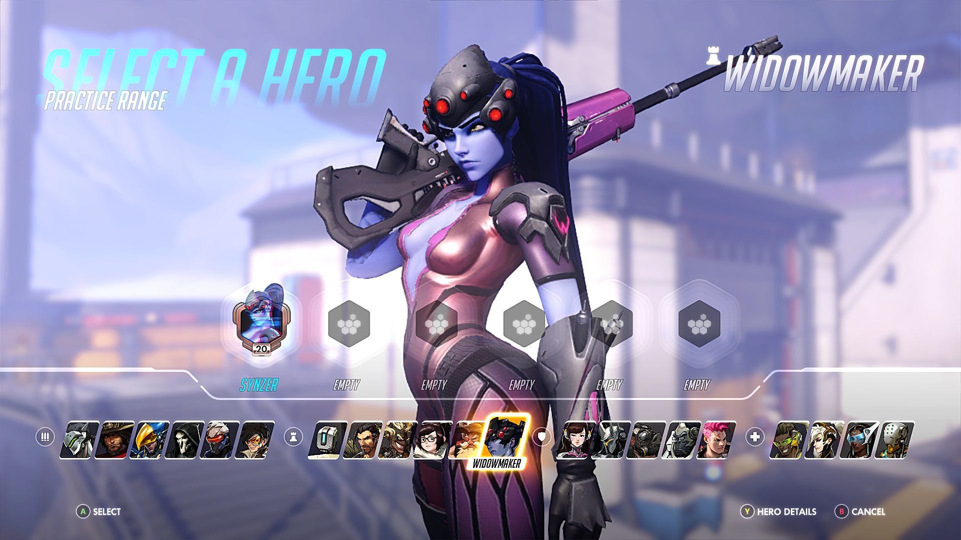
In Overwatch, Blizzard has created all of its layouts, and sub elements in a way that makes them clearly readable at large viewing distances. The high-level UI layout, the environment and character model setup is done once for both platforms, yet the interaction design is clearly different:
The console version uses the commonly used (to the point of being standard) pairing of select and commit interaction design, with button prompts at the foot of the screen for easy cross referencing
The PC version uses the mouse-centric hover and click method that is the most efficient browsing and interaction method for most PC players
Here are the same images posted individually for closer inspection:
 Console
 PC
PC
The Overwatch approach is achieved by building two sets of elements that are toggled on and off according to the input device currently being used. Where Dishonored 2 is simply replacing labels and icons, Overwatch is switching out the entire interaction design. This means that in conjunction with a high-level layout that has breathing room, the interaction layer can adapt to the needs of the input method. Note the small icon underneath the character name on the PC version that looks like “[!]”. This is a more mouse-appropriate way to handle the “Hero Details”, especially with its position following the gestalt (oh no he didn’t) principle of proximity. One could argue that this is the main positive of Fortnite’s method which leads me to this image:
 Some kind of rankings display, PC
Overwatch uses the proximity based button prompt method seen in Fortnite at several points in their menu systems, but the key difference is that it is exclusively for of secondary or tertiary actions. The above screen is about competitive rankings, the relevant controls such as detail drill-downs or main navigation are placed in along the bottom. Editing player identity specifics such as the emblem is an option placed as convenience for the player and not the primary function of the screen. I feel that this approach, used sparingly, helps keep the main row at the bottom clear for the few important interaction options, while still allowing the player to easily do other tangential things with the game without going back out and drilling into another menu somewhere.
Wrapping Up
Here is the basic Secretly Console First list of ingredients:
Information density, general UI element scale, and text legibility targets the greatest reasonable viewing distance
Interaction design and gameplay controls are solved for controllers first
PC interaction design favors mouse hover point and click with clear buttons favored over prompts, especially for primary actions
Screens have a single basic layout, and platform specific elements (2 and 3 above) are switched out on-the-fly as the player changes input method
This Secretly Console First approach, which in my opinion does both extremes justice, is not much more expensive to technically achieve—if at all—than the Simple Prompt Switch or the PC-Leaning methods shown further up the page. This is especially true if you’re using on of the major multi-platform development engines out there. The extra work is in the upfront design and even then it isn’t much. It mostly requires exercising a new mindset when approaching the design to the point that it becomes habit.
Let’s follow Overwatch’s great example and treat PC and Console players with equal care.
I’d like to thank Lauren Salk who worked with me on researching this stuff at Carbine. She is awesome and quickly got hired a couple of weeks after the shutdown.
P.S. I’m looking for a job…
Please get in touch if you are/know of someone who is looking to hire a spirited force for good in a UX Design leadership role.
Peace.
About the Author(s)
You May Also Like


.jpeg?width=700&auto=webp&quality=80&disable=upscale)


