Daily news, dev blogs, and stories from Game Developer straight to your inbox
Sponsored By
Featured Blog | This community-written post highlights the best of what the game industry has to offer. Read more like it on the Game Developer Blogs.
Porting an adventure game to mobile: Tips and Pitfalls: Part 3
This is the third and the last post in the Blog series ‘Porting an adventure game to mobile: Tips and Pitfalls’. Part 1 is here. Part 2 is here.
13 Min Read

This is the third and the last post in the Blog series ‘Porting an adventure game to mobile: Tips and Pitfalls’. Part 1 is here. Part 2 is here.
We talked about technical issues that propped up in the process of porting, such as platform specific programming and mobile limitations in the previous articles. Yet, none of those issues were as aggravating as having to fit a PC game into a tiny mobile screen.
The Problem
Let us assume we are displaying on the screen a small object, 40x40 pixels in size. On the computer monitor, at 96 PPI (pixels per inch), this object is almost half an inch in each dimension, and can be easily seen, and interacted with using a mouse. Now picture what happens on a 326 PPI screen of iPod Touch 4: The object has now shrunk to 0.12 inch in each dimension! An object this small would be annoying to click with a mouse, let alone trying to manipulate it with a finger!
Sizing The Screen
There is another issue we need to take care of, however. Both the games were developed when the CRT monitors were still around (anyone remember those?). As such, they have a 4:3 aspect ratio. The displays of most mobile devices, with the exception of iPad, tend to have ratios closer to 16:9.
We cannot just stretch the game scene to fit the device screen, as this will distort the aspect ratio (Image 1). Game ports with graphics having distorted aspect ratios always look horrible. Alternatively, we can scale the output of the game, while maintaining the aspect ratio as much as possible. But that would mean that portions of the display would be left blank, as illustrated in Image 2 below.
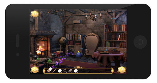
Image 1. Game with graphics stretched to fit the screen.
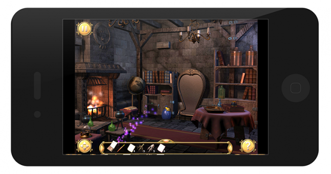
Image 2. Graphics stretched, while maintaining aspect ratio. Notice the black bars on the sides.
What we did, instead, was to stretch the game’s screen to fill the display width (Image 3). Height was also scaled by same amount, thus maintaining the aspect ratio. The player could touch the screen and drag the game display up and down to view the whole game area.
Since the game screen width matches the device width, we get the highest resolution possible. Despite this, the in-game objects remain far too small to manipulate, thanks to the small display size of mobile devices.
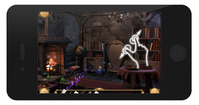
Image 3: Graphics scaled to fit device width. The player can scroll & zoom to see the entire game area.
The final part to the solution is to allow the player to zoom into the scene. With this, the player can zoom into the scene at will, and even smaller objects become visible. This allows the player to manipulate the scene in a much easier way.
Fiddling with the inventory
As with any other adventure game, the player has an inventory. In Pahelika: Revelations, the inventory is a bar that runs along the bottom of the scene. The player can hide/unhide the inventory at will.
The first problem arose because of finger size. On a PC, we use mouse to manipulate in-game objects. When we pick an object, it is drawn directly below the mouse, and it is easy to see because the mouse pointer is so tiny.
However, when the player uses her finger to manipulate an object, she cannot see exactly which object she is manipulating or at what location the finger is at, because her finger obscures the view! What we did here was to detect when the player starts to drag an object, and then move the object well above the finger so the player can clearly see it. This solved the first problem.
The second problem arose because of our solution to the first problem!
In Pahelika: Revelations, the player can combine objects in the inventory, or otherwise use one inventory object on the other. When the player tries to drag one inventory object to the other, the object is moved above the finger so the player can see it. Because inventory is at the bottom of the scene, the player does not have enough room on the device screen to move the object down. That makes it impossible to drag one inventory object over other inventory object!
In this case, we tried to detect whether the player finger is currently above an inventory object, and if the player was dragging an object then we try to apply the dragged object onto the inventory object. This solution, though not ideal, works well enough in practice.
Positioning the main menu
A lot of work went into designing the Main Menu for Pahelika: Revelations of the original PC version. It has 4 different moods, and different art and music for each mood. The main menu features buttons with pre-rendered text, and the buttons flash when lightning strikes in the game.
The problem here was two fold: First, the aspect ratio issue, while handled in the game, needed to be handled separately for the menu. Second, the composition of the menu scene became imbalanced because the original design was for a 3:4 scene. Additionally, the buttons were a bit too small.
This was an issue because the game now needed to run on devices with a variety of aspect ratios, including the old 4:3 (iPad).
Here we took refuge in the age-old rule of thumb for visual composition: The rule of thirds. The rule suggests that to balance a composition, we should place the object of interest along the lines which divide the artwork/photograph in ⅓ increments.
We re-coded the menu for mobile devices, using simple buttons this time, and placed them in accordance with the rule of thirds. While the menu for mobile devices doesn’t look as nice as the original, the composition does look alright on all devices.
Image 4: Main Menu on a 800x480 android device.
Mini Games
Any adventure game worth its salt has mini games. So did the Pahelika: Series. In fact, the series had several of them, which was a problem, because all of them needed to be modified to make sure they fitted in the small screens, and were playable in all type of devices.
Majority of them had hard coded values, offsets and the like. It took a really long time to ensure that the Mini Games were working fine on all devices. Still some of them, the Jigsaw Puzzle in particular, suffered the same problem as the game inventory and many people found it difficult to play.
Tips
Having gone through the whole hog, we have some tips for people aiming to make multiplatform games. Majority of these tips have been talked about by various people on various occasions in the past, but here it makes sense to reiterate.
Reduce HUD/Menu Size
The HUD/Menu must always be accessible (depending on the game) in a game. This means that there is less space available for the gameplay screen itself. This issue is especially acute on smartphones, where there is very little screen estate. Minimizing the screen estate the HUD takes in the PC version of the game will greatly improve the ease of porting.
Give Full Screen Space
Design Mini Games & the like so they take up the full screen space. This will help in porting to smartphones, where the general design is to let a functional unit take the entire screen space anyway.
Don’t Bake Text into Images
Photoshopped text does look good, but it causes problems if you want to translate the game, additionally, the images may appear too small on mobile devices and the text might be difficult to read.
Scrolling Books
Players are used to swiping and scrolling, and if you allow that in the in-game books, you’ve just saved yourself from the huge headaches that come from trying to fit the text in different languages on different screens.
This helps a lot, even if the dialogs in the game auto-size themselves according to the text, because sometimes the data just doesn’t fit.
Use screen size for positioning
Define AppWidth & AppHeight as the standard screen size your game is aiming for. Then, if you allow scrolling, you can scale everything by using:
ResizeRatioX = AppWidth/DeviceScreenWidth;
Now multiply positions with ResizeRatioX. If you need to make something fit on the screen without scrolling, compute
ResizeRatioY = AppHeight/DeviceScreenHeight;

and now scale positions with the lesser of the two. For games played in portrait orientation, reverse the use of ResizeRatioX & Y.
Use Render Targets
Instead of scaling each position in your Mini Game, you can just render as normal on a texture. Then you can just scale that texture and render it. Problem solved!
Of course you would need some code to scale player inputs too.
Finally...
With this, we come to the end of the Blog Series, hope you enjoyed it and it was useful to some of you. If you have some thoughts, questions, please do share.
Credits: Pinch & Zoom Icon from GestureWorks. iPhone image from Premiumpixels.
Read more about:
Featured BlogsAbout the Author(s)
You May Also Like