Daily news, dev blogs, and stories from Game Developer straight to your inbox
Sponsored By
Featured Blog | This community-written post highlights the best of what the game industry has to offer. Read more like it on the Game Developer Blogs.
Perceiving without looking: Designing HUDs for peripheral vision
Games often require players to keep their eyes focused on a small area of the screen. Here some recommendations (grounded in vision science) are given for making HUD elements visible in peripheral vision.
13 Min Read

Bob Tilford has a background in experimental psychology and works as a Games User Researcher at Player Research in Brighton, UK
TL;DR version:
Fast paced games are often best played by keeping your eyes on the action
HUD information might sometimes be perceivable without placing it in central vision
To do this, use big, stark HUD elements, with variations in brightness
Avoid clutter, and make HUD elements look visually distinct from one another
Draw attention through careful use of flashes and motion
Introduction
Look away from the action for the briefest moment and some games will punish you. Consider the ease with which “YOU DIED” follows an inauspicious glance at your Dark Souls Stamina meter. Sometimes this might add tension and contribute to the designers’ goals, though at other times it may just cause unwanted player frustration. This post will examine some basic vision science and make recommendations for designing in-game HUDs so that players can comprehend key information presented in their peripheral vision, without having to look away from the action.
Plenty of games have moments that are best played by keeping one’s eyes focused on a certain part of the screen. Fast-paced genres like shooters, MOBAs, rhythm games, and beat ‘em ups require the player to make time-critical responses to in-game events, such as when countering an opponent’s strike, or when a note reaches the end of Guitar Hero’s scrolling highway. But while the core gameplay keeps you fixated on a small, normally central area, HUDs often need to present other information simultaneously. Sometimes this might not be immediately pressing, and can wait until the player has a quiet moment to look at it, but other types of information can be time-critical, such as health, ammo, stamina, combo counters, and so on. In certain circumstances it might be appropriate to display these things near where the player is looking (see, for example, health bars over heroes' heads in MOBAs, or the diegetic health indicator along Isaac’s spine in Dead Space), but this is unlikely to be appropriate in many situations, and cluttering the player’s central visual field is never ideal. Pragmatically, a lot of information ends up relegated to UI elements away from the centre of the display. This can be a problem for designers though, since redirecting one’s gaze to check say, the combo multiplier, can cost valuable fractions of a second (Carpenter, 1988) in which the player might suffer for looking away. In this context it’s valuable to consider how information can be presented in the visual periphery without requiring the player to glance right at it to understand its meaning. A good understanding of some basic visual functions will allow UI designers to tailor their in-game HUDs to exploit the things we can and cannot see out of the corners of our eyes.

Arkham Knight players are likely to spend most of their time in combat fixating within the central area (highlighted) [Image credit: Accelerated Ideas | Game: Batman: Arkham Knight]
Our less-than-perfect peripheral vision
It’s crucial here to recognise that we don't perceive everything equally well across our visual field. While frequent unconscious flicks of the eye help maintain the illusion of a uniformly high resolution picture, a multitude of physiological factors from eye to brain (Carlson, 2007; Daniel & Whitteridge, 1961), means that our visual capabilities are relatively impaired in our visual periphery. Here it will be useful to define peripheral vision as anything more than 2° of visual angle from where we're directly looking (Strasburger, Rentschler, & Jüttner, 2011), which for illustration is roughly equivalent to the width of your thumb viewed at arm's length.
Fine details, form, and colour are all much more easily distinguished in central rather than peripheral vision (Coren, Ward, & Enns, 2004; Levi, McGraw, & Klein, 2000; Strasburger, 2011). Object recognition is also severely impaired in the visual periphery in the presence of clutter (Bouma, 1970; Levi, 2008; Pelli & Tillman, 2008; Whitney & Levi, 2011). Extending from this last point, letters ‘crowd’ other letters, so reading more than one solitary number or letter is extremely difficult, if not practically impossible, outside of where you’re currently looking (Bouma 1970; Rayner, 1975). There’s a lot working against us if we want to communicate useful information without asking players to look right at it. This said, there are options available for the designer who wants to capitalise on the things that peripheral vision is able to do. Note that the following design principles are likely to be of most use to experienced players who’ve had a chance to learn the intricacies of the game, its mechanics, and how its UI conveys information.
Use big, stark HUD elements, with variations in brightness
Spatial acuity and form perception drops off rapidly as you move from central to peripheral vision (Levi et al., 2000; Strasburger et al., 2011). The scarcity of cone photoreceptors also means that, while we can tell the difference between light and dark, colours are much more difficult (Coren et al., 2004). So, if you want to communicate information through peripheral vision, don’t rely solely on small intricate details, or variations in shape or colour. Instead look to make relevant HUD elements big and bold, with stark contrasts. Also consider how you can make use of variations in brightness, such as an energy bar that gets brighter the more it is charged. It should be noted that this is not an argument for using big, obnoxious, distracting HUD elements in every game. It’s simply worth considering that if you want your players to make use of information without focusing their eyes on it, you should not rely on fine details, shape, or colour.
Avoid clutter
Even familiar objects in our visual periphery become extremely difficult to recognise when surrounded by other objects - a phenomenon known as crowding (Bouma, 1970; Levi, 2008; Pelli & Tillman, 2008; Whitney & Levi, 2011). In particular, the smaller the distance between the surrounding objects and the object of interest, the less able you’ll be to identify it, and the further it is into visual periphery, the more important it is to avoid clutter (Bouma, 1970). Take, for example, the ammo indicator HUD element in Helldivers. It’s useful to keep track of this indicator during moment-to-moment gameplay so that you know when it’s appropriate to reload, especially since spamming the reload button discards your unused rounds. However, the indicator is small and visually crowded by other very close by HUD elements. Had the designers wanted to make the ammo counter visible out of the corner of the player’s eye while they fend off enemies, it would have helped to make it larger, and perhaps more importantly, increase the separation between it and its surrounding UI elements.
A demonstration of visual crowding. Keep your eyes on the central cross and note how much more difficult it is to identify the crowded ‘K’ on the right despite its identical distance from fixation
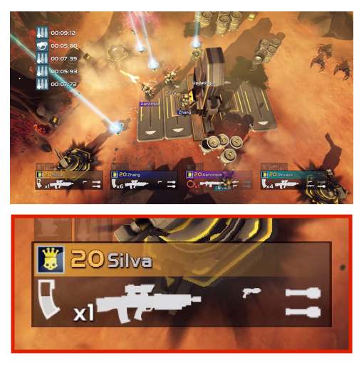
The ammo indicator (bottom-left of highlighted area) in Helldivers is visually crowded by surrounding UI elements [Image credit: Game Insider | Game: Helldivers]
Interestingly, crowding is also more problematic when something is surrounded by visually similar objects (Levi, 2008). For example, the letter ‘X’ is harder to identify between two ‘K’s (i.e., KXK) than between two ‘O’s (i.e., OXO), especially in the periphery. Let’s consider The Witcher 3’s Adrenaline meter. Not unlike the ammo counter in Helldivers, it’s helpful to keep track of your Adrenaline level because when it’s filled you can perform powerful special moves. However, not only is it small and cluttered by neighbouring HUD elements, it mirrors the aesthetic curve of the nearest element (the Stamina meter). Vision science suggests that the Adrenaline meter might be less crowded and easier to perceive out of the corner of your eye if it did not share the same curved design as its closest neighbour.
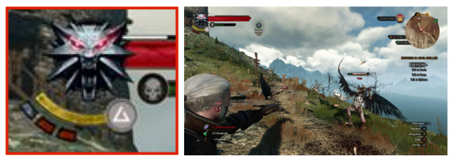
The Witcher 3's Adrenaline meter (3 bars in bottom-left of highlighted area) are potentially susceptible to crowding due to its visual similarity to the adjacent Stamina bar [Image credit: VG247 | Game: The Witcher 3: Wild Hunt]
Don’t use strings of text
Extending from the previous point on crowding is that text is almost impossible to read outside of central vision (Bouma 1970; Rayner, 1975). This is likely due to our inability to identify what each letter is because of the crowding effect of the surrounding letters. Be careful, then, not to expect players to be able to read more than a solitary character outside of where they’re looking. This is an issue that crops up in the fast-paced and hyper-competitive Super Smash Bros, where health is indicated by a percentage value that often goes over 100%. Health values can therefore comprise 3 digits and a percentage sign in close proximity. Since these characters crowd each other, players must glance away from the ongoing fight in order to read their health value. Were health visualised non-textually (e.g., with a health bar), then it might be more easily tracked during combat without having to look right at it. As a last point on this, however, it’s not unreasonable to expect players to be able to read single letters or numbers as long as they are sufficiently sized, close enough to fixation, and not crowded by other elements.

Super Smash Bros' Health percentages are difficult to read without looking directly at them. A string of characters in a row (e.g., '89%') effectively crowds itself, so that none of the characters are readable in peripheral vision [Image credit: Video Game Writers | Game: Super Smash Bros]
Make use of motion and transient events to capture attention
While the visual periphery is vastly inferior to central vision for most functions, it’s relatively good for perceiving both motion (McKee & Nakayama, 1984) and brief, transient events, like the individual flickers of a fluorescent light (Perz, 2010). Both of these things are also good at capturing attention (Franconeri & Simons, 2003). Indeed, most people can relate to the annoying ease with which your eyes are drawn to online banner adverts that move and flash.
Like banner ads, games HUDs already make use of motion and sudden changes to capture attention, but normally in a much less insidious way. Destiny, for instance, does a great job of highlighting the filled state of the Super Charge meter with an abrupt colour change and a regularly repeating pulse animation, along with a notification message in the middle of the screen. So effective is the pulsing animation at drawing the player’s attention, the additional ‘Super Charged” message might not even be necessary for players already familiar with how the Super Charge mechanic works.

Destiny's Super Charge meter (horizontal yellow bar) pulsates when filled to attract attention [Image credit: PS4 Fans | Game: Destiny]
Of particular interest here is that visual attention doesn’t actually require you to be pointing your eyes directly at a target (covert attention; Posner, 1980). Therefore, experienced players in particular should be able to attend to in-game events without having to reorient their gaze. This provides opportunities for designing HUD events containing flashes and/or motion (or a hybrid in the case of the Destiny example) with the intent that players will eventually become able to reorient their attention without looking away from the gameplay. This method may be used in conjunction with the principles outlined above to draw the player’s covert attention to a HUD element that can communicate information without requiring direct focus. Remember also that the dynamism of the flashing and motion will need to be tailored to suit the context. If it’s too subtle relative to the ongoing gameplay players may not notice it, but too strong and even expert players might struggle to avoid looking right at it automatically.
Conclusion
This post has attempted to touch upon some basic aspects of our visual system that are relevant when designing HUDs that can effectively communicate information in the visual periphery. To achieve this, UI elements would benefit from being big, stark, and obvious, and convey information through variations in brightness rather than colour. The effect of crowding must also be considered, so HUD elements that need to be perceived peripherally should be uncluttered and visually distinct from their surroundings. Finally, we looked at the ways in which attention can be captured by motion and brief events (such as flashes) and oriented independently of one’s gaze.
As mentioned earlier, being able to make use of information presented in the visual periphery is most likely to be of benefit to experienced players. Don’t expect beginners to pick up on and make use of these nuances of your HUD design in their initial moments with the game. Before being able to use information in their visual periphery, players will need to build up familiarity with how each HUD element displays information by looking directly at it. Only then, over time, are experienced players likely to be able to direct their attention independently of their gaze, and perceive and understand information in the edges of their vision.
Learn more about Player Research:
References
Bouma, H. (1970). Interaction effects in parafoveal letter recognition. Nature, 226, 177–178.
Carlson, N.R. (2007). The Physiology of Behavior. (9th ed.). Boston: Pearson Education.
Carpenter, R.H.S. (1988). Movements of the Eyes. (2nd ed.). London: Pion.
Cavanagh, P., & Alvarez, G.A. (2005). Tracking multiple targets with multifocal attention. Trends in Cognitive Sciences, 8(7), 349-354.
Coren, S., Ward, L.M., & Enns, J.T. (2004). Sensation and Perception. (6th ed.). Hoboken: Wiley.
Daniel, P.M., & Whitteridge, D. (1961). The representation of the visual field on the cerebral cortex in monkeys. Journal of Physiology, 159, 203-221.
Franconeri, S.L., & Simons, D.J. (2003). Moving and looming stimuli capture attention. Perception & Psychophysics, 65(7), 999-1010.
Green, C.S. & Bavelier, D. (2003). Action video game modifies visual selective attention. Nature, 423, 534-537.
Levi, D.M. (2008). Crowding - an essential bottleneck for object recognition: A mini-review. Vision Research, 48(5), 635-654.
Levi, D.M., McGraw, P.V., & Klein, S.A. (2000). Vernier and contrast discrimination in central and peripheral vision. Vision Research, 40, 973-988.
Pelli, D.G., & Tillman, K.A. (2008). The uncrowded window of object recognition. Nature Neuroscience, 11(10), 1129-1135.
Perz, M. (2010). Flicker perception in the periphery (Master’s thesis, Technische Universiteit Eindhoven, Eindhoven, The Netherlands). Retrieved from http://home.ieis.tue.nl/rcuijper/reports/Perz%20M_Master%20Thesis_Flicker%20Perception%20in%20the%20Periphery.pdf
Posner, M.I. (1980). Orienting of attention. Quarterly Journal of Experimental Psychology, 32, 3-25.
Rayner, K. (1975). The perceptual span and peripheral cues in reading. Cognitive Psychology, 7, 65-81.
Strasburger, H., Rentschler, I., & Jüttner, M. (2011). Peripheral vision and pattern recognition: A review. Journal of Vision, 11(5), 1-82.
Whitney, D., & Levi, D.M. (2011). Visual crowding: A fundamental limit on conscious perception and object recognition. Trends in Cognitive Sciences, 15(4), 160-168.
Read more about:
Featured BlogsAbout the Author(s)
You May Also Like