Daily news, dev blogs, and stories from Game Developer straight to your inbox
Sponsored By
Lucas Pope and the rise of the 1-bit 'dither-punk' aesthetic
Lucas Pope is trying to capture the legibility and simplicity of great Mac games from the era of monochromatic '1-bit' Mac Plus games with Return of the Obra Dinn
9 Min Read

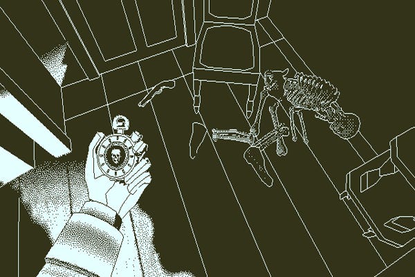
We've seen a lot of aesthetic trends in the games industry that ape older graphical styles, from cel shading to the retro 8-bit look. The next one could well be the most surprising: a lo-res monochromatic black and white, with only patterns of differently-spaced dots to create the illusion of shading. Papers, Please creator Lucas Pope sits at the forefront of this trend with his upcoming adventure Return of the Obra Dinn.
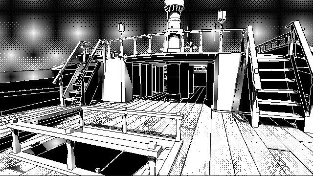
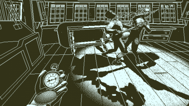
Return of the Obra Dinn is a detective story of sorts. Players explore a ghost ship with a special device allows them to rewind time and view the moment of each crew member's death. The mechanic is surprisingly involving, but it's the stark graphical style that's truly startling--especially if you recognize what it's paying homage to.
Pope is consciously aping the "1-bit" graphical limitations of an archaic piece of hardware. "People ask me why why the game is black and white," he tells me over Skype. "And I say, 'Remember the old Mac Plus?' And nobody remembers the fucking Mac Plus. Everybody was on the PC or Nintendo, or they're too young to remember."
The early Macintosh had a big hand in shaping the growth of personal computing, and its games, software, and mouse-driven multi-window interface directly influenced the graphic adventure and simulation genres. (Point-and-click adventures owe much to the likes of Deja Vu and Shadowgate, for instance, while the original SimCity's interface was modeled after MacPaint.) But the Mac was never all that popular, and games never found much success on the machine, so few people in or around the games industry seem to be familiar with its distinctive look.
Still, there are reasons to go "1-bit" beyond mere nostalgia. Return of the Obra Dinn is built around examining violent and gory murder scenes, which might have been hard to stomach without the stylization and abstraction of the graphical approach.
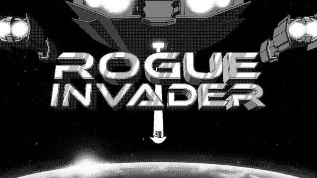
Squishy Games artist Nathan Rees notes that a 1-bit "dither-punk" style can be a great way to stand out from the glut of indies. "The market is very saturated with some great pixel art games," he says. "They're very talented. They've got some great game mechanics." But being black and white makes Squishy's recently released roguelike shooter Rogue Invader look unique. That has been enough to get the game early coverage in Rock Paper Shotgun, PC Gamer, and several other prominent games publications.
For Pope, standing out and looking different is always a concern, but he specifically singles out the chance to go back to simpler, more legible graphics as what attracted him to the look. "What's interesting is back then, I never considered that it wasn't in color. It was totally natural that in order to get these 'high-res' graphics in there, you had to do it in black and white," he recalls. He cites the 1986 puzzle platformer Dark Castle as an example, praising its "legibility" on the Mac. Everything in the game was clearly legible -- characters, backgrounds, objects -- and it was "hard to tell where the moving characters end and the backgrounds begin."
But then Dark Castle was ported to several other systems such as PC and Sega Genesis. "I feel like on the Mac Plus it was this gorgeous game – just absolutely gorgeous – and then you put it on these other systems and they have to put it in color. There's no other choice. So then it looks awful. It looks terrible. And it's not high-res any more because the pixels need to be bigger if you want to put color on them," says Pope.
Simplicity in black and white
Pope is trying to capture the legibility and simplicity of great Mac games from that black and white era by making Obra Dinn look like an inverted CAD drawing. He got this idea from a 1987 Mac first-person shooter called The Colony, which presented a mostly wireframe 3D world and began with the lights off so that it was mostly black -- much as onboard the Obra Dinn is predominately black because it's a dark old ship. He also copied The Colony's inversion outline style -- the color of a line is black in the light and white in the dark.
Not having any colors or grays makes the visual style simpler, cleaner. Pope is keeping most objects solid white or black because he's found it more legible in 3D to do so, but he still makes regular use of a technique called pattern dithering. On the early Macs, this was the main approach for introducing depth, detail, and shading. It basically involves alternating black and white pixels in various patterns to give the illusion of several shades of (ragged, raw) gray. The denser the black pixels, the darker the gray, and vice versa. (You can do it with colors or with a color and a shade, too -- as many Mac devs did in the 16 color days.)
The dithered look causes headaches with screen sizes and resolutions, though. Rees says that at a certain point in fidelity, dithering becomes invisible -- it just looks grayscale, which spoils the old Mac aesthetic. The sweet spot that he and programmer Lee J Hinkle settled on for Rogue Invader was a low HD resolution of 1280 by 720 pixels. Pope set Obra Dinn at just 640 by 360 pixels for similar reasons.
Video compression woes
Success in game development today hinges on YouTube and Twitch streaming, and it's here that Obra Dinn and Rogue Invader's 1-bit aesthetic will face their toughest test. The compression algorithms that process and serve video on the internet aren't optimized for 1-bit graphics. They often destroy the careful beauty and clarity of a dithered image. Crisp dots blur, while gray pixels appear where there weren't any. [Note: animated GIFs we've included in this story betray some of that muddying.]
Both developers believe their games look terrible on YouTube. But only Pope has actively tried to combat these video compression woes. He now uses a dithering pattern for the environment that has random elements. "The randomness works better when you're trying to compress because it doesn't have any sort of regular pattern," says Pope. "When you get a regular pattern, some of the compression algorithms can accentuate that and make it look much worse. But when you do it random it ends up looking a little better."
Designing without color or shade
Even without worrying about matching the old Mac look, 1-bit presents serious visual design challenges. "You basically have a white piece of paper, and any color you put on it is dead black," says Rees. He's put a lot of time into trying to figure out ways to get that legibility Pope describes into a 2D shooter-cum-roguelike. For Rogue Invader, it means keeping soldiers predominately white and aliens mostly black, with white ground to allow details to be seen more easily. And the character animations have a lot of responsibility in conveying story and theme, since they have to keep on-screen objects to a minimum lest it look too cluttered.
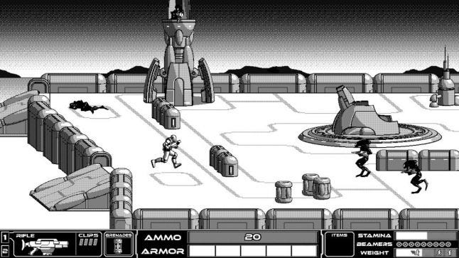 Rogue Invader's aliens are dark, and it's good guys are bright
Hinkle notes that the 1-bit look presents design opportunities, too. "We're able to tie the color into the storyline of the game and how the information is presented to the player," he explains. They're not willing to elaborate much on that, but there'll apparently be subtle changes in how information is presented that tie straight into the black and white look. And the interface in general has been crafted to accentuate black and white contrasts.
Pope has found different challenges and opportunities in 1-bit. "I'm not a fantastic artist, but when you've only got two colors it makes it easier to get this noir look where you want to use lights in a broad way," he says, noting also that many technical things are much simpler too -- rendering, shaders, memory usage on textures, and more.
In broader terms, Pope loves the chance to design for your imagination. Thinking back on his experience with early Macs, he says "there's something about the missing color. You had to fill it in with your imagination, and to me that's a lot more powerful than actually showing it." Unlike, say, an Atari 2600 game, Mac games like Dark Castle were detailed enough that you had the image but not the whole picture -- everything except the color.
The tricky part with 1-bit on Obra Dinn has been a core mechanic that involves recognizing people's faces when they reappear in a later scene. To recognize a face, of course, you need to see it clearly both times. "That's kind of hard when you've only got two colors and it's low resolution," says Pope. "The restrictions in this case are working directly against the game mechanics. Which is kind of bad. You don't really want that. So I need to find a solution."
He hasn't figured that out completely, but he knows at least that the player must get close in on the faces. That's the only way the game can have enough pixels for dithering to work well.
A "dither-punk" trend?
The 1-bit aesthetic looks striking, and it's already winning over many pixel art fans. But neither Pope nor Squishy Games' pair of developers seem convinced that it could turn into an indie trend. They all agree that the key factor will be how Obra Dinn and Rogue Invader are received. If people enjoy playing games with 1-bit graphics, then maybe -- at the very least, they'd love to stick with the style if there's interest in it and they're being careful to design good games that support the art style to prove it's not a mere gimmick.
But 1-bit art faces a big hurdle that the 8-bit and 16-bit pixel trends did not. Retro graphics and sound trends in game development are driven by nostalgia among developers more so than players. And far fewer indie developers seem to have fond memories of the early Macintosh than of NES, SNES, and Sega Genesis consoles. "In my hometown, I was made fun of because I had a Mac," notes Rees.
What might fare better, Pope suggests, is a hybrid look -- games that are predominately black and white with splotches of color, like Downwell or Unfinished Swan or the Sin City films and graphic novels. That way, you get the gritty, high-contrast style without the accompanying headaches with art direction.
About the Author(s)
You May Also Like


.jpeg?width=700&auto=webp&quality=80&disable=upscale)


