Daily news, dev blogs, and stories from Game Developer straight to your inbox
Sponsored By
How Fourattic captured the '80s with Crossing Souls' art design
Spanish studio Fourattic released its '80s love letter of a game Crossing Souls this week, and here Gamasutra chats with the lead animator and artist about how the game's unique look was achieved.
7 Min Read

Creating a coherent art style for your game can be difficult. There are lots things to consider: the color palette, the core assets, and the design of the characters and environments.
Fourattic, the Spanish studio behind the action-adventure game Crossing Souls, knows this all too well. The team set themselves the challenge of creating a distinctly 1980s aesthetic for the game, achieving this through the use of reference materials, detailed environments, and color.
Crossing Souls is out this week, and asks players to manage a group of five teenagers who discover a pink stone that allows them to travel between the realms of the living and the dead.
Using each character’s unique abilities, players need to explore a bunch of settings inspired by '80s media, communicate with ghosts, and unravel a sinister government conspiracy in order to save your hometown from ruin.
Using reference material
Juanga Jaén, lead animator and artist on Crossing Souls, explains the inspiration behind the game, “We were born in the '80s, so it was the movies we grew up with [that inspired us]. We wanted to make an adventure like that. So, we set the plot in the '80s and this small American neighbourhood.”
What's notable about this is how thoroughly the team at Fourattic went about recreating the look and feel of that halcyon decade. The developers relied heavily on reference material from the '80s, and many of the character designs in the game are based off popular figures in films from the period. For instance, Quincy Queen takes inspiration from Prince’s character ‘The Kid’ in Purple Rain, Vigo Sarducci borrows from Vigo the Carpathian from Ghostbusters 2, and Matt’s dad is based on Wayne Szalinski from Honey, I Shrunk the Kids.
Importantly, locking in this reference material helped them to nail the fashion of the period, as well as inject some clever Easter eggs for those knowledgeable enough to notice them.
This isn’t just limited to the character designs either. It also extends to many of the environments. The main city in the game is based on Tujunga, California, where ET the Extra-Terrestrial was filmed back in 1982.
Jaén and his team used Google Maps to explore the area and tried to incorporate elements of the place into Tajunga, the fictional location in the game. You can see this in the suburban houses, and the theme of the neighboring environments: forests, industrial areas, and deserts.
Aiming for a more detailed pixel art style
The game also captures the period through smaller details you can find in the environment too. The settings are extremely detailed, even though most the objects have the same pixel per unit (16x16 pixels). This because some of the bigger objects in the game are assembled from multiple tiles. Doors for example are composed of 3 tiles vertical and 1 horizontal, allowing the artists to add much more detail into them.
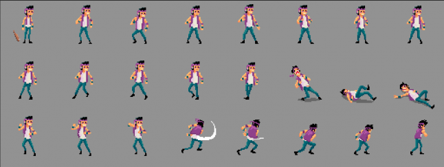
A perfect demonstration of this is Kevin and Chris’s house. Posters, props, and photos are spread all across the different rooms on walls, referencing 80s media like The Ghostbusters, Michael Jackson, and Pac-Man. This helps to cement the setting further.
Jaén states, “It’s not really a retro style, it’s just pixel art. Like, if you see, for example, Super Time Force or Hyper Light Drifter, all of those games are like a new form of pixel art.” He points to those games richly-detailed characters as proof of this. “We have old cutscenes, and the plot of the story, is [retro], but the art style is something new. I don’t remember seeing any game with [this] quality in the [environments].”
He continues, “Danny [Benítez, the pixel artist on Crossing Souls] put a lot of little references and details into each map. The player can explore [...] and find something in [every] corner. We really want the player to get immersed in this world.”
Deciding on a color palette
Color is extremely important at conveying the time period in Crossing Souls. The game uses a different color palette for each stage, but consistently opts for brighter hues, aiming to evoke the colorful look of the 1980s, popularized by design collectives like the Memphis Group.
There are several examples of this throughout. The forest scene, for instance uses blues and purples to convey the night time, as opposed to shades of grey, whereas bright pinks, blues, and purples represent the duat stone and everything associated with the 80s.
“We play with the pink and blue, because it fits well in the world,” says Jaén. “What we were thinking when we [chose] all the colors was we wanted the player to live an adventure and [for] every level they play [to be] different.”
He recalls buying games for the MegaDrive in the late 80s and early 90s based on the number of colors used in panels on the back of boxes; it always hinted at the size and scope of the world and the potential for adventure. This is something he wanted to capture with the art style in Crossing Souls: making the player feel they were going on a journey.
Emulating '80s cartoons
In addition to the pixel art, the game also has multiple cutscenes, used to heighten the drama and give the game’s characters more personality. They were created in TVPaint and are animated in a style reminiscent of cheap 1980s cartoons, like He-Man, Thundercats, and Dogtanian. Not only did this approach fit the theme, but it also helped to save time and money when animating.
“I’m the only animator here, so I’m the only one who made the animations. I’ll just say the budget is not the best. So, He-Man is a good reference […] because it has less frames. In Crossing Souls, the less frames we can use [the better]. There [are] 14 cutscenes and each one is between 20 seconds to one minute of length, so we need to optimize as much as possible.”
These cutscenes emulate this period of children’s television through the number of frames used, which is far below the amount in contemporary animation. Jaén also applied post-effects over the finished cutscenes, adding VHS scanlines over the individual frames to reference 80s home media.
Keeping things readable
"I’m the only animator here, so I’m the only one who made the animations. I’ll just say the budget is not the best. So, He-Man is a good reference […] because it has less frames...the less frames we can use [the better]. There [are] 14 cutscenes and each one is between 20 seconds to one minute of length, so we need to optimize as much as possible."
Even the game’s perspective is another nod to the 80s. It’s orthographic, calling to mind classic games from the era, like Bomberman, Pacman, and The Legend of Zelda. This approach came with some downsides, however; the most challenging was that distances were much harder to convey in this style. The team employed some simple tricks to fix this though.
Jaén explains, “It’s difficult to […] see distances, so we [added] some lines in the border and play with shadows to show that one place is higher than another. It’s [probably] the most difficult part of the game: to tell the player this place is higher or that you can reach it. When we play with shadows – sometimes we cheat and make the shadows go [the wrong way], because the player will see it better and they don’t notice [it].”
These are only subtle changes, but it makes a huge difference. Platforming is a massive part of the game, and these small alterations make it far more natural for the player to move around the map and locate where they need to go.
Crossing Souls is clearly deeply tied to the look and feel of '80s culture. Not only is the decade integral to the plot, it is woven into all aspects the art direction, coming across in the colors used, the minute details, and the design of the characters and environments.
To finish the interview, I ask Jaén if he has any advice from his time working on the art direction for Crossing Souls.
“This game is very huge, with a lot of characters. It isn’t the same to work on one character with a lot of moments, then a lot of characters with the same movements and a lot bosses," he says. "If you are starting out with pixel art, start with something like Mario, with less movements, less [environments], something that makes you learn from the beginning to the finish with cool running. Crossing Souls, for example, was difficult from the very beginning.”
About the Author(s)
You May Also Like


.jpeg?width=700&auto=webp&quality=80&disable=upscale)


