Daily news, dev blogs, and stories from Game Developer straight to your inbox
Sponsored By
Game Design Deep Dive: Relaying asymmetric info in Eon Altar
Designing a game around a single screen can be hard enough--what about multiple screens in local space? This mobile/PC hybrid tries to do just that, using players' phones or tablets as controllers.
11 Min Read

Game Design Deep Dive is an ongoing Gamasutra series with the goal of shedding light on specific design features or mechanics within a video game, in order to show how seemingly simple, fundamental design decisions aren't really that simple at all.
Check out earlier installments on the the action-based RPG battles in Undertale, situational awareness and player frustration in GRIP, and the capital ship invasions in Dead Star.
Also, dig into our ever-growing Deep Dive archive for developer-minded features on everything from rocket jumping in Rocket League to Dying Light's Natural Movement System.
Who:
I’m Joey Wiggs, lead programmer for Eon Altar at Flying Helmet Games. While my professional background before FHG is application development in Microsoft Office—specifically File IO—I'm a lifelong hardcore gamer, a roleplaying DM for over 15 years, and my education is computer science and video games design. Much of the rest of the studio is made up of ex-triple-A developers who wanted to go the indie route from studios like EA, Ubisoft, Bioware, and United Front Games.
What: Asymmetric Information via Individual Screens, AKA Secrets
Designing a game around a single screen can be hard enough, but what about multiple screens in local space? Why would you design a game around multiple simultaneous screens? What physical limitations exist for such a setup? How does said setup alter how you design the rest of the game?
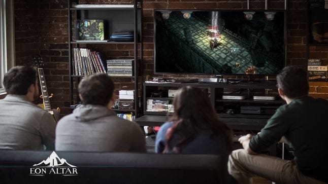
Eon Altar is a local co-op RPG, but the trick here is that rather than controllers, we use your mobile devices as the character controllers. Why? Secrets. With each player having their own screen, during the campaign we can send players their characters’ thoughts, personal quests and missions, and dialogue. So while you’re playing a cooperative RPG, we can amp up competition between the players as designers by providing competing goals and personalities, similar to an actual session of D&D or Pathfinder.
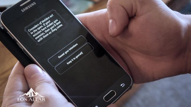
Right from the beginning, before I joined, the team knew they wanted a local co-op RPG with strong ties to cooperative board games—which often one player is a winner or everyone loses, think Arkham Horror’s First Mayor title, or Castle Panic—and they knew they wanted to bring in the concept of secret information, like those moments where the DM pulls you aside from your game into another room and says, “Hey, you know this, but the others, you don’t think they’re aware," something I myself often did in our roleplaying sessions growing up.
Immediately this suggested using extra screens like tablets or smart phones. The interesting and simultaneously frustrating part about using this paradigm is that we had to discover a lot about how to make simultaneous separate screens work. Short of EA's Scrabble Tile board app, Wii U, and Zelda 4 Swords (and later the Jack Box) there wasn’t much out there to crib from in terms of design practices, and it became very clear that nearly every feature in the game would impact or be impacted by our control scheme. How said scheme manifested would turn out to be a fair bit different from our original vision.
Eon Altar went through two major codebases: a prototype build which we scrapped; and the current iteration. To get to how we landed on the current controller scheme, let’s first talk about how we failed. Well, fail might be a strong word, perhaps miscalculation might be the better descriptor.
An old prototype build animated gif showing our original exploration gameplay.
The original build was very much a board game in nature, built around one main mobile screen, and a secondary mobile screen for each player. You had the main game on a tablet that was laid out on your table in the middle of the party, and each player also had their own mobile device. In our demos, the main game tablet was usually one of those mega-tablets from the Windows 8 heyday that never really took off. The “controllers” were less controllers and more just your character sheet.
Most interaction took place on the main “board”, including dragging and dropping your character while taking your turn. Your phone contained your character sheet; your dialogue and thoughts; and some combat and skill interactions. Gameplay itself was sometimes on the board (exploration), and sometimes on the controller (combat). Other times it even crossed over between the two, blurring the lines between where exactly the game was being played.
We got some attention, but between our PAX East 2013 demo and our Kickstarter, a few flaws in our plan became abundantly clear:
“Somebody else is going to have a lot of fun playing your game…”—the mega-tablet push never materialized with customers, so nobody had the equipment to play the way we had been demoing the game.
Hunching over a tiny tablet like an iPad constantly was ergonomically unfeasible. Time between turns was short enough that you didn’t get much chance to sit back and relax.
Paradoxically, the game played too slowly. Taking separate turns was annoying, but with the tablet model, it would be a literal game of Twister to let everyone go simultaneously.
It was back to the drawing board for our team.
After some thought, the team decided that couch co-op was the way to go, since the initial design around secrets and local co-op remained.
Why:
The actual purpose of separate screens, the asymmetric information, hasn’t changed much from the initial prototype. It worked quite well out of the gate, and based on playtest and customer feedback on Steam it continues to do so. We’ve had minor iterations in terms of interactions—notifications for attention being one, which having control over how long one can vibrate your phone would be nice Apple/Google—but overall, dialogue, thoughts, and personal missions as concepts were around strongly right from the start.
A design benefit of moving to couch co-op was a clear delineation between where the game was being played and where it was being controlled. While the cool factor of splitting control between phone and game was awesome, in hindsight it was messy and confusing. Instead, the controllers are literally controllers now, along with all of your personally relevant information: character sheet; dialogue and thoughts; decisions (dialogue trees, combat power choices); character control. Having a strict delineation cut down on player (and designer!) confusion about what screen and when certain activities would appear.
Diverging from the physical table aspect also freed us up from physical limitations around simultaneous turns. Instead of worrying about players getting their arms tangled over a mega-tablet (or worse, a normal-sized tablet), we could allow exploration be real time. That being said, we wanted to maintain our turn-based combat to allow for deep thought and strategizing if players so chose. But since we could allow for simultaneous actions, we made combat “team-turn-based”—players can all go at once, then enemies go. This allows for combat to be quick when players want it to be, and allows it to be slow enough for players to get a handle on the controls and decisions about powers.
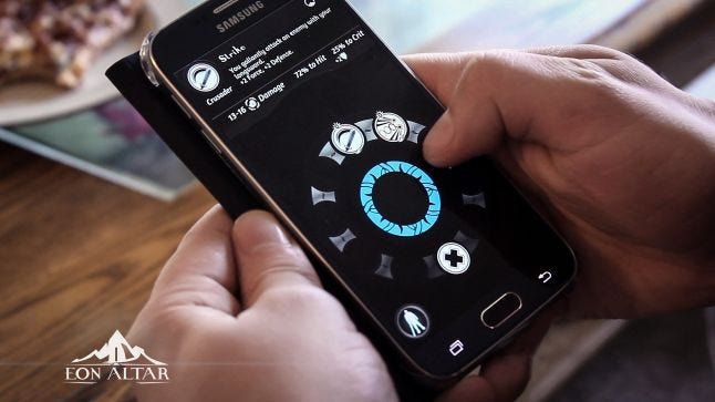 Once you’ve targeted something, a power wheel shows you contextually available moves.
Result:
These benefits came with some caveats, however. One such caveat is players learning an entirely new control scheme. We have two methods of control: “movement marker” (which is a total misnomer and should probably be called “targeting marker”, but the name stuck), and “free running”.
The movement marker is a mouse pointer of sorts that is controlled via a mapping from the controller app screen space to the character-space in-game. With our big coloured circle that matches the one on the screen, players grok this incredibly quickly. Target things to interact, and if there’s ever a question on how you want to interact, we bring up the power wheel. We knew we had to get this aspect correct, or we were toast.
We started with SNES Sim City-esque mouse pointer nudging, which is the poster child for "frustrating targeting experience"—which to be fair to the original designers of SNES game ports from PC games, the SNES mouse wasn't a thing until Mario Paint. How do you return to default? How much do you map from controller to the screen? What was the precise mapping anyhow? We threw this idea away incredibly quickly.
Next we tried mapping controller-screen-space to game-screen-space, which was awkward partly because while you control your phone in portrait, the game screen is effectively landscape, meaning your targeting resolution along the vertical was really good, but horizontal was woefully inadequate. It also made targeting some things really awkward if the camera angle wasn't perfectly pseudo-isometric. If the camera was lower to the ground, trying to target something farther away became very difficult.
The next step was to map the controller-space to camera-space. This solved the issue around the camera angle being wonky, but left us with the same problems around targeting resolution. If the camera was close to the scene, it wasn't generally a problem. If the camera had pulled back significantly? Good luck trying to make minute adjustments. This also introduced a chicken and egg issue where you couldn't push the camera position using the movement markers because the movement markers positions were intimately tied to the camera.
Finally we jumped to mapping the controller-space to character-space with reference to camera rotation along the Y-axis. Now regardless of where the camera was, the targeting resolution in the game world was always exactly the same. Up on the controller is "up" on the physical game screen, and the "default" rest point is always your character. Even in our nascent prototypes of this method, it felt miles better than any of the previous methods.
Animated gif showing the current Movement Marker mapping in action
Free run is using the area outside of the movement marker like a joystick. Press and hold, and your character runs in that direction. We treated it like a convenience method to the movement marker, so admittedly we didn’t do as much iteration here as we probably should have. It’s serviceable, but a little floaty.
Another caveat was player attention. While we have a clear story around control versus play, our story around where player attention should be at any given time was less clear to start. We originally had a mantra around the main screen being cinematic and big, bold, and beautiful. Initially, nearly all of our UI was on the controllers, and the only thing on the main screen was the movement markers.
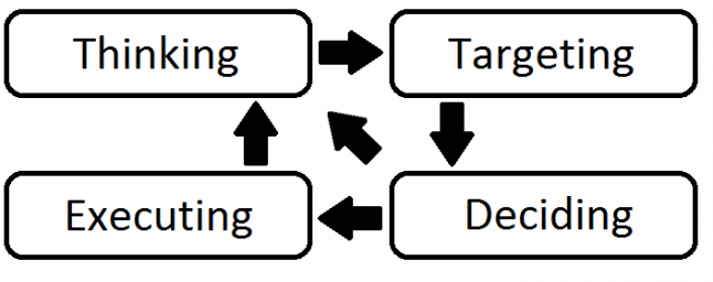 Ideally, players are only looking at their phone during the Deciding phase.
Players would end up doing what I called “the bounce”: look at the screen, down at their controller, and back up to the screen. Excessive bouncing led to sore necks and tired eyes. A specific example of this would be targeting an enemy. You would look at the phone, touch the movement marker, look at the screen, hover over something, look at your phone to determine if that something was an enemy, if yes, select a power, and then watch the power execute.
Over multiple iterations, we made the movement marker huge relative to the rest of the controller so that players could be relatively assured of picking it up without looking at the controller even without haptic feedback. We also started moving UI elements back on to the main screen: targeting notifications/lines as well as enemy/ally colour outlines so you can glean information about what you're targeting without digging into the details on your phone; health/energy bars for allies so you can tell the status of your friends at a glance; and status notifications such as effects, loot, and damage taken so you have immediate feedback without having to look down.
There are probably further steps for us to take here as well, continuing to bring information back to the main screen to reduce player bounce. For example, currently it's difficult to tell if an enemy is partially damaged without bouncing.
Without the design goals around local co-op and secret information, we may as well have created a CRPG with mouse/keyboard or traditional controllers. It was the desire to allow for player secrets that everything else had to change and iterate to achieve what we wanted. The feedback we've gotten from players is that we've really evoked the feeling of a tabletop RPG in our design, and we've delivered a gameplay experience that isn't just unique, but also a total blast to play with your significant other, siblings, and friends.
About the Author(s)
You May Also Like


.jpeg?width=700&auto=webp&quality=80&disable=upscale)


