Daily news, dev blogs, and stories from Game Developer straight to your inbox
Sponsored By
Game Design Deep Dive: Creating the striking pixel art of Crawl
"Seeing such modern high-fidelity animation applied to such low-resolution art was a pretty bold look to my eye, and not one I’d seen anywhere else."- Barney Cumming, artist on Powerhoof's Crawl
8 Min Read

Deep Dive is an ongoing Gamasutra series with the goal of shedding light on specific design, art, or technical features within a video game, in order to show how seemingly simple, fundamental design decisions aren't really that simple at all.
Check out earlier installments, including creating tension in Card Thief, achieving seamless branching in Watch Dogs 2’s Invasion of Privacy missions, and creating the intricate level design of Dishonored 2's Clockwork Mansion.
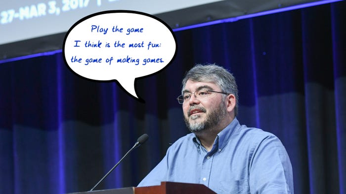
Who - Barney Cumming, Artist and Designer of Crawl
Hi, I’m Barney Cumming, artist and designer of Crawl. I created the art and animation for the game, and will be talking a little about the process and decision-making that went into the project. I've been working as an animator, designer and artist for video games in Australia over the last eleven years, with these past four under the banner of Powerhoof, a two-man games company started with programmer buddy David Lloyd.
I started making pixel animations on the computer at roughly eleven (around 1993), using HyperCard and a program called PC Animate Plus. In 1999 I started animating with 3D Studio MAX R3, which led me into the games industry; initially as a 3D animator, and later as a designer. In 2013, Dave and I quit our industry jobs to have a go at making something a bit more personal to our tastes, and to escape the crushing boredom of the mobile market and all those microtransactions.
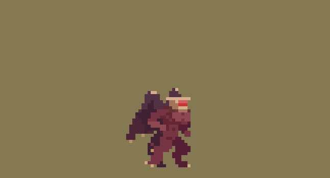
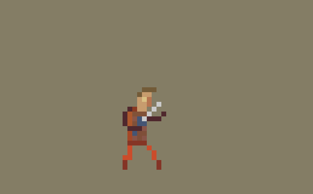
Crawl is our first commercial game, a local-multiplayer dungeon crawler where all the traps and monsters can be controlled by your real-life friends. The art style is very low resolution, with screens tending around 150 pixels high (where screens on the NES for example were closer to it’s full 240 pixels high). Crawl uses off-grid, scaled and rotated sprites, (rather than adhering to classic restrictions in these areas), to give a style which freely combines elements from modern and retro sensibilities.
What - Creating a visually striking and easily readable pixel art style
In developing this low-res art style for Crawl, we start with a simple list of requirements:
It must be efficient enough for our one-person art team to create and animate upwards of fifty unique monsters, as well as innumerable hero weapons, environments, props, menus etc, within a reasonable timeframe.
It has to be visually striking. Not just look good, but look good in some unique way that stands out from the way other games are looking good.
As I’ll be making all the art, the style should emphasize the things I’m good at, quick at, and experienced at, and deemphasize all my weaknesses.
It should be fun to make. If we’re going to be working our asses off on this thing, it’s best not to choose a style I already find laborious. Fortunately if we meet the other three requirements, this one tends to be a given.
Despite all my industry experience being with 3D art/animation, and not having touched pixels for a good fourteen years, after initial testing it quickly became clear that pixel art could be just the right tool to let us realize our design. If I took the resolution low enough, I could give the impression of “knight” “demon” or “spider” very quickly (compared to modeling, texturing and rigging in 3D), I would have access to all the fluidity of 2D animation (which you can’t ever get from a 3D rig), while magically being freed from how slow I usually am at drawing in 2D. I could focus on my strengths - animation and character movement - and avoid all my weaknesses.
I knew my tiny little 5 or 10 pixel high monster sprites wouldn’t be visually striking compared to all the amazing game art out there, but keeping them so low-res (so quick to draw and redraw) would allow me to really go crazy with the animation fidelity, and seeing such modern high-fidelity animation applied to such low-resolution art (which we’re used to seeing with only the most rudimentary animations) was a pretty bold look to my eye, and not one I’d seen anywhere else.
Why?
If we were trying to be visually appealing in the same way as other games, going for a well-trodden style but just trying to outdo everyone on execution alone, we’d have needed so much raw art firepower to be noticed above all the competition. So this technique of making our own little competition off to the side in which there are no other competitors, is a sneaky way of standing out without quite competing. It’s a bit like wanting to break the world high-jump record, but seeing it’s way too high, so creating your own “highest jump while also wearing a sparkly hat” category and winning that instead with a much lower jump (and a much cooler hat).
So the style goal I set was to take incredibly low-resolution characters, reminiscent of the games I played as a child, but instead of recreating the way those old sprites really moved, I’d animate them to look how they did in my imagination. As a kid, those clumsy two-frame attacks were heroic lunges, and the simple run animations were athletic and full of life. I wanted to recreate the version I saw through the rose-tinted lenses of my childhood imagination.
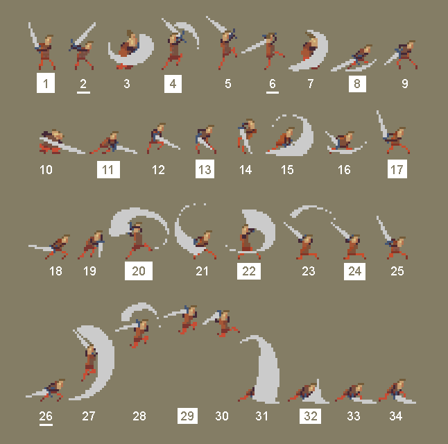
For the smaller characters, the animation process is simple. I’d start with the key poses (frame numbers with boxes around them) which in this case is mostly one frame for each swing of the sword, with the pose being drawn in the posture the hero holds on immediately after each swing. Beyond that it’s mostly just inbetweens, apart from a few cases (frame numbers with underlines) where I’ve pulled part of the pose out a little further from the upcoming key, to give a stronger anticipation.
You’ll notice practically none of my inbetweens are actually half way between the two poses. If things are moving very smoothly and robotically you’ll get half-way inbetweens, but in the case of combat (and most other animations in an action game) the movements are very staccato, so half-way inbetweens won’t suit. To get the desired movement, most of my inbetweens are actually copies of either the previous or next keyframe, with slight tweaks to indicate which direction the movement is about to go in (or which is has just come from) and some delayed and tweaked body parts to indicate where the force and weight are pushing, dragging and pulling things down. The actual “action”, the biggest movement of each strike, tends to happen between two of my frames, and I just draw a big motion-blur smear to indicate the movement of the blade over that time. This technique, which amounts to mostly just cushioning around keyframes, gives very snappy, staccato results.
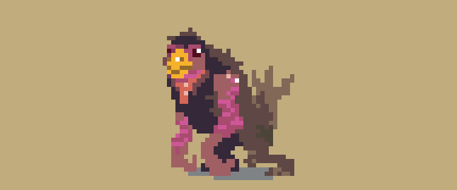
For larger, more complex creatures, I’d do most of the animation work using fairly simple stick-figure type lines (which are very quick to draw and redraw) before painting over with full detail once I’m happy with the movement. Any style or process which allows you to change your mind and redraw a pose quicker, will always result in better animations as you are freed to take more risks.
You can see the process is quite approachable when broken down into simple individual tasks, with the most important decision being the order in which to do it all. If you work hard on secondary movements before you’re entirely happy with the primary, you’ll end up having to redo all that work once you change the primary. Or even worse, you’ll be tempted to just accept an imperfect animation, to avoid redoing the work.
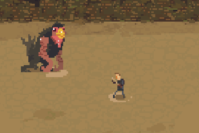
Immediately after animating that bird creature, I decided I didn’t like the direction I’d taken and redid the animation from scratch. The efficiency of low-resolution allowed me this extra creativity and experimentation, by stripping much of the sunk-cost in time spent experimenting. If this animation has taken a few days rather than a few hours, I probably wouldn’t have bothered to try again.
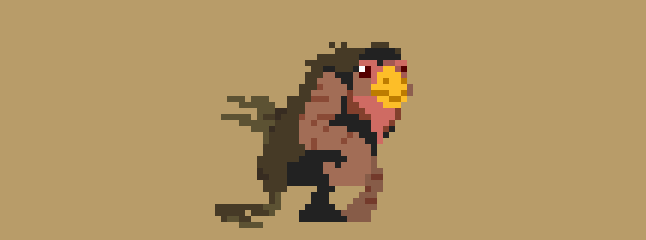
Of course as a small team we still try to minimize the wastage and reuse anything we can. When it came to designing combat functionality for the bird creature, I had initially envisioned him having a big “squawk” as one of his attacks, where sound waves would fly out like projectiles, and make the hero dizzy on contact.
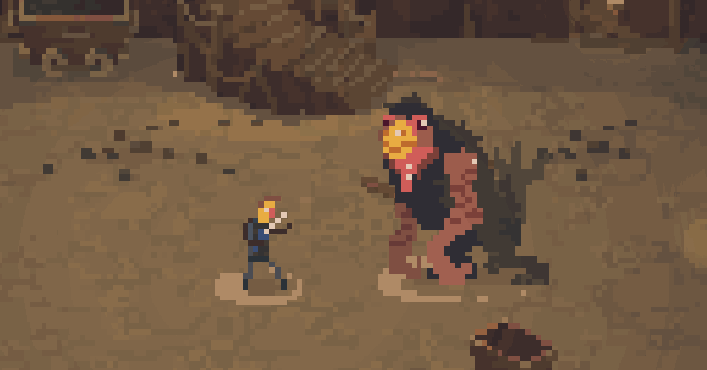
The attack wound up playing badly in-game, no matter how much I tried to make it work. Although the attack was scrapped I did quite like the squawk animation, so when I settled on a “grab and bite” move, I reused the old squawk frames for the anticipation on his grab.
Result
The speed of drawing in that art style wasn’t only about making better animations, it was about game-design efficiency and the ability to experiment. I could have a brand new character designed, animated and fighting in game within a day, allowing even our most risky ideas to be tested. With a higher sunk-cost for each failed experiment, we’d have been both risk-averse in our initial ideas (playing it safe and designing moves similar to ones which had worked in the past), and much more prone to making do with not-quite-right gameplay after all that work had been done for the art.
For us little developers, art can be a tightrope between visual impact and cost. We were lucky enough to find a style for Crawl that we loved the look of and was also efficient to make, but with that now old-hat, it’s time to find a new twist for the next game. Maybe low-resolution but wearing sparkly shoes this time?
About the Author(s)
You May Also Like