


Daily news, dev blogs, and stories from Game Developer straight to your inbox
Sponsored By
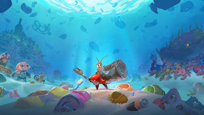
From Spheres to Cosmic Kites: Graphical Overhaul and Re-branding
In this post we go into details about how we find and actively work with inspiration and written down design goals to reach our desired destination. In this case when we re-branded one of our games with a new name, logo and total graphical overhaul.
10 Min Read

In this Article we go into details about how we find and actively work with inpspiration and written down design goals to reach our desired destination. In this case when we re-branded one of our games with a new name, logo and total graphical overhaul.
by Alexander Schach & Tobias Lindberg (Fishmoose Interactive)
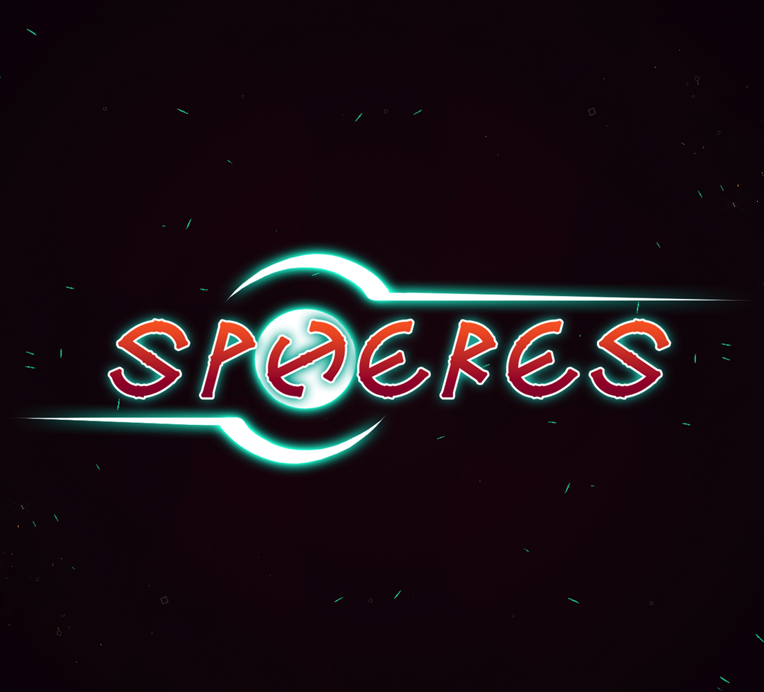
Before “Cosmic Kites” was a thing the game was called “SPHERES”. We will have an article out regarding the name change, and the process that went into it later down the line.
The origin of the name SPHERES was simply that Tobias suggested it as a project name after playing the first prototype, and the name stuck. Our biggest problem with the name was that it lacked personality and memorability, plus that it basically didn’t say anything about the game.
This basic lacking of personality and originality was something that we felt applied to the graphics as well, combined with problems concerning feedback to the players, which further led us to consider remaking the graphical style entirely.
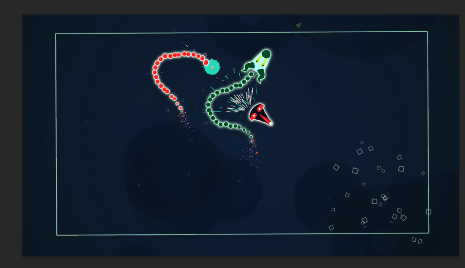
From the earliest prototypes all the way to this overhaul, the graphics had been in a more abstract / retro / minimalistic fashion with basic geometrical shapes as characters and game objects. Simple, clean, but highly forgettable, and what some people consider “programmer’s graphics”.
Initially, there were never any concise plans on keeping the simpler graphical style, but after months and months of working with them, we had sort of grown attached to them, which resulted in us holding onto them for way too long. We were also a bit misguided since people told us they liked the current visuals, and of course they told the truth; they did like it, or at least, and probably more commonly, did not dislike it. That does not mean that the graphics are great though. It’s simply means that it’s not ugly.
In search of a more personal graphical style
So we went in heads first with the question: How do we bring personality to this slightly generic looking and expressionless game? The gameplay is fairly creative, yet very easy to grasp, so we wanted the graphics to compliment the gameplay by having the same features, as well as making the visual feedback more intuitive, like the hitboxes of the trails for example.
Another side goal was to enable us to use different looking characters for the players to switch between. It hadn’t been the most frequent feedback we’d received, but several players was asking for additional player customization, which we’d figure might help the player(s) to feel a greater sense of attachment to the game and its characters.
So we set up some design goals which the new graphics should fulfill:
Have personality (be memorable and different).
It should be possible to create different characters with the style.
The thing is, there were aspects with the old graphics that worked very well, and that was what got all the compliments. Therefore it was easy for us to keep telling ourselves that everything about the graphics were good and they just needed some additional polish. But now the next step was pinpointing what was not working and what was working with the current visuals.
The main part that was likeable to players was the colors and the effects. Some enjoyed the extreme minimalism, but most people were indifferent and not really drawn in by the visuals.
What wasn’t exactly remarkable was the sprites for characters and objects. Even though they formed a nice visual framework together, there is a limit to how interesting triangles and circles can be.
Since we recognised that we would need to work on actual characters for the game, the obvious starting point was deciding what kind of characters we were to use.
Since it was, and still is, a top-down fast-paced action game, the first idea that popped up was of course vehicles, like cars and spaceships, and while looking for references and ideas in other games it became apparent that this is very prominent with similar games. We made some sketches but realised quickly that this wasn’t something interesting, intriguing, or even remotely original.
Our goal was to give the game more personality, so this did not feel right at all. It was such a generic theme that it felt almost worse than having triangles for characters.
Testing different ideas fast and being able to recognize what works and what does not is extremely important. Being a team of only two sure makes this a hell lot easier, but even in larger teams it’s a valuable aspect to work on. The key to this is, in our experience, to value and reflect over the mistakes instead of being too quick to throw them away and start on the next thing - a principle that permeates our entire development process. The problems with the vehicle design were that they didn't fulfill our goal of bringing personality to this slightly generic looking and expressionless game
So we started to look away from games in search of different sources of inspiration. We’ve been using Pinterest quite a lot when building mood boards or searching for references, and in combination with ordinary googling we found this image that we found very inspiring.
It was unique, weird and memorable. We also got very inspired by the different color schemes used by the artist.
We created some mockups based off of this image which looked pretty neat. But while they were way more interesting and creative, other problems arose. Primarily the added number of colors made the graphical feedback a lot messier in contrast to the very clean, older visuals. The game has a very high tempo with a lot of focus on split-second reaction time and quick decisions, hence the players would need really clear visuals. So we added a new criteria to the design goals:
Visuals should have good contrast and be easy to follow.
It did look a lot better, but video game visuals are more than making a pretty image. In motion the slightly diminished distinguishability of the character made it feel worse to play.
Two things were acknowledged
We should stick to a very limited number of colors for the characters in order to make them as easily distinguishable as possible.
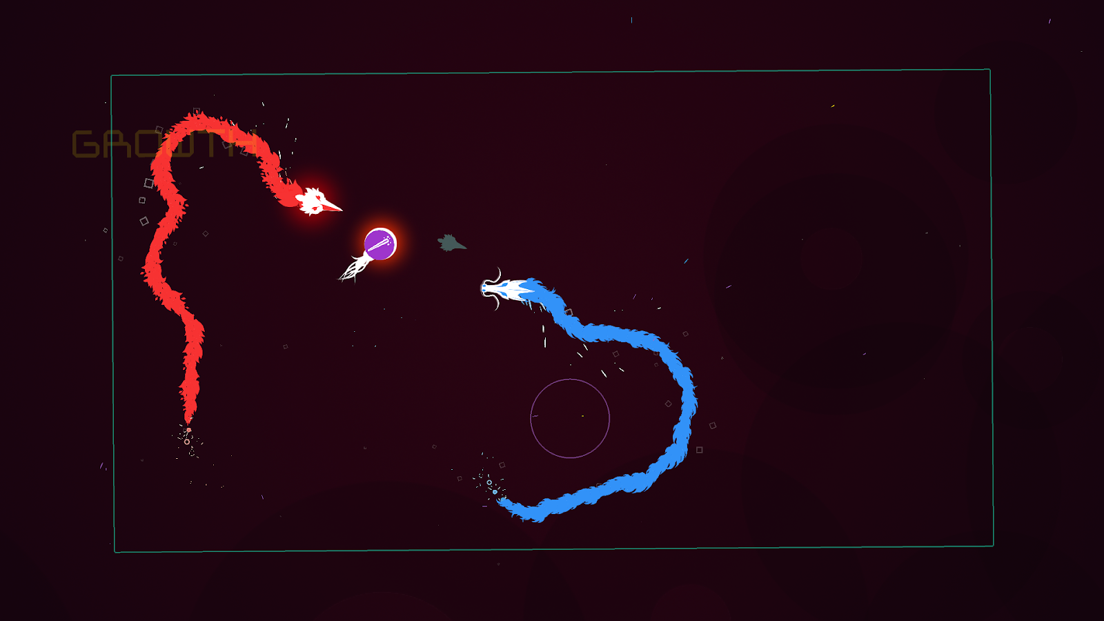
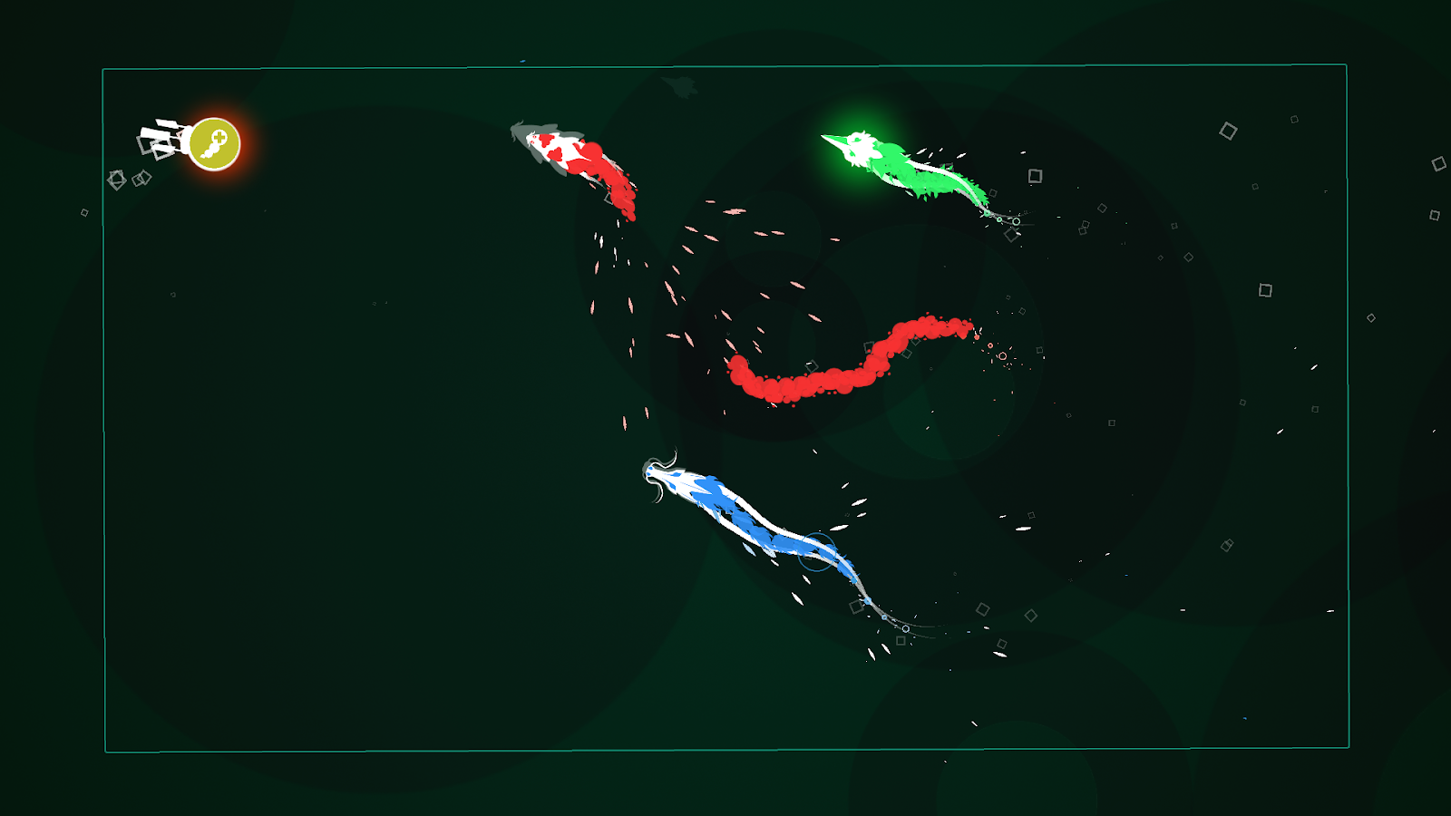
The concept of using weird masks to represent the players worked very well with the perspective that we were using, and we could create distinguishable characters with rather simple means and few colors.
From this point we kept running forward, continuing to look for inspiration everywhere. We can't stress this enough: Only looking for inspiration in other games limits your perspective; your inspiration, and there is a lot of different thinking in different media to borrow from.
Finally the last piece fell into place. Alex got very inspired by a shirt design from another developer he met at Nordic Game in Malmö, Sweden
This idea resulted in us adding white as our main color for the player characters, combined with one unique color per player, which gave us a lot more to work with and at the same time it did not make the visual feedback more messy.
Just as before, we put up some goals we wanted to achieve with the character design. We think this is a highly important step that challenges you to think about your decisions, which leads to creations with more conscious design.
The guidelines we ended up with were:
The different characters should have a common theme.
Each character should have distinguishable features.
They are not allowed to be spaceships or vehicles.
We ran into some cool paper-cutout animal masks and decided to experiment with the idea and ended up with animal masks/heads with different organic trails (e.g. fur, fire, water, feathers).
The common theme hence came to be “animals and mythical creatures”, much because of the multitude of choices as well as there being a lot of different distinguishable features / elements to work with.
The characters being organic instead of mechanic wasn't a guideline we went in with, but it was apparent that it was a good choice. It made the trails look more alive and it was easier to give the characters a sense of personality.
Conclusions
By pinpointing our design goals we created a list of things to check through on each iteration of the graphics. This part made it really easy to quickly realise if we were on the right track, or if we needed to change direction. Those goals were added and updated throughout the process and a combined list would look something like this:
The game needs to have personality (be memorable and different).
It should be possible to create different characters within the graphical style.
The different characters should have a common theme.
We should stick to a very limited number of colors for the characters in order to make them as easily distinguishable as possible.
Each character should have distinguishable features.
The characters are not allowed to be spaceships or vehicles.
Another big lesson here is to look for inspiration everywhere and to pick apart every idea, turn all of the individual parts around and look for new applications beyond their original / intended context.
It might also be dangerous to be too dismissive of things that you don’t think too highly of at the time, or that might not feel inspirational. The image on the shirt pictured spaceships, and we were very clear that we did not want spaceships. Still the graphical style of the image was very inspiring and the traces left by the image are easily spotted in the current iteration of the graphical style.
Now, with the improvements implemented, it’s easy to see the huge difference that the process has resulted in. The players get more drawn into the game and some people have complemented the game as early as in the Start Screen, which we think is due to a more relatable general image. The simplistic and abstract may be beautiful and functional, but it runs a great risk of feeling a bit distant and expressionless.
Many things mentioned in this post might be blatantly obvious to some readers and in that case - good for you! Now, go forth and create amazingly beautiful and creative things! For the rest of you, we hope that we’ve been able to provide some minor shortcuts in the creations of your future projects.
We hope this article was interesting and maybe even helpful. If you found it such, rejoice, because there will be more!
If you are interested in finding out more about Cosmic Kites, feel free to check us out on steam, gamejolt or our website: fishmoose.net
About the Author(s)
You May Also Like